How to Create Line Chart with JavaScript
July 28th, 2021 by Shachee Swadia A line chart is one of the basic and most commonly used techniques of data visualization. Such graphics are known to provide an informative look at the change of one or several variables over time. Right now, I’ll explain how to easily create a cool interactive line chart using JavaScript! The process will be demonstrated with the help of compelling examples that you can play with afterwards to hone your new data visualization development skills.
To make the article especially thrilling for you to read and learn from, I decided to showcase a practical application of a line chart to real-world data. The month of June was celebrated as Pride Month, and I thought it would be great to see how attitudes toward LGBT people have changed over the recent years. Then I found interesting public opinion data from the General Social Survey (GSS), a project of the National Opinion Research Center (NORC) at the University of Chicago, which appeared to be a good fit, and took part of it to visualize in this guide.
So, follow along with the tutorial and you will also be able to explore the shifts in acceptance of same-sex relationships in the United States over the last two decades! We will create a single-series JS line chart first, representing the general trend, and then a multi-series JS line chart to visualize a breakdown by age group.
All aboard!
Read the JS charting tutorial »
- Categories: AnyChart Charting Component, Big Data, Business Intelligence, HTML5, JavaScript, JavaScript Chart Tutorials, Tips and Tricks
- 2 Comments »
Creating JS Flow Map in Four Steps
July 13th, 2021 by Shachee Swadia A step-by-step tutorial showing how to create an interactive JS Flow Map. Illustrated by visualizing data on migration to the US.
It may seem to be complicated to create an interactive Flow Map for the Web using JavaScript. But it’s not! This easy-to-follow tutorial will show you how to build beautiful JS flow maps without too much effort.
In these difficult times of the pandemic, there is a lot of confusion and concern about the immigration status of people around the globe. I decided to take a look at the immigration data of the US which has more migrants than any other country in the world. Here, I explore where these immigrants come from and represent the top 15 countries that contributed the highest number of migrants to the US in the year 2019.
A flow map seems the perfect way to showcase the inflow of migrants into the United States from various countries. Before going further, let me give you a brief idea about a flow map and its uses.
Read the JS charting tutorial »
- Categories: AnyChart Charting Component, AnyMap, Big Data, Business Intelligence, HTML5, JavaScript, JavaScript Chart Tutorials, Tips and Tricks
- 2 Comments »
How to Build JavaScript Donut Charts
July 6th, 2021 by Shachee Swadia Wondering how data designers and developers create compelling donut charts using JavaScript? Then you’ve come to the right place at the right time. Follow along and you will learn how to build an interactive JS donut chart with great ease even if you are a beginner!
In this tutorial, we will be visualizing data about the global market share of the top online music streaming platforms. It is a good example of information that can be nicely represented in a donut chart.
To make sure we are on the same page, let’s first see what a donut chart is and then get down to charting straight away!
Read the JS charting tutorial »
- Categories: AnyChart Charting Component, HTML5, JavaScript, JavaScript Chart Tutorials, Tips and Tricks
- 2 Comments »
AnyChart JS Charts Used to Visualize Data on Ancient French Riddles
June 30th, 2021 by AnyChart Team As global leaders in data visualization solutions, we feel it is part of our mission to support educational and research projects by granting their authors a free license to use our products. Les Énigmes de Mercure (The Riddles of Mercury) by Timothée Léchot from the University of Neuchâtel (UniNE) is one such initiative we are proud to back on non-commercial terms.
Recently, we had a quick talk with Timothée and asked him a few questions to learn more about his project and experience visualizing data with the AnyChart JS charting library. Read our quick interview below. (Stack: PHP/MySQL.)
- Categories: AnyChart Charting Component, Big Data, Charts and Art, HTML5, JavaScript, Success Stories
- No Comments »
How to Create Interactive Timeline Chart with JavaScript
June 17th, 2021 by Shachee Swadia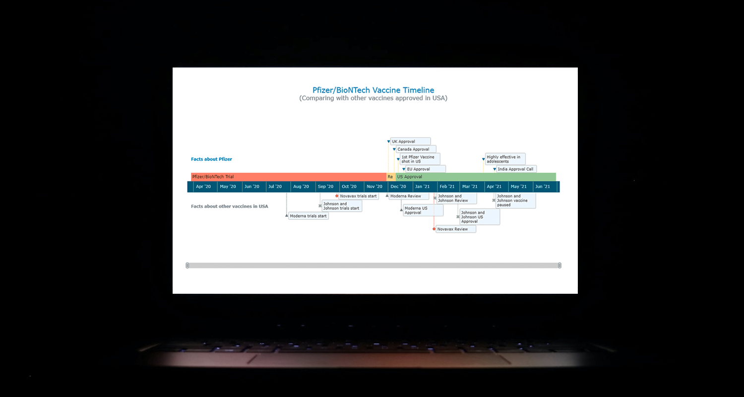 I think all of us have come across timelines somewhere or the other; as a means of conveying chronological information, the classic timeline is unmatched, both in the depth of information conveyed and the “cool” factor, when done with a deft creative touch. So, with that said, would you like to learn how to build a timeline chart using JavaScript that both looks great and is simple to create? (Of course, you do!) Follow along with me as I take you through the step-by-step breakdown for developing your own JS timeline with a practical example.
As the world continues to battle with COVID-19, the long-awaited good news is the development of vaccines across the globe. Here, I decided to build an interactive timeline that showcases the phases of Pfizer-BioNTech vaccine development in the United States. To add more contextual information, I also wanted to show approvals from other countries and some related facts, including the dates for the development of the 3 other vaccines approved for usage in the US.
Read the JS charting tutorial »
- Categories: AnyChart Charting Component, Big Data, Charts and Art, HTML5, JavaScript, JavaScript Chart Tutorials, Tips and Tricks
- No Comments »
AnyChart JS 8.10.0 Released with Circle Packing & Calendar Charts, Waterfall Arrows, Marker Series in Surface Chart
May 24th, 2021 by AnyChart Team A new version of our JavaScript charting library is now out with a bunch of super wow updates! First, we’ve added two new chart types: Circle Packing and Calendar. Second, now you are more than welcome to make use of the pre-built Arrow Connectors in Waterfall Charts and Marker Series in 3D Surface Charts. Keep reading to learn more about the key new arrivals in AnyChart JS 8.10.0, and enjoy these just-added charts and features in our powerful data visualization tool!
»»» See What’s New in AnyChart 8.10.0! «««
- Categories: AnyChart Charting Component, Big Data, Business Intelligence, Dashboards, HTML5, JavaScript, News
- No Comments »
Building Mosaic Chart in JavaScript
May 11th, 2021 by Shachee Swadia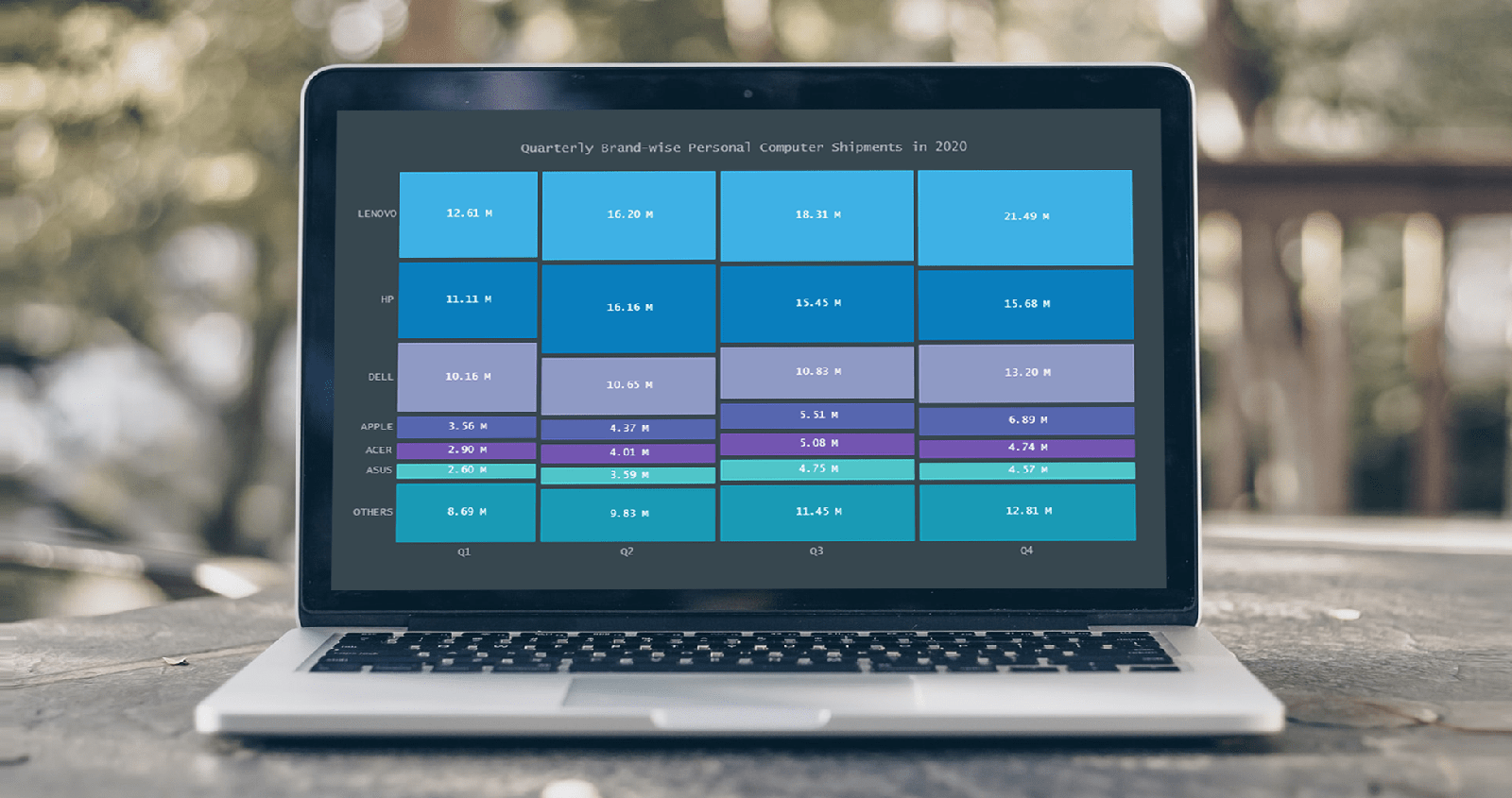 A step-by-step guide for building an interactive JS Mosaic Chart. Illustrated by visualizing data on quarterly PC shipments by brand in 2020.
Data visualization is a valuable tool in today’s scenario, with data everywhere and various opportunities to tap into that data to find insights. Visual charts are imperative to communicate ideas, identify patterns, and make the most of the available data.
So then, would you like to quickly and easily learn how to create a really cool chart that showcases data interestingly?
A mosaic chart is a multi-series chart that effectively represents data with over 2 parameters and is so-called because each data point has distinctive indents, making it visually similar to a piece of mosaic art. Not only is this chart beautiful to look at, but is also very helpful in representing multiple variables and recognizing the relationship between these different variables.
The year 2020 was not all bad, at least for the market of personal computers. The sales of PCs increased throughout each quarter of 2020, with more people working and studying from home. I explored how each brand fared in every quarter based on the number of global shipments.
Read the JS charting tutorial »
- Categories: AnyChart Charting Component, HTML5, JavaScript, JavaScript Chart Tutorials, Tips and Tricks
- No Comments »
Making JS Dot Density Map to Visualize Shipping Ports Across Globe
April 20th, 2021 by Shachee Swadia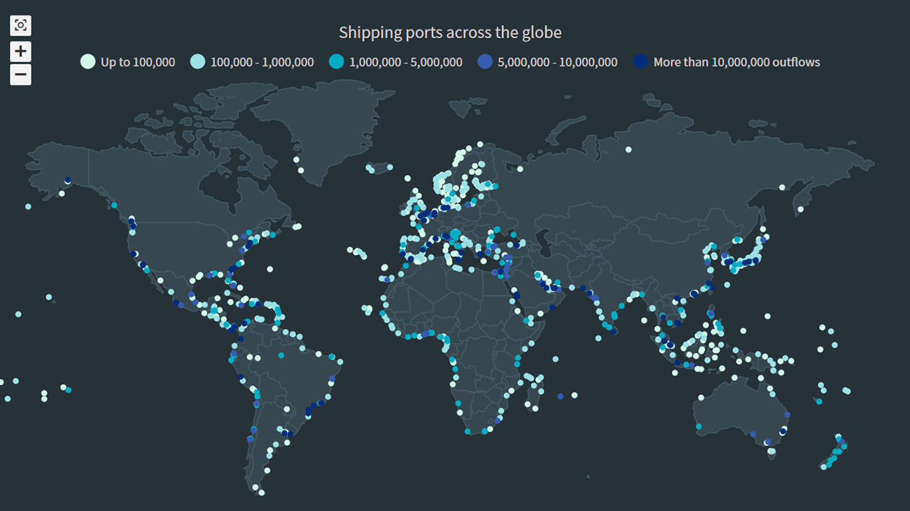 The recent incident of the Suez Canal blockage caught my interest in shipping and prompted me to explore the various shipping ports around the globe. There are more than 850 ports in the world and to get an overall view of where these are located, I decided to plot them on a dot map, or dot density map, using JavaScript.
Building an interactive JS dot density map can seem like a daunting task. But let me assure you that it can be pretty straightforward. Right now, I will show how to make a fully functional dot map chart using a JavaScript library for data visualization.
Read the JS charting tutorial »
- Categories: AnyChart Charting Component, AnyMap, Big Data, HTML5, JavaScript, JavaScript Chart Tutorials, Tips and Tricks
- No Comments »
Data Visualization for COVID-19 Dashboard Tracker Using AnyChart JS Charts
April 12th, 2021 by AnyChart Team![]() Data visualization has played an important role during the COVID-19 pandemic, allowing governments, scientists, healthcare professionals, and the general public to better understand different aspects of the crisis. There are many illuminating projects all over the web that leverage charts and maps to effectively communicate what the coronavirus statistics have to say. Some of them are using our data visualization tools under a free license provided as part of the special initiative we announced last spring to support the global COVID-19 data analysis effort.
Data visualization has played an important role during the COVID-19 pandemic, allowing governments, scientists, healthcare professionals, and the general public to better understand different aspects of the crisis. There are many illuminating projects all over the web that leverage charts and maps to effectively communicate what the coronavirus statistics have to say. Some of them are using our data visualization tools under a free license provided as part of the special initiative we announced last spring to support the global COVID-19 data analysis effort.
We told you about two examples of such projects earlier: StopCorona and iConcepts SARS-CoV-2 Stats. Now let us introduce you to another interesting resource — COVID-19 Dashboard Tracker by Maxime des Touches. Launched more than a year ago, while Maxime was yet a computer science student, it has turned from a simple online data table into a complex interactive data visualization project offering up-to-date insight into how the pandemic unfolds in France and worldwide.
Maxime kindly agreed to talk to us about his COVID-19 tracker, experience using AnyChart, and the pandemic in general. Check out our quick interview, glance at a few screenshots, and try his open-source dashboard by yourself. (Stack: HTML/jQuery/JSON.)
- Categories: AnyChart Charting Component, AnyStock, Big Data, Dashboards, HTML5, JavaScript, Stock Charts, Success Stories
- No Comments »
Creating Waterfall Chart with JS
March 16th, 2021 by Dilhani Withanage Do you want to know how to easily add a waterfall chart to a web page or application using JavaScript? This tutorial will make sure you’re prepared to confidently deal with that sort of interactive data visualization development!
Waterfall charts illuminate how a starting value turns into a final value over a sequence of intermediate additions (positive values) and subtractions (negative values). These additions and subtractions can be time-based or represent categories such as multiple income sources and expenditures. In finance, a waterfall chart is often called a bridge; you may have also heard it referred to as a cascade, Mario, or flying bricks chart.
To see waterfall charts in action and learn how to build them with JavaScript (HTML5), we need some interesting real-world data to visualize. In this tutorial, let’s look at the 2020 income statement for Alphabet Inc. (GOOGL), the parent company of Google.
Hence, be with me to reach our target step by step, so in the end, you’ll see how a lot of numbers can be made sense of with real ease when illustrated as a beautiful, interactive, JS waterfall chart. All aboard!
Read the JS charting tutorial »
- Categories: AnyChart Charting Component, Business Intelligence, HTML5, JavaScript, JavaScript Chart Tutorials, Tips and Tricks
- No Comments »