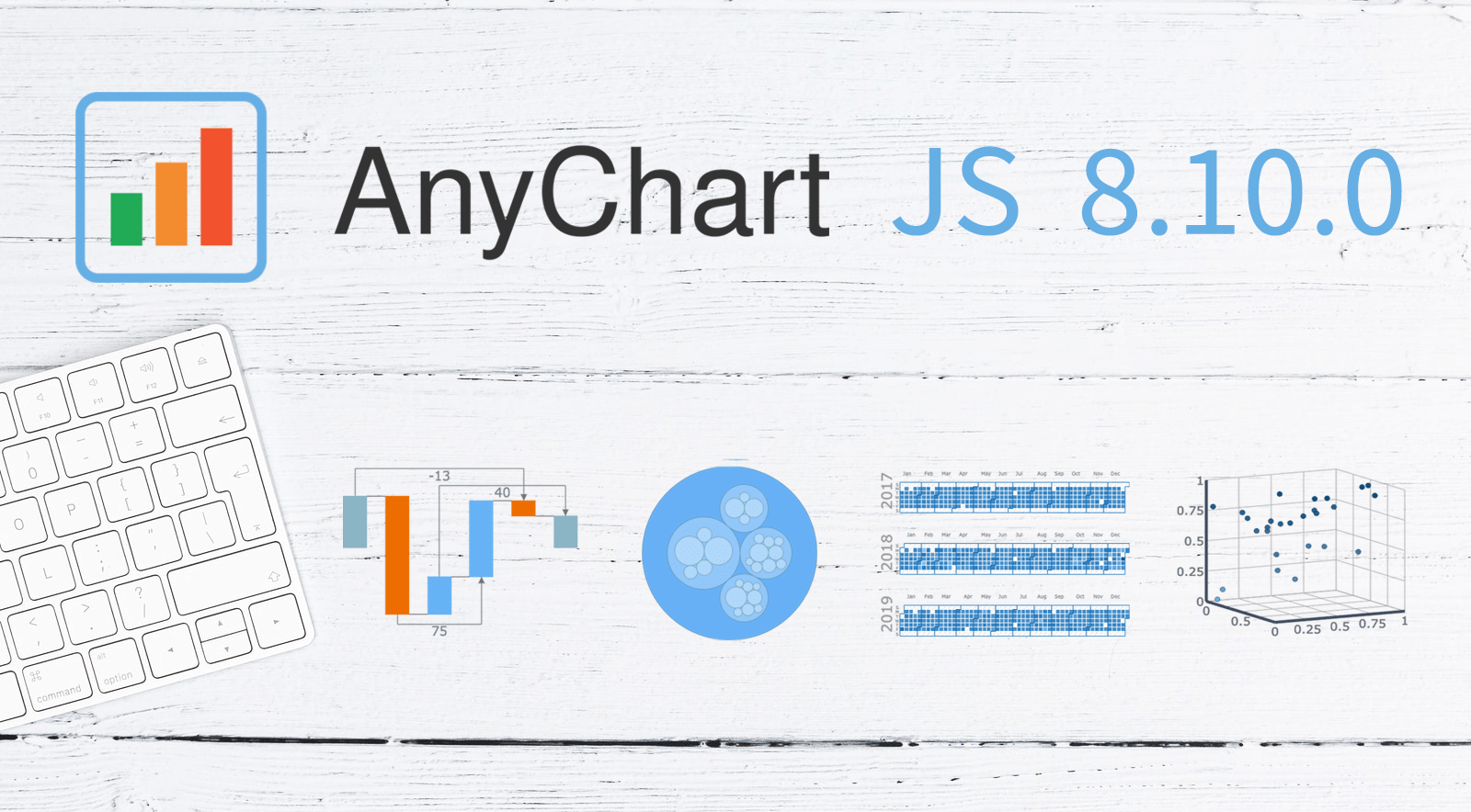
 A new version of our JavaScript charting library is now out with a bunch of super wow updates! First, we’ve added two new chart types: Circle Packing and Calendar. Second, now you are more than welcome to make use of the pre-built Arrow Connectors in Waterfall Charts and Marker Series in 3D Surface Charts. Keep reading to learn more about the key new arrivals in AnyChart JS 8.10.0, and enjoy these just-added charts and features in our powerful data visualization tool!
What’s New in AnyChart JS 8.10.0
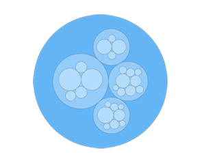 |
Circle Packing ChartA Circle Packing Chart, or a Circular Treemap, is a variation of a Treemap Chart that visualizes hierarchical data using circles instead of rectangles. The circle packing technique may not be as space-efficient as conventional treemapping. However, the former helps to reveal hierarchical structure better than the latter. Check out several examples of JS Circle Packing Charts in our gallery. |
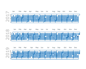 |
Calendar ChartA Calendar Chart is a form of data visualization designed to represent activity over a long time span such as years or months. For example, you can use it when you need to show how quantifiable values vary depending on the season, day of the week, and so on, or how they trend over time. Check out several examples of JS Calendar Charts in our gallery. |
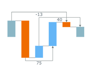 |
Arrows in Waterfall ChartIn addition to the two brand new chart types, two awesome features are now available in our JavaScript charting library. One of them is Waterfall Chart Arrows. To point out certain changes, arrow-shaped connectors can now be quickly drawn between the columns. In this way, the corresponding difference values are automatically displayed in the attached text labels. Learn about the addArrow method in the API reference. |
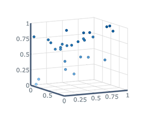 |
Marker Series in Surface ChartWe have also included the opportunity to create a Marker Series in a Surface Chart in a really straightforward manner. So, now you can quickly visualize data as a set of dots distributed in the 3D space. Check out an example of a JS Surface Chart with a Marker Series in our gallery. |
Next in Our Plans
While you are reading this, we are already working on more updates and improvements! For example, you can expect the cross axis feature, as well as — in Waterfall Charts — split totals and outside labels delivered in the next major release scheduled for September.
What other features or chart types do you need in the AnyChart JavaScript charting library? We would love to hear that from you! Please send your suggestions to our Support Team and we will be happy to adjust our roadmap accordingly.
Enjoy AnyChart JS 8.10.0!
- Categories: AnyChart Charting Component, Big Data, Business Intelligence, Dashboards, HTML5, JavaScript, News
- No Comments »