AnyChart Named Best in Data Analytics & Visualization 🏆
February 3rd, 2023 by AnyChart Team We’re proud to announce that AnyChart has won a prestigious 2023 DEVIES Award in the Data Analytics & Visualization category! Many thanks to the jury and congratulations to all our partners and customers!
Celebrating 20 years in the market this year, we at AnyChart have been working hard to develop the best-in-class data visualization solutions. And we will keep innovating and excelling!
The DEVIES Awards are the definitive annual awards for the software industry, recognizing outstanding design, engineering, and innovation in developer technology across multiple categories. This year, winners were selected from record-high hundreds of nominations by an expert-led panel of the DevNetwork Advisory Board, including representatives of Accenture, DigitalOcean, EA, Google, IBM, Salesforce, and other great companies.
- Categories: AnyChart charting component, AnyGantt, AnyMap, AnyStock, Big Data, Business Intelligence, Dashboards, Financial charts, Gantt Chart, GraphicsJS, HTML5, JavaScript, News, Oracle Apex, Qlik, Stock charts, Success stories
- 2 Comments »
Building Stock Chart with JavaScript
February 24th, 2022 by Shachee Swadia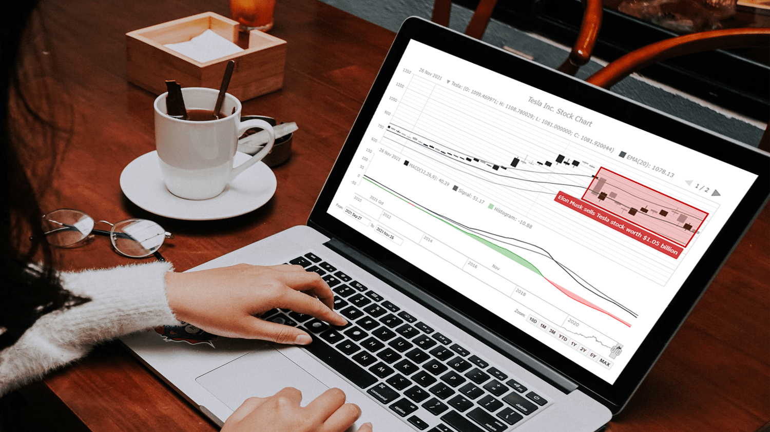 Data visualization is vastly applied in various fields. One such domain is financial trading, where stock charts are essential for smart market data analysis and decision making. Whether you invest in stocks or not, I am pretty sure that you have come across such graphics or even might need to build one right now. So, would you like to know how to make a stock chart? I’m ready to show you an easy path using the Tesla stock price data and JavaScript! Come along with me throughout this tutorial and you’ll learn how to quickly create elegant, interactive JS stock charts like the one you see in the picture.
Read the JS charting tutorial »
- Categories: AnyChart charting component, AnyStock, Big Data, Financial charts, HTML5, JavaScript, JavaScript chart tutorials, Stock charts, Tips and tricks
- No Comments »
How to Create Financial Open-High-Low-Close (OHLC) Chart Using JavaScript
September 7th, 2021 by Shachee Swadia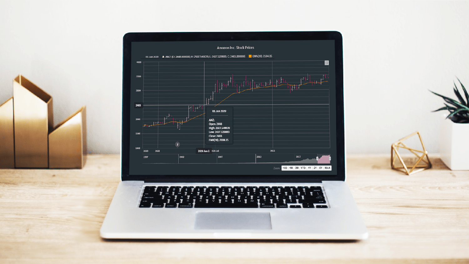 A stepwise guide on how to create interactive financial charts in the form of an OHLC chart. Visualizing the stock prices of Amazon over the course of Jeff Bezos’s tenure as the CEO.
Financial charts are especially useful to represent large amounts of data and identify trends. Would like to learn one such cool financial chart called the OHLC chart that visualizes stock price movement?
Read the JS charting tutorial »
- Categories: AnyChart charting component, AnyStock, Big Data, Financial charts, HTML5, JavaScript, JavaScript chart tutorials, Stock charts, Tips and tricks
- No Comments »
Data Visualization for COVID-19 Dashboard Tracker Using AnyChart JS Charts
April 12th, 2021 by AnyChart Team![]() Data visualization has played an important role during the COVID-19 pandemic, allowing governments, scientists, healthcare professionals, and the general public to better understand different aspects of the crisis. There are many illuminating projects all over the web that leverage charts and maps to effectively communicate what the coronavirus statistics have to say. Some of them are using our data visualization tools under a free license provided as part of the special initiative we announced last spring to support the global COVID-19 data analysis effort.
Data visualization has played an important role during the COVID-19 pandemic, allowing governments, scientists, healthcare professionals, and the general public to better understand different aspects of the crisis. There are many illuminating projects all over the web that leverage charts and maps to effectively communicate what the coronavirus statistics have to say. Some of them are using our data visualization tools under a free license provided as part of the special initiative we announced last spring to support the global COVID-19 data analysis effort.
We told you about two examples of such projects earlier: StopCorona and iConcepts SARS-CoV-2 Stats. Now let us introduce you to another interesting resource — COVID-19 Dashboard Tracker by Maxime des Touches. Launched more than a year ago, while Maxime was yet a computer science student, it has turned from a simple online data table into a complex interactive data visualization project offering up-to-date insight into how the pandemic unfolds in France and worldwide.
Maxime kindly agreed to talk to us about his COVID-19 tracker, experience using AnyChart, and the pandemic in general. Check out our quick interview, glance at a few screenshots, and try his open-source dashboard by yourself. (Stack: HTML/jQuery/JSON.)
- Categories: AnyChart charting component, AnyStock, Big Data, Dashboards, HTML5, JavaScript, Stock charts, Success stories
- No Comments »
New JavaScript Chart Features in AnyChart 8.9.0
September 29th, 2020 by AnyChart Team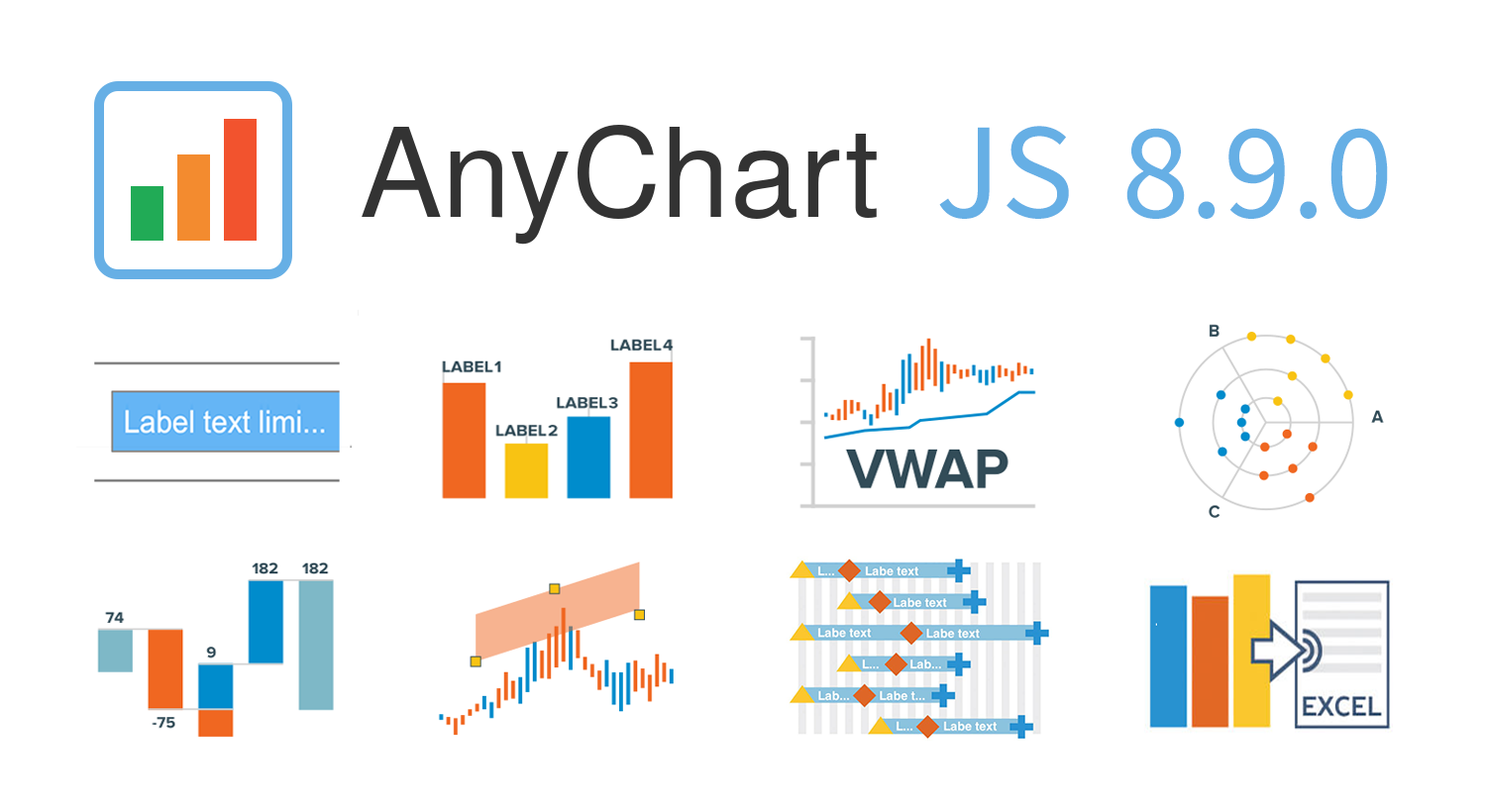 AnyChart 8.9.0 is out! The latest major update brings new exciting out-of-the-box features to our award-winning JavaScript charting library product family — AnyChart, AnyStock, AnyGantt, and AnyMap. Enjoy the improved functionality and build even more compelling data visualizations for your web sites and apps in less time!
»»» See What’s New in AnyChart 8.9.0! «««
- Categories: AnyChart charting component, AnyGantt, AnyMap, AnyStock, Big Data, Business Intelligence, Dashboards, Financial charts, Gantt Chart, HTML5, JavaScript, News, Stock charts
- 2 Comments »
Connecting MySQL Database to JS Chart Using PHP
August 4th, 2020 by Wayde Herman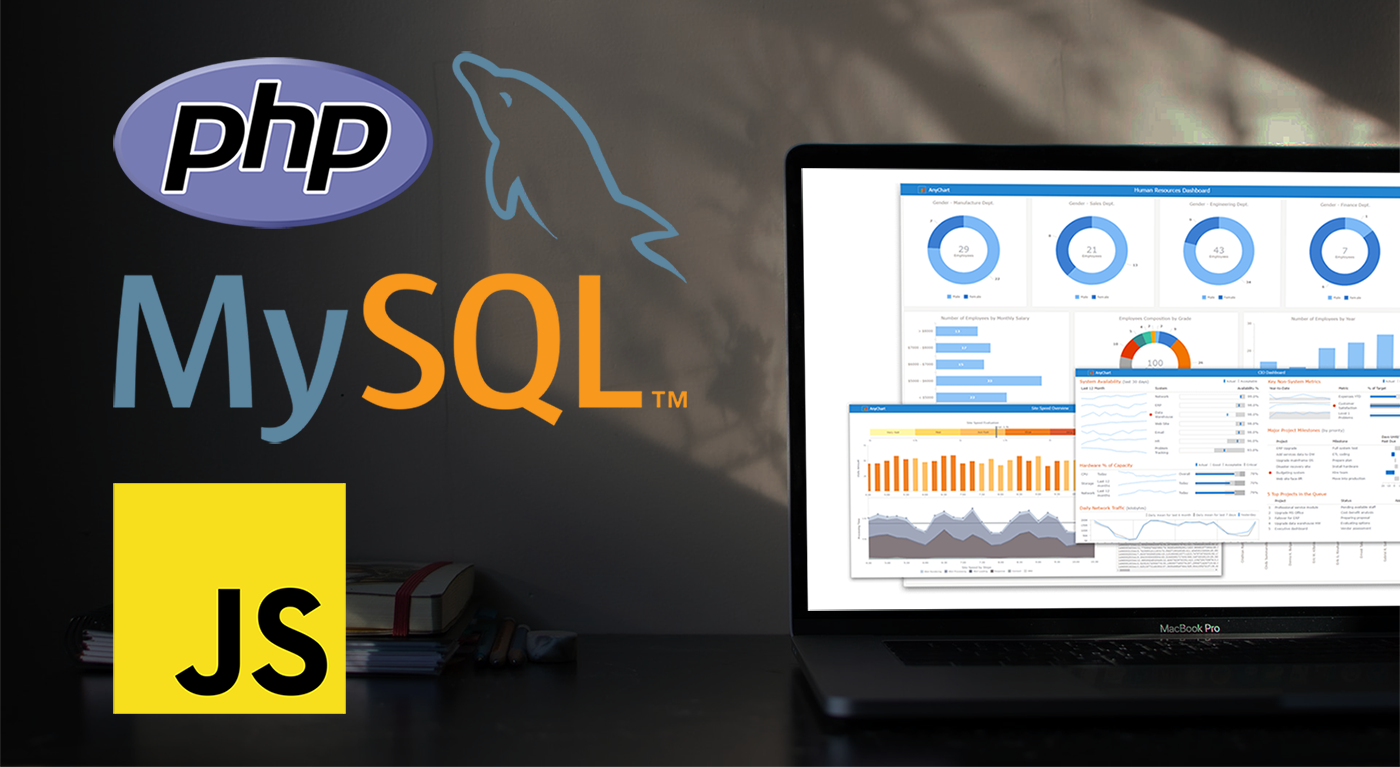 When using a charting library like AnyChart, which makes visualizing data so quick and easy, often the most challenging step for beginners is loading data. I think this is largely a result of the fact that while the ways we output the data are quite similar, the input data is commonly very different. The data may differ in many ways including the number of features in the dataset, what type these features may be, the format of the data, and how the data is stored. It is this final issue which we will be addressing today.
There is a lot of coverage in the documentation of using a data object declared within the code as well as importing your data from a file using AnyChart’s data loader. But what about importing the data from an SQL database? This is an easily done but often misunderstood approach to handling and loading data for data visualizations.
Unfortunately, it is not possible to use JavaScript to query a database because JavaScript is a client side solution and querying a database requires a server side approach due to security concerns — you just can’t store database login and password in your JavaScript code. There are many workarounds for this problem including approaches involving PHP, Ajax, Node.js, and many more. Today we will focus on using PHP to handle this task for us when our data is stored in MySQL.
In this tutorial, we will be covering how to query a MySQL database using PHP. We will describe the steps involved and reveal that it is in fact not challenging at all, just different!
- Categories: AnyChart charting component, AnyGantt, AnyMap, AnyStock, HTML5, JavaScript, JavaScript chart tutorials, Tips and tricks
- 2 Comments »
Qlik Sense Visualization Extensions AnyChart, AnyStock and AnyGantt Updated with New Features
July 16th, 2020 by AnyChart Team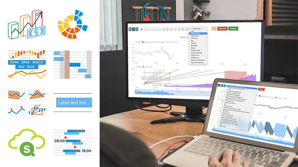 A number of new powerful capabilities are now available in our extensions for Qlik Sense! The new features are designed to help speed up data analysis in the native Qlik environment, making it even more intuitive and workflows streamlined.
Read more at qlik.anychart.com »
- Categories: AnyChart charting component, AnyGantt, AnyStock, Big Data, Business Intelligence, Financial charts, Gantt Chart, News, Qlik, Stock charts
- No Comments »
JavaScript Charting Library 8.8.0 Released with New Exciting Data Viz Features
May 22nd, 2020 by AnyChart Team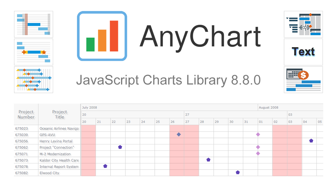 We’ve just updated our JavaScript charting library with new exciting features and improvements! In the 8.8.0 release of AnyChart JS, the focus is put on enhancements for Gantt charts. They will be helpful in making your project and resource data visualizations even more insightful with ease. We’ve also upgraded basic and time-series charts as well as maps. Below is an overview of the new key arrivals. Be sure to check it out, download the updated builds, and enjoy!
»»» See What’s New in AnyChart 8.8.0! «««
- Categories: AnyChart charting component, AnyGantt, AnyMap, AnyStock, Big Data, Business Intelligence, Dashboards, Financial charts, Gantt Chart, HTML5, JavaScript, News, Stock charts
- 1 Comment »
COVID Tracker StopCorona.info Adds AnyChart JS Charts to Visualize Coronavirus Statistics
May 18th, 2020 by AnyChart Team![]() COVID tracker StopCorona.info is using our JavaScript data visualization library to display up-to-date coronavirus statistics in compelling and insightful charts. (Read our interview with its creator to learn how.)
COVID tracker StopCorona.info is using our JavaScript data visualization library to display up-to-date coronavirus statistics in compelling and insightful charts. (Read our interview with its creator to learn how.)
COVID-19 is a global emergency and the fight against it requires a joint effort. We at AnyChart cannot stay aside, too. With a lot of pandemic data out there, from numerous sources and with constant updates, it’s difficult to keep up with how the situation unfolds, let alone making sense of all relevant information in due course. But this is exactly where we can help, with our established charting solutions that can visualize any data on the fly.
We thought you should know we’re ready to give a full-featured non-profit license to all initiatives aiming to tackle the novel coronavirus outbreak. Moreover, we’ve already allowed one project – StopCorona.info – to use our JavaScript charting library for free.
Developed as a not-for-profit initiative by Diffco, a top Silicon Valley app development company, StopCorona is designed to bring transparency to the pandemic situation worldwide. To achieve that, it collects COVID-19 statistics from more than 20 reliable public open data sources, including WHO, CDC, ECDC, CCDC, and NHC to name a few. Now this enormous (and ever-expanding) set of coronavirus data is graphically represented in an analyst-friendly interface powered by AnyChart JS Charts.
As a global leader of data visualization and reporting tools, we at AnyChart were more than happy to support StopCorona by letting them use our award-winning JS charting library absolutely free, under a full-featured non-profit license.
If you guys are building a useful resource for COVID-19 data analytics, try AnyChart and apply for a free license, too. We will gladly provide you with complimentary access to our flexible data visualization solutions. In this way you will get the industry’s best charts for the web or mobile fully at your service, empowering your website visitors or app users to make sense of the myriad COVID numbers at a glance, with great ease.
- Categories: AnyChart charting component, AnyStock, Big Data, Business Intelligence, Dashboards, HTML5, JavaScript, Success stories
- 5 Comments »
Making JS Candlestick Chart in Four Simple Steps
March 25th, 2020 by Anastasia Zoumpliou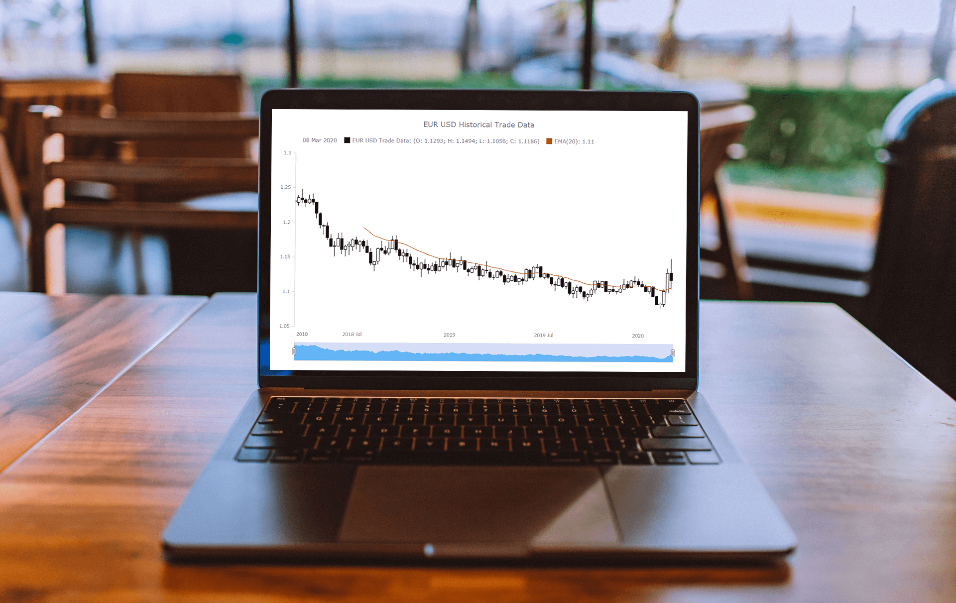 Do you have trading data, looking for a way to effectively visualize it for your website or app project? If so, a JS candlestick chart could be your best pick. This tutorial will break down the process needed to create such a chart into simple steps and provide a detailed explanation of the code. Keep reading even if you are new to programming, because only a basic understanding is needed to follow along and master such a JavaScript (HTML5) based data visualization technique.
Also called a Japanese candlestick chart, this chart type is one of the most popular forms of financial and stock data visualization. Each candlestick represents information about the open, high, low, and close price of the day. Candlestick charts are widely used in technical analysis of price movement patterns.
Complete this tutorial and you will be able to create a compelling interactive candlestick chart in JavaScript real quick, with ease.
Read the JS charting tutorial »
- Categories: AnyChart charting component, AnyStock, Big Data, Financial charts, HTML5, JavaScript, JavaScript chart tutorials, Stock charts, Tips and tricks
- No Comments »