Stunning New Charts & Maps from Around Internet — DataViz Weekly
October 4th, 2024 by AnyChart Team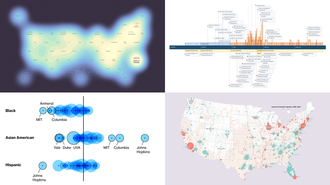 Charts and maps have a unique power to let data talk, transforming raw numbers into meaningful insights that anyone can grasp. In this edition of DataViz Weekly, we’re featuring some of the most stunning new examples of how data visualization brings information to life.
- Hazard-prone locations in the United States attracting migration — NYT
- Shifts in college admissions after the affirmative action ruling — Bloomberg
- Google search trends around U.S. elections — Google Trends and Truth & Beauty
- Interactive timeline of Roman history — AnyChart
- Categories: Data Visualization Weekly
- No Comments »
Paris 2024 Olympic Medal Count Trackers — DataViz Weekly
August 9th, 2024 by AnyChart Team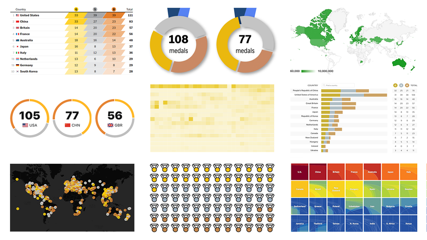 The Paris Summer Olympics are in full swing. If you’re interested in tracking the results and want to know which countries are excelling, numerous media outlets have prepared a variety of medal count trackers. In this special edition of DataViz Weekly, we showcase a selection of these projects, with a special focus on those that not only display numbers but also present them through compelling visualizations. Let’s dive in!
- Categories: Data Visualization Weekly
- No Comments »
2024 UK Election Maps — DataViz Weekly
July 8th, 2024 by AnyChart Team Last Thursday’s 2024 United Kingdom general election resulted in a historic shift within the nation’s political landscape, marking the Conservatives’ most severe defeat in nearly two centuries. As people look for clarity on these changes, election maps have come to the forefront as effective visual tools to make sense of voting outcomes and underlying patterns.
In this special edition of DataViz Weekly, we present a quick overview of UK election maps from prestigious sources including Sky News, The Independent, the BBC, The Financial Times, The Guardian, CNN, Open Innovations, and The New York Times, complete with links to them. Explore these data visualization projects to delve deeper into the dramatic shifts of the 2024 election, experience the power of effective electoral data mapping, and perhaps find inspiration for your own work.
? See also: 2024 U.S. Election Maps (November 2024).
- Categories: Data Visualization Weekly
- No Comments »
Stunning New Data Visualizations Not to Miss — DataViz Weekly
May 17th, 2024 by AnyChart Team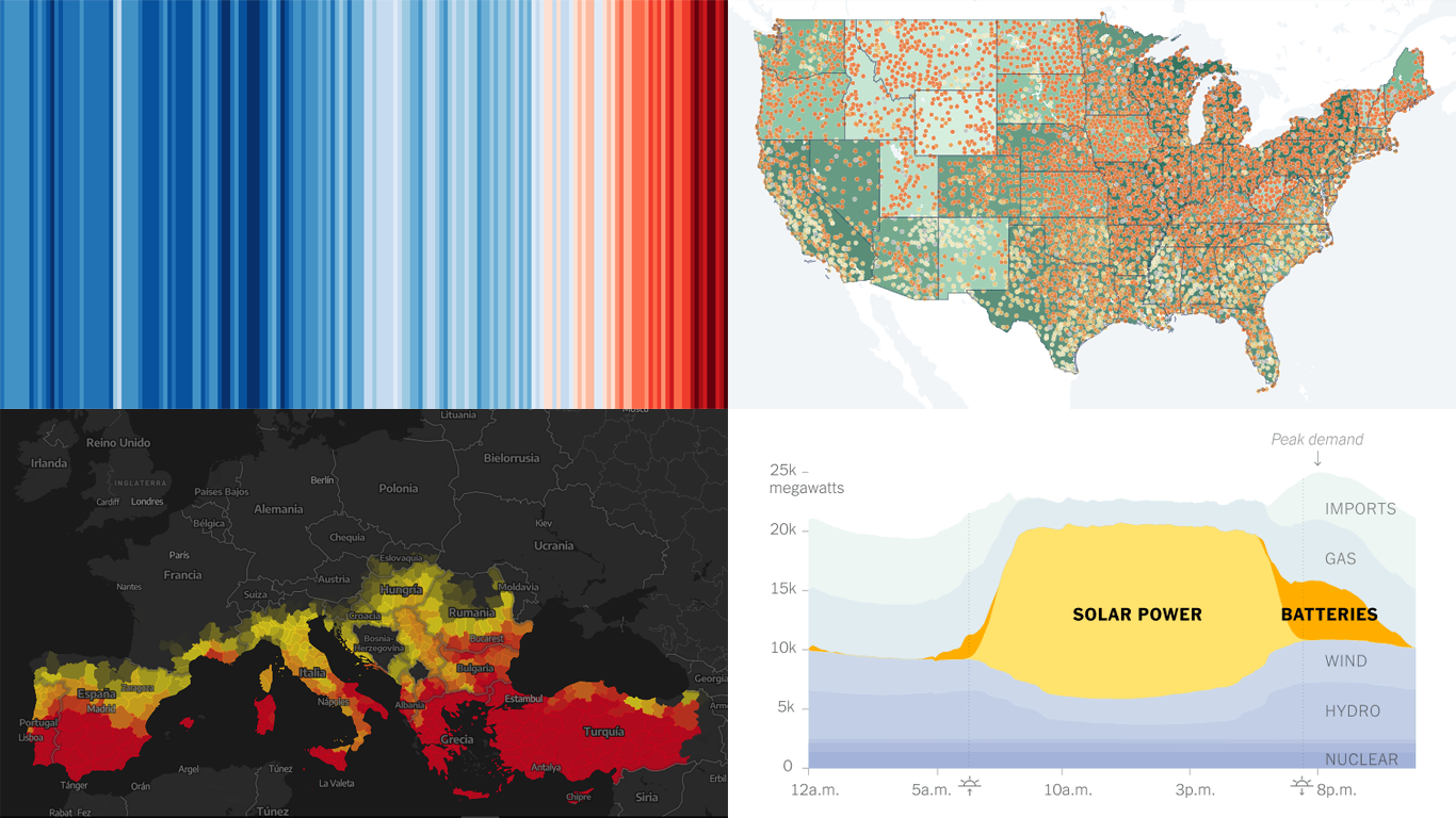 Data visualization is not just about making data look pretty; it’s about uncovering hidden patterns, revealing trends, and providing a clearer understanding of information. Through innovative visual techniques, we can explore data in ways that traditional methods can’t match. This week on DataViz Weekly, we bring you four compelling projects that showcase the transformative power of data visualization:
- Revealing the warming stripe for 2023 — Ed Hawkins
- Analyzing and predicting megafires in Europe — elDiario.es
- Understanding the growing role of giant batteries in electricity grids — NYT
- Analyzing segregation in U.S. schools — Stanford University
- Categories: Data Visualization Weekly
- No Comments »
New Data-Driven Stories Worth Exploring — DataViz Weekly
April 19th, 2024 by AnyChart Team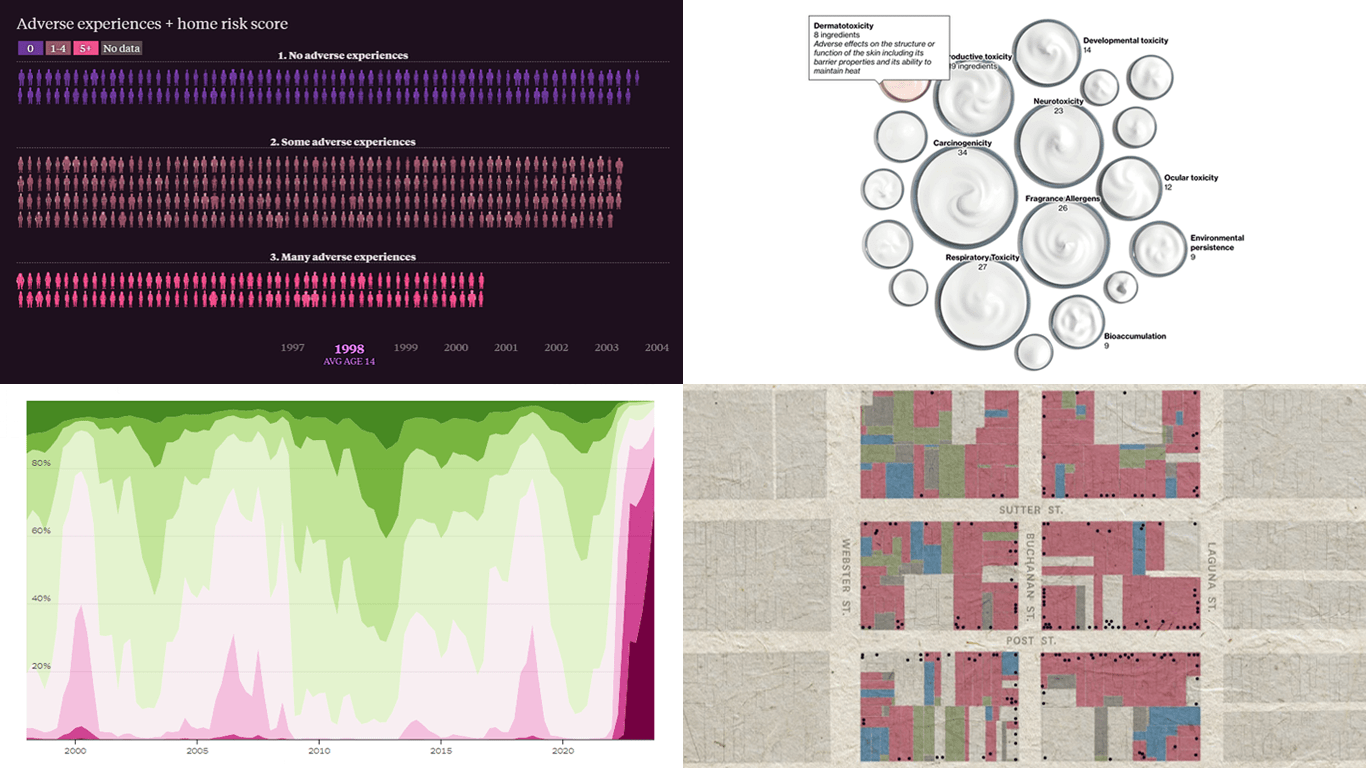 This week’s DataViz Weekly showcases a quartet of compelling data-driven stories, each powered by the adept use of data visualization techniques. These narratives not only inform but inspire, perhaps sparking creative concepts for your upcoming projects.
Here are the visual stories featured in this issue:
- Unraveling the hold of historical mortgage rates in the U.S. — The Upshot
- Retelling the transformation of San Francisco’s Japantown after Roosevelt’s Executive Order 9066 — The San Francisco Chronicle
- Revealing hidden risks in common fragrances — Bloomberg
- Exploring the persistent shadows of teen adversity — The Pudding
- Categories: Data Visualization Weekly
- No Comments »
Ukraine-Russia in Data Visualizations — DataViz Weekly
February 24th, 2023 by DataViz Weekly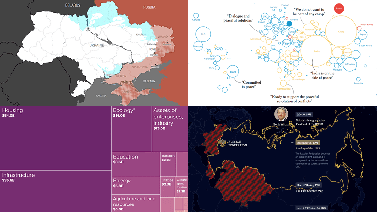 One year ago today, on February 24, 2022, Russia launched a massive attack on Ukraine. To mark this anniversary, DataViz Weekly has put together a collection of remarkable data visualizations that may offer insights into the conflict. These include Grid’s interactive that maps out how events unfolded over the last 365 days, Politico’s series of graphics that highlight some of the key numbers, The New York Times’s charts that illustrate the world’s stance, and Russia Beyond’s timeline of Russia’s territorial evolution since the 9th century.
- Categories: Data Visualization Weekly
- No Comments »
Most Notable New Data Visualizations — DataViz Weekly
February 10th, 2023 by AnyChart Team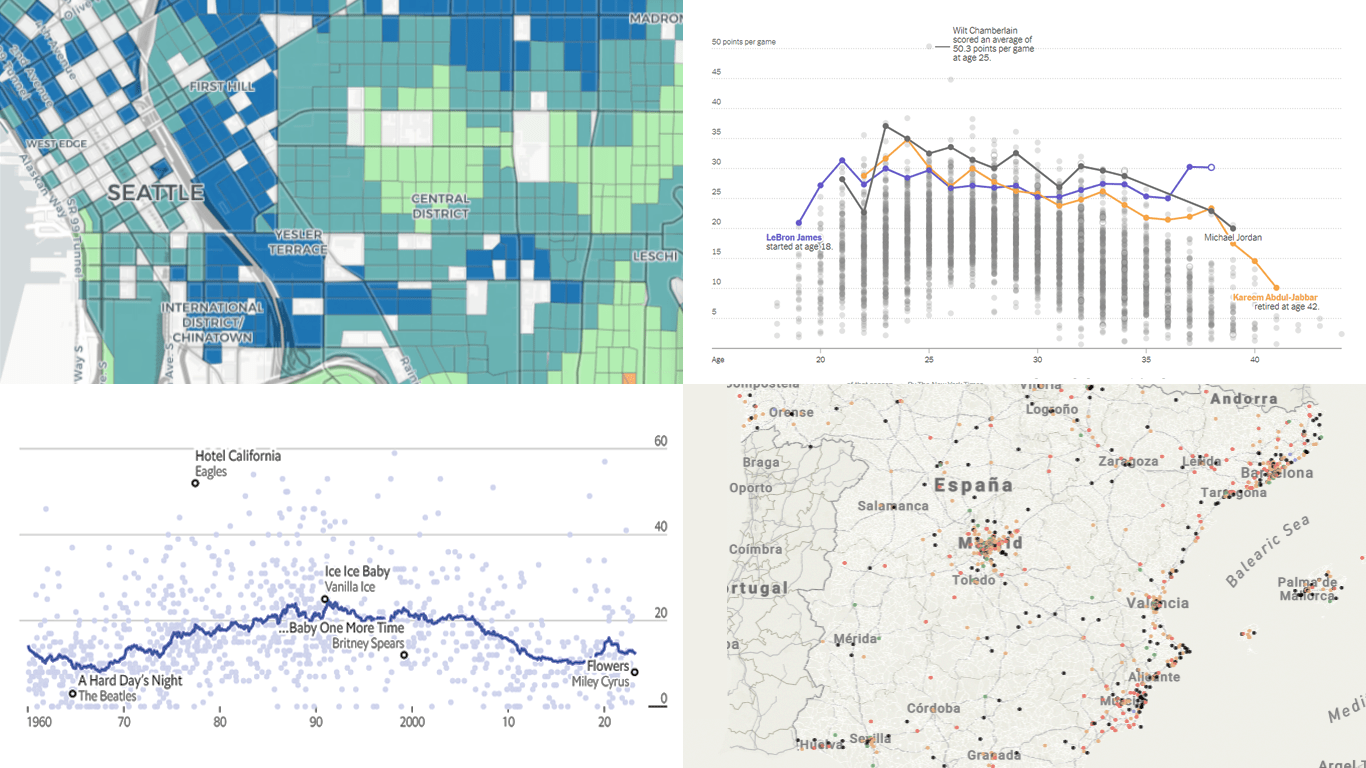 If you like cool data visualizations, DataViz Weekly is for you! In our new roundup, check out some of the most notable graphics we have seen around the web over the last seven days.
- Seattle as a 15-minute city — Nat Henry
- LeBron James vs the NBA’s other top scorers — The New York Times
- Subnational immigration patterns across Spain — El Confidencial
- Intro length in the top songs in 1960–2023 — The Economist
- Categories: Data Visualization Weekly
- No Comments »
Amazing New Data Graphics That Really Caught Our Attention — DataViz Weekly
December 23rd, 2022 by AnyChart Team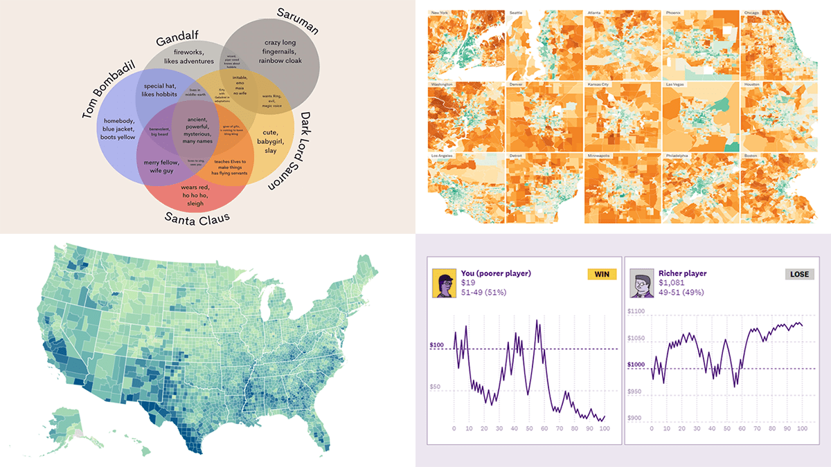 While the Christmas spirit is already in the air, join us for a quick look at some amazing new data graphics that really caught our attention these days. And you’ll even know what Santa Claus has in common with Gandolf, Dark Lord Sauron, and Tom Bombadil. So, here’re the data visualizations featured in this DataViz Weekly:
- Inevitability of the super rich — The Pudding
- Adult illiteracy across the United States — ProPublica
- Carbon emissions footprint per household across the United States — The New York Times
- Intersections between Santa Claus and Tolkien’s characters — Tea with Tolkien
- Categories: Data Visualization Weekly
- No Comments »
Newest Collection of Effective Data Visualization Examples — DataViz Weekly
December 16th, 2022 by AnyChart Team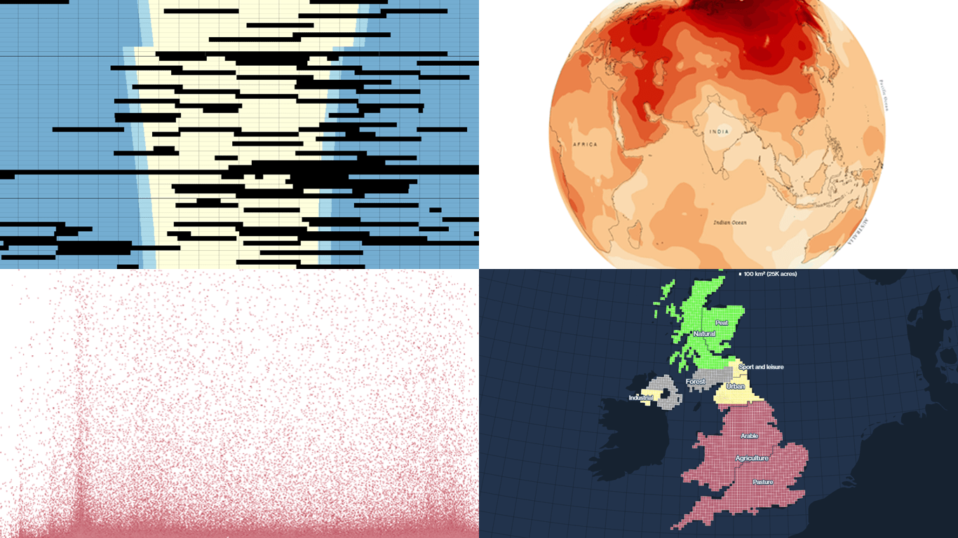 It’s easier to analyze data when it is visualized in the form of a chart or a map. On DataViz Weekly, we share with you some vivid examples we have recently seen out there. Here’s our newest collection!
- Blackouts in Kyiv — Volodymyr Agafonkin
- Earth’s slowest-warming parts — The Washington Post
- Twitter Blue subscribers — The New York Times
- Land use in the United Kingdom — Bloomberg
- Categories: Data Visualization Weekly
- No Comments »
Best Data Visualizations We’ve Come Across Most Recently — DataViz Weekly
October 28th, 2022 by AnyChart Team Interesting charts and maps come out all the time. DataViz Weekly is here to show you the best data visualizations we have seen most recently! Look at our newest picks!
- Feelings at work by occupation — FlowingData
- Impact of climate on conflicts — Auswärtiges Amt (German Foreign Office)
- U.S. President Biden’s legislative agenda — The Upshot
- Australians’ birth countries, languages, and religions — SBS News
- Categories: Data Visualization Weekly
- No Comments »