 Interesting charts and maps come out all the time. DataViz Weekly is here to show you the best data visualizations we have seen most recently! Look at our newest picks!
- Feelings at work by occupation — FlowingData
- Impact of climate on conflicts — Auswärtiges Amt (German Foreign Office)
- U.S. President Biden’s legislative agenda — The Upshot
- Australians’ birth countries, languages, and religions — SBS News
Data Visualization Weekly: October 21, 2022 — October 28, 2022
Feelings at Work by Occupation
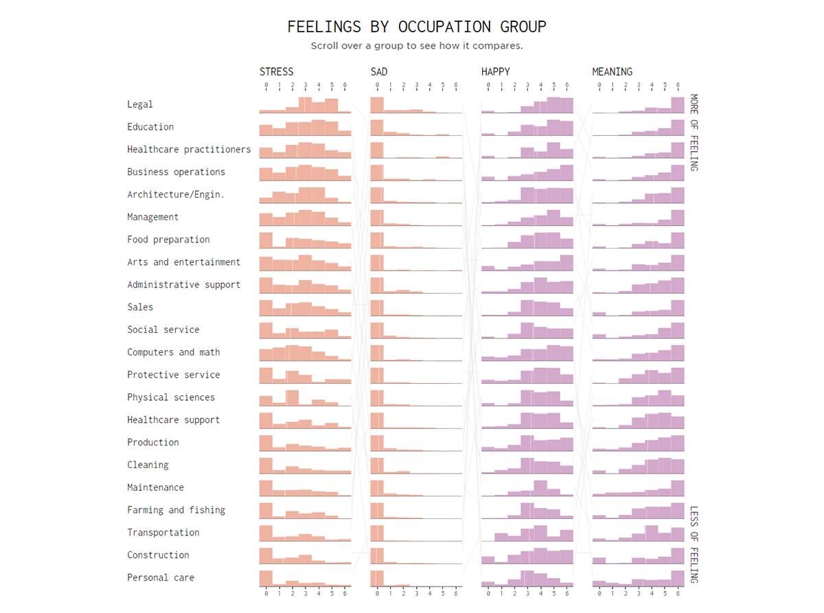
A large part of our time is devoted to working. So our jobs had better make us happy and cause little to no stress. But is it always so in reality?
Nathan Yau looked at the scores for happiness and some other feelings at work as revealed by the American Time Use Survey. As not all occupations are equal, he represented a breakdown by job group. In this interactive chart, you can hover over an occupation to see its stress, sadness, happiness, and meaningfulness scores, as well as to find out how it fares against the others in terms of average scores for one or another feeling.
Explore the feelings at work by job charted on FlowingData.
Impact of Climate on Conflicts
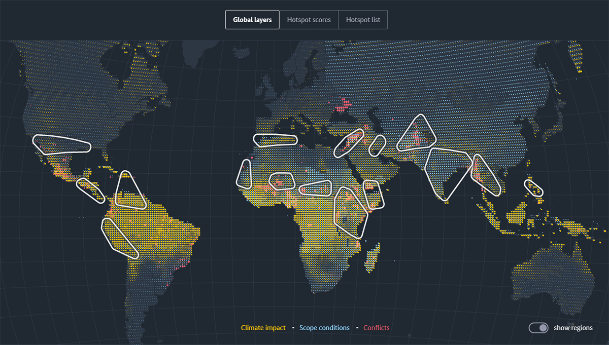
Researchers see a link between climate and conflicts. Last year, for example, we put a spotlight on Crisis Group’s “How Climate Change Fuels Deadly Conflict” with an impressive visual explanation. Last week, another interesting project on the subject was released by the German Foreign Office (Auswärtiges Amt).
Featuring stunning visualizations created by Moritz Stefaner and Flavio Gortana, “Climate & Conflict” analyzes the relationship between climate change and violent conflicts. The project also looks at the role of the socio-economic scope conditions. The initial section provides a global overview and highlights hotspot regions. It is followed by the Nigeria case study.
Check it out at climate-conflict.org.
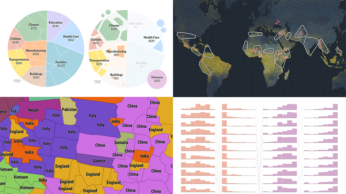
U.S. President Biden’s Legislative Agenda
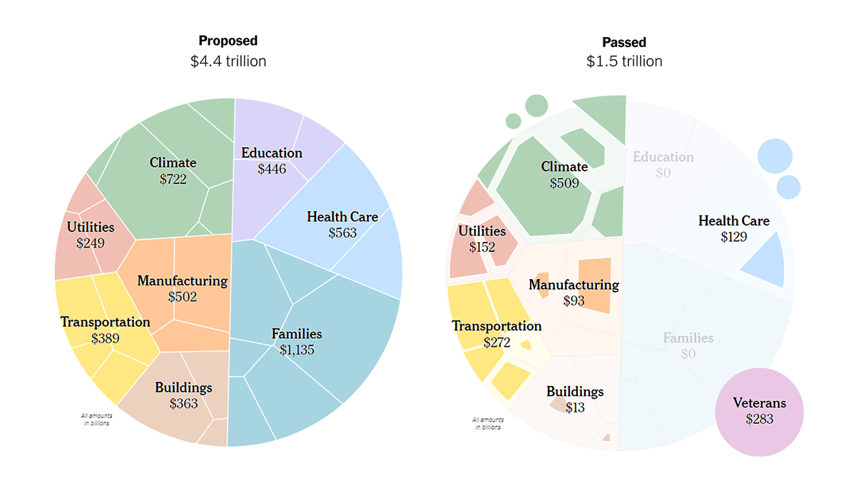
During his first two years in office, U.S. President Joe Biden has had a number of legislative victories. However, the White House could not win absolutely everything.
The New York Times’s The Upshot analyzed what the Biden administration wanted and got in the end. For that purpose, Aatish Bhatia and Francesca Paris made a series of beautiful (and informative) diagrams that make it easy to compare the spending proposed under the White House’s plans with the estimated costs of several large bills passed by the U.S. Congress. A breakdown by spending category is shown at a glance.
See the charts and learn more on The Upshot.
Australians’ Birth Countries, Languages, Religions
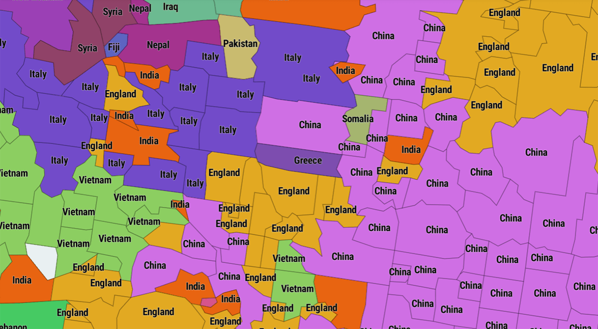
Australia is getting even more diverse. According to the results of the 2021 Census made public earlier this year, more than a quarter of Australians were born abroad, and in some areas, this share is significantly larger.
SBS News built a cool map that represents the top countries of birth by suburb, excluding Australia itself. When you click on one, a complete breakdown appears in the tooltip. The same piece also includes two similar and not less interesting maps displaying the top languages spoken at home, not including English, and the top religions.
Look at the maps in this article by Charis Chang and Ken Macleod on SBS News.
***
Don’t miss the best data visualizations around the web! Stay tuned for DataViz Weekly!
- Categories: Data Visualization Weekly
- No Comments »