 Data visualization is not just about making data look pretty; it’s about uncovering hidden patterns, revealing trends, and providing a clearer understanding of information. Through innovative visual techniques, we can explore data in ways that traditional methods can’t match. This week on DataViz Weekly, we bring you four compelling projects that showcase the transformative power of data visualization:
- Revealing the warming stripe for 2023 — Ed Hawkins
- Analyzing and predicting megafires in Europe — elDiario.es
- Understanding the growing role of giant batteries in electricity grids — NYT
- Analyzing segregation in U.S. schools — Stanford University
Data Visualization Weekly: May 10, 2024 — May 17, 2024
Revealing Warming Stripe for 2023
In 2023, the world experienced its hottest year on record, a significant milestone now captured in the iconic #ShowYourStripes project, which has been updated to reflect this new data.
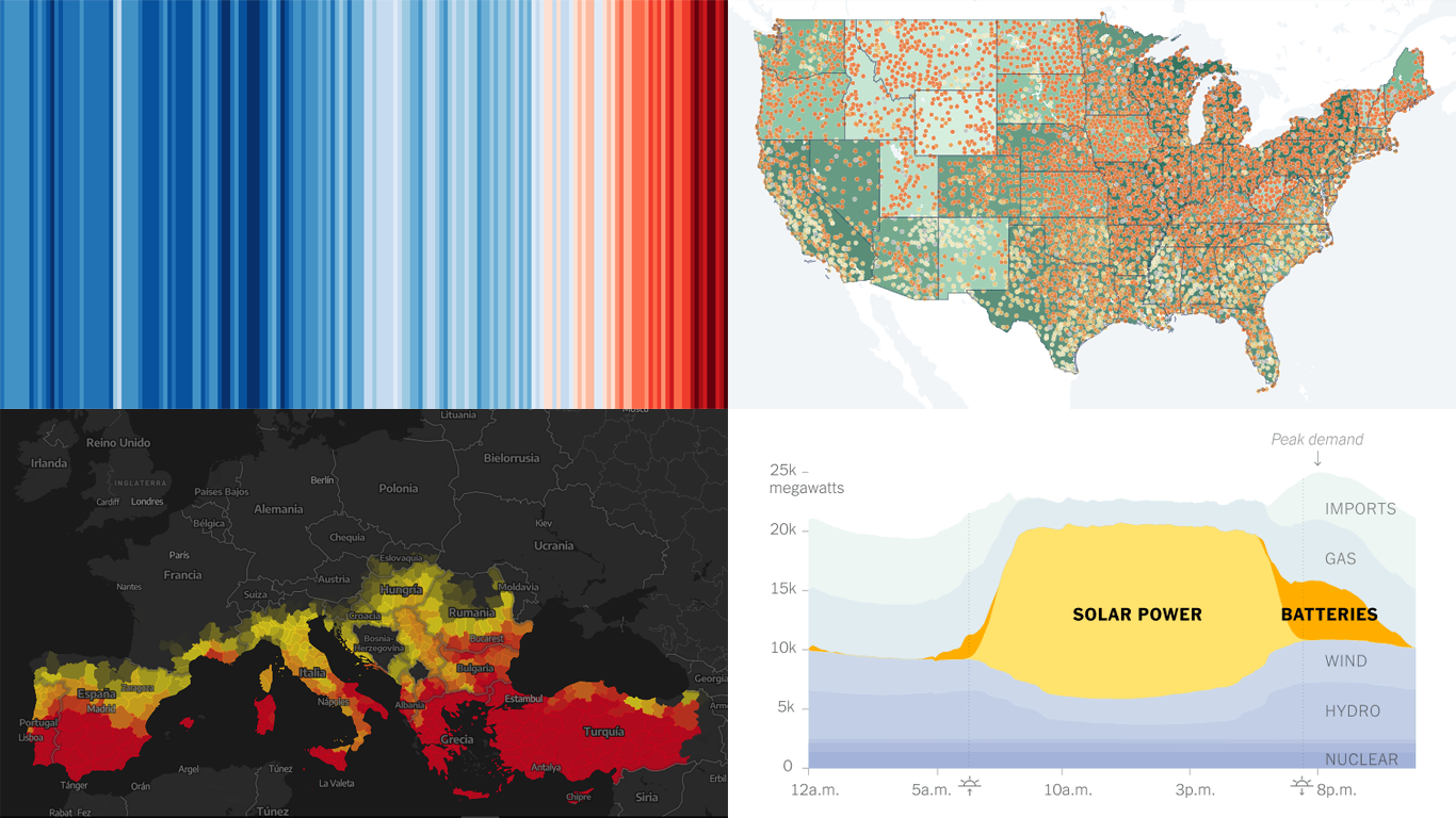
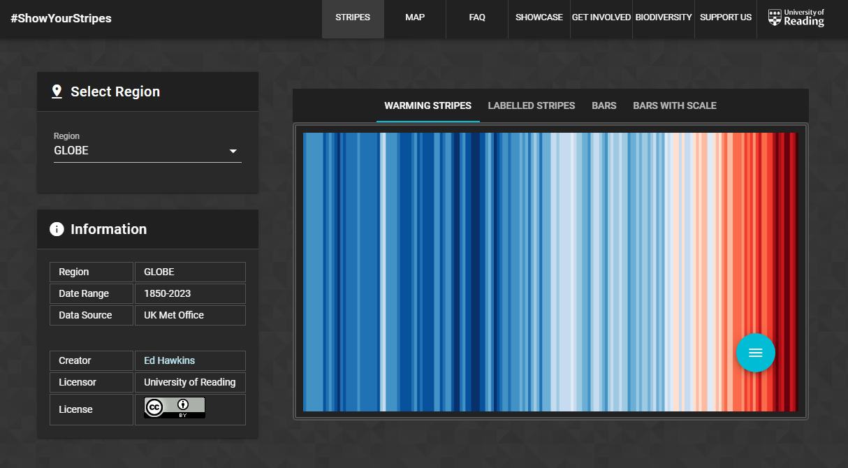
Created by climate scientist Ed Hawkins (National Centre for Atmospheric Science, University of Reading), #ShowYourStripes was launched in 2018 to visually communicate the realities of climate change. The project transforms historical climate data into a series of colored stripes, each representing the average global temperature for a specific year. Warmer years are shown in shades of red, while cooler years are depicted in blue. These stripes, arranged in chronological order, clearly illustrate the rising temperatures over the past 173 years.
The latest addition, a deep maroon stripe for 2023, highlights the extreme heat, with global temperatures averaging 1.18°C (2.12°F) above the 20th-century norm of 13.9°C (57.0°F). This update means that your local warming stripes will likely now end with a dark stripe representing last year’s intense heat.
Beyond adding the 2023 data, the #ShowYourStripes website now features an interactive map. This new tool allows users to select their nearest city to view localized warming stripes. By clicking on the graphic, users can access a complete set of temperature visualizations specific to their location.
Explore the updated #ShowYourStripes project and discover how your region has been affected by climate change.
Analyzing and Predicting Megafires in Europe
Climate change is widely blamed for the increase in large wildfires around the world. Over the past 20 years, satellites have detected over 4,200 large forest fires in Europe, with an upward trend in both frequency and intensity.
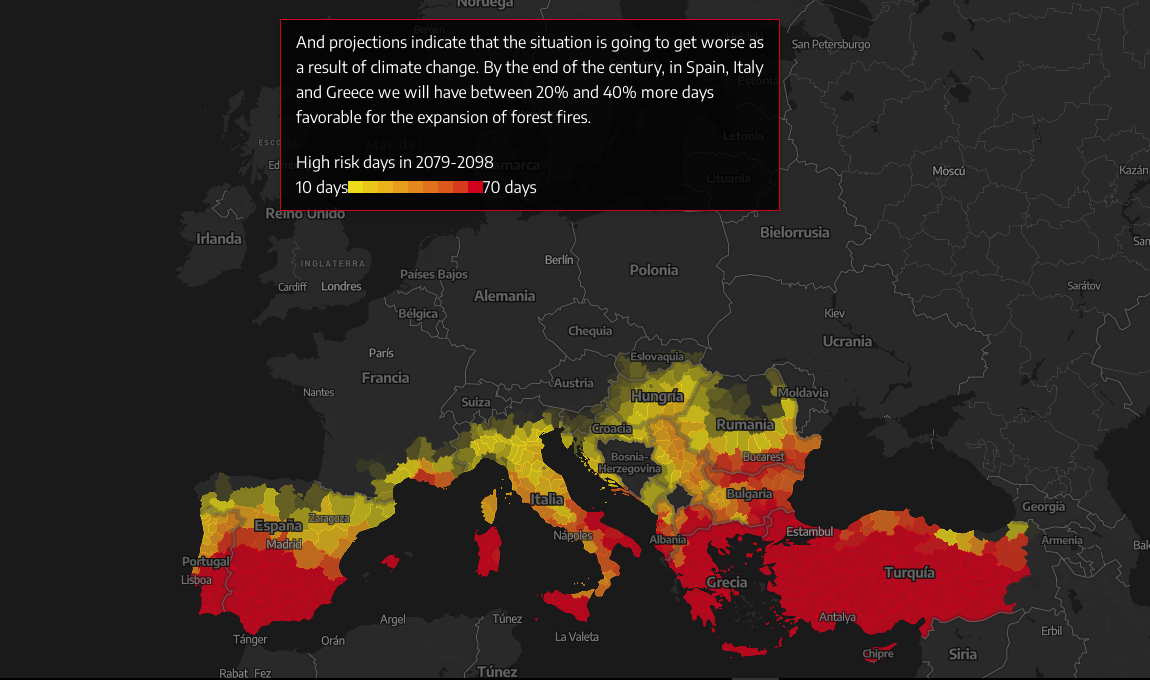
elDiario’s new visual story delves into whether Europe is prepared for these megafires, using the fire data published by the European Forest Fire Information System (EFFIS). The article features a comprehensive map that visualizes all the wildfires in Europe this century that have burned areas larger than 500 hectares. It reveals that southern Europe, particularly Portugal, Spain, and Greece, is the most affected by these fires. The data shows not only an increase in the number of large fires but also a rise in their size and destructiveness over the past decade, clearly represented in one of the accompanying charts.
The visualizations include mapping the number of days per year with high meteorological risk for fire spread under current climate conditions, as well as future projections. By the end of the century, Spain, Italy, and Greece could face 20-40% more days conducive to forest fires due to climate change.
Explore this compelling visual analysis by Mariangela Paone, Raúl Rejón, Sofía Pérez, and Raúl Sánchez on elDiario.
Understanding Growing Role of Giant Batteries in Power Grids
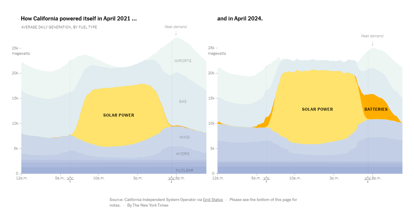
Giant batteries are revolutionizing the U.S. energy landscape by enabling the use of solar power after dark and stabilizing electricity grids across the nation. These batteries have become increasingly popular in recent years, particularly in California.
For The New York Times, Brad Plumer and Nadja Popovich illustrate this transformation with a pair of stacked area charts showing average daily electricity generation by fuel type. Comparing “How California powered itself in April 2021” with “April 2024,” the charts highlight the significant growth in battery storage that now absorbs excess solar energy during the day for use in the evening. This development is gradually replacing fossil fuels in California’s evening energy mix.
Battery storage capacity on the U.S. electricity grids has expanded tenfold over the past three years, reaching 16,000 megawatts. This year, it is projected to nearly double again, with the most substantial growth in Texas, California, and Arizona. The article also includes a map of battery storage plants across the United States, showing the widespread implementation of this technology.
Check out the full story on The New York Times.
Analyzing Segregation in U.S. Schools

Is racial segregation in U.S. schools on the rise? This question is explored through compelling new data presented in an engaging manner.
The Educational Opportunity Project at Stanford University has introduced the Segregation Explorer. This tool offers an interactive map that visualizes the levels of school segregation among racial/ethnic and economic groups across the U.S. since 1991. It provides insights into segregation at various levels, including states, counties, metro areas, commuting zones, school districts, and local educational agencies.
The Segregation Explorer’s estimates are derived from the Longitudinal Imputed School Dataset (LISD) 1.0. This dataset, created by the Segregation Explorer team, integrates and cleans data from the National Center for Education Statistics Common Core of Data (CCD), addressing missing and erroneous information.
Discover more about school segregation trends on the Segregation Explorer website.
Wrapping Up
This week’s Data Visualization Weekly showcased some of the most interesting data viz projects we’ve encountered recently. Each of them highlights the power of visualization in making data accessible, informative, and engaging.
We hope these examples spark your curiosity and encourage you to explore how data visualization can transform raw information into clear insights. Stay tuned for next week’s edition, where we’ll bring you more fascinating projects that bring data to life.
- Categories: Data Visualization Weekly
- No Comments »