Chart for Angular 4, Ionic, Java GWT Apps: Meet New AnyChart JS Charts Integration Samples!
September 20th, 2017 by AnyChart Team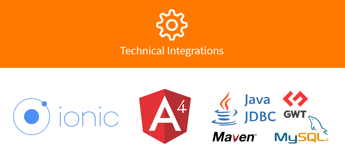 We at AnyChart continue to do our best to help you get interactive JavaScript charts in your HTML5 projects up and running very quickly no matter what technology stack you are into. In addition to the detailed and all-embracing chart documentation as well as the user and data friendly substance inherent in our data visualization solutions, we already created a number of dedicated plugins and integration samples. Using them will save you time and development effort to run AnyChart JS Charts on top of your technology stack.
Here’s another step in this direction. Now we are glad to deliver three new technical integration samples! These are designed for quickly and easily getting any chart for Angular 4, Ionic, and Java GWT apps with the help of advanced AnyChart’s JavaScript charting libraries.
- Categories: AnyChart Charting Component, JavaScript, News, Tips and Tricks
- No Comments »
Data Visualization with JavaScript: The Story of AnyChart JS Charts
September 7th, 2017 by AnyChart Team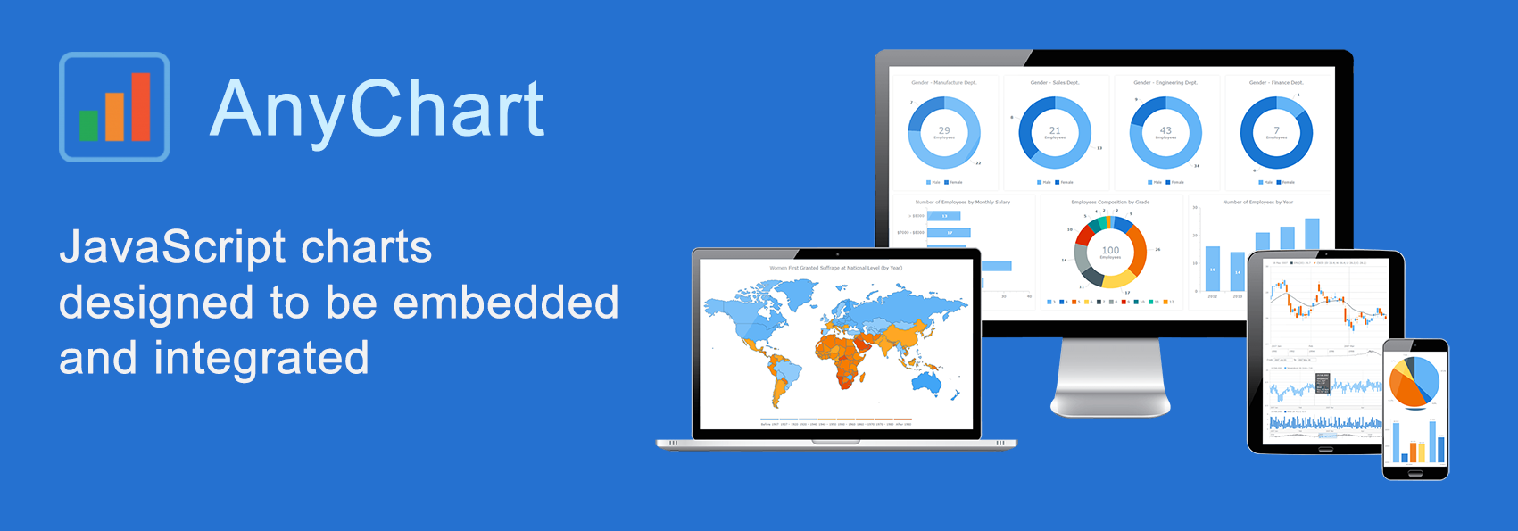 AnyChart is a flexible JavaScript (HTML5) based solution that allows you to create interactive and great looking charts. It is a cross-browser and cross-platform charting solution intended for everybody who deals with creation of dashboard, reporting, analytics, statistical, financial or any other data visualization solutions. AnyChart works everywhere -PCs, Macs, iPhones, iPads, Android devices and helps businesses transform operational data into actionable information.
Kevin William David interviewed Anton Baranchuk, CEO at AnyChart to know more.
- Categories: AnyChart Charting Component, AnyGantt, AnyMap, AnyStock, Business Intelligence, Flash Platform, GraphicsJS, HTML5, JavaScript, Oracle Apex, Qlik, Success Stories
- No Comments »
AnyChart JavaScript Charting Libraries 7.14.0 Released: Can’t Stop Perfecting Data Visualization!
May 30th, 2017 by AnyChart Team![]() Here are the spring May flowers we promised. After the hard work put in over the past months, we’re happy to announce that the 7.14.0 release of our JavaScript charting libraries AnyChart, AnyStock, AnyMap, and AnyGantt is out and ready to download! It brings you new cool features and important improvements that will make your data visualization life even better.
Here are the spring May flowers we promised. After the hard work put in over the past months, we’re happy to announce that the 7.14.0 release of our JavaScript charting libraries AnyChart, AnyStock, AnyMap, and AnyGantt is out and ready to download! It brings you new cool features and important improvements that will make your data visualization life even better.
Now, we invite you to discover all the new JavaScript/HTML5 charting capabilities that the 7.14.0 version of AnyChart’s data visualization software product family has to offer to you. Here’s a quick overview…
- Categories: AnyChart Charting Component, AnyGantt, AnyMap, AnyStock, Business Intelligence, Dashboards, Financial Charts, Gantt Chart, HTML5, JavaScript, News, Stock Charts
- 7 Comments »
Choose Right Chart Type for Data Visualization. Part 4: Data Distribution
May 4th, 2017 by AnyChart Team Displaying and researching some Data Distribution and relationship between data sets instead of studying precise values in each category is a quite common task in data analysis. It can be solved with the help of the chart types that we are going to identify and explain in this article.
Depending on a situation – the kind of data you have and the specific questions you’d like it to provide answers to – you can pick one approach or another. Just be careful when choosing between one chart type and another for the subsequent data distribution analysis. You want the visualization to clarify data, not obscure it or deliver any sort of confusion. Well, simply make sure you understand the following aspects, mind all the details of your situation, and you will have no problem with visualizing data distribution correctly.
- Categories: Choosing Chart Type, Tips and Tricks
- 1 Comment »
Choose Right Chart Type for Data Visualization. Part 3: Data Over Time (Trend Context)
April 26th, 2017 by AnyChart Team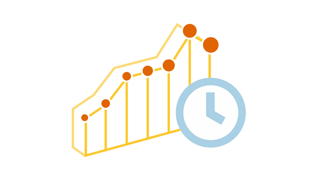 We are continuing the effort to better familiarize you with the world of chart types. This time let’s talk about good ways to visualize and explore Data Over Time.
Watching the change in data over time helps identify trends and dynamics in diverse timeline-based sets of values. Needless to say, choosing a right chart type is very important here. When applying an inappropriate form of visualization to your data, you might end up with an inaccurate idea of what happened in the past, what’s taking place now, and/or what will occur in the future. But we’ll do our best to help you avoid any mistakes in this field so you always make only right decisions based on your date/time data.
So, let’s get to the gist now.
- Categories: Choosing Chart Type, Tips and Tricks
- No Comments »
Choose Right Chart Type for Data Visualization. Part 2: Data Composition, Parts to Whole
April 20th, 2017 by AnyChart Team Illustrating part-to-whole relationships for further analysis is a very popular objective in data visualization. Basically, it is one of the most widespread ones, e.g. along with data comparison. With that in mind, the second part of the Choose Right Chart Type for Data Visualization series on our blog focuses on how to display Data Composition properly.
In particular, this article will show you the best ways to present the share percentages of simple values, compositional patterns in large data sets and hierarchical data (also with subordination), and stages in a process.
- Categories: Choosing Chart Type, Tips and Tricks
- 1 Comment »
JavaScript Charts Library Update 7.13.1 Released for AnyChart, AnyStock, AnyMap, AnyGantt
April 18th, 2017 by AnyChart Team “Sweet April showers do spring May flowers,” once wrote 16th-century English poet Thomas Tusser. Well, our customers already know that AnyChart’s April brings flowers, too! Last year we launched the great 7.10.0 version of the AnyChart JavaScript charts library and, basically, of our whole data visualization product family. Now, in the year of 2017, April brings you another great update.
So, please all greet the 7.13.1 release of AnyChart, AnyMap, AnyStock, and AnyGantt – our cute first spring flowers grown especially for you!
- Categories: AnyChart Charting Component, AnyGantt, AnyMap, AnyStock, HTML5, JavaScript, News, Qlik
- 2 Comments »
Interactive Data Visualization Examples (Mid-April): New Peculiar Charts and Maps in DataViz Weekly
April 14th, 2017 by AnyChart Team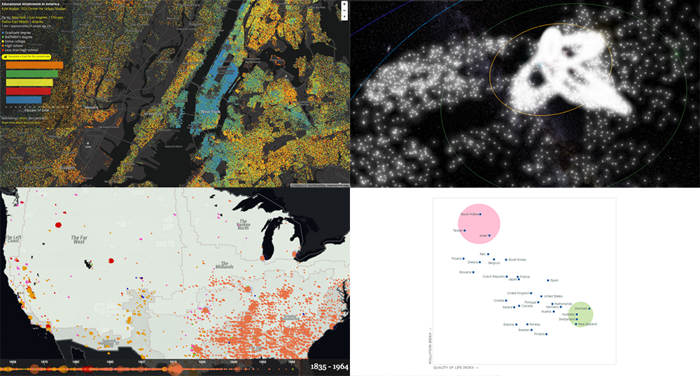 Tired after another workweek? Then now is a great time to lean back and relax and take a quick look at yet another set of interactive data visualization examples! We have shared these visualizations on social networks just recently. They got pretty much attention of our followers (and beyond). So their way to Data Visualization Weekly on the AnyChart blog was quite quick and simple.
Today we are presenting you with interactive visualizations of meteor streams, lynchings in America, JS quadrant chart of top 30 countries by quality of life plotted also according to their pollution indexes, and educational attainment in the United States.
- Categories: Data Visualization Weekly
- No Comments »
Choose Right Chart Type for Data Visualization. Part 1: Data Comparison
April 12th, 2017 by AnyChart Team When it comes to creating data analytics and reporting solutions, choosing the right chart type for a certain data visualization task remains a common challenge. What do you pick for data comparison, studying distribution, observing data over time, or some other purpose? It can be very tricky! To help you overcome this challenge to the best effect, today we are launching a series of articles titled Choose Right Chart Type for Data Visualization. The series is designed to quickly explain what chart types you should pick for different purposes of data analysis. With that said, each article here will be devoted to a specific, yet still big question that you want your data to answer.
The current (first) guide of the series is all about chart types that work best for finding out the differences in data: Data Comparison. In fact, it is one of the most frequently established purposes of data analytics. And sometimes many people use wrong chart types to fulfil it correctly. Now, finally, let’s get to the very point and see what visualization forms work best for comparing data.
- Categories: Choosing Chart Type, Tips and Tricks
- 4 Comments »
How to Integrate AnyChart JavaScript Charts in SAP Web UI
March 30th, 2017 by Sandor van der Neut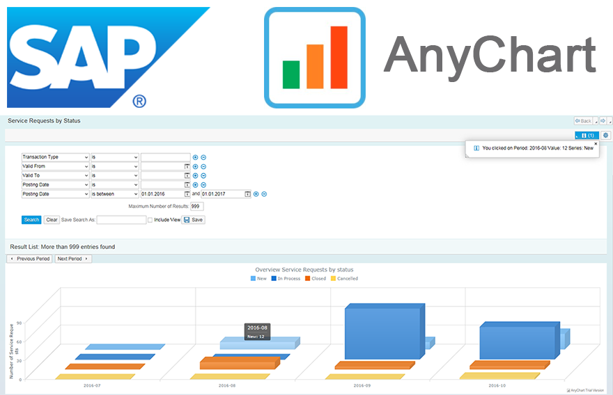 We as ‘mere’ humans are not very good at processing raw statistical data visually when it’s delivered to us in an unrefined form. We are, however, very good in detecting complex patterns when data is presented to us in a graph or a chart. It is therefore no wonder that as a developer you often get the requirement to represent data in a more comprehensible form. When you want to visualize data in the SAP Web UI in a more graphical way the standard possibilities available to you are rather limited. Luckily there are ways to overcome these limitations. When you combine SAP with the graphical power of AnyChart JS Charts a whole range of new possibilities will become available to you.
In this blog I will describe how you can integrate AnyChart in the SAP Web UI with relative ease, how you can feed AnyChart objects with SAP data using both a ‘pull’ and a ‘push’ mechanism and how you can respond in the SAP backend to the events triggered from user interaction with an AnyChart object.
- Categories: AnyChart Charting Component, AnyGantt, AnyMap, AnyStock, Business Intelligence, Dashboards, HTML5, JavaScript, Tips and Tricks
- No Comments »