 Tired after another workweek? Then now is a great time to lean back and relax and take a quick look at yet another set of interactive data visualization examples! We have shared these visualizations on social networks just recently. They got pretty much attention of our followers (and beyond). So their way to Data Visualization Weekly on the AnyChart blog was quite quick and simple.
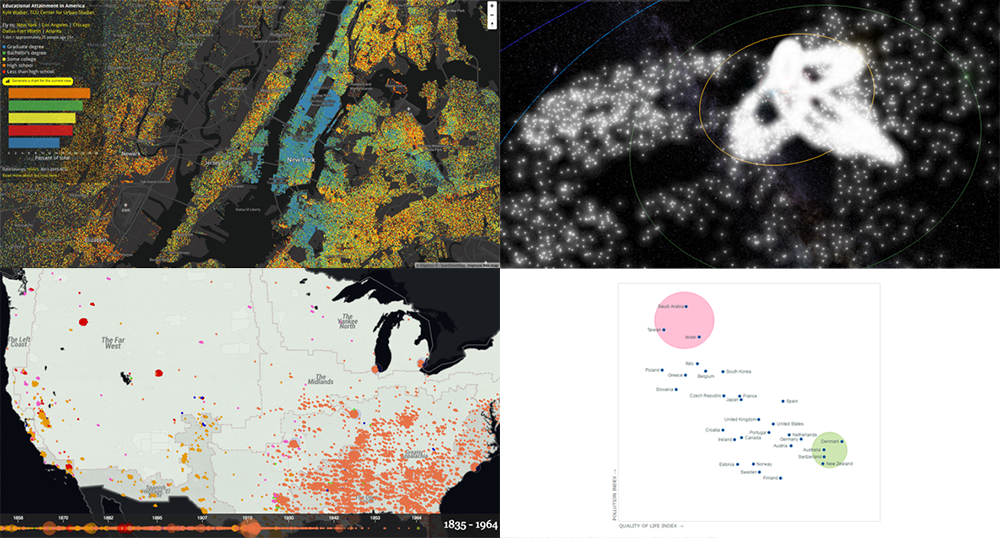
Today we are presenting you with interactive visualizations of meteor streams, lynchings in America, JS quadrant chart of top 30 countries by quality of life plotted also according to their pollution indexes, and educational attainment in the United States.
Interactive Data Visualization Examples: April 7, 2017 – April 14, 2017
Interactive Graphic of Meteor Showers from Space
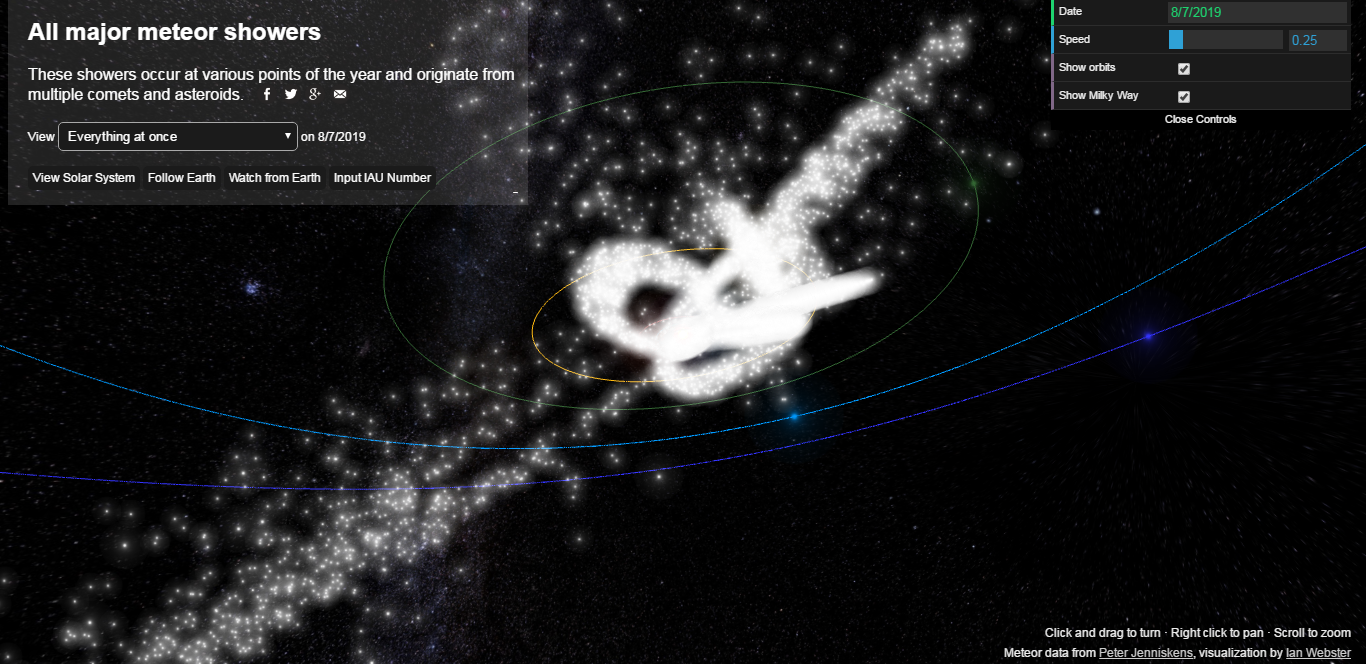
Ever wondered about meteor showers and where they come from? Check out the interactive visualization that depicts major meteor streams cruising within and through our solar system. Here you’ll find the paths of Lyrids, Eta Aquariids, Southern Delta Aquariids, Alpha Capricornids, Perseids, Southern Taurids, Orionids, Northern Taurids, Leonids, Geminids, Ursids, and Quadrantids. It is also possible to see all these meteor streams at once and change the view to focus on the Solar System, follow Earth, or even watch from Earth. The graphic is based on data from Cameras for Allsky Meteor Surveillance (CAMS) project by NASA/SETI Institute.
U.S. Educational Attainment Data Mapped
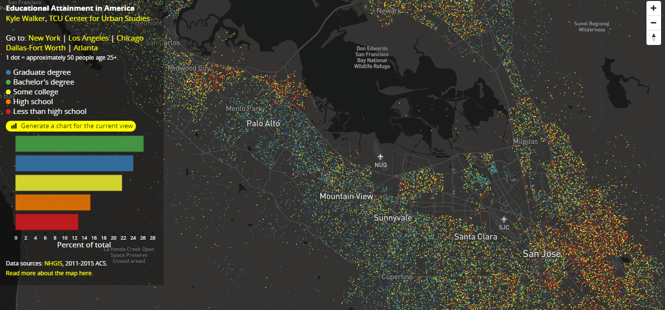
How educated are people in the United States? Educational Attainment in America, an interactive dot map based on The National Historical Geographic Information System (NHGIS) data, can help you reveal that. It displays the U.S. population, and each dot stands for about 25 people of the age of 25+. It is possible to use shortcuts here to see the level of educational attainment in the areas of New York, Los Angeles, Chicago, Dallas-Fort Worth, and Atlanta. Or, of course, you can explore this visualization manually, step by step, and view any other territory. It is also possible to generate a bar chart for any current view on the fly.
JS Quadrant Chart of Top 30 Countries by Quality of Life + Their Pollution Index
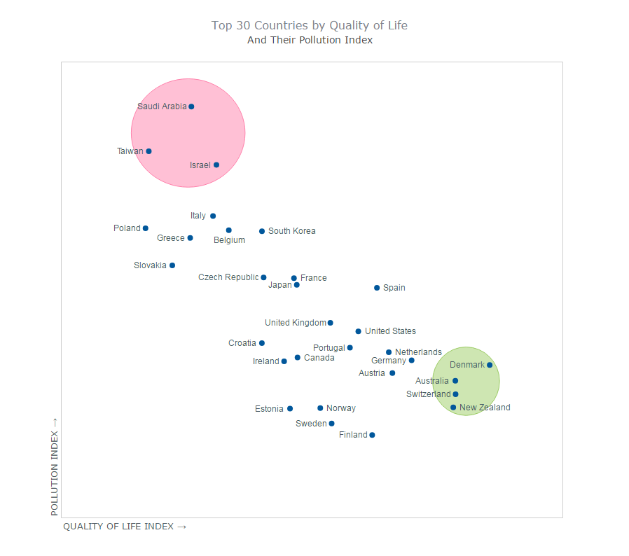
The next one of the interactive data visualization examples that we decided to share in this Data Visualization Weekly issue is a peculiar JavaScript quadrant chart that displays top 30 countries by quality of life, additionally characterized according to their pollution indexes. Data is taken from Numbeo and visualized with the help of the AnyChart JavaScript charting library.
Interactive Map of White Supremacy: Lynchings in America
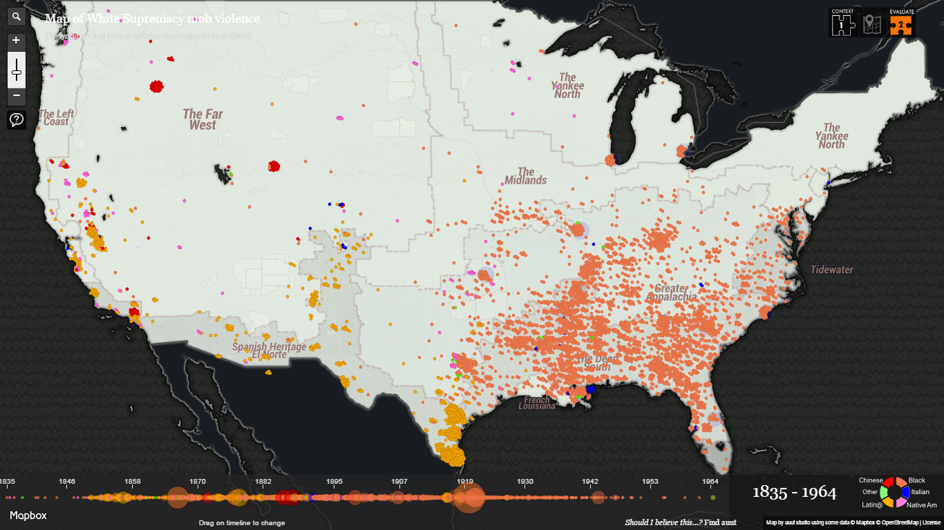
5,000 people of color were murdered in the United States of America between the years of 1835 and 1964. This interactive map, titled “Map of White Supremacy mob violence”, displays all of them as documented by sociologist Monroe Nathan Work and according to the archives of the Department of Records and Research that he founded at Alabama’s Tuskegee Institute. Horrible… However, “tools like this site serves as an important endeavor to help mark these dark parts of American history and make it more visible and accessible for all,” Smithsonian Magazine concludes.
We at AnyChart hope you liked the interactive data visualization examples included in this article. Of course, we’ll show you more next week. And now, we wish you a nice weekend!
- Categories: Data Visualization Weekly
- No Comments »