Nobel Laureates’ Countries, or Making Tag Cloud with JavaScript
October 3rd, 2023 by Awan Shrestha The Nobel Prize 2023 announcements are just around the corner, scheduled from October 2 to 9. Recently, I stumbled upon this news, sparking my interest in Nobel laureates and their countries of origin.
This curiosity led me to the comprehensive list of Nobel Prize winners on Britannica, which I transformed into an interactive tag cloud (or word cloud) using JavaScript, providing an elegant means to explore and uncover the countries with the highest number of Nobel laureates throughout history.
During this process, it dawned on me that this visualization could serve as an excellent illustrative example for a tutorial on creating interactive JS-based tag clouds. So, if you share my curiosity about Nobel laureates by country, you’re in for a treat right below! and if you’re eager to learn how I brought this tag cloud to life — and, therefore, how you can create your own — read on!
Read the JS charting tutorial »
- Categories: AnyChart Charting Component, Big Data, HTML5, JavaScript, JavaScript Chart Tutorials, Tips and Tricks
- No Comments »
Creating Dynamic Linear Gauge for Real-Time Typing Speed Test Data Visualization: Using JavaScript
August 17th, 2023 by Nick Gogin From clocks to weight scales, speedometers to thermostats, and even the battery charge icon on your phone, Gauge Charts are widely used to represent a value on a scale or range, providing a clear visual indication of the represented measurement. Gauges can be circular or linear, and in this article, our focus will be on the latter style. I will guide you on how to create a cool linear gauge using JavaScript.
Specifically, we will explore the demonstration of linear gauges using an example of a real-time typing speed test. Throughout the article, we will delve into the structure of linear gauges, discuss styling options, explore how they can be connected to data, and show how you can easily build your Linear Gauges using JavaScript in just a matter of minutes. By the end of the tutorial, you’ll have an awesome example of a linear gauge used to dynamically illustrate typing speed test results or whichever data you want.
So, let’s dive in and elevate your web-based interactive data visualization game!
Read the JS charting tutorial »
- Categories: AnyChart Charting Component, Big Data, Charts and Art, HTML5, JavaScript, JavaScript Chart Tutorials, Tips and Tricks
- No Comments »
Building Bubble Chart with JavaScript
August 1st, 2023 by Awan Shrestha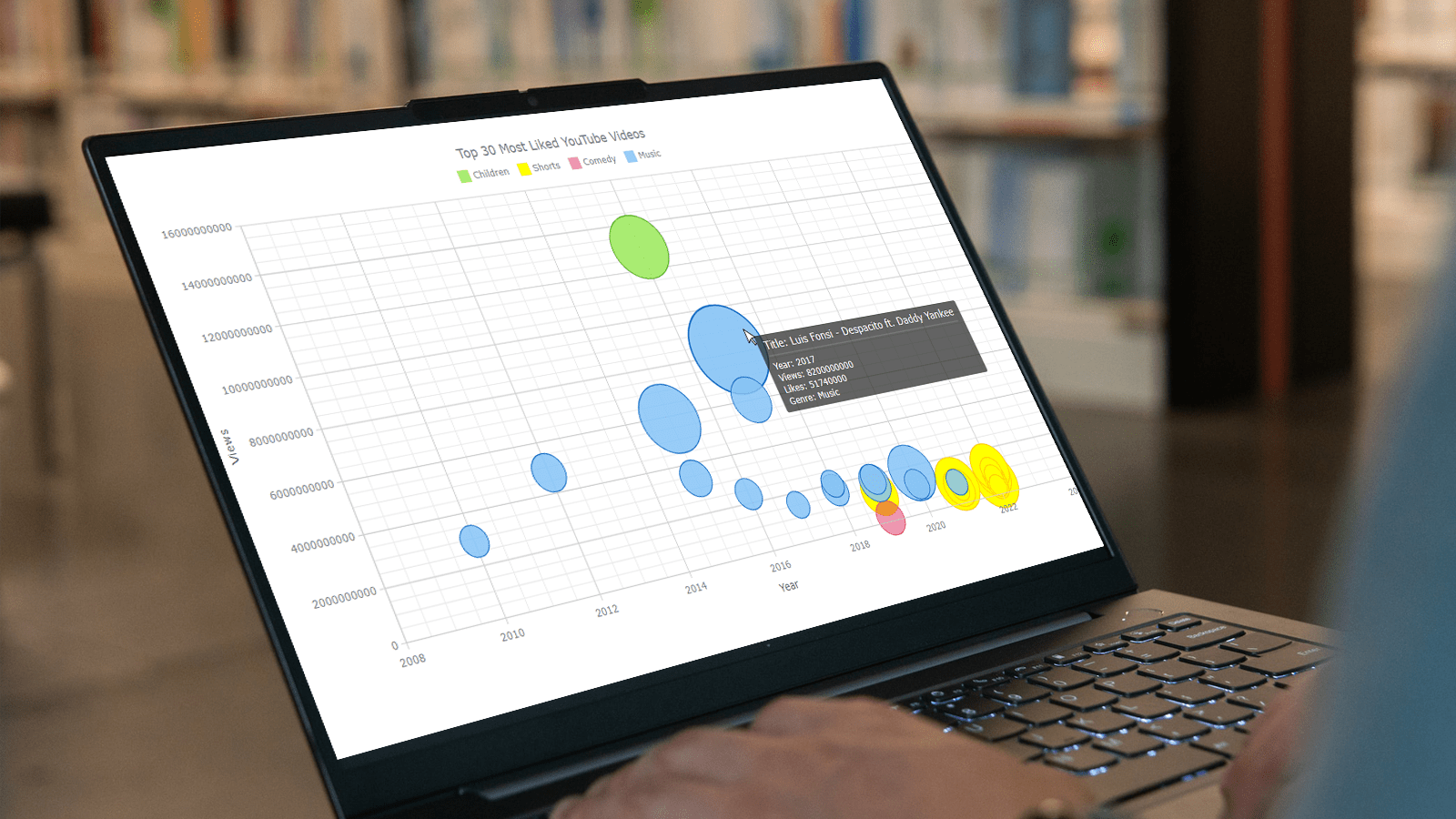 Do you want to turn that data chaos into a comprehensible data show? Look no further than data visualization! And let me tell you, one chart to rule them all is the bubble chart. It's like blowing bubbles at your data and watching them pop into understanding! And the best part? With JavaScript, you can easily create an interactive bubble chart, and I will show you how!
Bubble charts are versatile data visualizations that display data points in the form of bubbles, where the bubbles' size, color, and position represent different variables. In this tutorial, I'll walk you through building these graphics step by step, making the process a breeze. For illustration, we'll take data on the popularity of various YouTube videos and use JavaScript to create an interactive bubble chart showcasing the top 30 most-liked videos of all time, categorized by year of release, views, and likes.
By the end of this tutorial, you'll be able to create visually-stunning JS-based bubble charts without any hassle. So let's dive into the world of data bubbles and turn numbers into a visual feast for the eyes!
Read the JS charting tutorial »
- Categories: AnyChart Charting Component, Big Data, Business Intelligence, HTML5, JavaScript, JavaScript Chart Tutorials, Tips and Tricks
- No Comments »
How to Visualize Data with Pareto Charts Using JavaScript
July 11th, 2023 by Shachee Swadia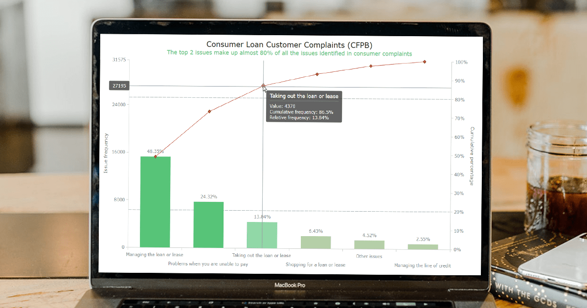 Welcome to this step-by-step tutorial that will empower you to create an interactive Pareto chart using JavaScript that will look nice on any device and in any browser!
A Pareto chart is a captivating graphical combo representation that showcases individual values through descending bars, while a line graph illustrates the cumulative total. It is a powerful tool highlighting the relative importance of different categories within a dataset. Named after the visionary economist Vilfredo Pareto, the Pareto chart embodies the Pareto principle, also known as the 80/20 rule. This principle reveals that approximately 80% of effects stem from a mere 20% of causes. With their ability to pinpoint the most significant elements driving a specific scenario, Pareto charts have become indispensable in certain areas of data analysis.
Every chart needs data, and for this tutorial, I have chosen a dataset to serve as an example for illustration. Together, we will embark on a journey to visualize the major customer complaints for consumer loans in a Pareto chart, demonstrating how easily you can achieve it at every step. So get ready, and let’s dive into the world of Pareto charts and create our own interactive masterpiece!
Read the JS charting tutorial »
- Categories: AnyChart Charting Component, Big Data, Business Intelligence, HTML5, JavaScript, JavaScript Chart Tutorials, Tips and Tricks
- No Comments »
Freiheit Gruppe Uses AnyChart JS to Visually Organize Berliners’ Ideas for Berlin University Alliance
July 5th, 2023 by AnyChart Team Data visualization is a game-changer when it comes to exploring and making sense of data. And here at AnyChart, we’re passionate about making the development of interactive charts a breeze. Our award-winning JavaScript charting library is not only trusted by the big players in enterprise data intelligence systems, with over 75% of Fortune 500 companies relying on it. It is a go-to choice for thousands of developers worldwide who want to easily create awesome visualizations for their – and their clients’ – websites and apps.
Recently, we discovered a stunning sunburst chart powered by AnyChart on the website of the Berlin University Alliance. This diagram effectively organizes the ideas submitted by Berliners within the framework of the #Berlinforschtmit project, which calls upon the local community to tip scientists regarding new research topics. These collective efforts aim to make significant contributions toward enhancing the quality of life in the city.
We’ve had the pleasure of having a quick conversation with Björn Knetter from Freiheit Gruppe, the team responsible for the design and technical implementation of #Berlinforschtmit. He told us more about this innovative initiative and how they leverage AnyChart for impactful data visualization. All aboard for our quick interview!
- Categories: AnyChart Charting Component, Big Data, HTML5, JavaScript, Success Stories
- No Comments »
Creating Decomposition Tree in Qlik Sense
June 27th, 2023 by Alejandro Wassermann Hey Qlikkies, are you itching to explore your data ad-hoc across multiple dimensions and conduct root cause analysis like a boss? Look no further than the Decomposition Tree visualization! I first stumbled upon this gem in Power BI, but guess what? Now you can harness its power within the realms of the Qlik Analytics Platform. In this tutorial, I’ll demonstrate how you can easily create amazing decomposition trees for your BI dashboards and apps in Qlik Sense.
A decomposition tree is a type of chart that uses a tree-like structure to represent how a whole metric or outcome can be broken down into its constituent parts or factors. It provides a hierarchical view of the relationships between different dimensions or variables and their contributions to the overall metric. By visually displaying the decomposition of a measure, such as sales or revenue, into various components, such as product categories, regions, or time periods, the decomposition tree helps identify the key drivers and understand the underlying factors influencing the metric. And I’ll use the tech layoffs data to show you how this can look and work in reality.
Let’s dive in and unleash the decomposition tree power in Qlik Sense!
Read more at qlik.anychart.com »
- Categories: AnyChart Charting Component, Big Data, Business Intelligence, Dashboards, Qlik, Tips and Tricks
- No Comments »
How to Create Box-and-Whisker Plot in JavaScript
March 16th, 2023 by Awan Shrestha Transform your data into insights with a stunning box-and-whisker plot! Learn what it is and how to create one with ease using JavaScript. In this tutorial, I’ll walk you through the steps to make a neat and visually appealing JS-based (HTML5) box chart with the yearly gross salaries of different IT professions in Europe. Unlock the power of data visualization and start quickly identifying trends and patterns today!
Read the JS charting tutorial »
- Categories: AnyChart Charting Component, Big Data, HTML5, JavaScript, JavaScript Chart Tutorials, Tips and Tricks
- No Comments »
Best Data Visualizations of 2022 — DataViz Weekly
December 30th, 2022 by AnyChart Team 2022 has been fruitful in terms of data visualizations for every taste and interest. On DataViz Weekly, we’ve shown you more than 200 awesome projects as great examples of effective charting and mapping in action. Today, in the year’s last edition, let’s look at the best data visualizations of 2022 through the eyes of third-party experts!
Find out which projects made it to the “best of the year” selections of Nathan Yau, DataJournalism.com, The Pudding, and Kenneth Field.
- Categories: Data Visualization Weekly
- No Comments »
Building Column Charts with JavaScript
December 29th, 2022 by Shachee Swadia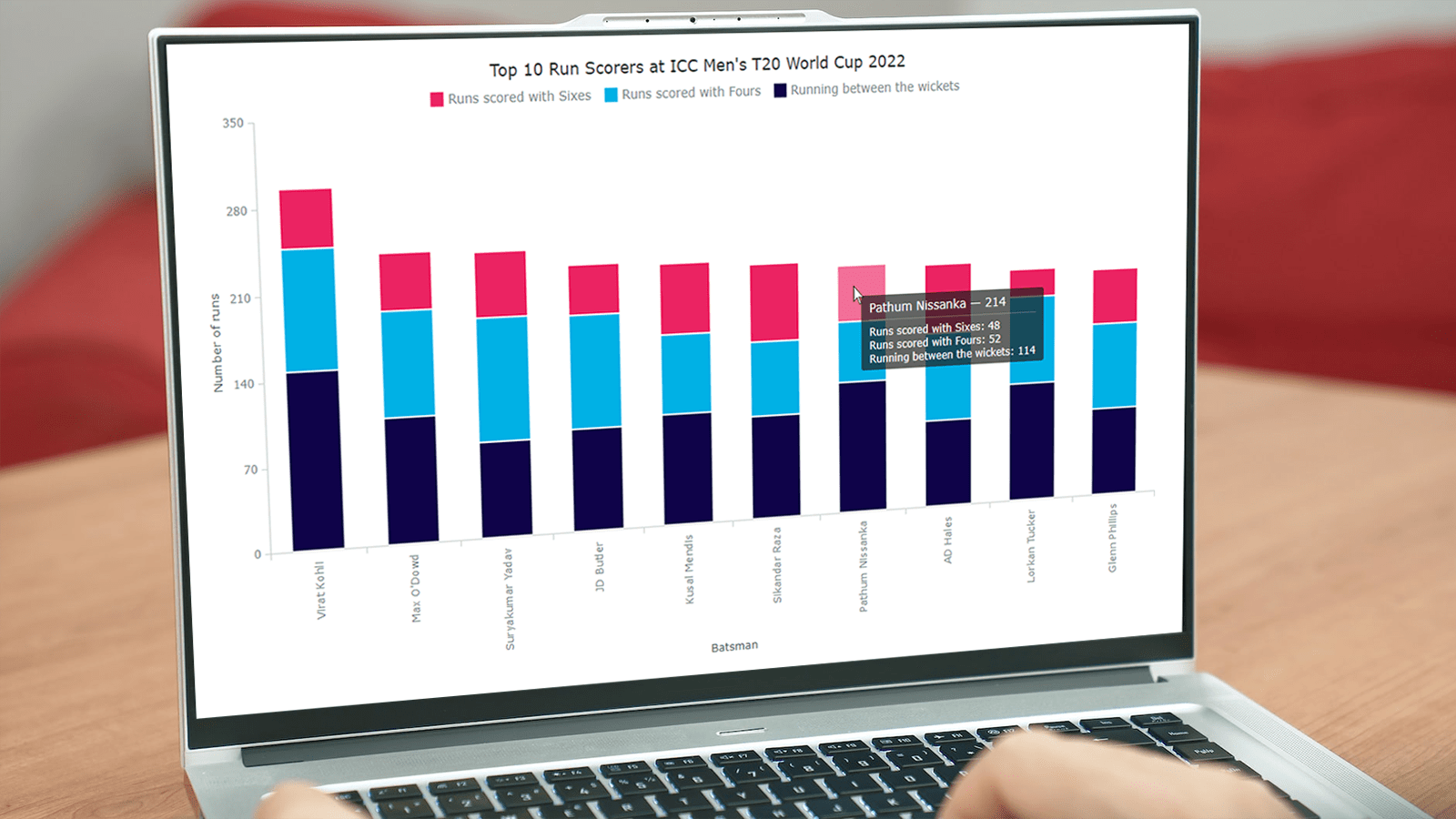 With data everywhere around, we should know how to graphically represent it to better (and faster) understand what it tells us. One of the most common data visualization techniques is column charts, and I want to show you how you can easily create interactive ones using JavaScript.
A column chart is a simple, yet powerful way to display data when you need to compare values. From this tutorial, you will learn to make its different variations — basic single-series, multi-series, stacked, and 100% stacked column graphs — and apply effective customizations in a few more lines of JS code.
As a cricket fan, I thoroughly watched the ICC Men’s T20 World Cup held last month in Australia. I decided to use some data related to the championship for illustrative visualizations. JavaScript column charts built throughout this tutorial will let us look into the batting statistics, and more precisely, the number of runs scored by the top 10 batsmen at the tournament. Let’s have fun learning!
Read the JS charting tutorial »
- Categories: AnyChart Charting Component, HTML5, JavaScript, JavaScript Chart Tutorials, Tips and Tricks
- 2 Comments »
How to Create Word Tree Using JavaScript
October 14th, 2022 by Awan Shrestha It is a pure fact that a graphical or pictorial representation of data, known as a data visualization, conveys information faster than raw data in arrays, spreadsheets, or dense reports. Charts make data easier to understand, which further helps to quickly develop valuable insights. Interesting, right? Now, let’s have a look at one chart type called a word tree and see how to build it with ease.
A word tree is a data visualization form designed to show multiple parallel sequences of words (or phrases) as they appear in a text. Analyzing texts becomes easier with word trees as they display, by means of a branching structure, how selected words are connected to others.
In this tutorial, I will walk you through the process of creating a beautiful word tree chart with JavaScript (HTML5). The text being visualized will be the famous speech “I Have a Dream” by minister and civil rights activist Martin Luther King Jr. Each step will be explained in detail, and you’ll see everything is pretty simple. Sit tight and enjoy the learning!
Read the JS charting tutorial »
- Categories: AnyChart Charting Component, HTML5, JavaScript, JavaScript Chart Tutorials, Tips and Tricks
- No Comments »