Freiheit Gruppe Uses AnyChart JS to Visually Organize Berliners’ Ideas for Berlin University Alliance
July 5th, 2023 by AnyChart Team Data visualization is a game-changer when it comes to exploring and making sense of data. And here at AnyChart, we’re passionate about making the development of interactive charts a breeze. Our award-winning JavaScript charting library is not only trusted by the big players in enterprise data intelligence systems, with over 75% of Fortune 500 companies relying on it. It is a go-to choice for thousands of developers worldwide who want to easily create awesome visualizations for their – and their clients’ – websites and apps.
Recently, we discovered a stunning sunburst chart powered by AnyChart on the website of the Berlin University Alliance. This diagram effectively organizes the ideas submitted by Berliners within the framework of the #Berlinforschtmit project, which calls upon the local community to tip scientists regarding new research topics. These collective efforts aim to make significant contributions toward enhancing the quality of life in the city.
We’ve had the pleasure of having a quick conversation with Björn Knetter from Freiheit Gruppe, the team responsible for the design and technical implementation of #Berlinforschtmit. He told us more about this innovative initiative and how they leverage AnyChart for impactful data visualization. All aboard for our quick interview!
- Categories: AnyChart Charting Component, Big Data, HTML5, JavaScript, Success Stories
- No Comments »
Impressive New Data Graphics on Abortions, Homes, Names, Land — DataViz Weekly
March 11th, 2022 by AnyChart Team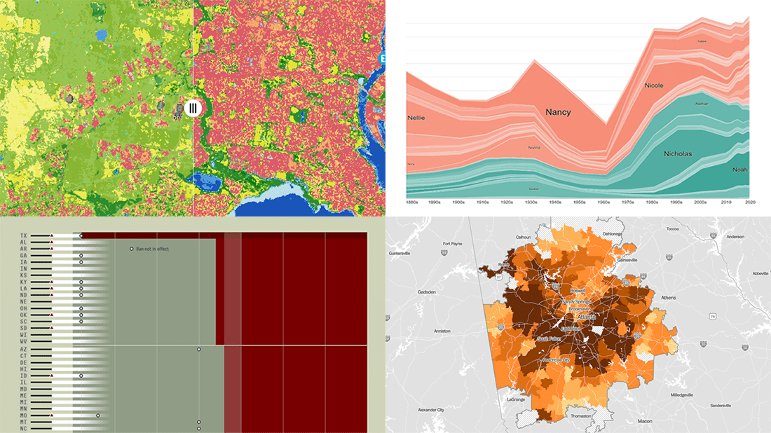 DataViz Weekly is here with another batch of impressive data graphics worth looking at and exploring! Today, we are eager to tell you about the following four new projects:
- Burden of abortion across the United States — FiveThirtyEight
- Real estate investor activity in the 40 major American cities in 2021 — The Washington Post
- Historical popularity of baby names in the U.S. since the 1880s — Namerology
- Australia land cover in detail — Geoscience Australia
- Categories: Data Visualization Weekly
- No Comments »
Amazing Data Visualization Works Worth Seeing — DataViz Weekly
January 21st, 2022 by AnyChart Team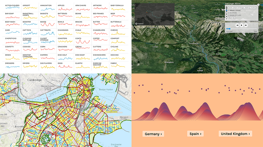 DataViz Weekly is here to let you know — and get excited — about the four most amazing data visualization works we have come across out there just about now. They are:
- Roadway traffic stress on bicyclists in Boston — Boston Transportation Department and Toole Design Group
- Shopping search behavior patterns for the pandemic era — Schema Design, Google Trends, Axios, and Alberto Cairo
- Thoughts and feelings about immigration in Europe — Federica Fragapane, Alex Piacentini, and ODI
- Raindrop flow path — Sam Learner
- Categories: Data Visualization Weekly
- No Comments »
Analyzing Population Shifts, Box Office, Heat Exposure, Daily Routines — DataViz Weekly
November 26th, 2021 by AnyChart Team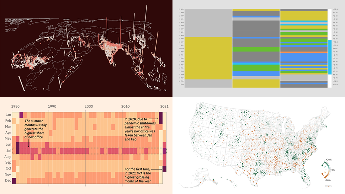 It is much easier to analyze large amounts of data when they are represented using the right visualization techniques. We are ready to show you another four vivid examples! Today on DataViz Weekly:
- Population and racial changes in the United States — Pitch Interactive & Census 2020 Data Co-op
- Box office for cinema-exclusive and simultaneous release movies — FT
- Global extreme urban heat exposure — AP News
- Most common daily time uses — Nathan Yau
- Categories: Data Visualization Weekly
- No Comments »
Four Impressive Visual Data Stories To Check Out — DataViz Weekly
October 1st, 2021 by AnyChart Team Looking for awesome examples of visual data stories? You’re in the right place at the right time! In this edition of DataViz Weekly, we feature four impressive new ones we’ve come across these days:
- Sexual violence crisis in Singapore — Kontinentalist
- Climate change in the Arctic and beyond — Woodwell Climate Research Center
- Melting glaciers as vanishing climate archives — Reuters
- All 12+ million buildings in Spain by height — elDiario.es
- Categories: Data Visualization Weekly
- No Comments »
Canadian Elections, Germany Under Merkel, Caracas Sounds, Night Temperatures in U.S. Cities — DataViz Weekly
September 17th, 2021 by AnyChart Team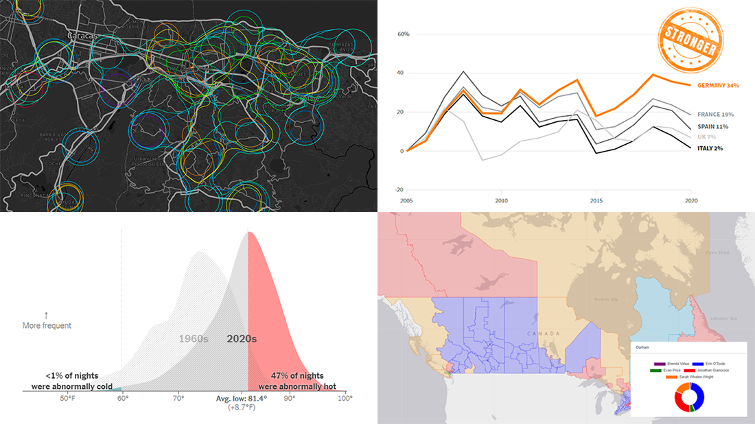 We continue to choose the most interesting out of all the newest data visualizations published here and there and show you them in weekly roundups. It’s time to look at our fresh selection! This time, the following projects are featured in DataViz Weekly:
- Canadian federal elections since 2000 — Stephen Taylor
- Germany under the 16-year leadership of Angela Merkel — Reuters
- Sounds of Caracas — Valeria Escobar
- Abnormally hot summer nights in American cities — The Upshot
- Categories: Data Visualization Weekly
- No Comments »
New Fascinating Visualizations to Explore on Weekend — DataViz Weekly
June 11th, 2021 by AnyChart Team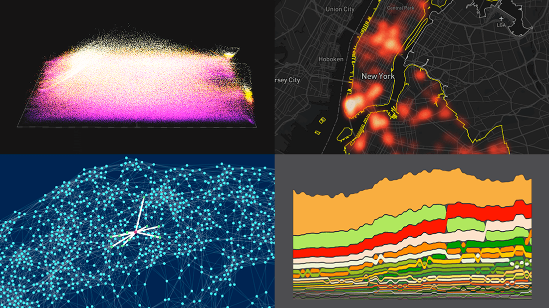 DataViz Weekly is here with a new dose of fascinating data graphics for visualization addicts! Check out some of the most interesting recent projects right away!
- Changes in the American diet over the past 40 years — Nathan Yau
- Surveillance cameras in New York City — Amnesty International
- Cities with similar street networks — Andrei Kashcha
- A million soccer passes visualized at once — Karim Douïeb
- Categories: Data Visualization Weekly
- No Comments »
Visualizing Organization Structure, Location Guesses, Time Allocation, and Retreats from Streets — DataViz Weekly
January 17th, 2020 by AnyChart Team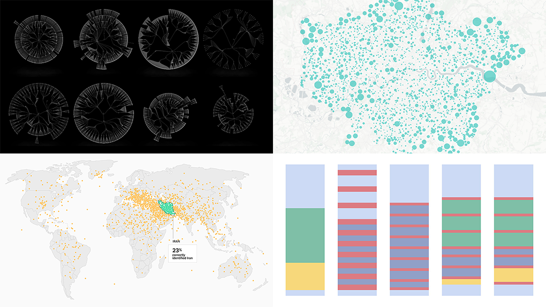 Join us on a quick review of some of the most interesting projects with cool charts and maps made public just recently. These are good examples of visualizing organization structure, changes in time spending patterns, and more. Here’s a full list of the projects highlighted in today’s DataViz Weekly:
- Structure of British government departments — Peter Cook
- Identifying Iran on unlabeled maps — Morning Consult
- Time allocation before and with a baby — Caitlin Hudon
- Retreats from busy streets in big cities — Hans Hack
- Categories: Data Visualization Weekly
- No Comments »
Charting Salaries, Earthquakes, Housing, and Coffee Shops — DataViz Weekly
November 22nd, 2019 by AnyChart Team Join us as we praise new amazing data visualization projects from around the web. These are cool examples dedicated to charting salaries, earthquakes, housing history, and coffee shop locations. Look what DataViz Weekly has to showcase today:
- Salaries across occupations in the United States — FlowingData
- Earthquakes worldwide, with exaggerated depth — Raluca Nicola
- History of Moscow housing — Strelka Mag
- Coffee shops in America and worldwide — Thinknum
- Categories: Data Visualization Weekly
- No Comments »
Created Visualizations on Cities, Politics, Education, and Romanovs — DataViz Weekly
May 24th, 2019 by AnyChart Team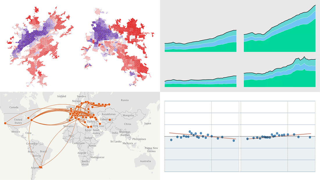 Each Friday, we meet you with four of the most interesting data-based projects we’ve just come across. Here’s what recently created visualizations we are glad to tell you about this time on DataViz Weekly:
- Why Workers Without College Degrees Are Fleeing Big Cities — The New York Times
- Where Democrats And Republicans Live In Your City — FiveThirtyEight
- Cost of College — FlowingData
- The Romanovs’ Twilight — TASS
- Categories: Data Visualization Weekly
- No Comments »