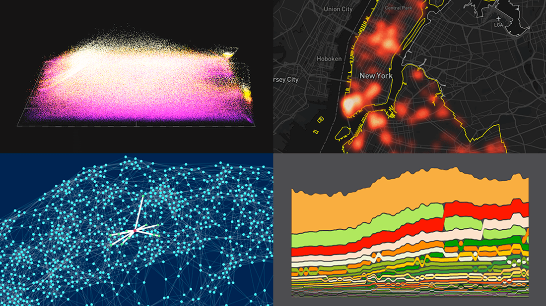
 DataViz Weekly is here with a new dose of fascinating data graphics for visualization addicts! Check out some of the most interesting recent projects right away!
- Changes in the American diet over the past 40 years — Nathan Yau
- Surveillance cameras in New York City — Amnesty International
- Cities with similar street networks — Andrei Kashcha
- A million soccer passes visualized at once — Karim Douïeb
Data Visualization Weekly: June 4, 2021 — June 11, 2021
Changes in American Diet over 40 Years
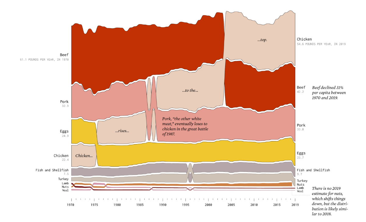
What American people eat has not been the same over the years. Wondering how that is changing? Here are several new cool charts shedding light on food consumption trends in the United States.
Nathan Yau took data from the Food Availability Data System (FADS) of the U.S. Department of Agriculture’s Economic Research Service (ERS) and created nine alluvial diagrams based on it. Each graphic shows the rankings of how much food Americans have eaten per year per capita since 1970, within the following groups: proteins, fresh vegetables, fresh fruits and fruit juice, dairy (beverage, food, and frozen), grains, and added fats.
The chart displayed above, for example, reveals the continuing rise of chicken. Take a closer look and explore the situation in the other groups over the past four decades, in the original article on FlowingData.
Surveillance Cameras in New York City
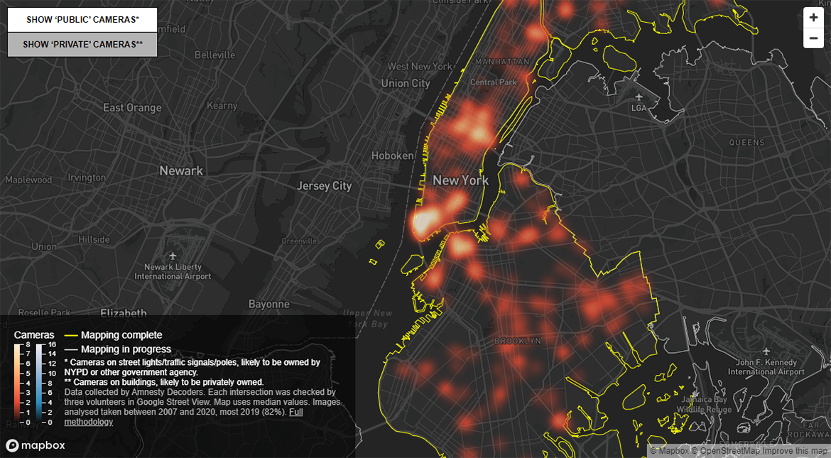
Nowadays, it is hard to remain anonymous in a big city. Look at NYC. According to Amnesty International, the New York City Police Department (NYPD) can use more than 15,000 surveillance cameras to track people all over Bronx, Brooklyn, and Manhattan with the help of facial recognition technologies. The organization considers such practice as amplifying discriminatory policing and a threat to human rights.
In a new investigation, Amnesty asked volunteers from all over the world to tag surveillance cameras on Google Street View imagery of intersections in NYC. The project is still ongoing. But the current results revealing how the identified total of 15,280 cameras are distributed across three NYC boroughs — Brooklyn (8,220), Manhattan (3,590), and Bronx (3,470) — are now ready and visualized in a spatial heat map.
As you would expect from such a graphic, it does not show the precise location of each camera. Instead, the heat map displays the density of cameras, revealing the most surveilled places. You can learn more about the investigation and its results here.
Cities with Similar Street Networks
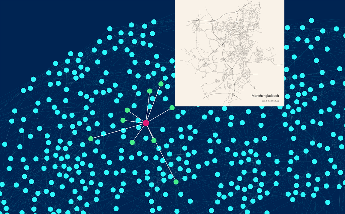
Globally, what city’s street network do you think is the most similar to NYC’s? You may be surprised but it is Lima, the capital of Peru. Guarapuava (Brazil) and Miami (U.S.) conclude the top three.
Such comparisons are easy to make using Similar Cities, a new compelling interactive data project by Andrei Kashcha. It maps cities based on how similar their street patterns are. Just pick one using the search field and the dropdown menu. You will see a snapshot of its road network as well as what other cities’ ones resemble it the most, arranged by the degree of similarity. The accompanying diagram is designed to highlight such links.
Check out the visualization to find the most similar cities to yours in terms of the look of the street network. The methodology is explained here in case you are interested.
Million Soccer Passes at Once
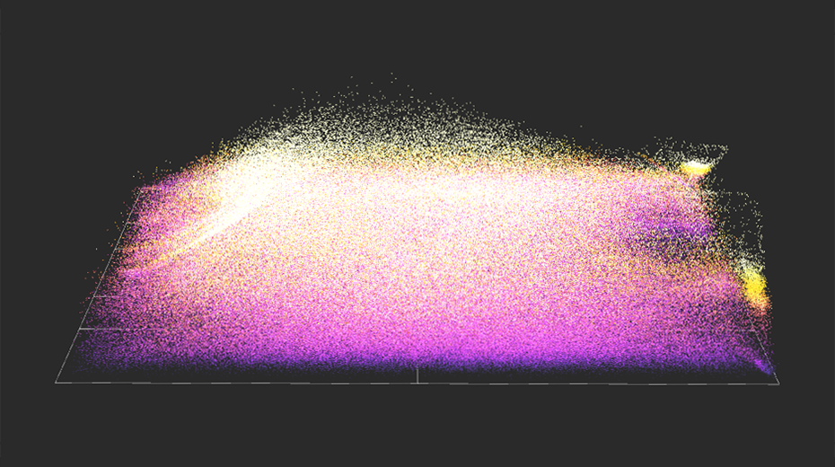
Even if you are not a fan of soccer at all, it is highly likely that you will love this mesmerizing visualization.
Karim Douïeb made an animated graphic showing, based on data from StatsBomb, 882,536 passes from 890 matches that were played across several major soccer competitions held in various seasons: the FIFA World Cup of 2018, the FIFA Women’s World Cup of 2019, the UEFA Champions League of 1999, the Campeonato Nacional de Liga de Primera División (La Liga) of 2004-2020, the Football Association Women’s Super League of 2018, the National Women’s Soccer League of 2018, and the English Premier League of 2003-2004. Color represents pass distance.
See how all the passes look like when visualized at once. Hover around to focus on specific parts of the field. Change the look by playing with the radius, speed, and particle size right there.
***
That’s all for now, folks! Stay tuned for Data Visualization Weekly!
- Categories: Data Visualization Weekly
- No Comments »