Seeing numbers is one thing — seeing what they mean is another. With data visualization, even familiar topics can take on new depth, and unexpected ones become approachable. This edition of DataViz Weekly brings together four compelling new projects that turn diverse datasets into visual insight:
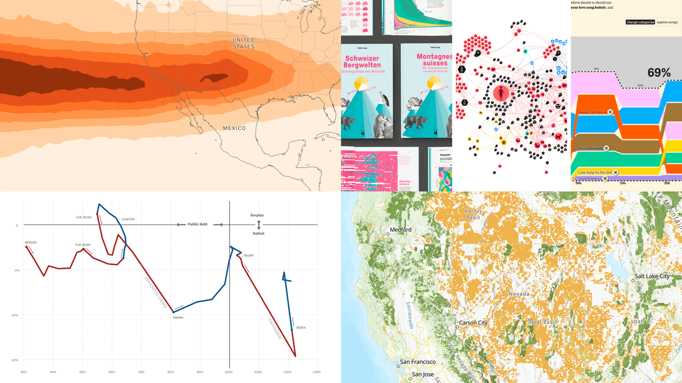
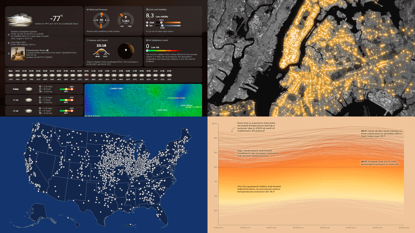
Heat in U.S. prisons — Reuters
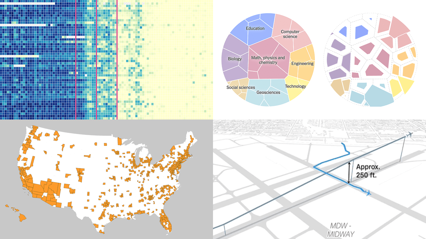
All Carnegie libraries in America — Carnegie Corporation of New York
Words seen on New York City streets — The Pudding & alltext.nyc
Weather on Mars — NASA Goddard Space Flight Center
本セッションでは、AnyChart 社 CEO の Anton Baranchuk が自ら進行を務め、Qlik Sense 拡張機能における最新のイノベーションを紹介し、それらが分析ワークフローをどのように改善し、より的確なデータドリブンな意思決定を支援できるかを実演を交えてご説明します。
We are pleased to invite you to an in-person session in Tokyo introducing practical tools to enhance your Qlik analytics environment.
During the session, AnyChart‘s CEO Anton Baranchuk will present the latest in Qlik Sense extensions, demonstrating how they can improve analysis workflows and support more informed, data-driven decision-making.
The human brain processes visual information more readily than raw numbers. That makes data visualization a particularly effective way to uncover insights. DataViz Weekly presents some of the best recent examples we have come across:
Public lands for sale in the United States — The Wilderness Society
Future flight turbulence under warming — The Washington Post
U.S. federal finances — Reuters
Winners of the Information is Beautiful Awards — Data Visualization Society
Qlik Connect 2025 is now in the books, and it was everything we hoped for — and more. Building on last year’s success, we returned to Orlando to find even more connections, deeper engagement, and a truly electric atmosphere around our booth. Our brand-new Excel-style Spreadsheets for Qlik Sense turned heads, and our chance-to-win activities became a real magnet on the show floor.
The buzz was real — just take a look below, then read on for a recap of our time at Qlik Connect:
Here we are with a new selection of great examples showing the power of data visualization in action, whether for exploring or explaining. See which projects made it to this edition of DataViz Weekly:
Flight delays and cancellations in Northern California — San Francisco Chronicle
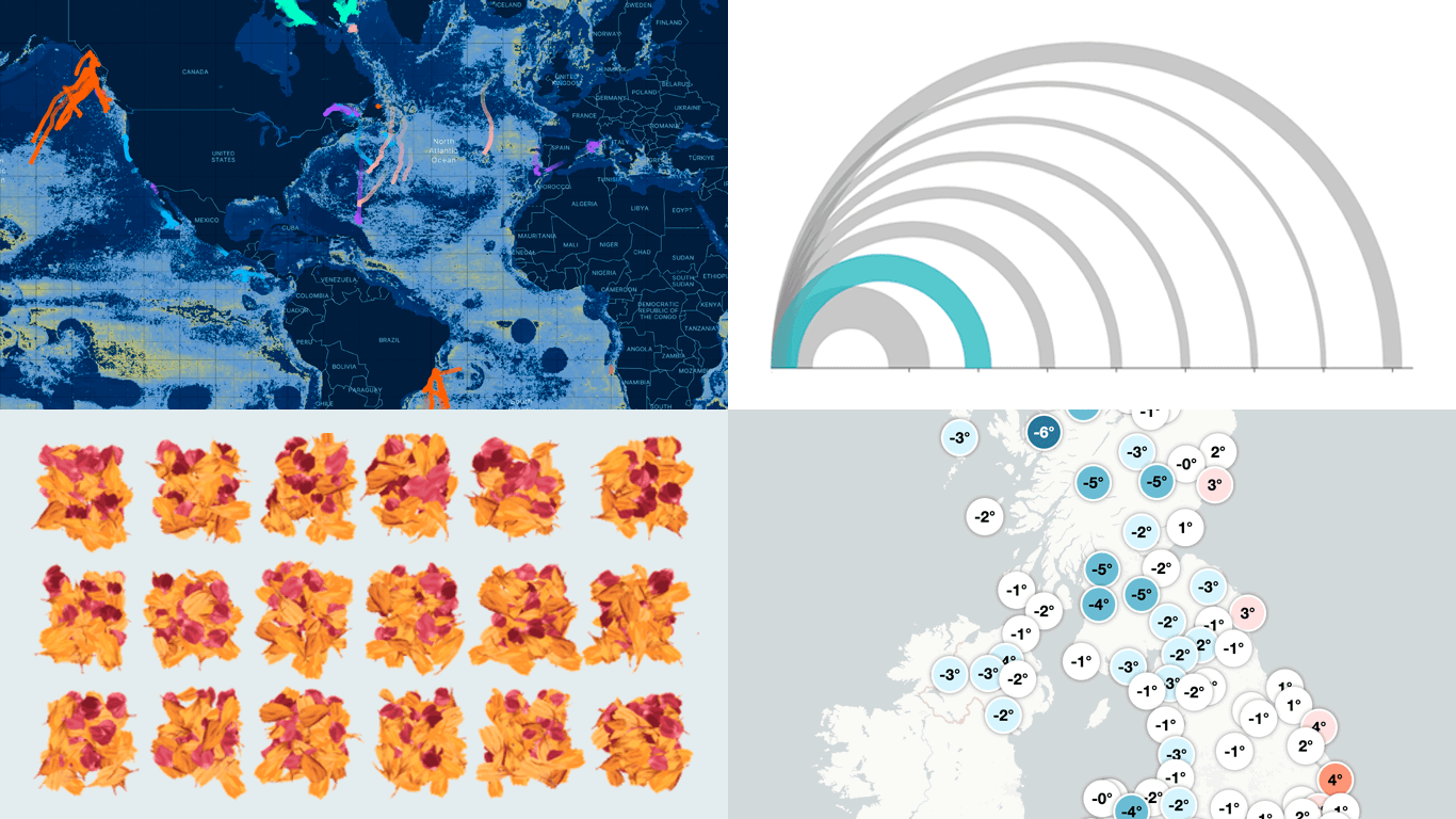
Real-time UK temperature tracker — Dan Harris and Ed Hawkins
Threats to whale migration — Blue Corridors Initiative
Hey data visualization lovers, ready for a new dose of inspiration? Welcome back to DataViz Weekly, where we spotlight the most interesting new projects in which charts and maps help make sense of data visually. Take a look at what stood out to us this time around:
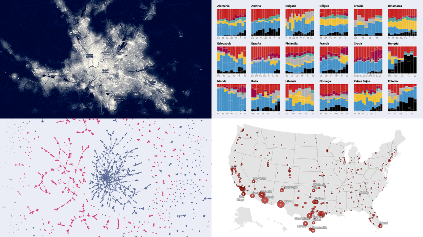
Ukraine’s energy crisis revealed by city lights — Bloomberg
Far-right electoral growth across Europe — elDiario.es
U.S. guns for Mexican cartels — The Conversation
History of Lubartów’s Jewish population — WeDoData
Seeing data is not the same as understanding it — that is where visualization makes the difference. This edition of DataViz Weekly features fresh examples showing how insight emerges when numbers are presented thoughtfully. Whether you work with data or just follow it, here’re four new projects we thought you wouldn’t want to miss:
Aviation incidents in America — CNN
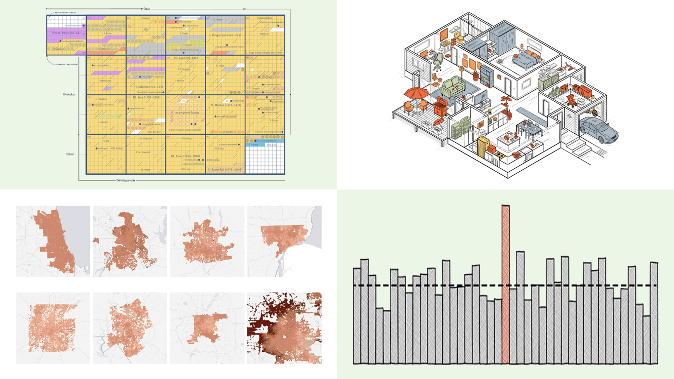
County population across the United States — Kyle Walker
Qlik Connect was a blast — catch some highlights on our LinkedIn if you’re interested. With all that whirlwind now behind, we’re completely back in the flow of our Friday tradition with a new edition of DataViz Weekly. As always, it is all about sharing great projects that show how visualization lets data talk and sparks insight. Today, we bring you four new visual data stories to check out:
Visual guide to papal election — Atlo
Chance of death on birthday — The Pudding
Sinking ground in U.S. cities — The Washington Post
Chinese products in American homes — The New York Times
We skipped a few Fridays — but for good reason. With Qlik Connect just around the corner, we have been deep in prep mode: finalizing assets, polishing demos, and getting our brand-new Spreadsheets extension for Qlik Sense completely ready to launch. Still, we could not hold off any longer, so we carved out a quick break to bring you a new edition of DataViz Weekly! Here are the most compelling visualizations we have come across lately — take a look:
Marine migration pathways — MiCO
Spain’s energy system under strain — Colpisa
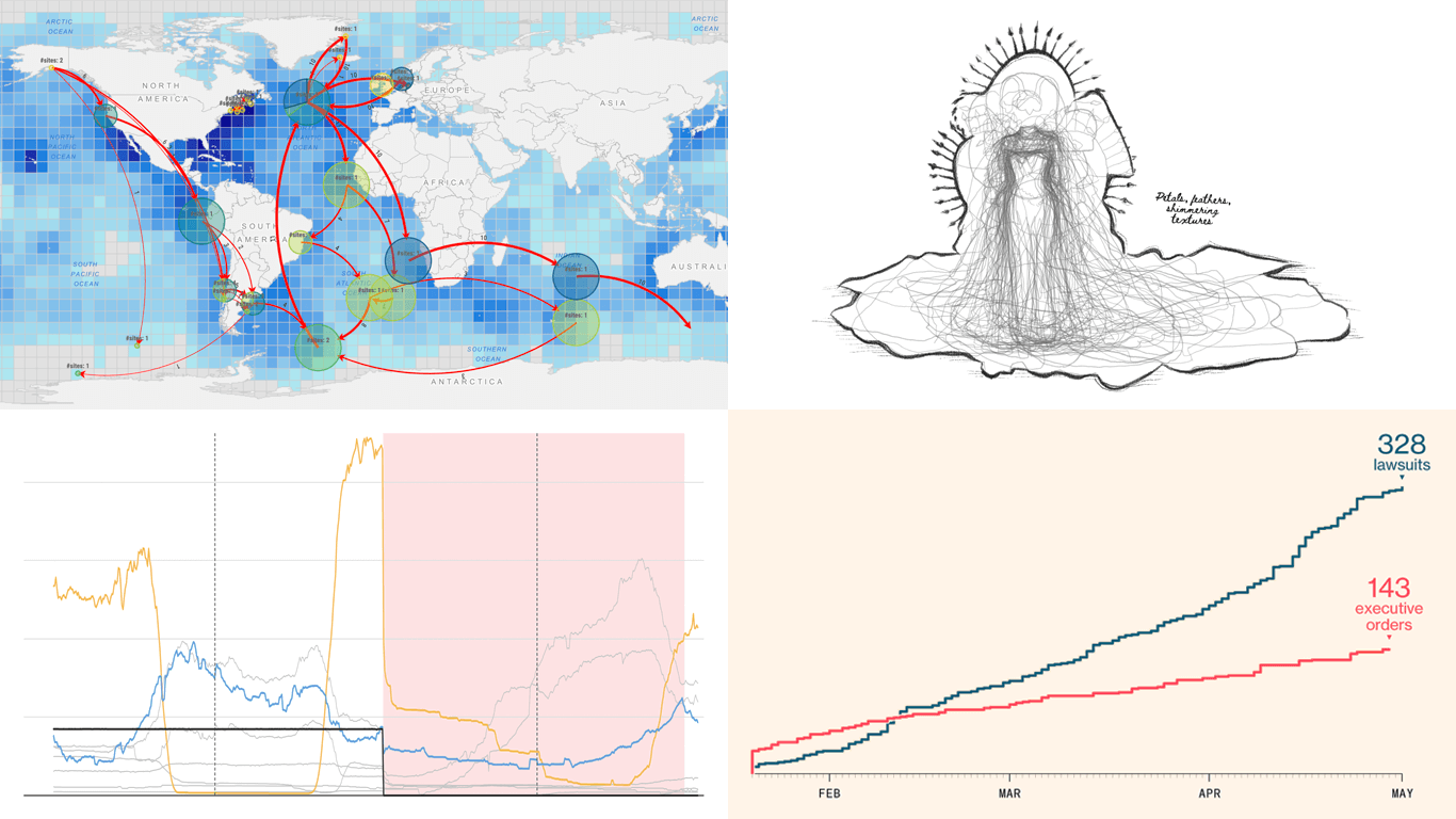
Lawsuits against Trump’s executive orders — Bloomberg
Qlik Connect 2025 is coming up fast, and we at AnyChart are excited to return as a sponsor and exhibitor after last year’s success! Mark your calendar for May 13–15 and join us at Disney’s Coronado Springs Resort in Lake Buena Vista, Florida.
Be sure to stop by Booth #1007 to explore the latest in our suite of Qlik Sense extensions. Discover Excel-like Spreadsheets for Qlik, see what’s new and upcoming in other tools, and enter our contests for a chance to win premium Apple prizes — including a MacBook, Apple Watch, iPad, and more!
 Seeing numbers is one thing — seeing what they mean is another. With data visualization, even familiar topics can take on new depth, and unexpected ones become approachable. This edition of DataViz Weekly brings together four compelling new projects that turn diverse datasets into visual insight: