 We are glad to continue supporting non-profit initiatives all over the world by allowing them to use our JavaScript charting library free of charge. Recently, Giorgio Mazzacurati of Gruppo Astrofili Galileo Galilei, an Italian association of amateur astronomers, told us about how AnyChart helps with their visual data analysis. He also shared a few snapshots showing our interactive JS charts in action. Take a look! (Stack: Python/Flask/MySQL.)
AnyChart: Could you please tell us a few words about your organization, to begin with?
Giorgio Mazzacurati: Gruppo Astrofili Galileo Galilei (GrAG) is a non-profit association in Tarquinia, Italy, formed by a group of amateur astronomers, mainly of Viterbo and Rome area, with the goal of bringing together astronomy enthusiasts in stargazing and astrophotography.
The association has been providing technical support for astronomical monitoring to the national and international scientific community for several years. We have established a fixed observation point to host monthly meetings for amateur astronomers and those interested in developing their passion for astronomy. Additionally, we aim to promote astronomical science through free public events, as well as courses in schools and advanced paying courses to fund the association’s projects. The association is also willing to organize thematic conferences with professional astronomers and experts in the field, thanks to the support of local authorities and collaboration with local cooperatives.
A: How important is data visualization in your work?
Data visualization plays a crucial role in interpreting and communicating data obtained from our own observatory. By using graphs, charts, and other visual forms of representing the data, it is much easier to discover patterns, anomalies, and trends and, therefore, draw meaningful conclusions from the observations.
With data visualization, we can quickly identify relationships between different variables that might not be immediately obvious and highlight areas of interest that require further investigation. Additionally, it helps communicate the results to others, such as team members or stakeholders, in a clear and concise manner. Overall, data visualization is an essential tool for understanding and communicating the results of our work.
A: How do you use AnyChart?
GM: AnyChart has been an invaluable tool in producing graphs for the analysis of data from our observatory. It has allowed us to easily visualize and interpret data on the discovery of variable stars and provide concise reports on the observatory’s performance.
Mainly, we use AnyChart to visualize observation session data and light curves. We have put a lot of interactivity in place in order to achieve the best possible user experience in data exploration.
A: Is there a chance we may check out a few examples of AnyChart in action?
GM: Our data is not public; it is only visible to the members of our association. But I am glad to share some screenshots of what we’ve got.
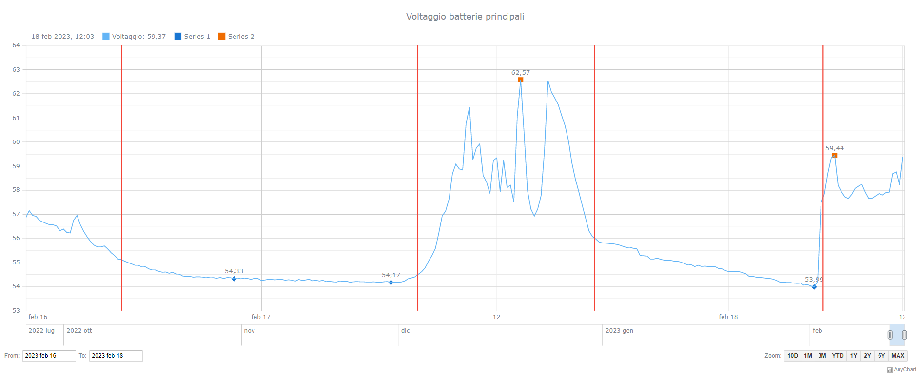
For example, here is a chart for the voltage dome battery, helping us manage solar charge:
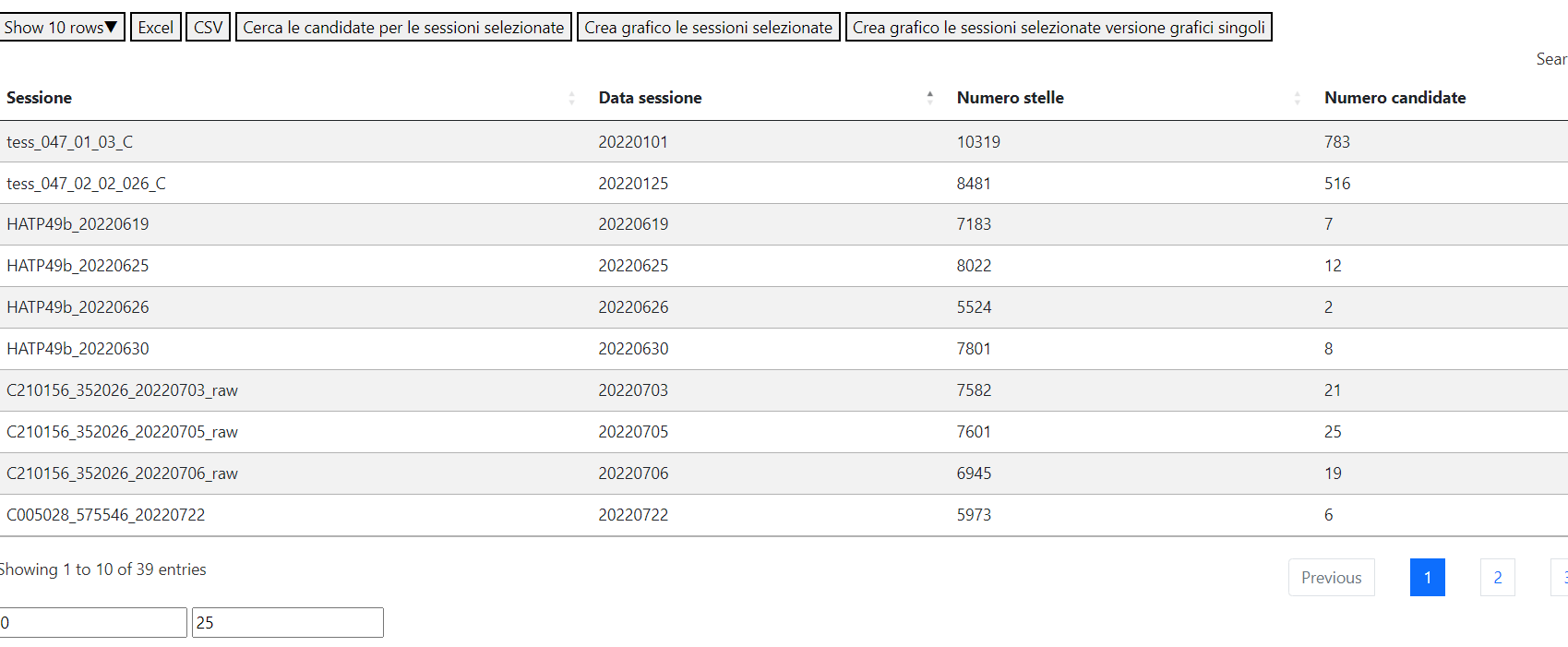
We have data about sessions in tabular form. Any item can be selected to view the details.
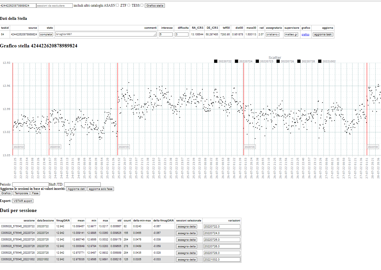
And the following is the main graphic page that provides a lot of ways to work with our data: move part of the data, create a phase plot, apply a time filter, and so on.
A: What is your technology stack? Was it easy to integrate AnyChart with it?
GM: We have a three-layer environment with a MySQL database, a Python application, and a Flask front end, and the integration itself was easy enough.
A: How did you learn about AnyChart, and why did you choose it?
GM: We just found it when searching for a good JavaScript charting library on the internet. AnyChart appeared to be the best fit for our needs in terms of easy data visualization deployment and management.
A: What do you like most about AnyChart?
The main features of AnyChart that we appreciate are its flexibility, dynamicity, and interactivity. Your library’s flexibility allows us to customize our visualizations to best suit our needs and present our data in a really actionable way. The dynamic nature of AnyChart makes it possible to create real-time charts and animations, which is especially useful for tracking changes over time. The rich interactivity features enable us to create user-friendly dashboards and reports, allowing viewers to interact with the data and gain a deep understanding of the observations.
A: Will you recommend AnyChart if someone asks you which JavaScript charting library to use for data visualization?
GM: The AnyChart library has greatly streamlined the charting process in our organization, saving us time and effort while producing high-quality graphical representations of our data. It allows us to customize our visualizations just as we need to enhance the clarity of our reports. Overall, AnyChart has become an essential component in our data analysis process, and I can certainly recommend it.
A: Thank you very much for the interview, and we are happy our solution has been helpful in your work! All the very best wishes to you and your teammates!
If you’d like to share your AnyChart story, please let us know.
See other customer stories on our blog.
- Categories: AnyChart Charting Component, AnyStock, Big Data, Dashboards, HTML5, JavaScript, Success Stories
- No Comments »