April 30th, 2025 by AnyChart Team
 Qlik Connect 2025 is coming up fast, and we at AnyChart are excited to return as a sponsor and exhibitor after last year’s success! Mark your calendar for May 13–15 and join us at Disney’s Coronado Springs Resort in Lake Buena Vista, Florida.
Be sure to stop by Booth #1007 to explore the latest in our suite of Qlik Sense extensions. Discover Excel-like Spreadsheets for Qlik, see what’s new and upcoming in other tools, and enter our contests for a chance to win premium Apple prizes — including a MacBook, Apple Watch, iPad, and more!
Read more at qlik.anychart.com »
April 21st, 2025 by AnyChart Team
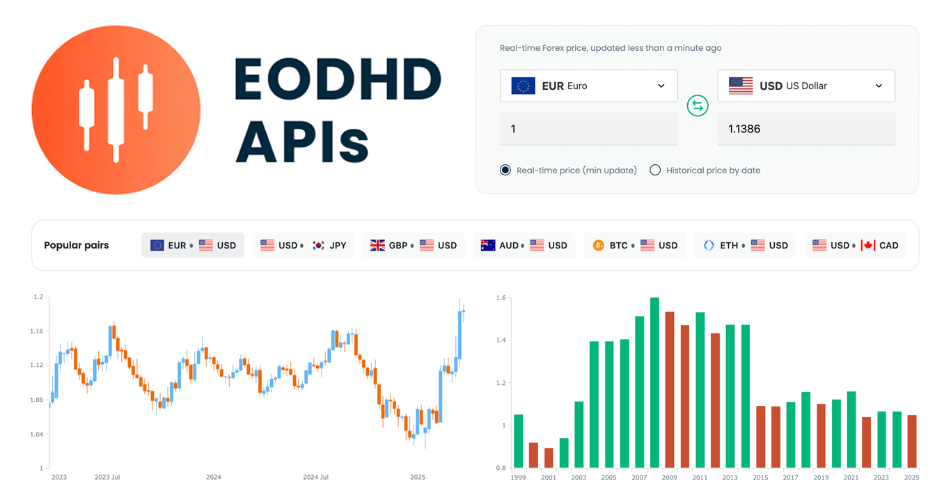 We are pleased to share that EODHD APIs, a prominent provider of financial market data, selected our JavaScript charting library to power charts in their new Online Currency Converter.
The tool provides free access to both live and historical exchange rates for more than 1,100 currency pairs. Interactive stock charts, built with our specialized AnyStock product, enrich numerical conversion data with clear visual context, providing insight into currency dynamics over time.
This case highlights how charts built with AnyChart can add clarity and usability to financial tools. Let’s take a closer look at how it works.
Read more »
April 11th, 2025 by AnyChart Team
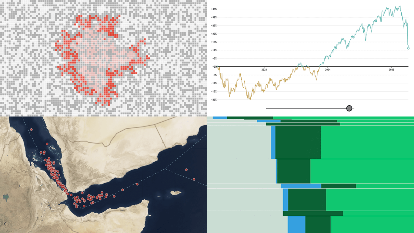 New week, new visualizations that deserve your look! DataViz Weekly brings together several strong new examples demonstrating how data visualization works in practice — making patterns visible, comparisons clearer, and context easier to understand.
- S&P 500 drops and recoveries over time — FlowingData
- Herd immunity thresholds in disease outbreaks — The Upshot
- Renewable energy targets in the Mediterranean — Ember
- Red Sea under Houthi attacks — International Crisis Group
Read more »
April 4th, 2025 by AnyChart Team
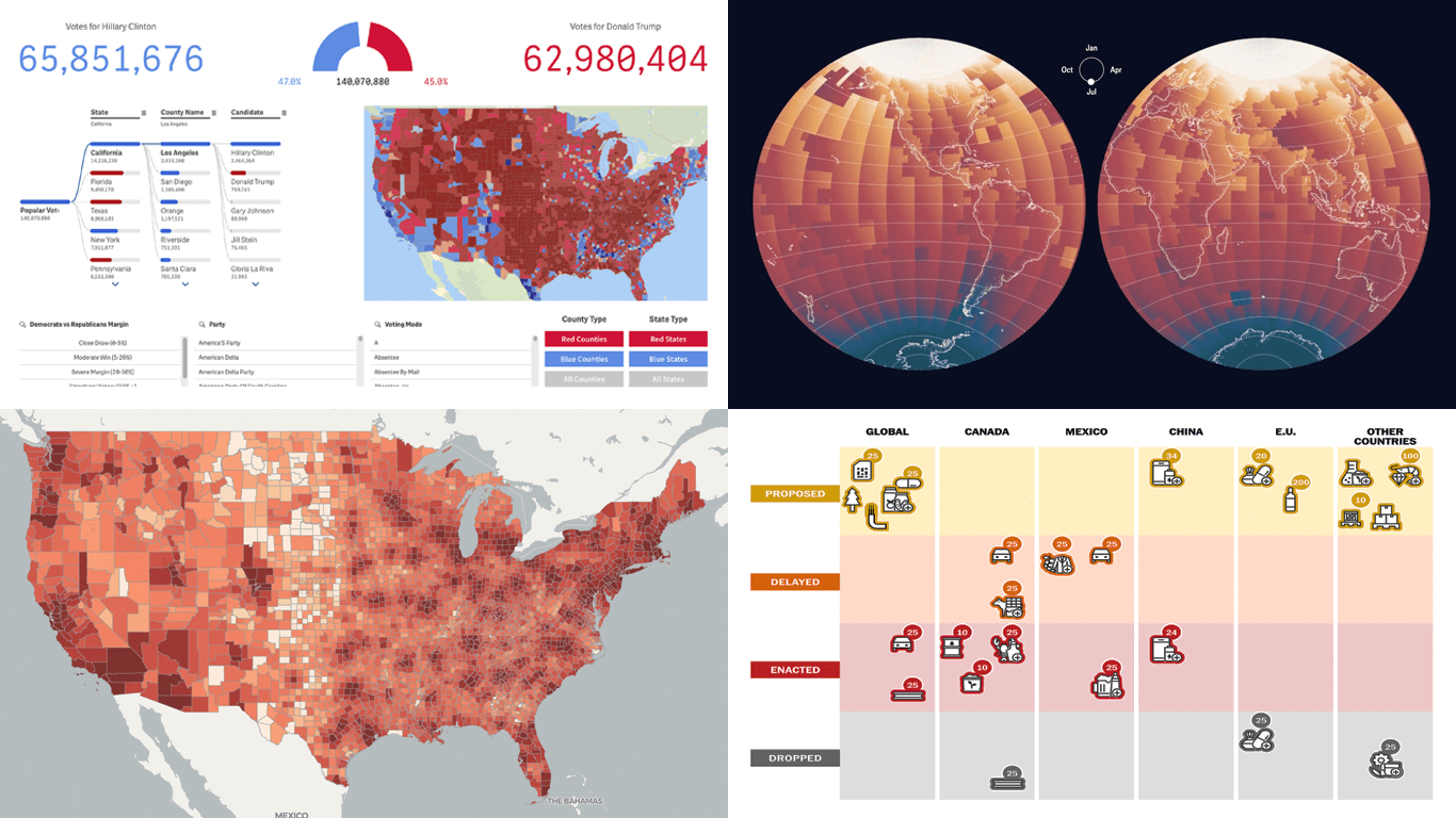 Politics shapes the world in many ways — and, as always, data visualization helps make sense of it all. This time in DataViz Weekly, we are looking at how charts and maps reflect political shifts, decisions, and consequences — from election results and government budgets to tariff policies and even time zones.
One of these projects is ours. We hesitated for a moment — but let’s be honest, we would have featured it anyway if we had stumbled upon it elsewhere.
So, without further ado, here are the four new data visualization projects we think you’ll want to check out:
- U.S. presidential elections — AnyChart
- Trump tariffs timeline — The Washington Post
- Science funding cuts in the United States — SCIMaP
- Politics of time zones — The Economist
Read more »
April 3rd, 2025 by AnyChart Team
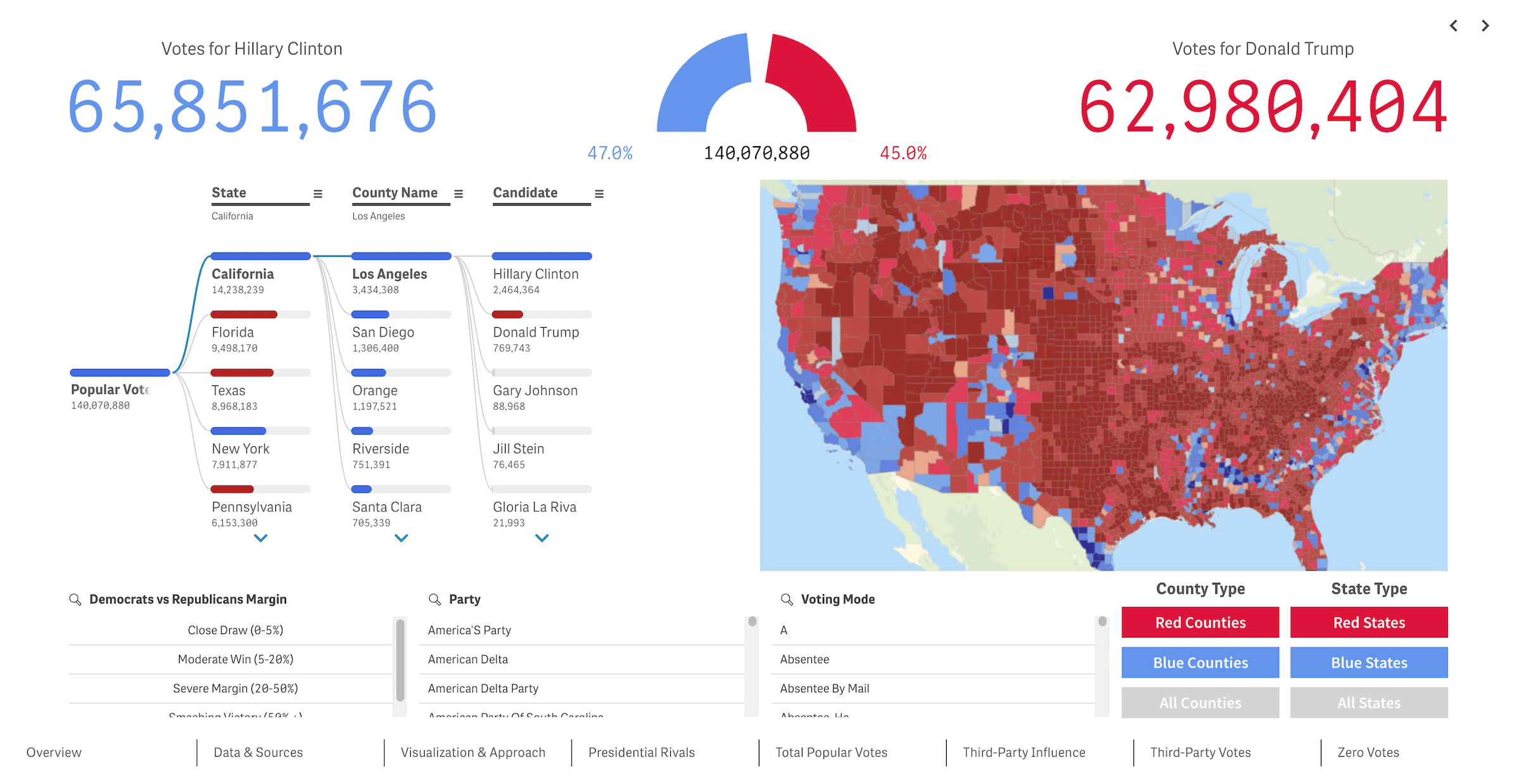 We recently released a new public Qlik Sense application that offers an interactive deep dive into U.S. presidential elections from 2016 through 2024 — our first step toward building the ultimate tool for exploring every presidential election in American history. We’re glad to see it’s already been well-received in the Qlik community and attracted significant attention, especially after being featured in the Qlik Gallery. The app is fully accessible in the browser, even if you do not have Qlik.
Read more at qlik.anychart.com »
March 25th, 2025 by AnyChart Team
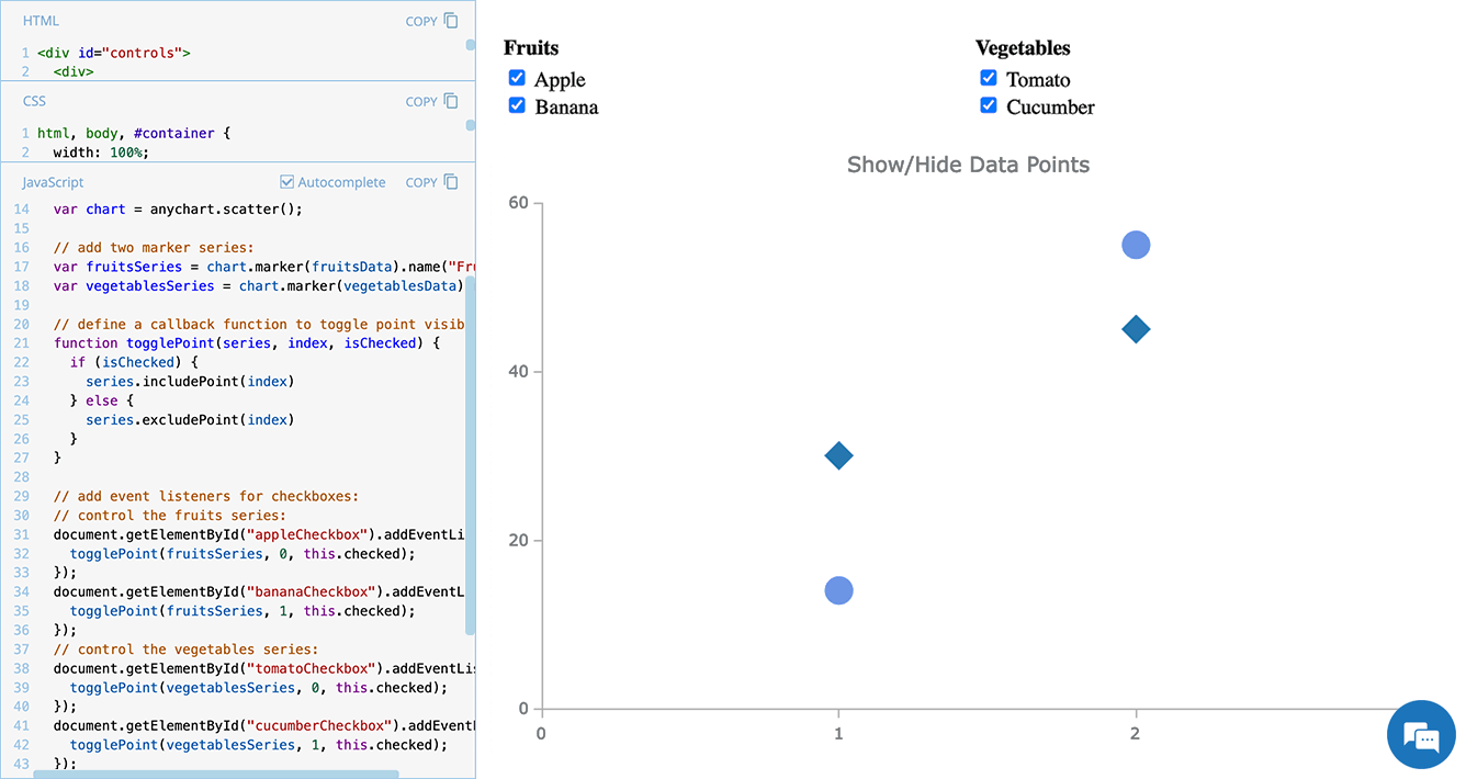 Scatter plots are widely used to visualize relationships between variables by displaying values on a coordinate plane. In some cases, users may need to control which data points remain visible — whether to focus on a specific category, filter out outliers, or simplify the view for better readability.
In this edition of JS Chart Tips — our blog series featuring practical solutions inspired by real customer questions — we’ll show you how to implement interactive point visibility control in a JavaScript scatter plot. By using specialized API methods, you can let users dynamically hide and show individual markers, making data exploration more flexible and insightful.
Let’s dive in!
Read more »
March 21st, 2025 by AnyChart Team
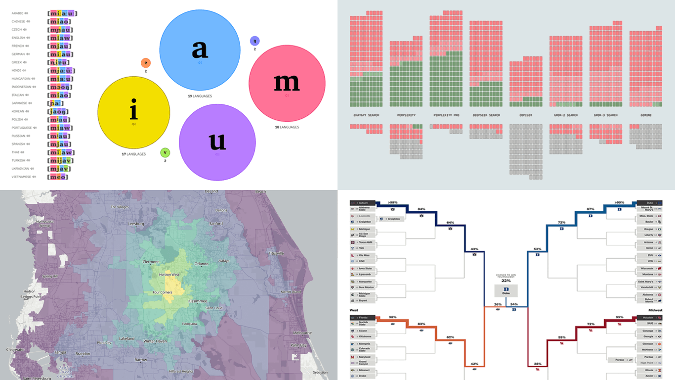 Data can speak — when we let it. Visualization is how we give it a voice. That is what DataViz Weekly is here for: to present real projects showing how data can be expressed through thoughtful visual work. In this edition, we’ve picked four new ones worth your attention:
- Animal sounds across languages — The Pudding
- March Madness 2025 bracket projections — The Athletic
- AI search citation failures — Columbia Journalism Review
- Travel times from any U.S. location — OpenTimes
Read more »
March 14th, 2025 by AnyChart Team
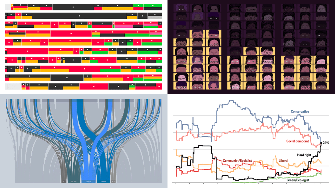
 Data has its own language, but humans? We’re wired for visuals. Charts and maps serve as translators, turning raw numbers into something we can instantly grasp. Welcome to DataViz Weekly, where we bring forward compelling visual graphics that bring data to life! Here are the latest we’re glad to feature:
- Looking back at the COVID-19 pandemic — Scientific American
- COVID’s impact in 30 charts — The Upshot
- Prisoner release risk assessment in Spain — Civio
- Settlement sizes in the Donbas region — NZZ
Read more »
March 7th, 2025 by AnyChart Team
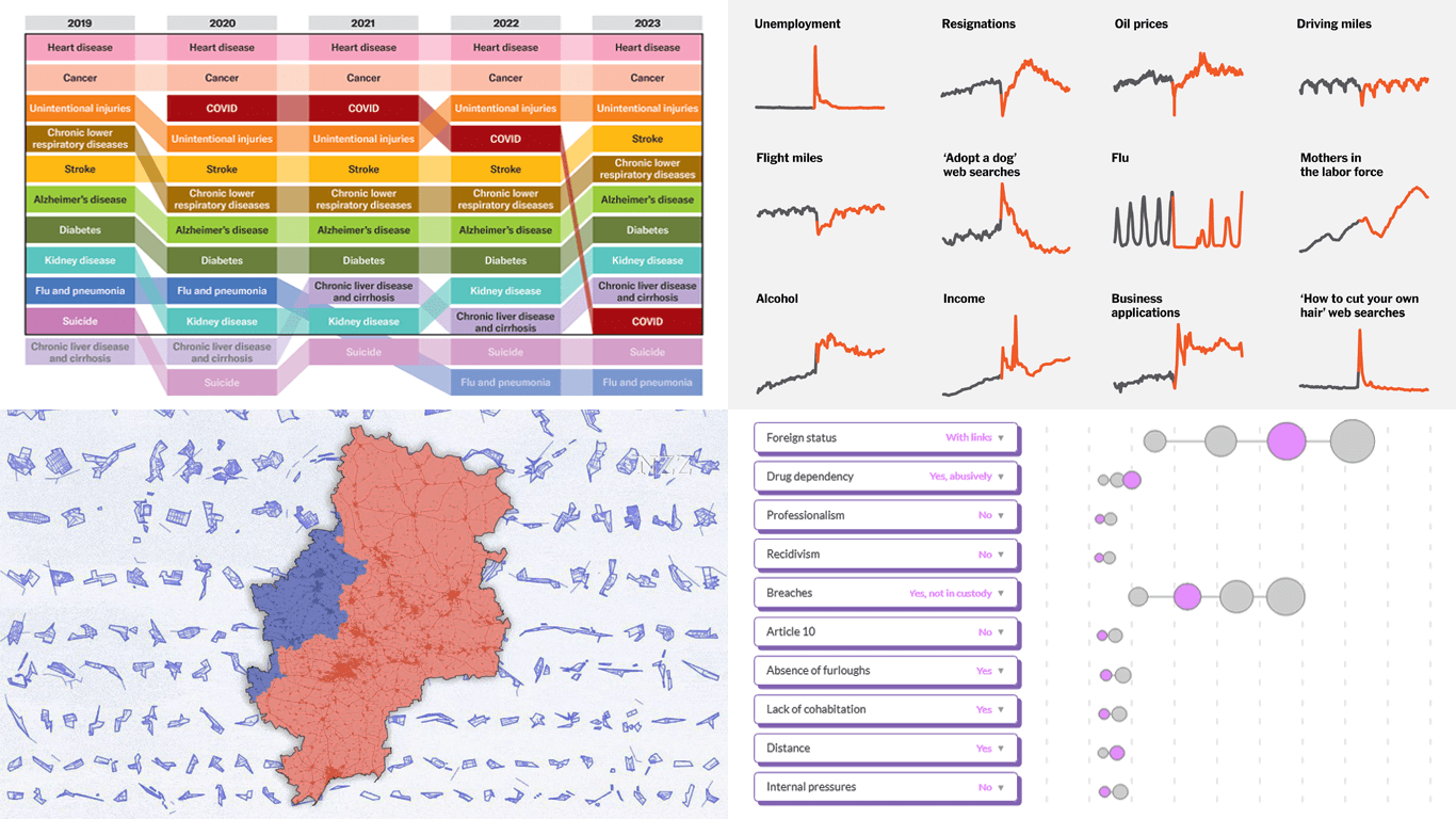
 Data visualization is powerful — when done right, it conveys meaning clearly and helps insights emerge naturally. We continue DataViz Weekly, where we regularly highlight some excellent examples from around the internet, offering a firsthand look at how graphical representation can effectively reveal and clarify information. This time, we think you just need to see the following:
- U.S. imports and tariffs — Reuters
- Coalition scenarios in Germany — Bloomberg
- Hard-right parties in Europe — The Economist
- Emotional experiences of middle schoolers — The Pudding
Read more »
March 5th, 2025 by AnyChart Team
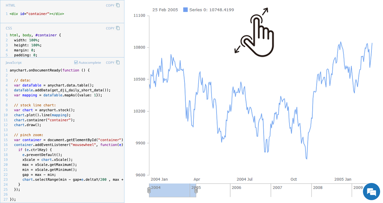 Stock charts are designed to handle large volumes of time-based data, and smooth navigation is key to working with them effectively. One common need is zooming — whether to focus on a specific time range in greater detail or to get a broader view of the data.
In our JavaScript stock charts, zooming works out of the box through the scroller element, which appears by default as the main navigational UI control, making it easy to adjust the visible range on the go. For even greater flexibility, the range selection UI provides extra tools like preset time period buttons and date input fields. You can also activate zooming via mouse wheel scrolling with the zoomOnMouseWheel() method, which corresponds to the two-finger swipe gesture on touchpads and trackpads.
Pinch-to-zoom is another intuitive zooming option. It allows users to zoom in and out naturally on mobile and touch devices by moving two fingers farther apart or closer together. This is also easy to implement — and it is exactly what we cover in this edition of JS Chart Tips. Learn how to add pinch-to-zoom to your JavaScript stock chart!
Read more »