Recap of the Week – 10/17/2015
October 17th, 2015 by Margaret SkomorokhIn this post you will find a quick recap of our Facebook posts and tweets on data visualization, JavaScript, and AnyStock JS charts, which we have shared with you this week:
- AnyStock: Big Data Speed Test – a speed test demonstrating that AnyChart Stock and Financial Charts can render 250,000 data points in less than a second on average PC.
- Gender Pay Gap – a simple and clear data visualization showing the gender pay gap in the United States. Look at it and try to spot the jobs where women are actually paid more than men.
- NodeJS : A quick optimization advice.
- 50 Smartest Companies 2015 – this interactive chart by MIT Technology Review looks quite informative. Massive solar panel factories. Fertility treatments. Friendly robots. Meet the companies reshaping the technology business.
- London Bicycle Usage – an analysis of the frequency bicycles were used in London.
- Categories: AnyStock, HTML5, JavaScript, News
- No Comments »
Recap of the Week – 10/5/2015
October 5th, 2015 by Margaret SkomorokhGood news! This week we have released AnyStock 7.7.0, AnyMap 7.7.0 (with 200+ Map Collection and Bubble Series), and AnyChart 7.7.0 (with new types of Tooltips and the ability to multi-select points). Read more in this blog.
And here are the news on data visualization we have posted on AnyChart Facebook Page and Twitter:
- Time and Place – a successful attempt to find stories from personal data. See how mundane information about one’s movement and activity can be turned into something noteworthy.
- City Layouts – extraordinary views of large capitals and small towns, created using satellite-based information.
- Global threat interactive: What’s the world scared of? Obviously, it depends on the country…
- Categories: AnyChart Charting Component, HTML5, JavaScript, News
- No Comments »
7.7.0 Release
October 1st, 2015 by Margaret SkomorokhA lot of good things come in this grand package: AnyStock HTML5 release, 200+ Map Collection and Bubble Series for AnyMap, and new types of Tooltips along with the ability to multi-select points in AnyChart.
AnyStock 7.7.0 Features
AnyChart Stock and Financial Charts (AnyStock) is a JavaScript-based financial charting solution. AnyStock technology turns your real-time data into highly sophisticated interactive web charts. Designed to display date- and time-based information, AnyStock is an ideal tool for client reporting and performance reporting applications, bringing the analysis of your financial data to life.
 |
Stock Data Engine We are proud to introduce anychart.data.Table, a data layer designed specifically to meet Stock and Financial Charts needs. Beside basic features like data streaming, data mapping, and transaction-based data flow, anychart.data.Table provides the ability to search and select data by DateTime intervals, which allows to implement custom UI elements based on this data. Learn more about Stock Data Engine >> Take a look at the Gallery sample >> |
 |
Ultimate Performance Good rendering performance is essential for Stock and Financial Charts, and AnyStock meets this requirement in full. Our performance tests show the ability to render 300,000 points in less than a second on an average PC. The data stream can append 10,000 data points in 100 milliseconds. You can test it yourself on the performance test page. Take a look at the Speed Test page >> |
This release of AnyStock includes basic chart and plot layout options and basic features (such as Scroller, Legend, and Value Highlighter), along with the Column, Line, and OHLC series types. If you are wondering where the technical indicators, other series types, event markers and drawings are, the answer is simple: in our roadmap! Check it out and see that we will catch up very fast. See the roadmap>>
AnyMap 7.7.0 New Features
 |
Map Collection Without geographical data, it is impossible to create a data visualization related to geographic areas. We are happy to introduce our new Map Collection. For the moment it contains 200+ country maps and one world map. We are planning to extend this collection, and, of course, the ability to create custom maps is available. See Map Collection CDN Page >> Take a look at the Map Collection in AnyChart Playground >> |
 |
Bubble/Proportion Maps Bubble maps (also known as Proportion maps) are usually used to display or compare quantitative data related to geographic areas, be it election results, sales statistics per region, or earthquake magnitude. Take a look at the Map Gallery sample >> Learn more about Bubble/Proportion maps >> |
- Categories: AnyChart Charting Component, AnyGantt, AnyMap, AnyStock, Gantt Chart, HTML5, JavaScript, News
- No Comments »
Recap of the Week – 9/21/2015
September 21st, 2015 by Margaret SkomorokhIn this post you will find a recap of news on data visualization and AnyChart (which we have shared with you this week on AnyChart Facebook Page and here):
- We have created a basic sample to show how you can work with AnyChart JavaScript charts in an SWT application.
- What’s really warming the world? – a nice interactive chat that will help you to explore different factors contributing to global warming.
- Gloam.io – an interactive data visualization of sunrise, sunset, and twilight times. (You can also read an article explaining some interaction details in Gloam.io – http://bit.ly/1UQGsgn)
- Why we still need women’s equality day? – Take a look at this great infographic by TIME and learn some sad numbers.
- 17 Graphs That Are Way Too Real For Introverts.
- Categories: AnyChart Charting Component, HTML5, JavaScript, Uncategorized
- No Comments »
Recap of the Week – 9/4/2015
September 4th, 2015 by Margaret SkomorokhThis week we have posted the following news on data visualization and AnyChart:
- A quick guide demonstrating how to save AnyChart 6 charts as images in Oracle APEX.
- This interactive map portraying Rennes Metropolis inhabitants is quite enjoyable to play around with. The visualization is based on 18 indicators including location of workplace, marital status, number of cars in the household, and so on. In addition, the initial data were cross-referenced, which makes the picture even more detailed!
- These two colorful infographics will help you to find out what insect venoms are made of and which insect’s sting is the most painful. But don’t worry – summer is over 🙂
- How Is Big Data Changing the World? – An article about Big Data in our everyday lives.
- 13 Helpful Diagrams For People Who Only Care About Cheese – “Knowledge is power: the power to eat more cheese” – there is nothing more to add to this. Enjoy the diagrams!
- Categories: AnyChart Charting Component, HTML5, JavaScript, News
- No Comments »
Recap of the Week – 8/29/2015
August 29th, 2015 by Margaret SkomorokhThis week we have posted on Facebook the following information on data visualization and AnyChart:
- We have shared a tutorial explaining how to insert AnyChart JavaScript charts into WordPress posts.
- Android Fragmentation Report – Fragmentation is both a strength and weakness of the Android ecosystem, a headache for developers that also provides the basis for Android’s global reach. This visualization demonstrates the scale of the problem.
- Mapping Migration in the United States – In this interactive map by The Upshot, you can find detailed information on how often Americans migrate from their states of birth. (Each shape represents where the people living in a state were born. Within a state, larger shapes mean a group makes up a larger share of the population.)
- How People Engage with Data Visualisations and Why It Matters – An article by Helen Kennedy, Professor of Digital Society at the University of Sheffield, explaining what is visualization literacy and what skills it requires.
- Categories: AnyChart Charting Component, HTML5, JavaScript, News
- No Comments »
AnyChart, AnyMap, and AnyGantt 7.6.0
August 13th, 2015 by Margaret Skomorokh
We are proud to announce 3 new releases – AnyChart 7.6.0, AnyMap 7.6.0, AnyGantt 7.6.0. Our team has been working hard to make our products even more aesthetically pleasing, and now all AnyChart charts have a new modern look and design (See the New Look and Theming feature). We have also added a number of other great improvements, and here are the most important of them:
AnyChart 7.6.0 New Features
 |
All AnyChart products now support the Theming feature which makes customizing and integrating charts easier. With Theming, you can set similar visual and functional settings for all charts without duplicating your code. Take a look at Gallery samples >> Learn more about Theming >> |
 |
Crosshairs are thin vertical and horizontal lines centered on a data point, which are useful when you want to locate a point precisely on your chart or to analyse data by comparing different charts. Take a look at a Gallery sample >> Learn more about Crosshair >> |
 |
Pie/Donut Charts are popular, nice-looking, and very easy to understand, and now you can make them even more attractive by adding 3D! Take a look at Gallery samples >> Learn more about 3D Pie Chart >> |
AnyMap 7.6.0 Features
- Choropleth Maps provide an easy way to visualize how a measurement varies across a geographic area.
- Ordinal Color Range looks like several boxes of different colors which depend on the palette chosen according to the type of a map and its data.
- Quantitative Color Range is a bar colored with a gradient, its colors depend on the palette of a map and its data.
- Full Compatibility with other Charts – when you need to show any extra information along with a map – no problem! Use AnyMap with any other charts.
AnyGantt 7.6.0 New Features
- Now a double-click on borders of data grid columns resets their width to the default value.
- Added the ability to draw the Baseline above the Actual, see API Reference for details.
- AnyGantt now supports formatting for Data Grid Columns, see API Reference for details.
AnyChart version history: https://www.anychart.com/products/anychart/history/
AnyMap version history: https://www.anychart.com/products/anymap/history/
AnyGantt version history: https://www.anychart.com/products/anygantt/history/
Trial download: https://www.anychart.com/download/
P.S. The set of ready-to-use maps is rather small for the moment, but we will add about a hundred maps in a week, and then the list will just keep growing.
- Categories: AnyChart Charting Component, AnyGantt, AnyMap, HTML5, JavaScript, News
- No Comments »
AnyStock Alpha Preview
August 3rd, 2015 by Margaret Skomorokh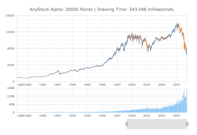
AnyChart Stock 7 is an upcoming addition to new AnyChart 7 HTML5 JavaScript Engine: Financial charting solution that allows to turn your real time data into highly sophisticated charts with interactive capability.
Designed to display large datetime datasets, AnyStock is the ideal tool for client reporting and performance based reporting applications. Reports and Dashboards are visualized with scrolling, drill downs, panning and zoom functionality.
Demo page: https://www.anychart.com/products/anystock/demos/alpha/
What you can see on a demo page is the early Alpha preview of AnyStock, this chart shows dataset of 20.000 points and it usually takes about half a second to be rendered in a modern browser on an average workstation. The title of the chart you see shows results of the real performance benchmark for this chart on your computer.
We are working hard to go into the release stage, polishing all bells and whistles and hoping to make it by September 2015.
New AnyStock will feature amazing speed and all the neat things our customers loved previous versions of in AnyStock, and it will be fully integrated into the new AnyChart 7 Framework and share most of its ideology, settings technique and ease of use – and you will be able to use it along other charts, including those we have in the AnyChart Basic Charts, AnyGantt Gantt Charts and AnyMap HTML5 Maps.
We are convinced that you will be pleased with the result, stay tuned!
- Categories: AnyStock, HTML5, JavaScript, News
- 2 Comments »
AnyChart 7.5.1 Available – new version of our HTML5 charts
July 8th, 2015 by Margaret SkomorokhAnyChart 7.5.1, a bug fix release of our HTML5 charts, is now available. This version contains the following changes:
Improvements
- Improved the Animation feature.
Bug fixes
- Fixed the bug with multiple markers in Circular Gauges.
- Solved the issue with the min/max bubble size in Bubble Charts.
- Fixed the bug with Inside Labels incorrect overlapping in Pie Charts.
We are sorry for any inconveniences caused by the bugs. Our team is constantly working to improve AnyChart and achieve the best quality possible. And you’re always welcome to submit any questions to our support system.
AnyChart version history: https://www.anychart.com/products/anychart/history/
Trial download: https://www.anychart.com/download/
- Categories: AnyChart Charting Component, HTML5, JavaScript, News
- 1 Comment »
Sparks & Associates Chooses AnyChart to Visualize Assessment Results using JavaScript pie chart
July 3rd, 2015 by Margaret SkomorokhToday we are glad to publish a new customer success story – about AnyChart and Sparks & Associates.
 The Actualized Leadership Profile (ALP) is a 77-item self assessment that measures an individual’s dominant motive need and corresponding style of leadership. Based on the seminal works of Abraham Maslow and David McClelland, the ALP measures the degree of self-actualization that is demonstrated in one’s current style of leadership. A customized, full color and confidential report identifies the strengths and limitations in the individual’s current leadership approach.
The challenge was:
- To provide a creative and intuitive visualization of personal assessment results.
- To create a visualization that accepts result parameters from the system’s existing ASP code.
Solution:
- AnyChart JavaScript (HTML5) component was chosen as a solution. The flexibility of the AnyChart.graphics technology allowed to nest several pie charts and create a multi-level JavaScript pie chart not available from other chart vendors.
- AnyChart provides the flexibility to use customized background visualizations.
You can enjoy the full success story here:
|
Sparks & Associates Sparks & Associates Chooses AnyChart to Visualize Assessment Results >> |
Or see other AnyChart Customer Success Stories.
- Categories: AnyChart Charting Component, HTML5, JavaScript, News, Success Stories
- No Comments »