New Data Visualization Examples in DataViz Weekly: Charts of Government Spending, Beer Cities, Fortune 500 Leaders, Cherry Blossom Bloom Date
April 29th, 2017 by AnyChart Team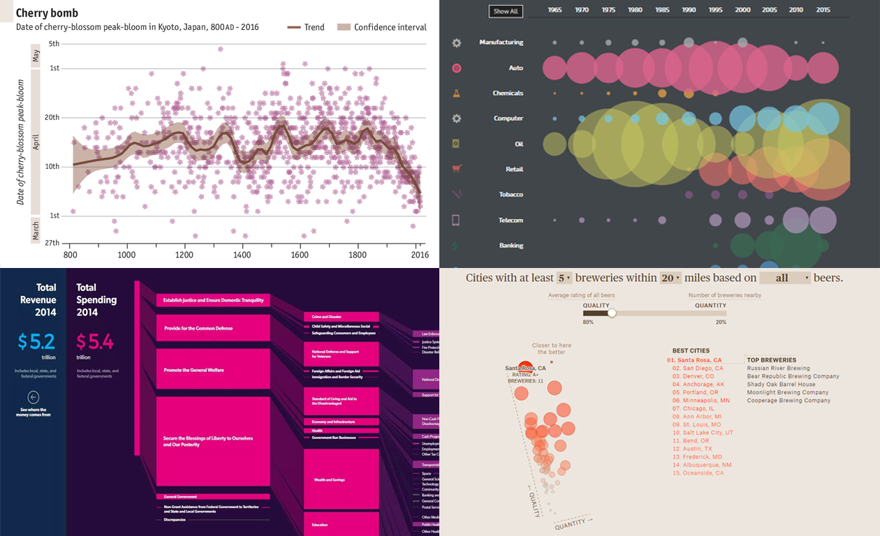 We are glad to present you new data visualization examples within the framework of the weekly recap. These charts – mostly interactive – will definitely catch your eye, if you haven’t seen them before.
The graphics shared today in Data Visualization Weekly are about:
- finding the craft beer brew capital of the U.S.,
- revealing how the date of Japan’s cherry blossom peak-bloom has shifted,
- exploring the evolution of industries atop the Fortune 500 list, and
- making sense of U.S. government spending data.
Now, let’s see all of those cool new data visualization examples.
- Categories: Data Visualization Weekly
- No Comments »
Choose Right Chart Type for Data Visualization. Part 3: Data Over Time (Trend Context)
April 26th, 2017 by AnyChart Team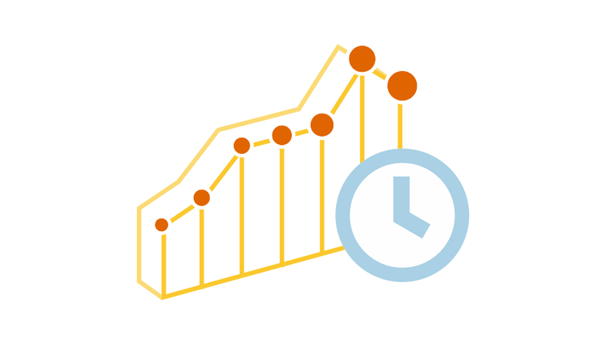 We are continuing the effort to better familiarize you with the world of chart types. This time let’s talk about good ways to visualize and explore Data Over Time.
Watching the change in data over time helps identify trends and dynamics in diverse timeline-based sets of values. Needless to say, choosing a right chart type is very important here. When applying an inappropriate form of visualization to your data, you might end up with an inaccurate idea of what happened in the past, what’s taking place now, and/or what will occur in the future. But we’ll do our best to help you avoid any mistakes in this field so you always make only right decisions based on your date/time data.
So, let’s get to the gist now.
- Categories: Choosing Chart Type, Tips and tricks
- No Comments »
Chart Visualizations of the Week: Data Visualization Weekly
April 21st, 2017 by AnyChart Team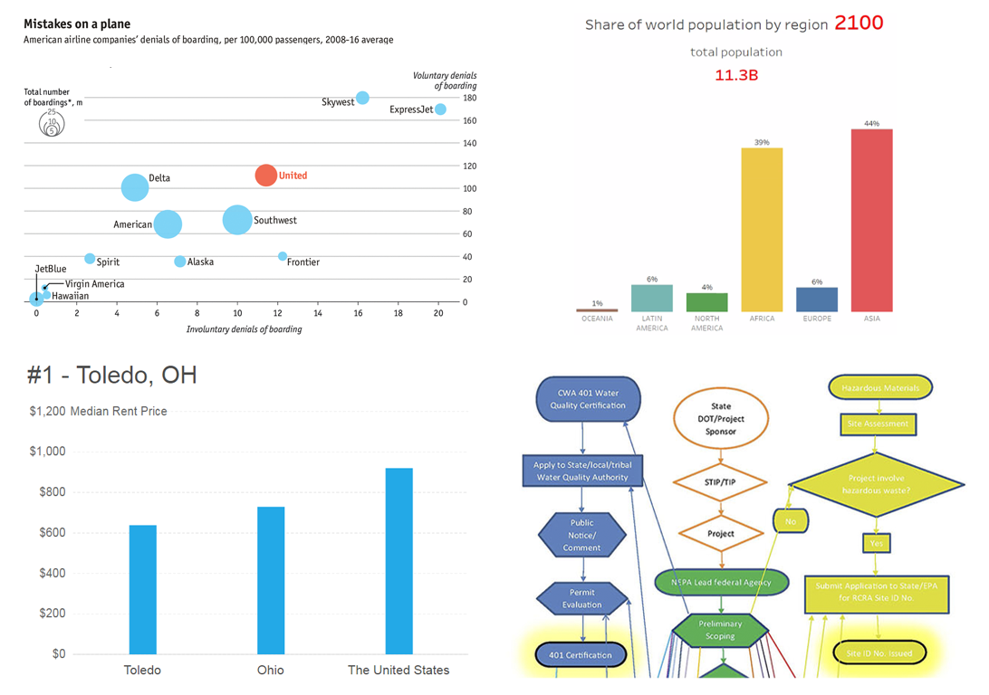 Welcome to the new Data Visualization Weekly collection of interesting chart visualizations of the latest 7 days! In this series, it’s always Friday. Not that we are now part of the T.G.I. Friday’s restaurant chain – not at all! But we usually publish DataViz Weekly posts on Friday, in the Friday mood. And our goal here is to let you heave a sigh of relief after another workweek and simply enjoy some cool chart visualization examples before going to a pub (or exactly from there!), home, or wherever else for a Friday night.
See below for four engaging data visualizations. In particular, there you’ll find the animated chart that became one of the most widely liked and shared tweets with third-party charts in our Twitter account‘s history. And it goes first.
- Categories: Data Visualization Weekly
- No Comments »
Choose Right Chart Type for Data Visualization. Part 2: Data Composition, Parts to Whole
April 20th, 2017 by AnyChart Team Illustrating part-to-whole relationships for further analysis is a very popular objective in data visualization. Basically, it is one of the most widespread ones, e.g. along with data comparison. With that in mind, the second part of the Choose Right Chart Type for Data Visualization series on our blog focuses on how to display Data Composition properly.
In particular, this article will show you the best ways to present the share percentages of simple values, compositional patterns in large data sets and hierarchical data (also with subordination), and stages in a process.
- Categories: Choosing Chart Type, Tips and tricks
- 1 Comment »
JavaScript Charts Library Update 7.13.1 Released for AnyChart, AnyStock, AnyMap, AnyGantt
April 18th, 2017 by AnyChart Team “Sweet April showers do spring May flowers,” once wrote 16th-century English poet Thomas Tusser. Well, our customers already know that AnyChart’s April brings flowers, too! Last year we launched the great 7.10.0 version of the AnyChart JavaScript charts library and, basically, of our whole data visualization product family. Now, in the year of 2017, April brings you another great update.
So, please all greet the 7.13.1 release of AnyChart, AnyMap, AnyStock, and AnyGantt – our cute first spring flowers grown especially for you!
- Categories: AnyChart charting component, AnyGantt, AnyMap, AnyStock, HTML5, JavaScript, News, Qlik
- 2 Comments »
Interactive Data Visualization Examples (Mid-April): New Peculiar Charts and Maps in DataViz Weekly
April 14th, 2017 by AnyChart Team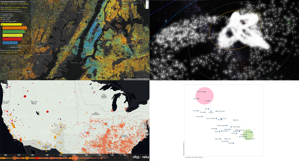 Tired after another workweek? Then now is a great time to lean back and relax and take a quick look at yet another set of interactive data visualization examples! We have shared these visualizations on social networks just recently. They got pretty much attention of our followers (and beyond). So their way to Data Visualization Weekly on the AnyChart blog was quite quick and simple.
Today we are presenting you with interactive visualizations of meteor streams, lynchings in America, JS quadrant chart of top 30 countries by quality of life plotted also according to their pollution indexes, and educational attainment in the United States.
- Categories: Data Visualization Weekly
- No Comments »
Choose Right Chart Type for Data Visualization. Part 1: Data Comparison
April 12th, 2017 by AnyChart Team When it comes to creating data analytics and reporting solutions, choosing the right chart type for a certain data visualization task remains a common challenge. What do you pick for data comparison, studying distribution, observing data over time, or some other purpose? It can be very tricky! To help you overcome this challenge to the best effect, today we are launching a series of articles titled Choose Right Chart Type for Data Visualization. The series is designed to quickly explain what chart types you should pick for different purposes of data analysis. With that said, each article here will be devoted to a specific, yet still big question that you want your data to answer.
The current (first) guide of the series is all about chart types that work best for finding out the differences in data: Data Comparison. In fact, it is one of the most frequently established purposes of data analytics. And sometimes many people use wrong chart types to fulfil it correctly. Now, finally, let’s get to the very point and see what visualization forms work best for comparing data.
- Categories: Choosing Chart Type, Tips and tricks
- 4 Comments »
“Interactive Maps” Edition | Data Visualization Weekly
April 7th, 2017 by AnyChart Team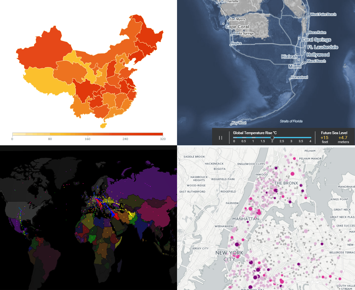 Today’s Data Visualization Weekly issue is fully devoted to interactive maps. To put it precisely, we’ll highlight four of them this time. These maps have been popular on the Web and also most followed on our Facebook and Twitter accounts within the last days. So they’ve completely deserved to be mentioned here.
Here’s what interactive maps we are sharing with you today:
- Lead-Tainted Water Fountains in NYC Schools,
- Surging Seas,
- Asylum Seekers’ Paths, and
- China’s Regions and Counties.
- Categories: Data Visualization Weekly
- No Comments »
How to Name a Graph: Tips for Writing Great Chart Captions
April 5th, 2017 by AnyChart Team Charts are one of the best ways to display your data in a way that’s meaningful to readers, but if you don’t have great chart captions, your readers may interpret that meaningful information incorrectly.
Readers’ attention spans are waning by the second. In fact, humans now have a shorter attention span than goldfish (yes that cute, little fish you won from the carnival can pay attention better than the average person). This means that most people are scanning through your work. Without a clear, concise chart caption, your chances of getting your message across are slim.
Fear not! Here are some tips to help you come up with excellent chart captions, titles for graphs and dashboards.