 Today’s Data Visualization Weekly issue is fully devoted to interactive maps. To put it precisely, we’ll highlight four of them this time. These maps have been popular on the Web and also most followed on our Facebook and Twitter accounts within the last days. So they’ve completely deserved to be mentioned here.
Here’s what interactive maps we are sharing with you today:
- Lead-Tainted Water Fountains in NYC Schools,
- Surging Seas,
- Asylum Seekers’ Paths, and
- China’s Regions and Counties.
DataViz Weekly: March 31, 2017 – April 7, 2017
Map of Lead-Tainted Water Fountains in NYC Schools
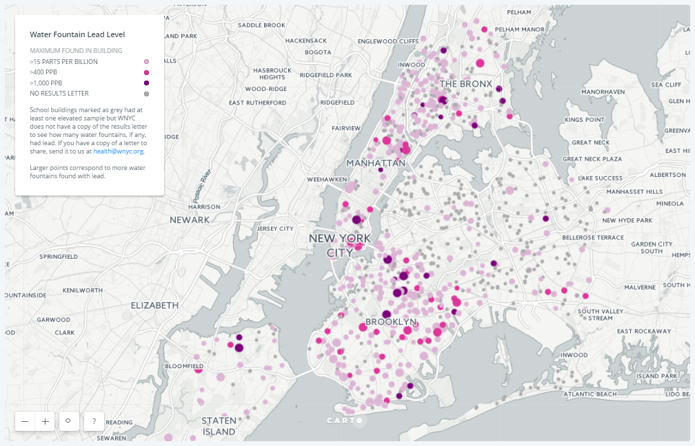
Water fixtures in a number of New York City’s public schools were reported to have been tested positive for lead. While the Department of Education claims to keep the things under control, the news indeed shocked a lot of parents. And if you are wondering what had caused the unsafe level of lead to get to the water fountains in schools, here’s an explanation of an official at the New York City Department of Health and Mental Hygiene: “This is a flushing issue.” According to further details shared, consuming more water in schools “would clean the pipes out and protect the water supply.”
In the meantime, WNYC made an interactive map that displays all schools with lead-positive water fountains. Check it out to learn more on the issue. WNYC also welcomes any new data to keep the visualization up-to-date and as comprehensive as possible.
Interactive Map of Surging Seas: Before The Flood
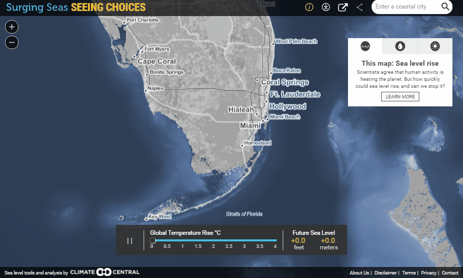
Concerns about climate change are likely to remain very topical and, basically, stay on the rise. Well, it is not surprising, because the facts speak for themselves, according to scientists.
To explain what is going to happen if global warming persists, Climate Central created an interactive map titled Surging Seas now published on the Before The Flood website. We can clearly see on this data visualization the expected consequences of the increase in global temperature and of the subsequent sea level rise. Scary? Yes, it is. For example, we can say goodbye to South Florida if the temperature rises just a little bit. And that’s not all! Just enter a coastal (or, basically, any other) city in the search box located in the interactive map’s top right corner, and you’ll see whether the flood is expected here and there as well as how strong it is going to be.
Map of Asylum Seekers’ Paths
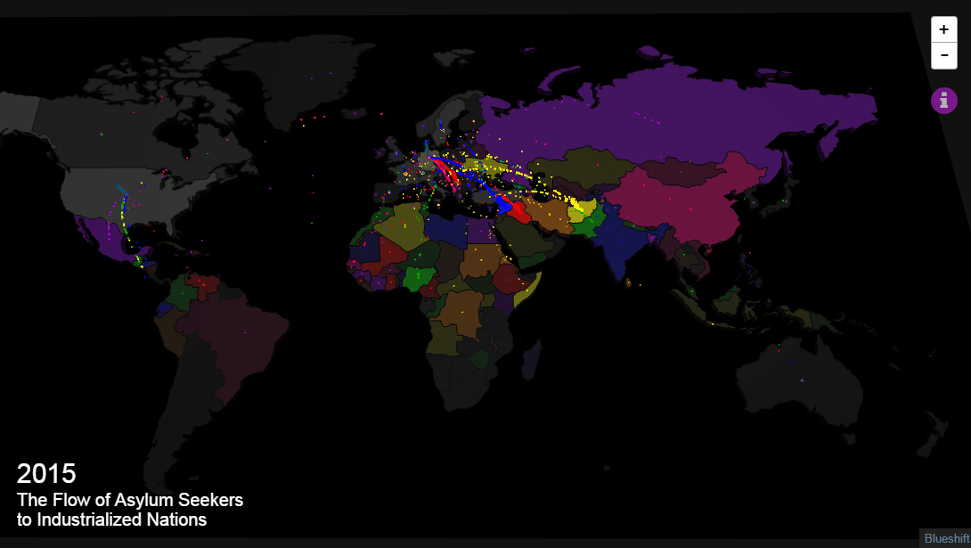
Foreign Policy published a cool interactive map that shows where asylum seekers went from and to between the years of 2013 and 2016.
This visualization, created by Metrocosm, is based on U.N. Refugee Agency’s data. The data covers more than 4 million asylum applications submitted to 40+ industrialized countries.
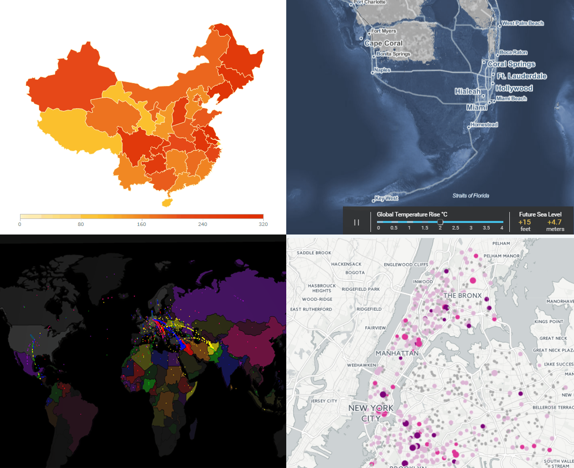
Interactive Maps of China’s Regions and Counties: Drill Down
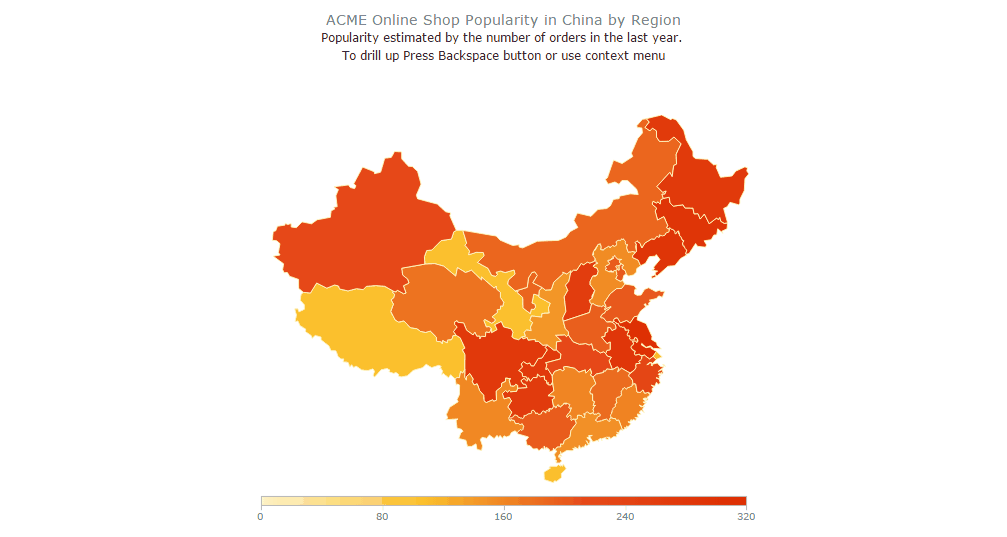
Nowadays, Drill Down is a must-have feature in a geo-data visualization software. It ensures the best user experience when there’s a need to display geographical and location-related information on more than one level. For example, this interactive choropleth map example created with the AnyMap JS Maps library allows the viewer to see and analyze data both by region (within the country) and by county (within some region). To put it more precisely, the default view is the Chine-wide map that can be used to compare regions by magnitude of the variable under research. Clicking on a certain region makes the map “zoom” in that region and start displaying county-specific data within the region. Drilling up returns us to the country-wide view.
If you are interested in data visualization as much as we are, follow our Data Visualization Weekly series. In this issue, we’ve covered four recently shared interactive maps. Next Friday we’ll take a look at what other peculiar masterpieces the next week will have brought us. In the meantime, have a wonderful weekend time!
- Categories: Data Visualization Weekly
- No Comments »