 We are glad to present you new data visualization examples within the framework of the weekly recap. These charts – mostly interactive – will definitely catch your eye, if you haven’t seen them before.
The graphics shared today in Data Visualization Weekly are about:
- finding the craft beer brew capital of the U.S.,
- revealing how the date of Japan’s cherry blossom peak-bloom has shifted,
- exploring the evolution of industries atop the Fortune 500 list, and
- making sense of U.S. government spending data.
Now, let’s see all of those cool new data visualization examples.
DataViz Weekly: New Data Visualization Examples, April 21, 2017 – April 28, 2017
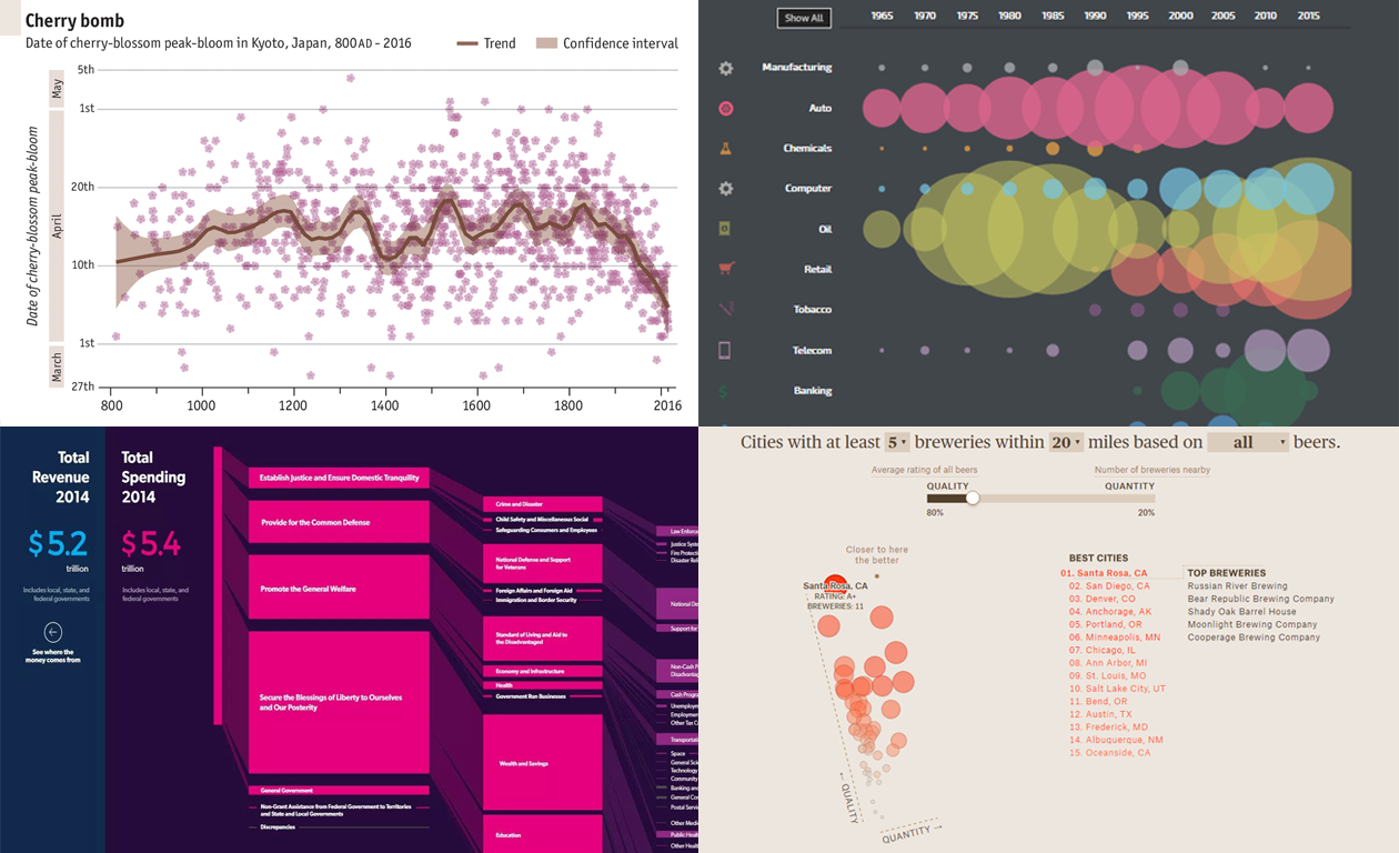
What City is America’s Craft Beer Capital?
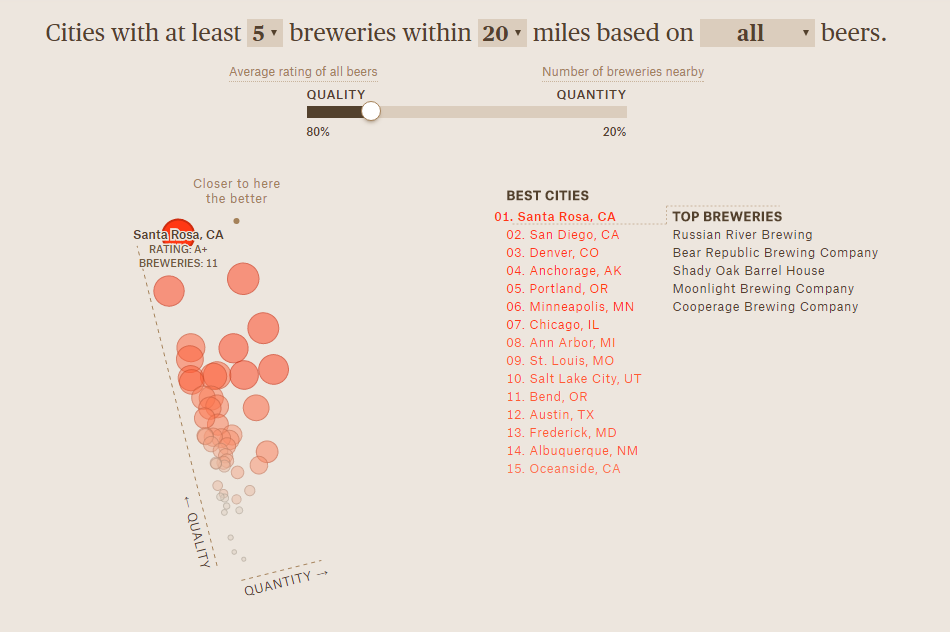
ThePudding‘s Editor Russell Goldenberg created a stunning data visualization in (successful) attempt to find the craft beer capital of the United States. Analysis of data about 1,600 breweries all over the country brings quite a surprising result. The U.S. microbrew capital is Santa Clara, CA, whereas, for example, New York City takes only the 16th position on the list.
Check out this interactive, new data visualization example to learn more or simply for inspiration. And do not forget to play with the chart in the middle of the article (pictured above): adjust the criteria according to your own preferences and find out where you should go in search of cool craft beer.
Climate Change Makes Japanese Cherry Blossom Bloom Earlier
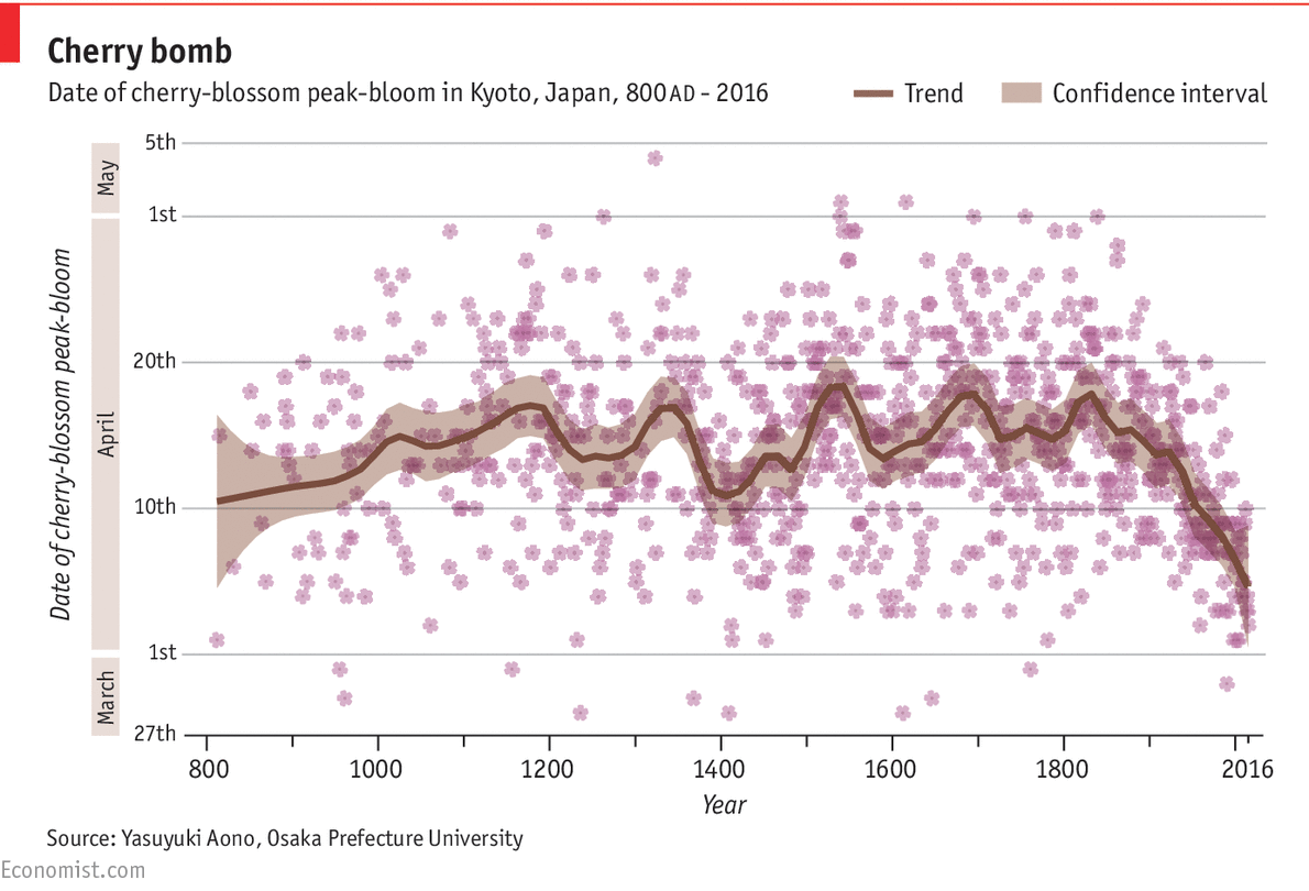
The Japanese cherry blossom now full-flower in very early April, which is earlier than ever. And the date of the peak-bloom keeps on shifting further. Experts say, climate change is the reason.
Take a look at this nice chart by The Economist to observe cherry blossom bloom data for Kyoto, Japan, that dates back more than 1,000 years.
Top of Fortune 500: How Industries Changed Since 1965
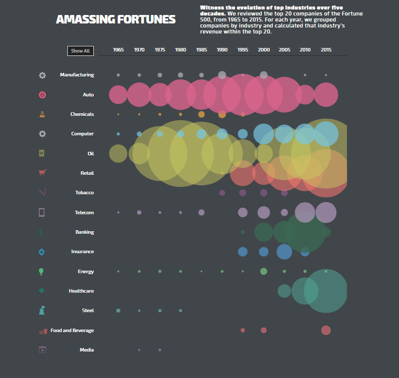
Amassing Fortunes is another peculiar one of new data visualization examples. Using bubbles of different size and color spread along the 1965-2015 timeline, the chart displays how industries evolved during that period. The methodology used here is quite simple: the analysis is based on exploring the composition of the top 20 companies from the Fortune 500 list.
USA Facts: Government Spending Data Visualized
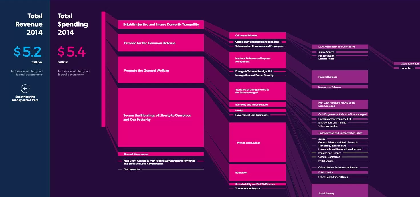
Microsoft’s former CEO Steve Ballmer launched USAFacts.org, a great interactive project that presents U.S. government financial data. It allows everyone to quickly find necessary government data and analyze how money is spent. Actually, even if you are not related to the U.S. too much, you’ll find it all interesting, not to mention a nice interactive visualization design.
And just a few more of useful links. In this great talk at TEDxRiga, Mauro Martino from IBM’s Cognitive Visualization Lab speaks about visualizing the artificial intelligence (and about related challenges). And here’s a nice example on how you can use interactive JavaScript maps (with zoom controls, arrows, etc.) for storytelling with the help of data visualization.
Good luck with everything! Make sure to check our blog next Friday for another portion of worth-seeing new data visualization examples!
- Categories: Data Visualization Weekly
- No Comments »