Insightful Data Visualizations You Need to See — DataViz Weekly
March 7th, 2025 by AnyChart Team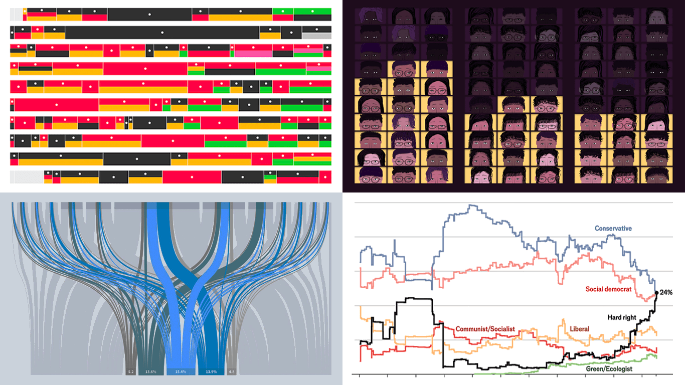 Data visualization is powerful — when done right, it conveys meaning clearly and helps insights emerge naturally. We continue DataViz Weekly, where we regularly highlight some excellent examples from around the internet, offering a firsthand look at how graphical representation can effectively reveal and clarify information. This time, we think you just need to see the following:
- U.S. imports and tariffs — Reuters
- Coalition scenarios in Germany — Bloomberg
- Hard-right parties in Europe — The Economist
- Emotional experiences of middle schoolers — The Pudding
- Categories: Data Visualization Weekly
- No Comments »
Best Data Visualizations of 2024 — DataViz Weekly
January 17th, 2025 by AnyChart Team In 2024, data visualization remained a vital tool for exploring complex topics and presenting insights in engaging ways. From global conflicts and environmental challenges to cultural phenomena and historical trends, charts and maps provided valuable perspectives and captivated audiences.
This special edition of DataViz Weekly highlights the best data visualizations of 2024. Featuring projects selected by FlowingData, The Pudding, and the Global Investigative Journalism Network (GIJN), as well as year-in-review collections from leading media sources, it offers a curated look at some of the most compelling visual storytelling created during the year. All aboard!
- Categories: Data Visualization Weekly
- No Comments »
Awesome New Data Visualization Works — DataViz Weekly
November 15th, 2024 by AnyChart Team Welcome back to DataViz Weekly, where we spotlight the most awesome data visualization works we have recently come across. Check out the projects we’re diving into this time:
- Love songs: death or evolution? — The Pudding
- Historical dry streaks in NYC — Bloomberg Green
- NYC subway ridership in detail — Subway Stories
- Vote swings in U.S. presidential elections — NYT
- Categories: Data Visualization Weekly
- No Comments »
Fresh Data Visuals That Impressed Us — DataViz Weekly
November 4th, 2024 by AnyChart Team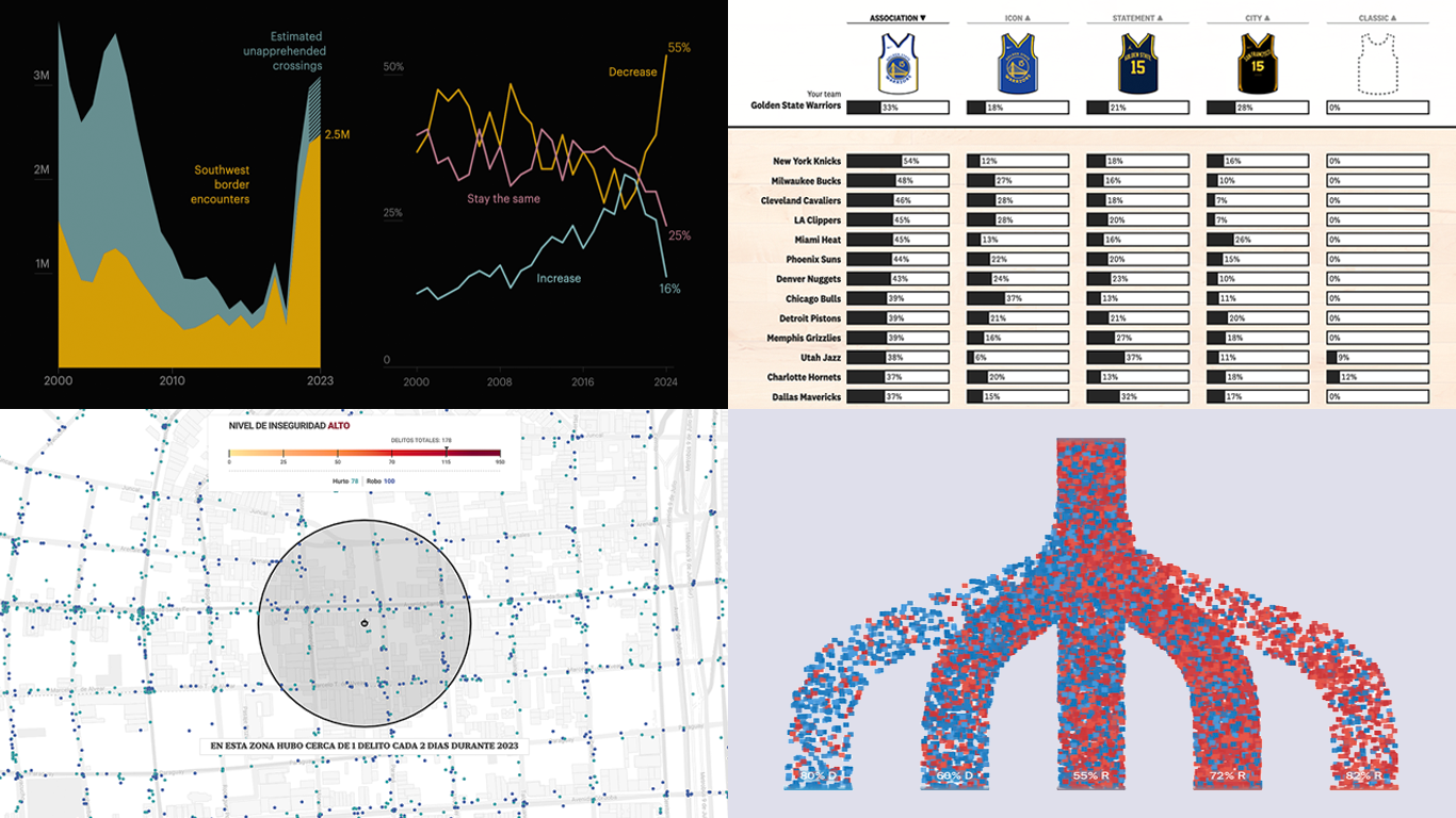 We’re a bit behind schedule after last week’s big release of updates for our Qlik Sense extensions, including the transformative AI Splits feature in the Decomposition Tree. But finally, here we are with a fresh edition of DataViz Weekly! Check out the projects with charts and maps that stood out to us most lately:
- U.S. immigration trends in historical context — ProPublica
- Crime trends in Buenos Aires — LA NACION
- Evolution of NBA uniform colors — The Pudding
- Internal migration and political polarization in the United States — The Upshot
- Categories: Data Visualization Weekly
- No Comments »
New Data Visualization Projects Worth Checking Out — DataViz Weekly
July 19th, 2024 by AnyChart Team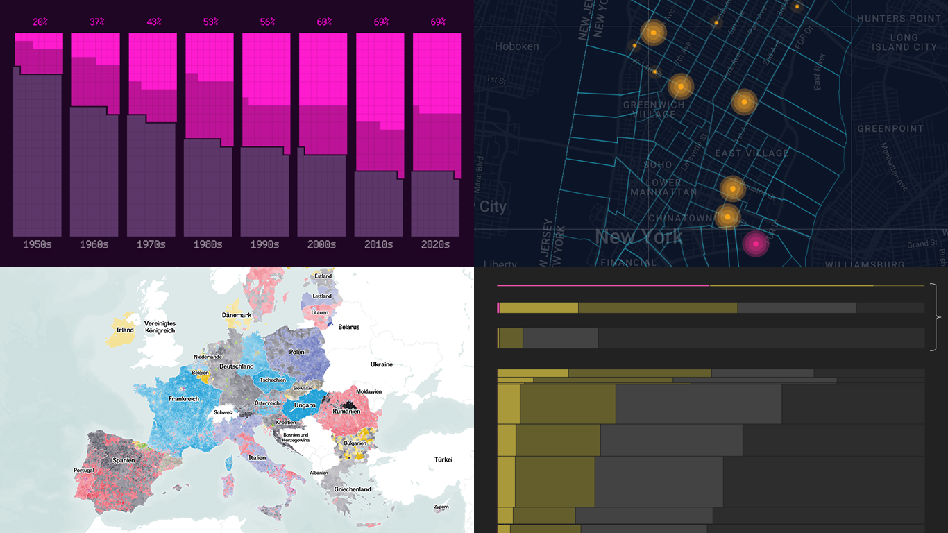 Data is easier to explore and analyze when visualized. If you’re looking for practical examples, you’ve arrived at the right place. DataViz Weekly is here to introduce you to some new data visualization projects we have found on the web.
- NYC congestion zone crash tracker — Transpo Maps
- 2024 European Parliament election map — ZEIT ONLINE
- Global hunger insights — Reuters
- Evolution of sci-fi films — The Pudding
- Categories: Data Visualization Weekly
- No Comments »
New Data-Driven Stories Worth Exploring — DataViz Weekly
April 19th, 2024 by AnyChart Team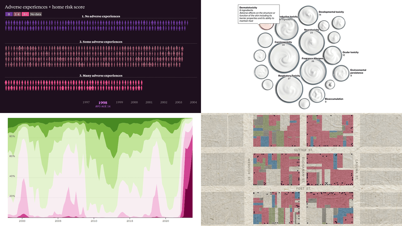 This week’s DataViz Weekly showcases a quartet of compelling data-driven stories, each powered by the adept use of data visualization techniques. These narratives not only inform but inspire, perhaps sparking creative concepts for your upcoming projects.
Here are the visual stories featured in this issue:
- Unraveling the hold of historical mortgage rates in the U.S. — The Upshot
- Retelling the transformation of San Francisco’s Japantown after Roosevelt’s Executive Order 9066 — The San Francisco Chronicle
- Revealing hidden risks in common fragrances — Bloomberg
- Exploring the persistent shadows of teen adversity — The Pudding
- Categories: Data Visualization Weekly
- No Comments »
Best Data Visualizations of 2022 — DataViz Weekly
December 30th, 2022 by AnyChart Team 2022 has been fruitful in terms of data visualizations for every taste and interest. On DataViz Weekly, we’ve shown you more than 200 awesome projects as great examples of effective charting and mapping in action. Today, in the year’s last edition, let’s look at the best data visualizations of 2022 through the eyes of third-party experts!
Find out which projects made it to the “best of the year” selections of Nathan Yau, DataJournalism.com, The Pudding, and Kenneth Field.
- Categories: Data Visualization Weekly
- No Comments »
Amazing New Data Graphics That Really Caught Our Attention — DataViz Weekly
December 23rd, 2022 by AnyChart Team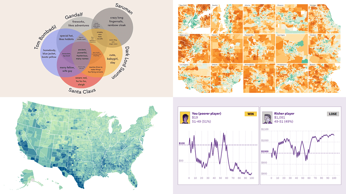 While the Christmas spirit is already in the air, join us for a quick look at some amazing new data graphics that really caught our attention these days. And you’ll even know what Santa Claus has in common with Gandolf, Dark Lord Sauron, and Tom Bombadil. So, here’re the data visualizations featured in this DataViz Weekly:
- Inevitability of the super rich — The Pudding
- Adult illiteracy across the United States — ProPublica
- Carbon emissions footprint per household across the United States — The New York Times
- Intersections between Santa Claus and Tolkien’s characters — Tea with Tolkien
- Categories: Data Visualization Weekly
- No Comments »
Impressive New Visualizations Allowing Data to Speak — DataViz Weekly
December 2nd, 2022 by AnyChart Team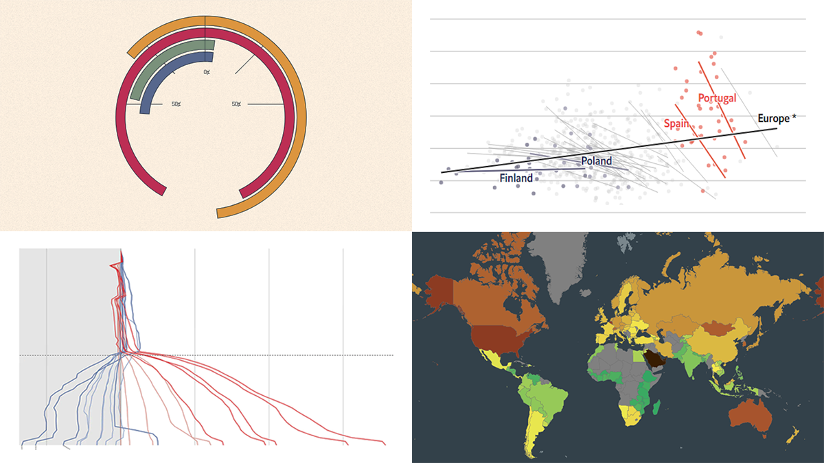 We continue the DataViz Weekly series with a new collection of interesting charts and maps curated from around the internet. Today, we want to put a spotlight on the following impressive visualizations that truly let data speak:
- Winter death toll in Europe — The Economist
- Upward mobility from personal experience — The Pudding
- Shifts in Democrat and Republican follower counts on Twitter under Elon Musk — The Washington Post
- Carbon footprint by country — Electricity Maps
- Categories: Data Visualization Weekly
- No Comments »
Looking at Some Awesome New Graphs & Maps — DataViz Weekly
July 29th, 2022 by AnyChart Team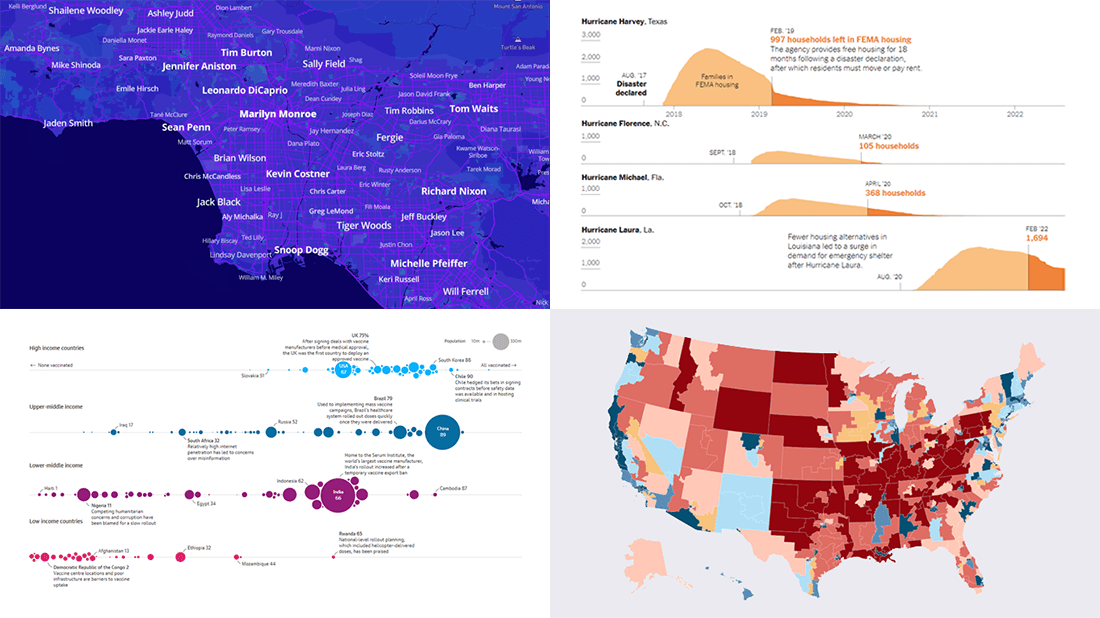 It’s time to check out some awesome new graphs and maps! In this DataViz Weekly roundup, we are glad to put a spotlight on the following great data visualization works:
- Birthplaces of notable people worldwide — Topi Tjukanov
- Global COVID-19 vaccine inequality — The Guardian
- New congressional district boundaries — CNN
- Post-disaster displacements in America — The New York Times
- Categories: Data Visualization Weekly
- No Comments »