Data Analysis Through Visualization in New Examples: Citywide Migration, Cost of Living, #JobsNotMobs, Urban Evolution — DataViz Weekly
November 16th, 2018 by AnyChart Team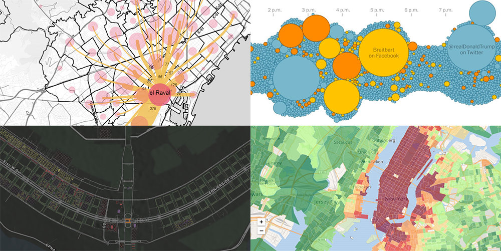 With visualization, data analysis can get easier, faster, and more insightful. In this DataViz Weekly article, we’ll share a few more interesting practical examples we’ve recently come across:
- internal migration paths in Barcelona;
- cost of living in the United States;
- #JobsNotMobs meme transition onto a slogan;
- urban evolution of Brasilia.
- Categories: Data Visualization Weekly
- No Comments »
2018 Midterm Election Results in Data Visualization — DataViz Weekly
November 9th, 2018 by AnyChart Team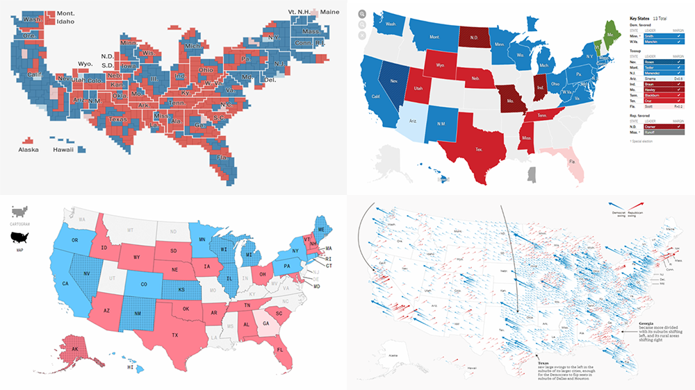 The 2018 midterm election in the United States of America has been among the hottest topics on the media agenda for quite a long time. Various publications were covering the course of the House, Senate, and governor campaigns, sharing forecasts from analysts, and so on. Now that voting is over, all eyes are on the outcome.
Today’s DataViz Weekly will show you how several prominent publications communicated the results of the midterms to their readers with the help of data visualization techniques: The New York Times, The Washington Post, Bloomberg, and The Guardian. So get ready for a lot of choropleth maps! But not only.
- Categories: Data Visualization Weekly
- 1 Comment »
Charting Projects About Population, Voting, Traffic, and Buildings — DataViz Weekly
October 19th, 2018 by AnyChart Team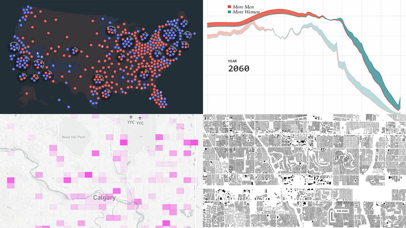 Another seven-day wait is over, and a new DataViz Weekly issue is here! This time, we offer you to look at the following interesting charting projects:
- U.S. population projections through 2060;
- House of Representatives elections from 1840;
- Calgary traffic incident prediction;
- every building in America.
- Categories: Data Visualization Weekly
- No Comments »
Captivating Visualizations of Data About Recipe Ingredients, Social Connectedness, Decade Since Financial Crisis, and U.S. Government Spending — DataViz Weekly
September 21st, 2018 by AnyChart Team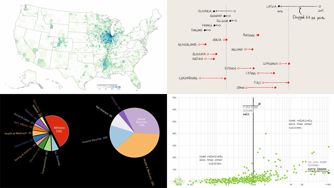 Take a look at another four new interesting projects with captivating visualizations that we’ve come across just about now. As always happens on DataViz Weekly, we start with a quick list of topics and then get straight down to the show:
- food ingredients by cuisine;
- social connectedness across the United States;
- ten years since the 2008 global financial crisis;
- U.S. federal government spending from 1962 to 2023.
- Categories: Data Visualization Weekly
- No Comments »
Interesting Data Graphics About Warming, Debt, Commuting, and China — DataViz Weekly
September 7th, 2018 by AnyChart Team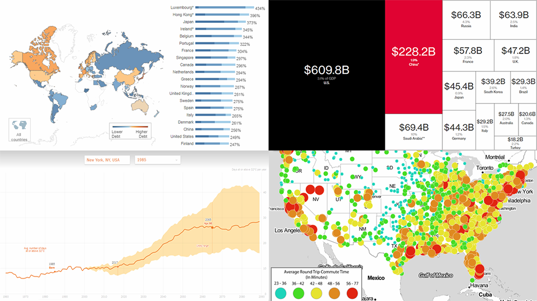 Check out the new issue of DataViz Weekly on the AnyChart blog, showing you four interesting data graphics-based stories and projects on the following topics:
- how much hotter your hometown is than when you were born;
- global debt;
- commute times in U.S. cities;
- China as an aspiring superpower.
- Categories: Data Visualization Weekly
- No Comments »
California Wildfire in Maps and Charts — DataViz Weekly
August 17th, 2018 by AnyChart Team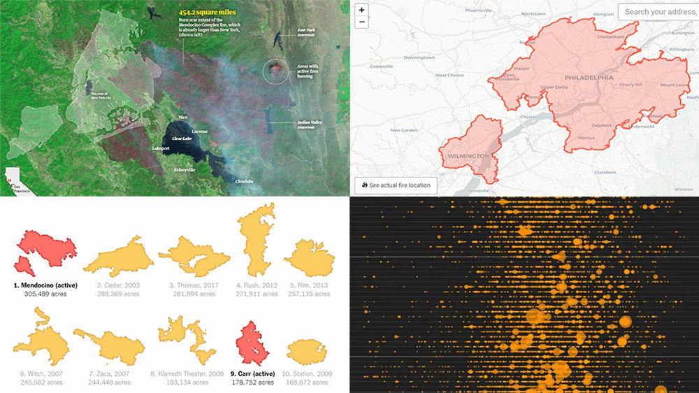 A new record-breaking wildfire season in California is in full swing, occupying the headlines of many national and even world media outlets. To better analyze and present what’s going on, data and graphics experts created various maps and charts. Today’s issue of Data Visualization Weekly features some interesting ones of them, and in fact, is fully dedicated to the topical California wildfire problem.
- Categories: Data Visualization Weekly
- 1 Comment »