 With visualization, data analysis can get easier, faster, and more insightful. In this DataViz Weekly article, we’ll share a few more interesting practical examples we’ve recently come across:
- internal migration paths in Barcelona;
- cost of living in the United States;
- #JobsNotMobs meme transition onto a slogan;
- urban evolution of Brasilia.
Examples of Visualizations for Data Analysis: November 9, 2018 — November 16, 2018
Internal Migration Routes in Barcelona
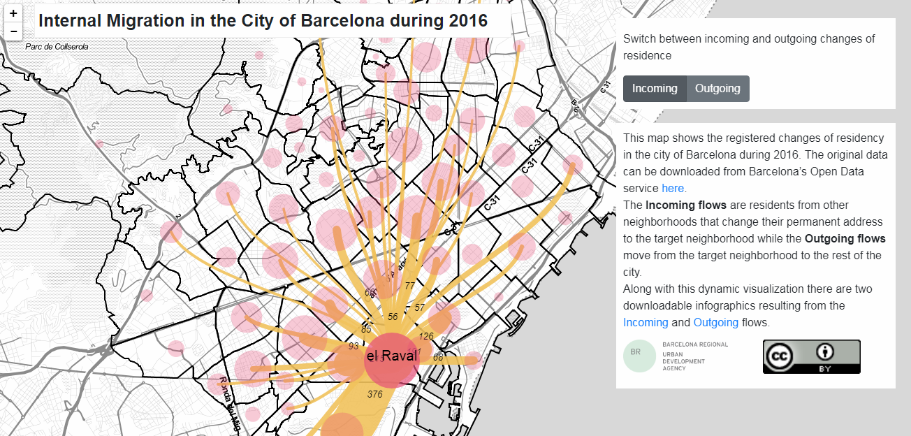
Barcelona’s urban development agency Barcelona Regional visualized the internal migration paths in the city. Based on data from the Open Data BCN portal, the authors mapped all incoming and outcoming flows of residents for each neighborhood as they had been officially recorded during the year of 2016. In addition to the bubble and connector map-based interactive geovisualization, two pieces of infographics are available for download. These take advantage of choropleth maps to show the outgoing and incoming flow for every neighborhood one by one.
Cost of Living in U.S.
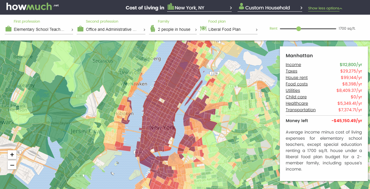
Cost information graphics website Howmuch.net published an interactive choropleth map that reveals the cost of living across the United States and whether it is affordable for you. There you can start with selecting the area you want to check. After that, choose one of the ten personal profile suggestions to view data based on your specific family and income needs. If none of the pre-built options fits, make up a custom profile by entering your first and second professions, family details, food plan, and rent size. Read more about the tool in the description.
#JobsNotMobs Meme Spread Across Internet
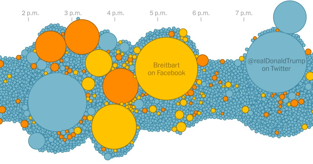
Kevin Roose and Keith Collins made an interesting visual story of how the #JobsNotMobs meme had developed from a simple three-word expression into an important political slogan in less than a couple of weeks, days before the November 2018 midterms. Follow the timeline from October 11 through October 20 to overview the expansion.
Urban and Architectural Evolution of Brasilia
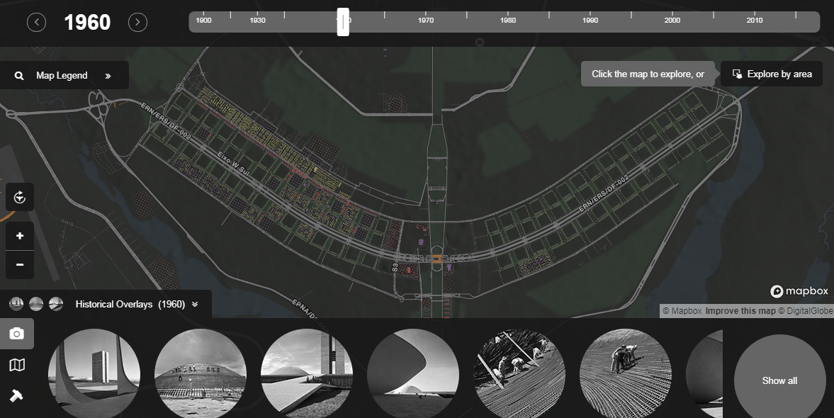
Rice University’s Humanities Research Center launched pilotPlan, an interactive atlas that visualizes the architectural and urban development of Brazil’s capital, Brasilia. Check it out for historical maps, photos, and plans, providing insight into how the city looked and evolved over time. See the authors’ earlier dataviz project imagineRio for a similar look at the urban development history of Rio de Janeiro.
***
We’ve also seen a lot of visualizations about the results of the 2018 midterm elections in the U.S. They are literally everywhere and you’ll quickly find a bunch of them if you want. Meanwhile, check out last week’s DataViz Weekly that showcases some of the first midterms results data visualizations.
- Categories: Data Visualization Weekly
- No Comments »