Impressive New Data Visuals for Your Inspiration — DataViz Weekly
October 11th, 2024 by AnyChart Team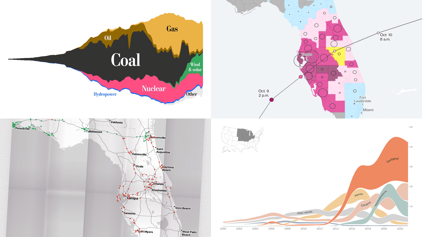 Ready for another dose of impressive data visuals? DataViz Weekly is back with a fresh selection of projects that use powerful graphics to help unravel various trends and patterns. Here are our top picks from what we’ve most recently come across out there:
- End of the UK’s coal power era and lessons for the world — The Washington Post
- Hurricane Milton’s impact and power outages — Bloomberg
- Waffle House Index for Florida under and after Milton — Riley Walz
- Opioid overdose deaths across the United States — NYT Opinion
- Categories: Data Visualization Weekly
- No Comments »
Great New Data Visualizations Worth Your Attention — DataViz Weekly
July 15th, 2022 by AnyChart Team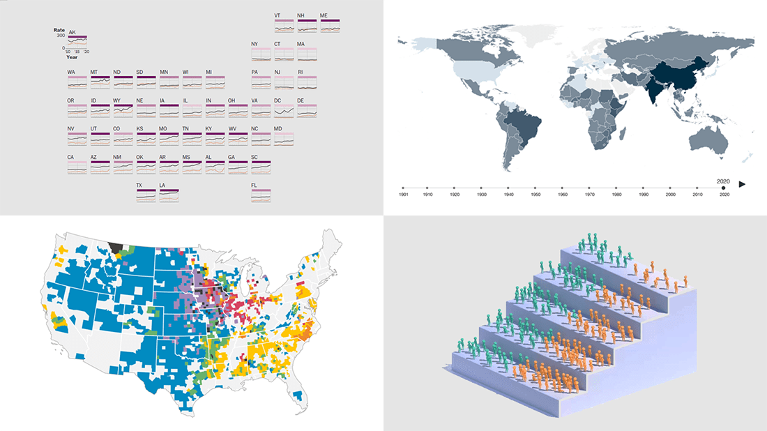 Eager to see some great data visualizations? Your wait is over! DataViz Weekly is back to the AnyChart blog to make sure you have not missed these four new works as they are definitely worth checking out!
- Gun deaths in America — The Washington Post
- Health effects of climate change worldwide — Wellcome
- Economic success of the U.S. immigrants’ children — The New York Times Opinion
- Livestock vs human populations in the United States — Data Stuff
- Categories: Data Visualization Weekly
- No Comments »
Great Recent Data Graphics Worth Looking At — DataViz Weekly
October 22nd, 2021 by AnyChart Team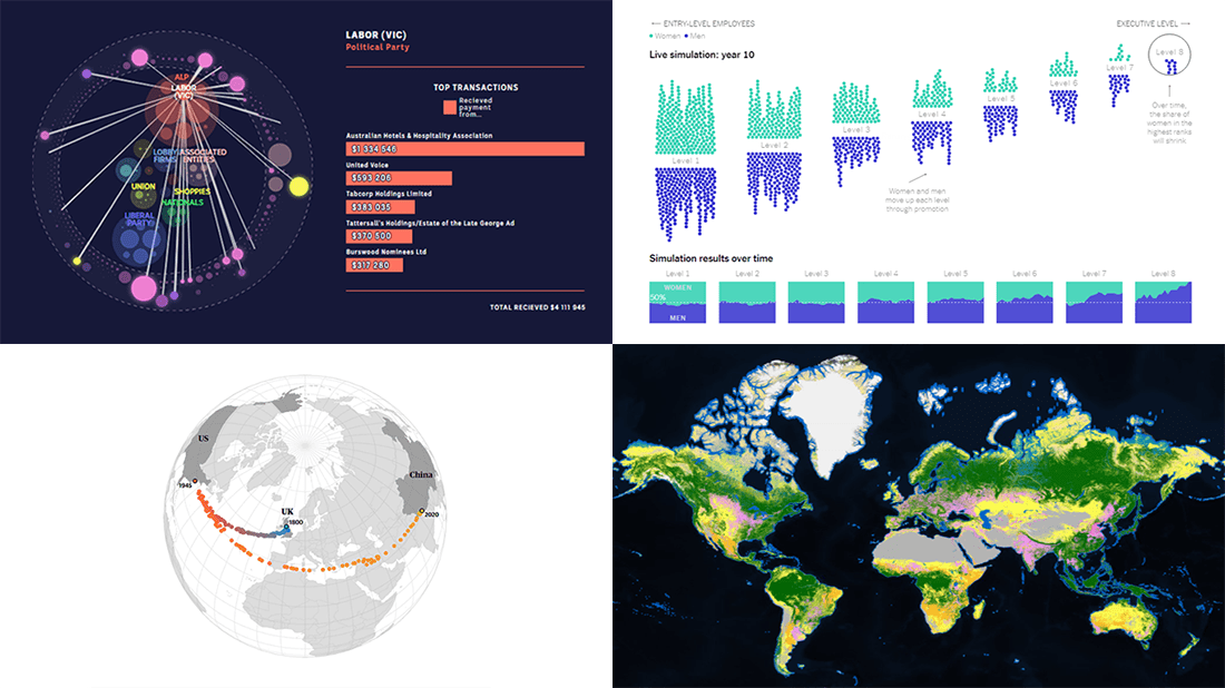 It’s time for DataViz Weekly! Check out the most interesting data visualizations that have recently come to our attention!
- Political donations from the gambling industry in Australia — ABC News
- Land cover worldwide — ESA
- Gender bias in the workplace — NYT Opinion
- World’s carbon “center of gravity” from 1800 through 2020 — The Guardian
- Categories: Data Visualization Weekly
- No Comments »
Excellent Examples of Data Graphics from Around Internet — DataViz Weekly
August 27th, 2021 by AnyChart Team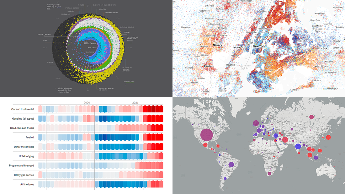 Are you ready for another set of excellent data graphics examples? It’s time! The following projects made it to the newest DataViz Weekly digest — see the list below and keep reading for a closer look!
- Average weekday in the life of Americans — Nathan Yau
- Race and ethnicity across the United States — CNN
- Inflation in the United States — NYT Opinion
- COVID-19 spread across the world over time — Olivia Jack
- Categories: Data Visualization Weekly
- No Comments »
Visualizing Vaccination Rates, Political Bubbles, Curry’s Stats, World Justified — DataViz Weekly
May 7th, 2021 by AnyChart Team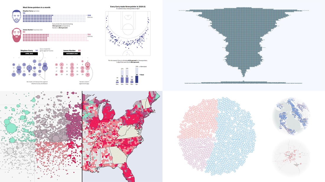 Every week, we choose the four most interesting visualizations from all we came across these days and present them to you in a quick review. Below is a list of the ones that made it to this new DataViz Weekly — take a glance and keep reading for a closer look at each!
- Vaccination rates in comparison with case metrics across the U.S. — McKinsey & Company
- Political bubbles across the U.S. — The New York Times Opinion
- Stephen Curry’s record-setting April scoring spree — The Washington Post
- World justified, left-aligned, centered, right-aligned — Nicolas Lambert
- Categories: Data Visualization Weekly
- No Comments »
Visualizing Noise, Census, COVID-19, and Happiness Data — DataViz Weekly
September 25th, 2020 by AnyChart Team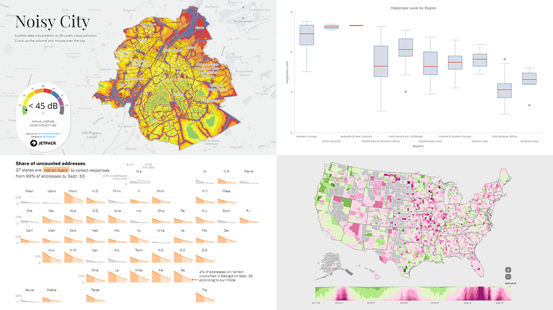 We have put together a roundup of new awesome data visualizations from around the web. Look what we’ve got for you to check out this Friday on DataViz Weekly:
- Noise pollution in Brussels — Karim Douïeb
- Census 2020 undercounts and their consequences — NYT Opinion
- COVID-19 symptoms search trends — Google People + AI Research (PAIR)
- World happiness by region — Wayde Herman
- Categories: Data Visualization Weekly
- No Comments »
New Great Charts and Maps for Data Visualization Addicts — DataViz Weekly
August 21st, 2020 by AnyChart Team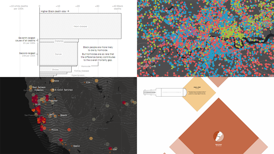 DataViz Weekly is here with a new dose of awesome charts and maps for all data visualization addicts! Today, we are putting a spotlight on the following projects where data is allowed to speak with the help of graphics:
- Stop and search incidents in London — Esri UK Education
- California wildfires — Los Angeles Times
- Scale of the Beirut explosion — Reuters
- Mortality rates for Black and White Americans — New York Times Opinion
- Categories: Data Visualization Weekly
- No Comments »
Information Visualization Techniques in Action on Democracy, Covid-19, Inequality & Gerrymandering — DataViz Weekly
June 26th, 2020 by AnyChart Team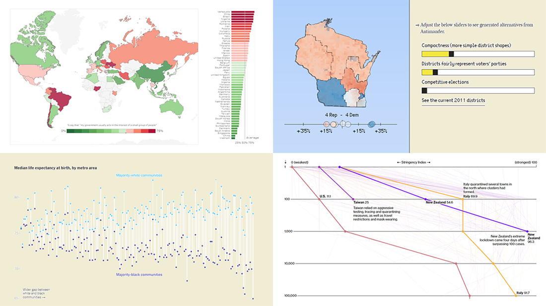 DataViz Weekly is here exhibiting new interesting projects from around the web that demonstrate a great use of different information visualization techniques to deliver better insight. See our new picks:
- Democracy Perception Index 2020 — Dalia
- Government reactions to the Covid-19 pandemic — Bloomberg News
- Gaps between Black and White America — The New York Times Opinion
- Antimander, a tool to expose gerrymandering in congressional districts — Joel Simon
- Categories: Data Visualization Weekly
- No Comments »