Hiding & Showing Data Points in JavaScript Scatter Plots — JS Chart Tips
March 25th, 2025 by AnyChart Team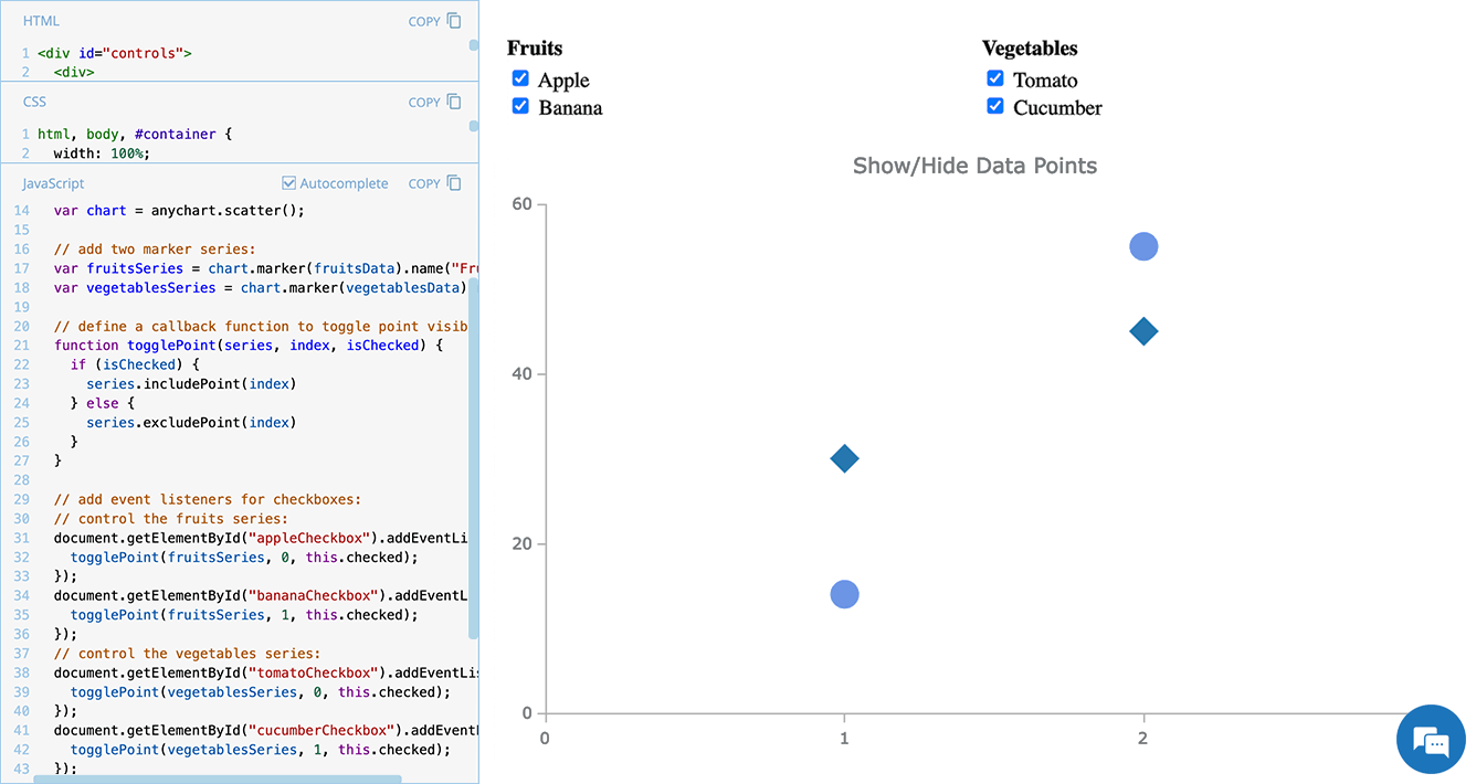 Scatter plots are widely used to visualize relationships between variables by displaying values on a coordinate plane. In some cases, users may need to control which data points remain visible — whether to focus on a specific category, filter out outliers, or simplify the view for better readability.
In this edition of JS Chart Tips — our blog series featuring practical solutions inspired by real customer questions — we’ll show you how to implement interactive point visibility control in a JavaScript scatter plot. By using specialized API methods, you can let users dynamically hide and show individual markers, making data exploration more flexible and insightful.
Let’s dive in!
- Categories: AnyChart Charting Component, HTML5, JavaScript, JS Chart Tips, Tips and Tricks
- No Comments »
Data Visualization in Action: Fresh Examples — DataViz Weekly
February 14th, 2025 by AnyChart Team We’re back with DataViz Weekly, where we showcase some of the best new data visualization examples — from individual charts and maps to full-scale visual stories and projects. Take a look at our latest picks:
- Swiss research funding — Colas Droin
- Education and voting patterns in U.S. presidential elections — Jon Boeckenstedt
- City walkability and improvement potential — The Economist & Matteo Bruno et al.
- Self-censorship in Super Bowl halftime shows — Artur Galocha for The Washington Post
- Categories: Data Visualization Weekly
- No Comments »
Quadrant Chart with Custom Image Markers — JS Chart Tips
February 11th, 2025 by AnyChart Team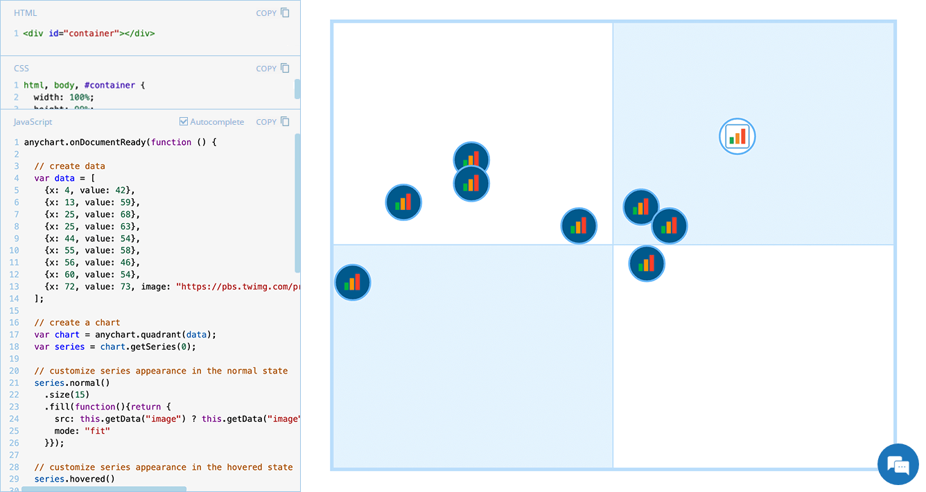 Displaying unique images as markers can add a distinctive touch to your charts, making data visualization more engaging and informative. In this edition of JS Chart Tips, we will guide you through the process of using custom image markers for each data point in a quadrant chart with our JavaScript charting library.
- Categories: AnyChart Charting Component, HTML5, JavaScript, JS Chart Tips, Tips and Tricks
- No Comments »
Building Scatter Chart in JavaScript
June 17th, 2022 by Shachee Swadia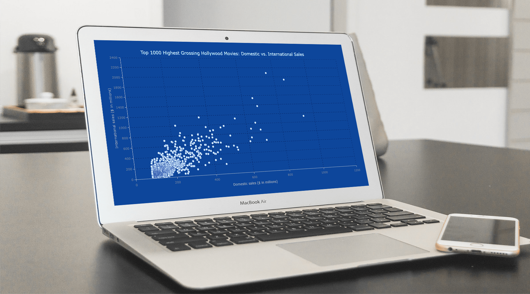 With data everywhere around us, it is imperative to know how to quickly create visualizations that help reveal trends and patterns in it. Today, let’s learn how to build a scatter chart in just a few lines of simple JavaScript code!
Scatter charts, or scatter plots, are designed to identify a correlation between typically two variables. In such graphics, the data is visualized as a set of points usually displayed as markers. The position of each marker indicates the values of the variables along the horizontal and vertical axes.
In this tutorial, we will be visualizing international and domestic sales of the 1000 highest-grossing Hollywood movies as of January 2022. So, get your popcorn and start watching the JS scatter chart development!
Read the JS charting tutorial »
- Categories: AnyChart Charting Component, Big Data, HTML5, JavaScript, JavaScript Chart Tutorials, Tips and Tricks
- No Comments »
Demonstrating Power of Clever Data Visualization in 4 Examples — DataViz Weekly
October 15th, 2021 by AnyChart Team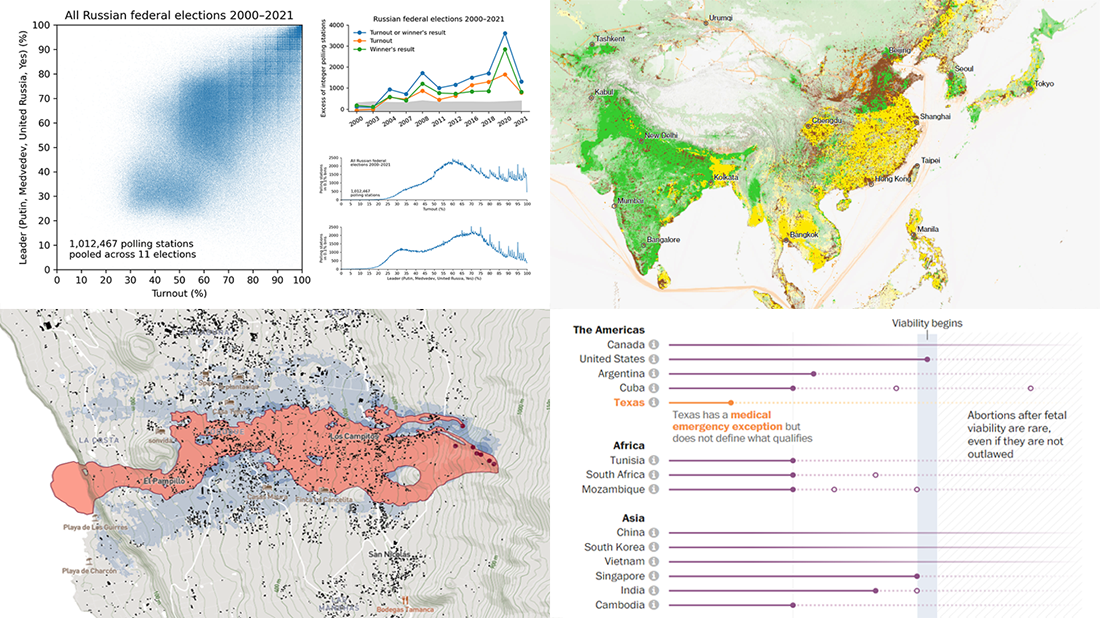 When properly visualized, data can truly speak and tell stories allowing us to quickly decode what raw numbers hide. Would you like to see some clever examples? Look at the awesome new charts and maps that made it to this Friday’s DataViz Weekly!
- All Russian federal elections since 2000 — Dmitry Kobak and Sergey Shpilkin
- Advance of the lava in La Palma — El País
- Abortion laws worldwide — The Washington Post
- Global methane emissions — Bloomberg Green
- Categories: Data Visualization Weekly
- No Comments »
New Interesting Visualizations on Jobs, Climate, TV Shows, Pandemic — DataViz Weekly
October 8th, 2021 by AnyChart Team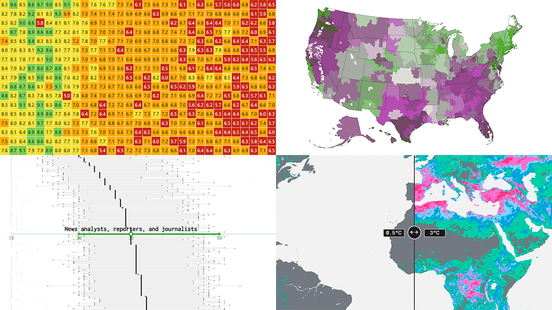 For all who already have an eye for data visualization or only want to get it, DataViz Weekly is here with an overview of four new interesting projects curated from around the web!
- U.S. jobs by age of workers — Nathan Yau
- Probable climate futures based on different scenarios — Probable Futures
- Average IMDb scores of all TV series by episode — Jim Vallandingham
- Vaccination vs hospitalization rates across the United States — The Washington Post
Read on to learn more about each and check them out!
- Categories: Data Visualization Weekly
- No Comments »
Power of Data Visualization in Four New Compelling Examples — DataViz Weekly
November 27th, 2020 by AnyChart Team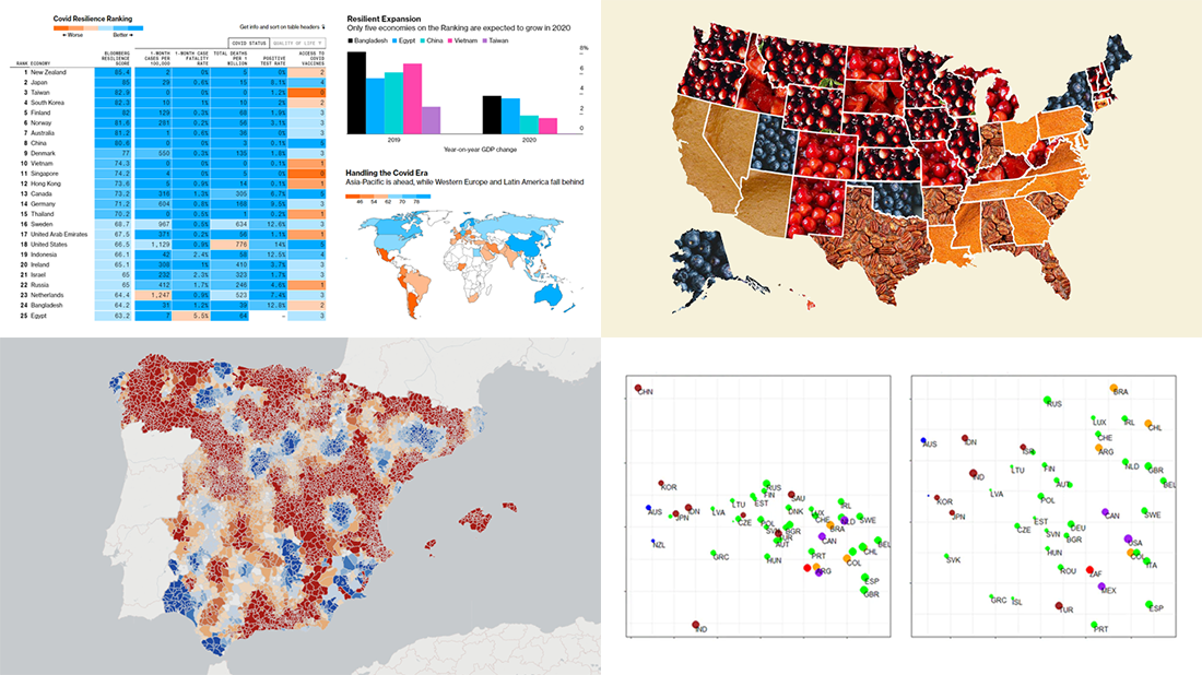 If you love good data visualizations, you’ve come to the right place at the right time! Every Friday, we choose the four most interesting projects making good use of charts and maps, from those we have come across out there just lately, and introduce you to them. Here are the visualizations we’re going to tell you about this time on DataViz Weekly:
- (False?) dichotomy between saving lives and saving the economy during the second wave — Michael Smithson on The Conversation
- COVID Resilience Ranking revealing the best and worst places to stay during the pandemic — Bloomberg
- Length of summers in Spain since 1950, by municipality — Predictia
- The most popular Thanksgiving pie in each state — Instagram
- Categories: Data Visualization Weekly
- No Comments »
Building JavaScript Scatter Plot Module
May 27th, 2020 by Wayde Herman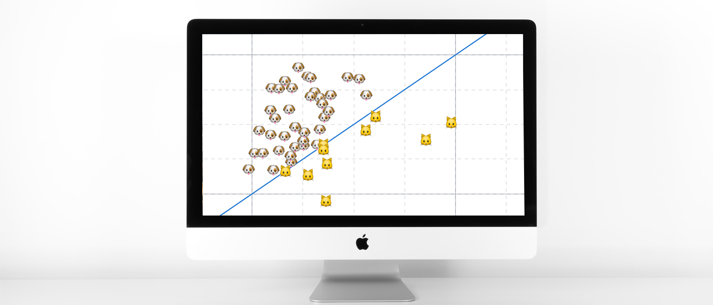 Scatter plots are a great way to visualize data. Data is represented as points on a Cartesian plane where the x and y coordinate of each point represents a variable. These charts let you investigate the relationship between two variables, detect outliers in the data set as well as detect trends. They are one of the most commonly used data visualization techniques and are a must have for your data visualization arsenal!
In this tutorial, I will teach you how to build your very own interactive scatter plot charts using JavaScript.
Ever wondered whether the population of the United States of America were dog people? Well, you’re about to find out! To help you learn more about building scatter plots I will be using the Cat vs Dog Popularity in US dataset. This dataset contains the percentage of homes with dogs and cats for each US state.
Read the JS charting tutorial »
- Categories: AnyChart Charting Component, Big Data, HTML5, JavaScript, JavaScript Chart Tutorials, Tips and Tricks
- 1 Comment »
How to Create JavaScript Bubble Chart — Tutorial for Web Developers
March 3rd, 2020 by Wayde Herman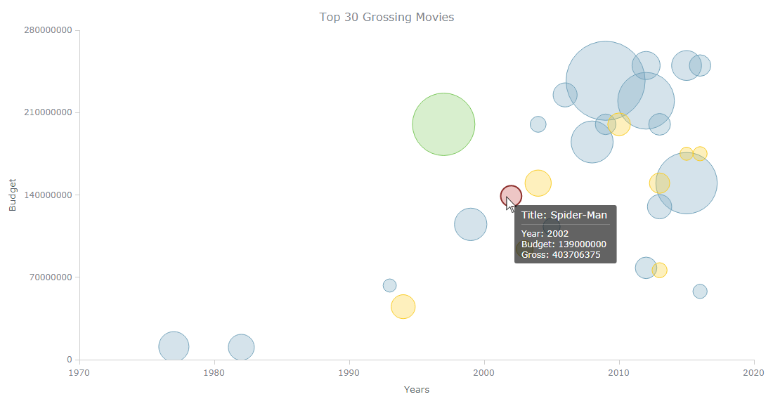 Have you ever wanted to create a bubble chart using JavaScript but did not know how? Then this tutorial is for you! Carry on reading to learn more about bubble charts and how we can build them quickly and painlessly.
Bubble charts are an extension of the scatter plot. Most commonly, they display three variables which are expressed as the horizontal distance of the point (x), the vertical distance of the point (y), and the size of the point (z). A bubble chart is a great visualization technique to let users compare data points. When designed well, it can be really eye-catching and engaging.
In this tutorial, I will teach you how to build your very own interactive JS bubble chart and bring it to life through customization. All examples will be available with the full code.
For this “getting started” guide, I have decided to explore the data of the top 30 grossing movies. Let’s look at the amount of money each movie has grossed, the budget, as well as the year of release. A bubble chart is a particularly good choice for the visualization of this dataset as it will allow us to easily compare these three numeric variables in an interesting and beautiful way.
Read the JS charting tutorial »
- Categories: AnyChart Charting Component, HTML5, JavaScript, JavaScript Chart Tutorials, Tips and Tricks
- No Comments »
Choose Right Chart Type for Data Visualization. Part 4: Data Distribution
May 4th, 2017 by AnyChart Team Displaying and researching some Data Distribution and relationship between data sets instead of studying precise values in each category is a quite common task in data analysis. It can be solved with the help of the chart types that we are going to identify and explain in this article.
Depending on a situation – the kind of data you have and the specific questions you’d like it to provide answers to – you can pick one approach or another. Just be careful when choosing between one chart type and another for the subsequent data distribution analysis. You want the visualization to clarify data, not obscure it or deliver any sort of confusion. Well, simply make sure you understand the following aspects, mind all the details of your situation, and you will have no problem with visualizing data distribution correctly.
- Categories: Choosing Chart Type, Tips and Tricks
- 1 Comment »