New Charts & Maps Turning Data Into Insights — DataViz Weekly
January 31st, 2025 by AnyChart Team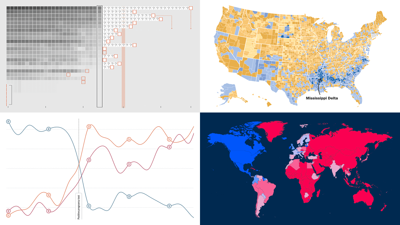 DataViz Weekly is here with a spotlight on new charts and maps that do a great job of turning data into meaningful insights. Today, we invite you to explore the following projects, each demonstrating how data visualization helps reveal patterns, tell stories, and deepen understanding:
- European electricity transition — Ember
- The United States vs. China on global trade — Lowy Institute
- Single-parent families in America — The Washington Post
- Pregnancy through health metric shifts — Maggie Appleton
- Categories: Data Visualization Weekly
- No Comments »
JavaScript Line Chart with Annotations — JS Chart Tips
October 10th, 2024 by AnyChart Team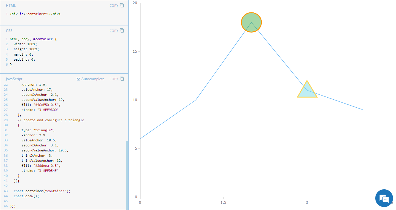 Annotations in charts, such as shapes or text markers, can greatly enhance data narratives by providing more context directly on the visual plane. Thus, it’s no surprise that the ability to add them is one of the most sought-after features of our JavaScript charting library. Although typically used in stock charts, annotations can be just as effective in standard graphics for highlighting specific data points or trends. In this edition of JS Chart Tips, you’ll learn how to add annotations to a basic line chart.
- Categories: AnyChart Charting Component, Charts and Art, HTML5, JavaScript, JS Chart Tips, Tips and Tricks
- No Comments »
Making Line Chart — and Step Line Chart — in JavaScript
September 14th, 2022 by Shachee Swadia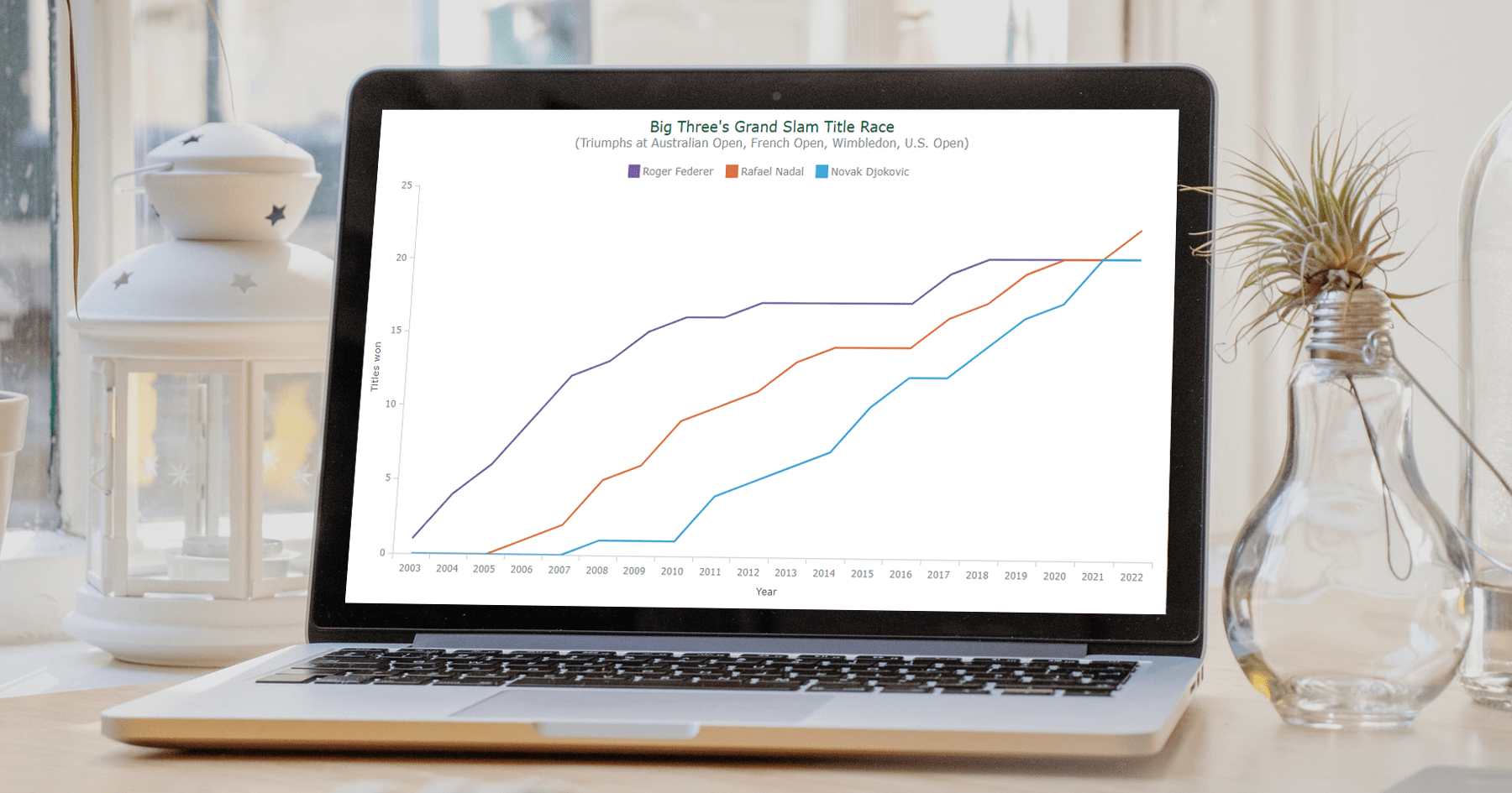 Data visualization is a vast field with so many different types of charts to learn and create. But there are several basic, evergreen graphs that every data designer and web developer dealing with analytics should know how to build. One of them is a Line Chart (or Line Graph). It’s primarily designed to represent data over time.
You can follow along with this tutorial to learn how to quickly create beautiful interactive line (and step-line) charts using JavaScript. We’ll look at some cool examples and build them step by step, which will make the process both clear and entertaining.
For your convenience, you can find all of them on CodePen [and on AnyChart Playground] so you could play with the line charting code further without limits.
Read the JS charting tutorial »
- Categories: AnyChart Charting Component, HTML5, JavaScript, JavaScript Chart Tutorials, Tips and Tricks
- No Comments »
Most Compelling New Examples of Data Visualization in Action — DataViz Weekly
September 24th, 2021 by AnyChart Team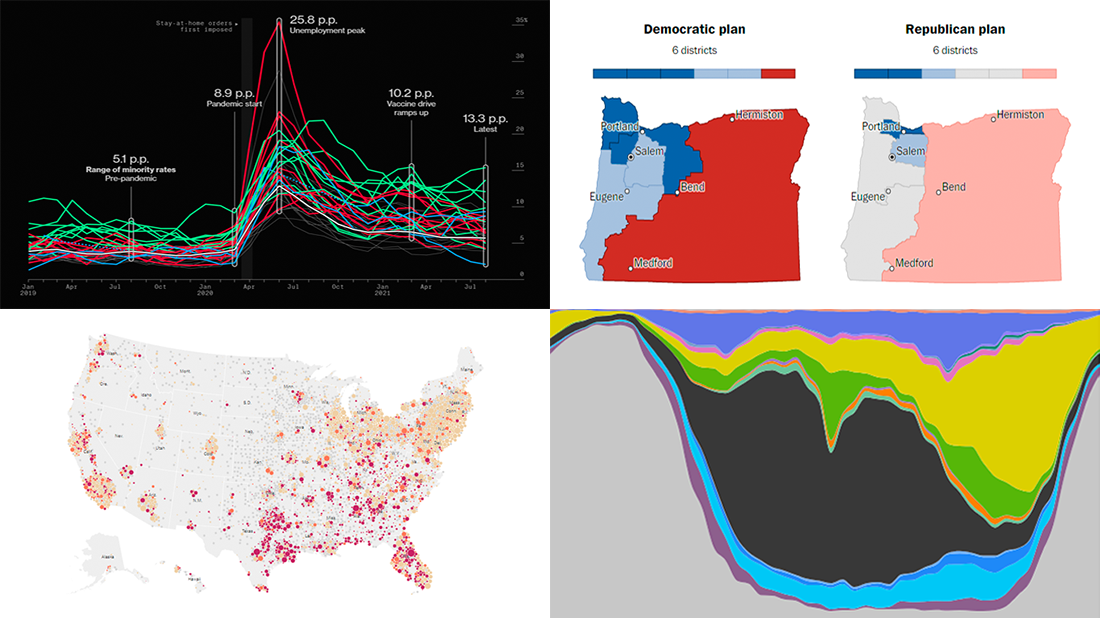 Hey everyone! It is Friday, and we are here to put a spotlight on the most compelling examples of sensible data visualization we have recently seen around the internet. As always, let’s start with a quick list and then look at each project. All aboard for DataViz Weekly!
- Intensive care unit occupancy rates in the United States — The New York Times
- Minority unemployment rates in 15 large U.S. cities. — Bloomberg
- Early proposals for congressional redistricting in Oregon, Indiana, and Colorado — The Washington Post
- Time use of American men and women by employment status — Nathan Yau
- Categories: Data Visualization Weekly
- No Comments »
How to Create Line Chart with JavaScript
July 28th, 2021 by Shachee Swadia A line chart is one of the basic and most commonly used techniques of data visualization. Such graphics are known to provide an informative look at the change of one or several variables over time. Right now, I’ll explain how to easily create a cool interactive line chart using JavaScript! The process will be demonstrated with the help of compelling examples that you can play with afterwards to hone your new data visualization development skills.
To make the article especially thrilling for you to read and learn from, I decided to showcase a practical application of a line chart to real-world data. The month of June was celebrated as Pride Month, and I thought it would be great to see how attitudes toward LGBT people have changed over the recent years. Then I found interesting public opinion data from the General Social Survey (GSS), a project of the National Opinion Research Center (NORC) at the University of Chicago, which appeared to be a good fit, and took part of it to visualize in this guide.
So, follow along with the tutorial and you will also be able to explore the shifts in acceptance of same-sex relationships in the United States over the last two decades! We will create a single-series JS line chart first, representing the general trend, and then a multi-series JS line chart to visualize a breakdown by age group.
All aboard!
Read the JS charting tutorial »
- Categories: AnyChart Charting Component, Big Data, Business Intelligence, HTML5, JavaScript, JavaScript Chart Tutorials, Tips and Tricks
- 2 Comments »
Visualizing COVID-19 Pandemic Data for Austria Using AnyChart JS Charts
June 25th, 2020 by AnyChart Team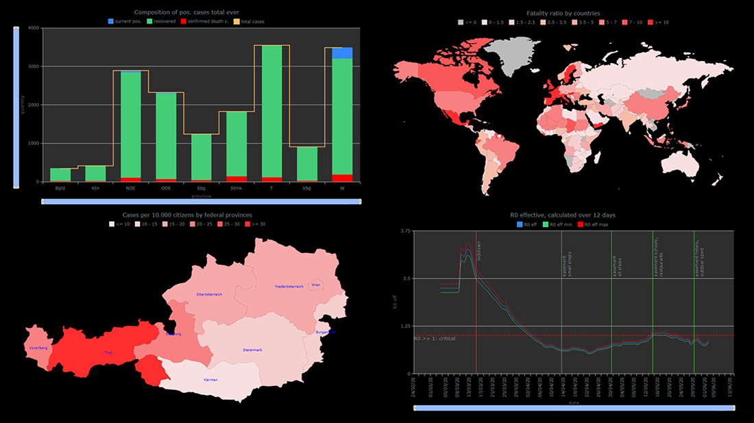 The COVID-19 pandemic persists as a global emergency, and we continue to support initiatives that contribute to tackling the coronavirus crisis. Specifically, we allow COVID-19 analytics projects to use our data visualization tools for free under a non-profit license.
You already know about StopCorona, a COVID tracker by Diffco, which is one such resource. Today, we want to meet you with another noteworthy project using AnyChart to visualize the pandemic statistics — iConcepts SARS-CoV-2 Stats. Created by Austrian part-time web developer Juergen Hoefer and featured on the official Open Data Austria portal, it shows the COVID-19 statistics for Austria (and worldwide) from different perspectives, in countless interactive charts powered by our JavaScript (HTML5) charting library.
We asked Juergen a few questions to learn more about this project and his experience visualizing COVID-19 pandemic data with the help of AnyChart. Read the answers and take a glance at several quick chart examples from his website. (Stack: HTML/CSV.)
- Categories: AnyChart Charting Component, AnyMap, Big Data, HTML5, Success Stories
- 1 Comment »
StopCorona Creator Shares How They Visualize COVID-19 Data Using AnyChart
May 21st, 2020 by AnyChart Team![]() Earlier, we introduced you to a new, ever-updating COVID tracker that uses AnyChart to visualize the latest pandemic data in insightful charts, StopCorona.info. To let you know more, we also talked to Vadim Peskov, CEO at Diffco, the app development company behind StopCorona, and asked him a few questions.
Earlier, we introduced you to a new, ever-updating COVID tracker that uses AnyChart to visualize the latest pandemic data in insightful charts, StopCorona.info. To let you know more, we also talked to Vadim Peskov, CEO at Diffco, the app development company behind StopCorona, and asked him a few questions.
Read our quick interview to learn more about StopCorona and their experience using our JavaScript charting library for interactive data visualization. (Stack: MySQL/Symfony/Angular.)
- Categories: AnyChart Charting Component, Big Data, Charts and Art, HTML5, JavaScript, Success Stories
- 3 Comments »
Visualizing Numbers on Migration, Powerlifting, Commute, and Nature — DataViz Weekly
October 18th, 2019 by AnyChart Team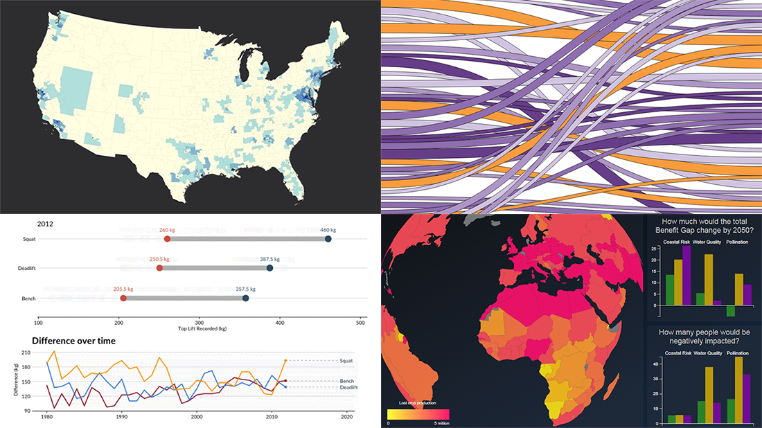 This week, we’ve found more new cool projects that wonderfully demonstrate the power of visualizing numbers. Here are the four most interesting ones where charts and maps actually let data speak — join us as we quickly present them in today’s DataViz Weekly:
- Charting migration pathways worldwide — Bloomberg
- Plotting differences between men’s and women’s top lifts at IPF events — Connor Rothschild, Rice University
- Mapping commute thresholds across the United States of America — Nathan Yau, FlowingData
- Visualizing nature’s contributions to people globally — Natural Capital Project
- Categories: Data Visualization Weekly
- No Comments »