Elevated Data Control & Customization in AnyChart’s Latest Qlik Sense Extensions
September 12th, 2023 by AnyChart Team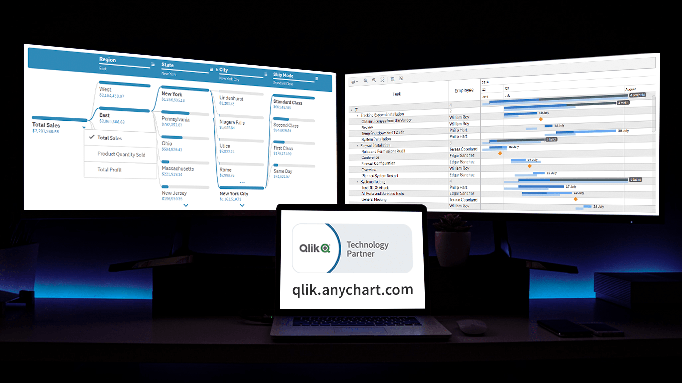 Prepare for an advanced level of data control and customization as we unveil the latest update for our Qlik Sense extensions! The September 2023 release is dedicated to enhancing your visual analytics experience, with a particular emphasis on the Decomposition Tree and Gantt Chart visuals. So, without delay, let’s delve into what’s new.
Read more at qlik.anychart.com »
- Categories: Big Data, Business Intelligence, News, Qlik
- No Comments »
Stock Chart Creation in JavaScript: Step-by-Step Guide
September 5th, 2023 by Shachee Swadia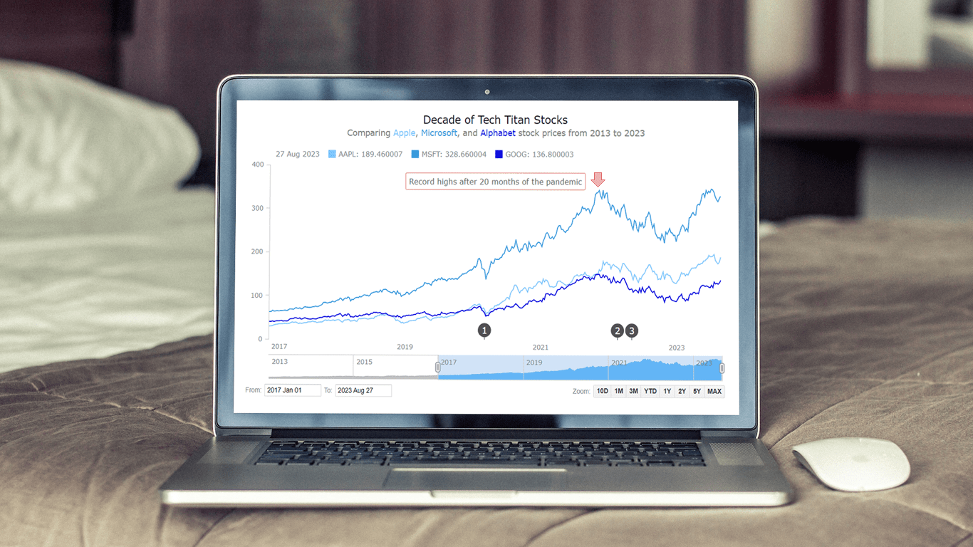 Chances are, you’ve come across various stock charts, whether you’re a seasoned trader or not. If crafting your data graphics piques your interest, you’re in the right place. Welcome to this user-friendly tutorial on building an interactive stock chart using JavaScript!
The JS stock chart we’ll create by the end of this guide will visually compare stock prices for three tech giants — Apple, Microsoft, and Google (Alphabet) — over the past decade. It’s a robust example to illustrate the stock charting process and the power of market data visualization.
So, hop on board as we explore the world of stock charts and learn how to create one from scratch.
Read the JS charting tutorial »
- Categories: AnyChart Charting Component, AnyStock, Big Data, Financial Charts, HTML5, JavaScript, JavaScript Chart Tutorials, Stock Charts, Tips and Tricks
- No Comments »
Creating Dynamic Linear Gauge for Real-Time Typing Speed Test Data Visualization: Using JavaScript
August 17th, 2023 by Nick Gogin From clocks to weight scales, speedometers to thermostats, and even the battery charge icon on your phone, Gauge Charts are widely used to represent a value on a scale or range, providing a clear visual indication of the represented measurement. Gauges can be circular or linear, and in this article, our focus will be on the latter style. I will guide you on how to create a cool linear gauge using JavaScript.
Specifically, we will explore the demonstration of linear gauges using an example of a real-time typing speed test. Throughout the article, we will delve into the structure of linear gauges, discuss styling options, explore how they can be connected to data, and show how you can easily build your Linear Gauges using JavaScript in just a matter of minutes. By the end of the tutorial, you’ll have an awesome example of a linear gauge used to dynamically illustrate typing speed test results or whichever data you want.
So, let’s dive in and elevate your web-based interactive data visualization game!
Read the JS charting tutorial »
- Categories: AnyChart Charting Component, Big Data, Charts and Art, HTML5, JavaScript, JavaScript Chart Tutorials, Tips and Tricks
- No Comments »
Join AnyChart at QlikWorld Tour 2023
August 10th, 2023 by AnyChart Team Get ready to dive into an exceptional data experience at QlikWorld Tour 2023! We at AnyChart are super stoked to be part of this epic roadshow as proud sponsors and warmly invite you to join us in one of the participating U.S. cities:
- Dallas (The Star in Frisco) — August 10
- San Francisco (Oracle Park) — August 24
- New York (Pier60 at Chelsea Pier) — September 18
- Atlanta (College Football Hall of Fame) — September 20
Spoiler alert: The star of the show will be our first-ever presentation of YODA — Your Own Documents Assistant, the newest, groundbreaking, AI-driven extension for Qlik Sense. Be among the first to witness its power!
Read more at qlik.anychart.com »
- Categories: AnyChart Charting Component, AnyGantt, Big Data, Business Intelligence, Dashboards, Gantt Chart, News, Qlik
- No Comments »
How to Visualize Data with Pareto Charts Using JavaScript
July 11th, 2023 by Shachee Swadia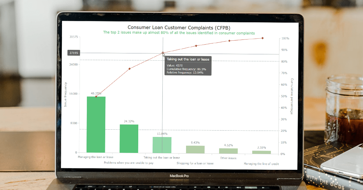 Welcome to this step-by-step tutorial that will empower you to create an interactive Pareto chart using JavaScript that will look nice on any device and in any browser!
A Pareto chart is a captivating graphical combo representation that showcases individual values through descending bars, while a line graph illustrates the cumulative total. It is a powerful tool highlighting the relative importance of different categories within a dataset. Named after the visionary economist Vilfredo Pareto, the Pareto chart embodies the Pareto principle, also known as the 80/20 rule. This principle reveals that approximately 80% of effects stem from a mere 20% of causes. With their ability to pinpoint the most significant elements driving a specific scenario, Pareto charts have become indispensable in certain areas of data analysis.
Every chart needs data, and for this tutorial, I have chosen a dataset to serve as an example for illustration. Together, we will embark on a journey to visualize the major customer complaints for consumer loans in a Pareto chart, demonstrating how easily you can achieve it at every step. So get ready, and let’s dive into the world of Pareto charts and create our own interactive masterpiece!
Read the JS charting tutorial »
- Categories: AnyChart Charting Component, Big Data, Business Intelligence, HTML5, JavaScript, JavaScript Chart Tutorials, Tips and Tricks
- No Comments »
Creating Decomposition Tree in Qlik Sense
June 27th, 2023 by Alejandro Wassermann Hey Qlikkies, are you itching to explore your data ad-hoc across multiple dimensions and conduct root cause analysis like a boss? Look no further than the Decomposition Tree visualization! I first stumbled upon this gem in Power BI, but guess what? Now you can harness its power within the realms of the Qlik Analytics Platform. In this tutorial, I’ll demonstrate how you can easily create amazing decomposition trees for your BI dashboards and apps in Qlik Sense.
A decomposition tree is a type of chart that uses a tree-like structure to represent how a whole metric or outcome can be broken down into its constituent parts or factors. It provides a hierarchical view of the relationships between different dimensions or variables and their contributions to the overall metric. By visually displaying the decomposition of a measure, such as sales or revenue, into various components, such as product categories, regions, or time periods, the decomposition tree helps identify the key drivers and understand the underlying factors influencing the metric. And I’ll use the tech layoffs data to show you how this can look and work in reality.
Let’s dive in and unleash the decomposition tree power in Qlik Sense!
Read more at qlik.anychart.com »
- Categories: AnyChart Charting Component, Big Data, Business Intelligence, Dashboards, Qlik, Tips and Tricks
- No Comments »
How to Build Heatmap in JavaScript
May 30th, 2023 by Shachee Swadia Data visualization is a powerful tool that helps us make sense of complex data. With it, we can spot patterns and trends that might take much more time to become obvious just by looking at raw numbers. One particularly useful chart type is the heatmap, and I’m excited to teach you how to create one with JavaScript in this tutorial.
Read the JS charting tutorial »
- Categories: AnyChart Charting Component, Big Data, HTML5, JavaScript, JavaScript Chart Tutorials, Tips and Tricks
- No Comments »
MARVI Project Uses AnyChart Android Charts to Visualize Groundwater Data in MyWell App
May 25th, 2023 by AnyChart Team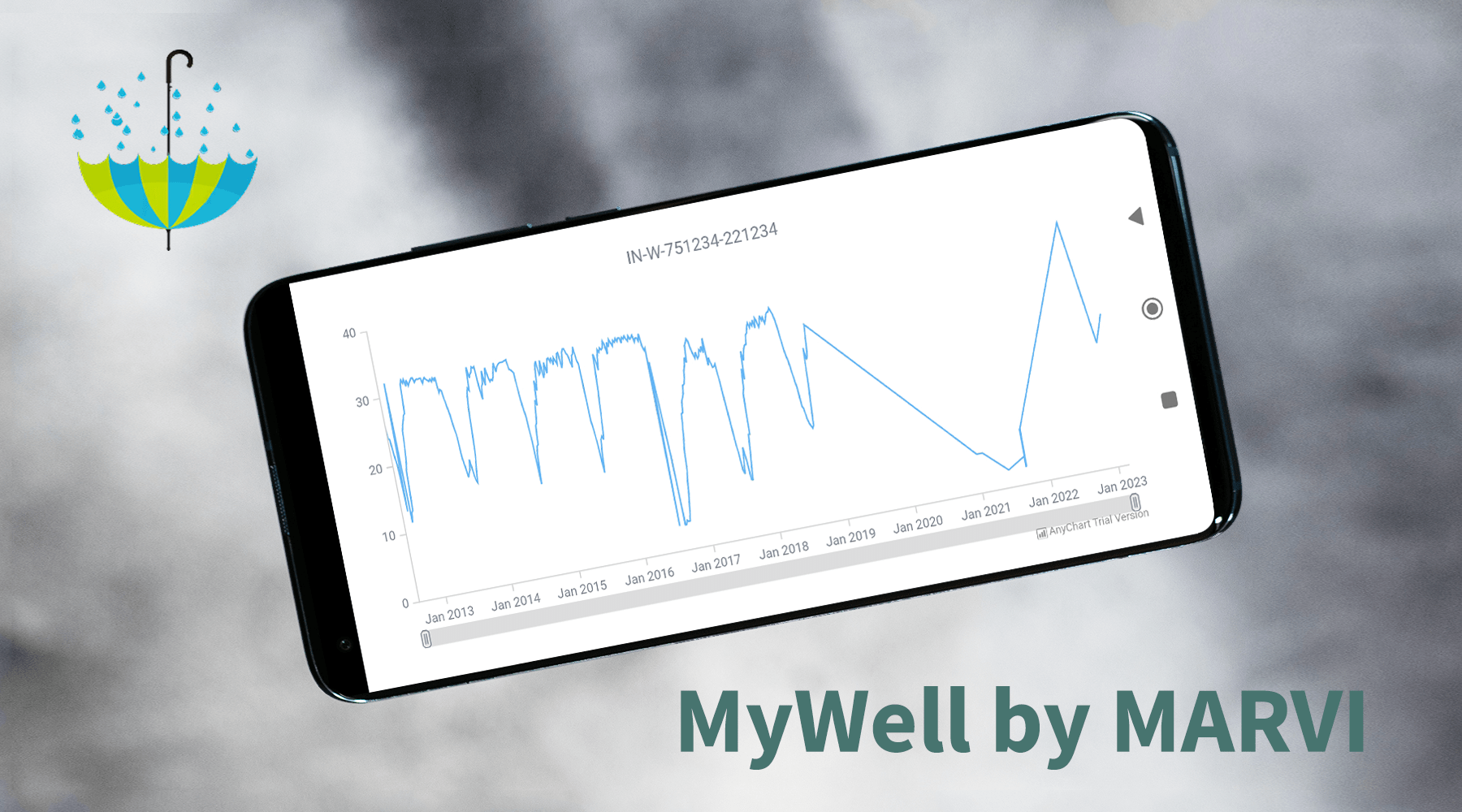
At AnyChart, we take great pride in our position as leaders in the global data visualization industry. Our JavaScript Charting Library is renowned for its excellence for developers, while our Qlik Sense Extensions continue to push the boundaries with innovative solutions for analysts. But we don’t stop at being awesome! We also bring the ultimate data visualization magic to Android app developers with AnyChart Android Charts! You’ve probably come across these charting wonders in some of your favorite mobile apps. Today, we’re putting the spotlight on one specific use case that caught our attention.
We recently had a blast speaking with Professor Basant Maheshwari, the lead scientist at the MARVI project. Their mission? To revolutionize groundwater management through community empowerment. They are achieving that with the help of MyWell, a mobile app that streamlines crowdsourced data collection to sustain groundwater resources, ensure access to clean drinking water, and boost livelihoods. MyWell harnesses the power of our Android data visualization library. And to fuel MARVI’s noble mission, we provided them with a complimentary license to wield the mighty AnyChart within the app.
Dive into the inspiring world of MARVI and MyWell, and witness firsthand how AnyChart contributes to making a real difference for ordinary people while paving the way for the future of groundwater management.
- Categories: AnyChart Charting Component, AnyStock, Big Data, HTML5, JavaScript, Stock Charts, Success Stories
- No Comments »
Viva Qlik with AnyChart — Thank You QlikWorld!
May 24th, 2023 by AnyChart Team Hey, we’d like to share with you the amazing experience QlikWorld provided to its Customers and Partners alike. It was fantastic, and we’re still buzzing with excitement about all that happened in and around Mandalay Bay Las Vegas on April 17–20!
First and foremost, our Decomposition Tree extension for Qlik Sense stole the show…
Read more at qlik.anychart.com »
- Categories: AnyChart Charting Component, AnyGantt, Big Data, Business Intelligence, Gantt Chart, Qlik
- No Comments »
How to Build Choropleth Map with JavaScript
May 18th, 2023 by Shachee Swadia Are you ready to learn how to create a choropleth map with JavaScript like a boss? Maps are a powerful way to visualize data, but building one from scratch can be a daunting task. Don’t worry, I’m here to help!
In this tutorial, I’ll guide you through the process of building a JavaScript choropleth map step by step. And to make things more interesting, we’ll use Queen Elizabeth II’s state visits as an example to showcase the power of this type of map.
Get ready to impress yourself and your audience with stunning data visualizations, and let’s get started on this exciting journey together!
Read the JS charting tutorial »
- Categories: AnyChart Charting Component, AnyMap, HTML5, JavaScript, JavaScript Chart Tutorials, Tips and Tricks
- No Comments »