Creating Decomposition Tree in Qlik Sense
June 27th, 2023 by Alejandro Wassermann Hey Qlikkies, are you itching to explore your data ad-hoc across multiple dimensions and conduct root cause analysis like a boss? Look no further than the Decomposition Tree visualization! I first stumbled upon this gem in Power BI, but guess what? Now you can harness its power within the realms of the Qlik Analytics Platform. In this tutorial, I’ll demonstrate how you can easily create amazing decomposition trees for your BI dashboards and apps in Qlik Sense.
A decomposition tree is a type of chart that uses a tree-like structure to represent how a whole metric or outcome can be broken down into its constituent parts or factors. It provides a hierarchical view of the relationships between different dimensions or variables and their contributions to the overall metric. By visually displaying the decomposition of a measure, such as sales or revenue, into various components, such as product categories, regions, or time periods, the decomposition tree helps identify the key drivers and understand the underlying factors influencing the metric. And I’ll use the tech layoffs data to show you how this can look and work in reality.
Let’s dive in and unleash the decomposition tree power in Qlik Sense!
Read more at qlik.anychart.com »
- Categories: AnyChart Charting Component, Big Data, Business Intelligence, Dashboards, Qlik, Tips and Tricks
- No Comments »
How to Make Sunburst Chart in JavaScript
June 19th, 2023 by Awan Shrestha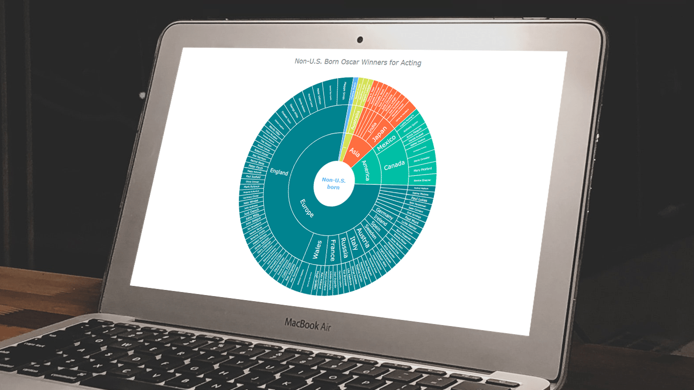 In the world of data all around us, charts play a crucial role in helping us explore and understand data more effectively. One powerful visualization technique is the sunburst chart, which allows us to represent hierarchical datasets, providing insights into complex compositions visually. In this tutorial, I’ll show you how to create your own stunning interactive sunburst charts using JavaScript effortlessly.
We’ll embark on an exciting journey using data about Oscar-winning actors and actresses from countries around the world as an example. Our JS-based sunburst chart will shine a spotlight on the achievements of those born outside the United States, representing the rich diversity of their origins.
Get ready to unlock the secrets of JavaScript sunburst chart development as I’ll guide you step-by-step. Together, we’ll learn how to effortlessly bring data to life, creating this mesmerizing visualization that engages and informs. Let’s dive in and discover the fascinating world of the sunburst chart!
Read the JS charting tutorial »
- Categories: AnyChart Charting Component, Big Data, HTML5, JavaScript, JavaScript Chart Tutorials, Tips and Tricks
- No Comments »
How to Create Donut Chart Using JavaScript
June 13th, 2023 by Shachee Swadia Visualizing data isn’t just insightful, it’s also a lot of fun! One of the simplest and most enjoyable charts you can create is the donut chart. And now, I will show you how to make an awesome interactive one using JavaScript effortlessly!
Aptly named because it looks like a donut, a donut chart is essentially a pie chart with a hole in the center. It can be nice for representing categorical data with a moderate number of categories, where each slice represents a percentage of the whole. Throughout this tutorial, we will apply the donut charting technique to visualize the impressive Grand Slam title tally of a tennis legend, Roger Federer. So you’ll have a real-world example to work with and enhance your understanding.
I’ll guide you through each step, ensuring a seamless learning experience. By the end of the tutorial, you’ll have all the skills and knowledge required to create your very own personalized and impressive JS donut chart. So let’s embark on this exciting journey and get started!
Read the JS charting tutorial »
- Categories: AnyChart Charting Component, HTML5, JavaScript, JavaScript Chart Tutorials, Tips and Tricks
- No Comments »
How to Build Heatmap in JavaScript
May 30th, 2023 by Shachee Swadia Data visualization is a powerful tool that helps us make sense of complex data. With it, we can spot patterns and trends that might take much more time to become obvious just by looking at raw numbers. One particularly useful chart type is the heatmap, and I’m excited to teach you how to create one with JavaScript in this tutorial.
Read the JS charting tutorial »
- Categories: AnyChart Charting Component, Big Data, HTML5, JavaScript, JavaScript Chart Tutorials, Tips and Tricks
- No Comments »
MARVI Project Uses AnyChart Android Charts to Visualize Groundwater Data in MyWell App
May 25th, 2023 by AnyChart Team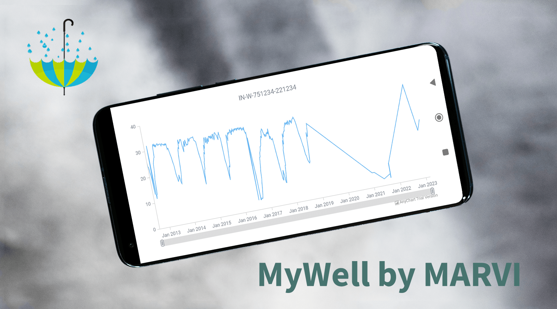
At AnyChart, we take great pride in our position as leaders in the global data visualization industry. Our JavaScript Charting Library is renowned for its excellence for developers, while our Qlik Sense Extensions continue to push the boundaries with innovative solutions for analysts. But we don’t stop at being awesome! We also bring the ultimate data visualization magic to Android app developers with AnyChart Android Charts! You’ve probably come across these charting wonders in some of your favorite mobile apps. Today, we’re putting the spotlight on one specific use case that caught our attention.
We recently had a blast speaking with Professor Basant Maheshwari, the lead scientist at the MARVI project. Their mission? To revolutionize groundwater management through community empowerment. They are achieving that with the help of MyWell, a mobile app that streamlines crowdsourced data collection to sustain groundwater resources, ensure access to clean drinking water, and boost livelihoods. MyWell harnesses the power of our Android data visualization library. And to fuel MARVI’s noble mission, we provided them with a complimentary license to wield the mighty AnyChart within the app.
Dive into the inspiring world of MARVI and MyWell, and witness firsthand how AnyChart contributes to making a real difference for ordinary people while paving the way for the future of groundwater management.
- Categories: AnyChart Charting Component, AnyStock, Big Data, HTML5, JavaScript, Stock Charts, Success Stories
- No Comments »
Viva Qlik with AnyChart — Thank You QlikWorld!
May 24th, 2023 by AnyChart Team Hey, we’d like to share with you the amazing experience QlikWorld provided to its Customers and Partners alike. It was fantastic, and we’re still buzzing with excitement about all that happened in and around Mandalay Bay Las Vegas on April 17–20!
First and foremost, our Decomposition Tree extension for Qlik Sense stole the show…
Read more at qlik.anychart.com »
- Categories: AnyChart Charting Component, AnyGantt, Big Data, Business Intelligence, Gantt Chart, Qlik
- No Comments »
How to Build Choropleth Map with JavaScript
May 18th, 2023 by Shachee Swadia Are you ready to learn how to create a choropleth map with JavaScript like a boss? Maps are a powerful way to visualize data, but building one from scratch can be a daunting task. Don’t worry, I’m here to help!
In this tutorial, I’ll guide you through the process of building a JavaScript choropleth map step by step. And to make things more interesting, we’ll use Queen Elizabeth II’s state visits as an example to showcase the power of this type of map.
Get ready to impress yourself and your audience with stunning data visualizations, and let’s get started on this exciting journey together!
Read the JS charting tutorial »
- Categories: AnyChart Charting Component, AnyMap, HTML5, JavaScript, JavaScript Chart Tutorials, Tips and Tricks
- No Comments »
Nick Mar Uses AnyChart JS Charts to Visualize User Performance and Stock Market Data
April 24th, 2023 by AnyChart Team As the world’s top provider of cutting-edge data visualization solutions, we are constantly thrilled to witness how our products are utilized by both businesses and individuals to create interactive charts and dashboards. We recently had the opportunity to chat with software developer Nick Mar, who shared some of his personal projects with us, highlighting the use of AnyChart and his experience with our JavaScript charting library. Check out our interview with him! (Stack: HTML/CSS/JavaScript.)
- Categories: AnyChart Charting Component, HTML5, JavaScript, Success Stories
- No Comments »
Creating Interactive Flow Maps with JavaScript
March 22nd, 2023 by Awan Shrestha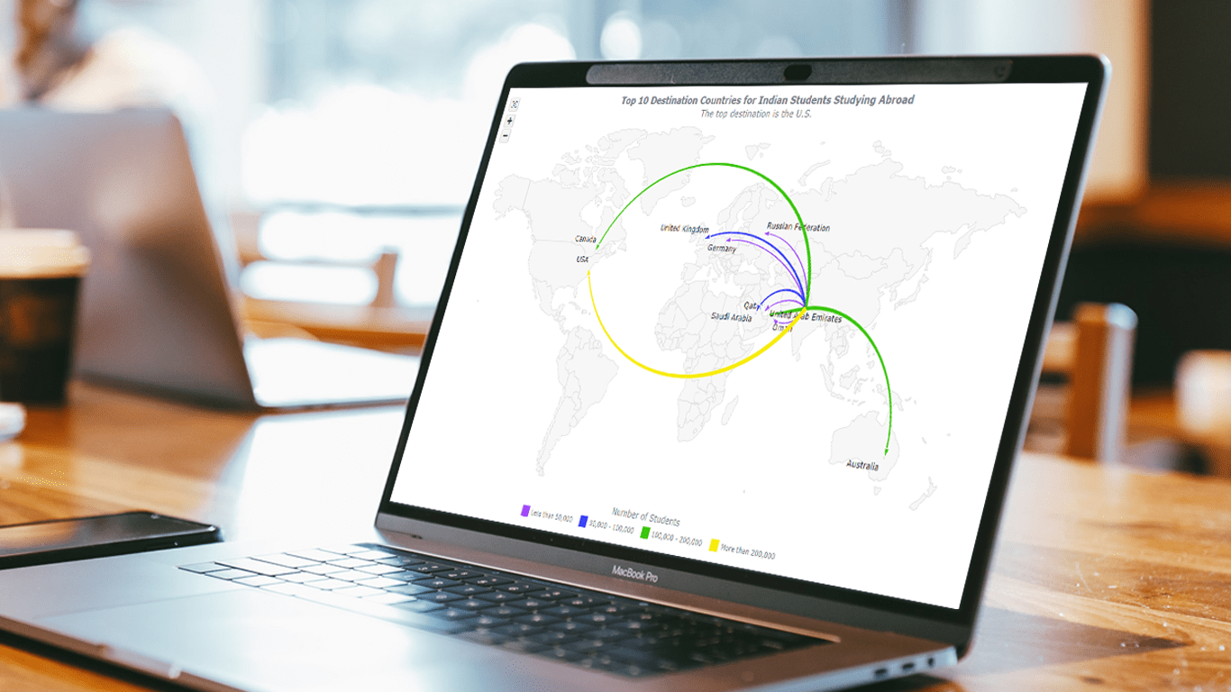 Flow maps are a powerful way to represent the movement of objects between different geographic locations, and with JavaScript, creating an interactive flow map is easier than you might think. Flow maps combine the functionality of a map and a flow diagram; this type of visualization shows the direction of movement of people, goods, money, or information, as well as the quantity of those.
In this step-by-step tutorial, we’ll guide you through the process of creating a JavaScript flow map. To make it more practical, we’ll use the example of visualizing the number of students from India studying abroad in different countries. By following the tutorial, you’ll learn how to create your own flow maps using JavaScript, regardless of the data you choose to use.
So, let’s get started! Follow along with us to learn how to develop your own JS Flow Map.
Read the JS charting tutorial »
- Categories: AnyChart Charting Component, AnyMap, HTML5, JavaScript, JavaScript Chart Tutorials, Tips and Tricks
- No Comments »
How to Create Box-and-Whisker Plot in JavaScript
March 16th, 2023 by Awan Shrestha Transform your data into insights with a stunning box-and-whisker plot! Learn what it is and how to create one with ease using JavaScript. In this tutorial, I’ll walk you through the steps to make a neat and visually appealing JS-based (HTML5) box chart with the yearly gross salaries of different IT professions in Europe. Unlock the power of data visualization and start quickly identifying trends and patterns today!
Read the JS charting tutorial »
- Categories: AnyChart Charting Component, Big Data, HTML5, JavaScript, JavaScript Chart Tutorials, Tips and Tricks
- No Comments »