 Visualizing data isn’t just insightful, it’s also a lot of fun! One of the simplest and most enjoyable charts you can create is the donut chart. And now, I will show you how to make an awesome interactive one using JavaScript effortlessly!
Aptly named because it looks like a donut, a donut chart is essentially a pie chart with a hole in the center. It can be nice for representing categorical data with a moderate number of categories, where each slice represents a percentage of the whole. Throughout this tutorial, we will apply the donut charting technique to visualize the impressive Grand Slam title tally of a tennis legend, Roger Federer. So you’ll have a real-world example to work with and enhance your understanding.
I’ll guide you through each step, ensuring a seamless learning experience. By the end of the tutorial, you’ll have all the skills and knowledge required to create your very own personalized and impressive JS donut chart. So let’s embark on this exciting journey and get started!
Donut Chart Preview
Here’s a sneak peek at the donut chart we’ll build by the end of this tutorial (and it will be interactive).
Building a JavaScript Donut Chart in Four Steps
Let’s dive into how you can quickly and easily create a beautiful and functional donut chart using JavaScript. The process can be split into four steps:
- Create a basic HTML page.
- Include the necessary JavaScript files.
- Add the data.
- Write the JS code.
1. Create a basic HTML page
To begin, let’s create a basic HTML page with a <div> element to hold the donut chart. Give it an ID. Set the width and height to 100% with no margins or padding if you want to ensure that the chart renders full screen.
<html>
  <head>
    <title>JavaScript Donut Chart</title>
    <style type="text/css">
      html, body, #container {
        width: 100%; height: 100%; margin: 0; padding: 0;
      }
    </style>
  </head>
  <body>
    <div id="container"></div>
  </body>
</html>
2. Include the necessary JavaScript files
JavaScript charting libraries provide ready-to-use features that simplify chart development, even for those without extensive technical skills. There are many out there and the core principles are the same.
For this tutorial, we’ll use a JS charting library called AnyChart to create the donut. It’s a lightweight and flexible data viz tool with many examples and comprehensive documentation to help you get started. To build a JavaScript donut chart, we need to include two scripts in our HTML page’s <head> section: the core module and the pie module.
<html>
  <head>
    <title>JavaScript Donut Chart</title>
    <script src="https://cdn.anychart.com/releases/8.11.1/js/anychart-core.min.js"></script>
    <script src="https://cdn.anychart.com/releases/8.11.1/js/anychart-pie.min.js"></script>
    <style type="text/css">
      html, body, #container {
        width: 100%; height: 100%; margin: 0; padding: 0;
      }
    </style>
  </head>
  <body>
    <div id="container"></div>
    <script>
      // All the code for the JS donut chart will come here
    </script>
  </body>
</html>
3. Add the data
So, let’s take a look at the composition of Roger Federer’s Grand Slam title tally. You’ve probably heard of him even if you’re not a tennis fan. Given his recent retirement, it’s an interesting data set to explore.
Let’s add this data (collated from Wikipedia) as a simple array:
var data = anychart.data.set([
  ["Wimbledon", 8],
  ["Australian Open", 6],
  ["US Open", 5],
  ["Roland Garros", 1]
]);
4. Write the JavaScript code for our chart
Here’s the exciting part: creating the donut chart visualization with just a few lines of JavaScript code.
First, add the anychart.onDocumentReady() function that ensures the web page is ready before executing the code. The rest of the JS code is to be placed within this function, and let’s start with setting the data:
anychart.onDocumentReady(function () {
  var data = anychart.data.set([
    ["Wimbledon", 8],
    ["Australian Open", 6],
    ["U.S. Open", 5],
    ["French Open", 1]
  ]);
});
Then, in the same function, create a pie chart and define an inner radius to give it that donut appearance.
var chart = anychart.pie(data)
  .innerRadius('50%');
Let’s also give the chart a title. Then set the container. And finally, draw the chart.
chart.title('Grand Slam Titles Won by Roger Federer');
chart.container('container');
chart.draw();
Aha! Look at that lovely, functional, JavaScript-based donut chart we’ve created! Let’s be honest here — it was as smooth as Roger Federer’s backhand! You can check out the interactive version with the entire code on the playground and even click on the slices to see the cool slicing animation. Don’t forget to explore the automatically generated legend by clicking on it too!
<html>
  <head>
    <title>JavaScript Donut Chart</title>
    <script src="https://cdn.anychart.com/releases/8.11.1/js/anychart-core.min.js"></script>
    <script src="https://cdn.anychart.com/releases/8.11.1/js/anychart-pie.min.js"></script>
    <style type="text/css">
      html, body, #container {
        width: 100%; height: 100%; margin: 0; padding: 0;
      }
    </style>
  </head>
  <body>
    <div id="container"></div>
    <script>
      anychart.onDocumentReady(function () {
        // add the data
        var data = anychart.data.set([
          ["Wimbledon", 8],
          ["Australian Open", 6],
          ["U.S. Open", 5],
          ["French Open", 1]
        ]);
        // create a pie chart instance with the passed data
        var chart = anychart
          .pie(data)
          // set the inner radius to make a donut chart
          .innerRadius("55%");
        // set the chart title
        chart.title("Grand Slam Titles Won by Roger Federer");
        // set the container id for the chart
        chart.container("container");
        // draw the resulting chart
        chart.draw();
      });
    </script>
  </body>
</html>
Now that we have our donut chart, let’s take it up a notch and make it even cooler and more eye-catching. Here’s how you can customize the chart.
Customizing a Donut Chart
When working with JavaScript charting libraries, you can create charts quickly and have the flexibility to customize them to your liking. In the case of a donut chart, numerous options are available to enhance its aesthetic appeal and information presentation. The following section will explore various customization choices to make your JS donut chart more visually pleasing and informative.
Changing the color palette
To add visual coherence, let’s color the slices based on the prominent colors in the respective Grand Slam logos. This can be achieved by defining the required colors and setting the chart’s color palette.
// create a color palette
var palette = anychart.palettes.distinctColors();

// add the colors according to the brands
palette.items([
  { color: "#563783" },
  { color: "#1b8cca" },
  { color: "#022789" },
  { color: "#d35220" }
]);

// create a pie chart instance with the passed data
var chart = anychart
  .pie(data)
  // set the inner radius to make a donut chart
  .innerRadius("50%")
  // set the color palette
  .palette(palette);
Setting the labels
Since this donut chart has only four categories, we can add the name of each Grand Slam directly on the corresponding slice. We can also disable the automatic legend, as it may not be necessary in such a situation.
chart.labels().format("{%x}: {%y}").fontSize(14);
chart.legend(false);
Changing the click aesthetics
As an additional customization feature, let’s modify the appearance of the clicked slice. Instead of the default behavior, we’ll make all slices look the same when clicked.
// set the fill when selected
chart.selected().fill("#007247");

// customize the outline when selected
chart
  .selected()
  .outline()
  .fill(function () {
    return anychart.color.lighten("#007247", 0.55);
  });
These small yet impactful changes make the donut chart look so much more personalized.
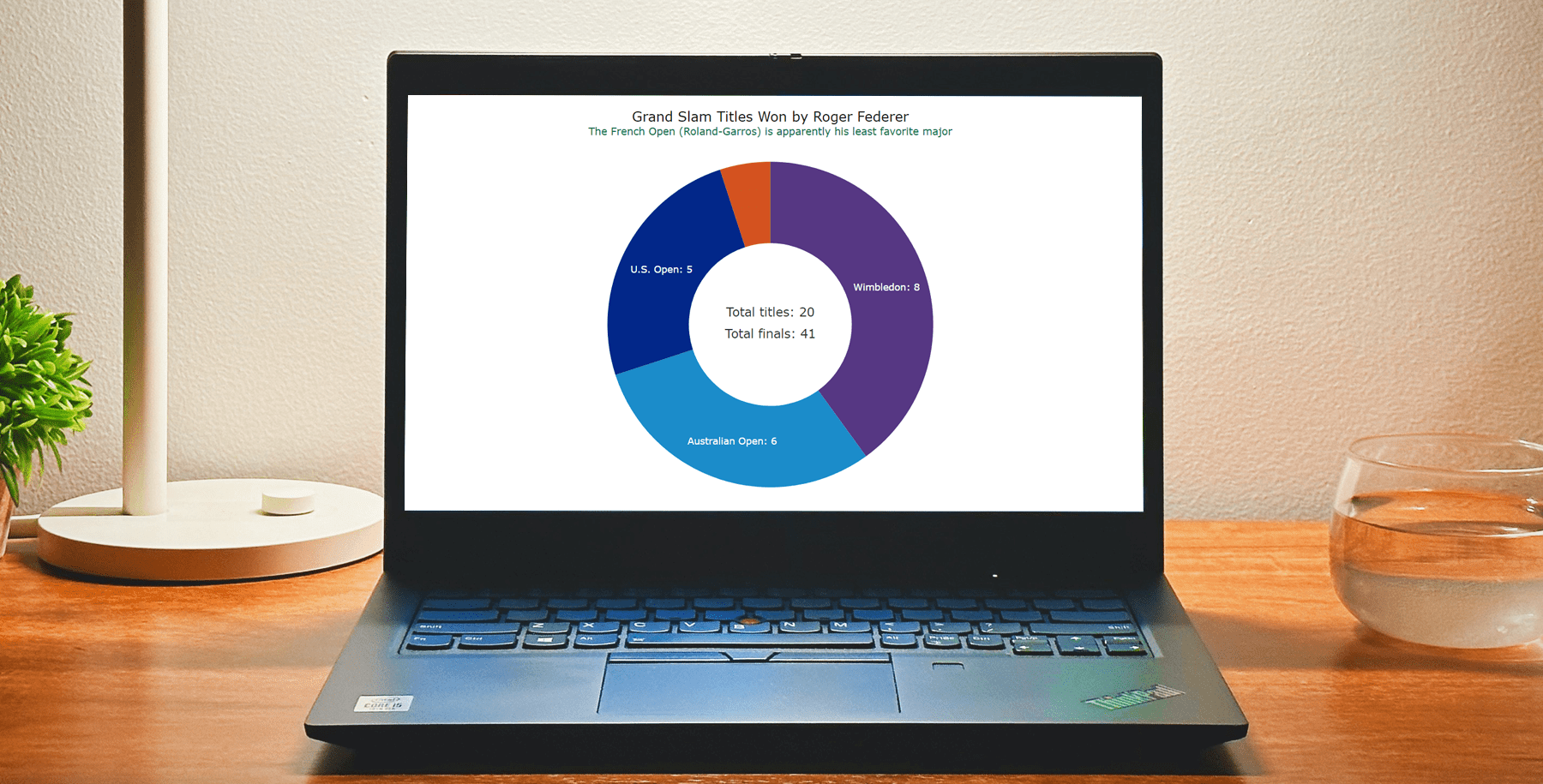
Adding the center content
To maximize insights, it’s possible to utilize the central part of the donut chart, which is typically empty. You can add extra information by placing a standalone label in the center. Let’s use HTML to style the text, set the height and width to 100%, and position it at the center of the donut.
// create a standalone label
var label = anychart.standalones.label();

label
  .useHtml(true)
  .text(
    '<span style = "color: #313136; font-size:18px;">Total titles: 20</span>' +
      '<br><br><span style = "color: #313136; font-size:18px;">Total finals: 41</span>'
  )
  .position("center")
  .anchor("center")
  .hAlign("center")
  .vAlign("middle");

label.width("100%");
label.height("100%");

// set the label as the center content
chart.center().content(label);
Improving the tooltip and the title
As the final steps, we’ll enhance the donut chart tooltip by including the percentage value alongside the name of the Grand Slam on the label.
chart.tooltip().format("Percent of total wins: {%PercentValue}%");And we’ll improve the chart’s title and add a subtitle by enabling HTML formatting.
chart
  .title()
  .enabled(true)
  .useHtml(true)
  .text(
    '<span style = "color: #111; font-size:20px; margin-bottom:10px; dy:20px">Grand Slam Titles Won by Roger Federer</span>' +
      '<br/><span style="color:#007247; font-size: 15px;">The French Open (Roland-Garros) is apparently his least favorite major</span>'
  );
Voila! We’ve created a totally trendy JS donut chart! You can find the final code for this data visualization example below and play with it on the playground.
<html>
  <head>
    <title>JavaScript Donut Chart</title>
    <script src="https://cdn.anychart.com/releases/8.11.1/js/anychart-core.min.js"></script>
    <script src="https://cdn.anychart.com/releases/8.11.1/js/anychart-pie.min.js"></script>
    <style type="text/css">
      html, body, #container {
        width: 100%; height: 100%; margin: 0; padding: 0;
      }
    </style>
  </head>
  <body>
    <div id="container"></div>
    <script>
      anychart.onDocumentReady(function () {
        // add the data
        var data = anychart.data.set([
          ["Wimbledon", 8],
          ["Australian Open", 6],
          ["U.S. Open", 5],
          ["French Open", 1]
        ]);
        // create a color palette
        var palette = anychart.palettes.distinctColors();
        // add the colors according to the brands
        palette.items([
          { color: "#563783" },
          { color: "#1b8cca" },
          { color: "#022789" },
          { color: "#d35220" }
        ]);
        // create a pie chart instance with the passed data
        var chart = anychart
          .pie(data)
          // set the inner radius to make a donut chart
          .innerRadius("50%")
          // set the color palette
          .palette(palette);
        // set the position of the labels
        chart.labels().format("{%x}: {%y}").fontSize(14);
        // disable the legend
        chart.legend(false);
        // set the fill when selected
        chart.selected().fill("#007247");
        // customize the outline when selected
        chart
          .selected()
          .outline()
          .fill(function () {
            return anychart.color.lighten("#007247", 0.55);
          });
       // create a standalone label
        var label = anychart.standalones.label();
        label
          .useHtml(true)
          .text(
            '<span style = "color: #313136; font-size:18px;">Total titles: 20</span>' +
              '<br><br><span style = "color: #313136; font-size:18px;">Total finals: 41</span>'
          )
          .position("center")
          .anchor("center")
          .hAlign("center")
          .vAlign("middle");
        label.width("100%");
        label.height("100%");
        // set the label as the center content
        chart.center().content(label);
        // format the tooltip
        chart.tooltip().format("Percent of total wins: {%PercentValue}%");
        // set the chart title
        chart
          .title()
          .enabled(true)
          .useHtml(true)
          .text(
            '<span style = "color: #111; font-size:20px; margin-bottom:10px; dy:20px">Grand Slam Titles Won by Roger Federer</span>' +
              '<br/><span style="color:#007247; font-size: 15px;">The French Open (Roland-Garros) is apparently his least favorite major</span>'
          );
        // set the container id for the chart
        chart.container("container");
        // draw the resulting chart
        chart.draw();
      });
    </script>
  </body>
</html>
Conclusion
As you can see, creating and customizing a JS donut chart is pretty straightforward. Donut charts are simple yet widely used, making them a great option to learn at the beginning of your data visualization journey. If you have any questions or doubts, please let me know. Remember, creating interactive JS charts is not as tough as achieving Roger Federer’s feat, so go ahead and create some exciting donut and other charts without any excuses!
Published with the permission of Shachee Swadia. Originally appeared on Level Up Coding with the title “Creating a Donut Chart with JavaScript” on June 11, 2023.
You may also like to see the JavaScript Donut Chart Tutorial originally published here earlier.
Check out more JavaScript charting tutorials on our blog.
Would you like to create some amazing guest post for us? Let’s discuss your idea!
- Categories: AnyChart Charting Component, HTML5, JavaScript, JavaScript Chart Tutorials, Tips and Tricks
- No Comments »