Charting COVID-19 Data and Models — DataViz Weekly
May 15th, 2020 by AnyChart Team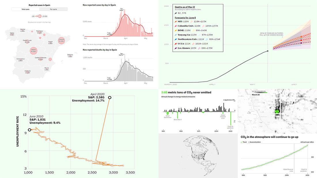 Check out new interesting examples of charting COVID-19 data in action. We have seen a lot of visualizations over the past few days and selected the following projects to share with you today in DataViz Weekly:
- Fatality models for the United States – FiveThirtyEight
- Impact on climate change – Bloomberg Green
- (Now broken) correlation between the stock market and unemployment rates in America – The Washington Post
- Situation in Spain – The New York Times
- Categories: Data Visualization Weekly
- No Comments »
COVID-19 Vaccine, Future, Impact, and Non-COVID Wiki Atlas Visualizations — DataViz Weekly
May 8th, 2020 by AnyChart Team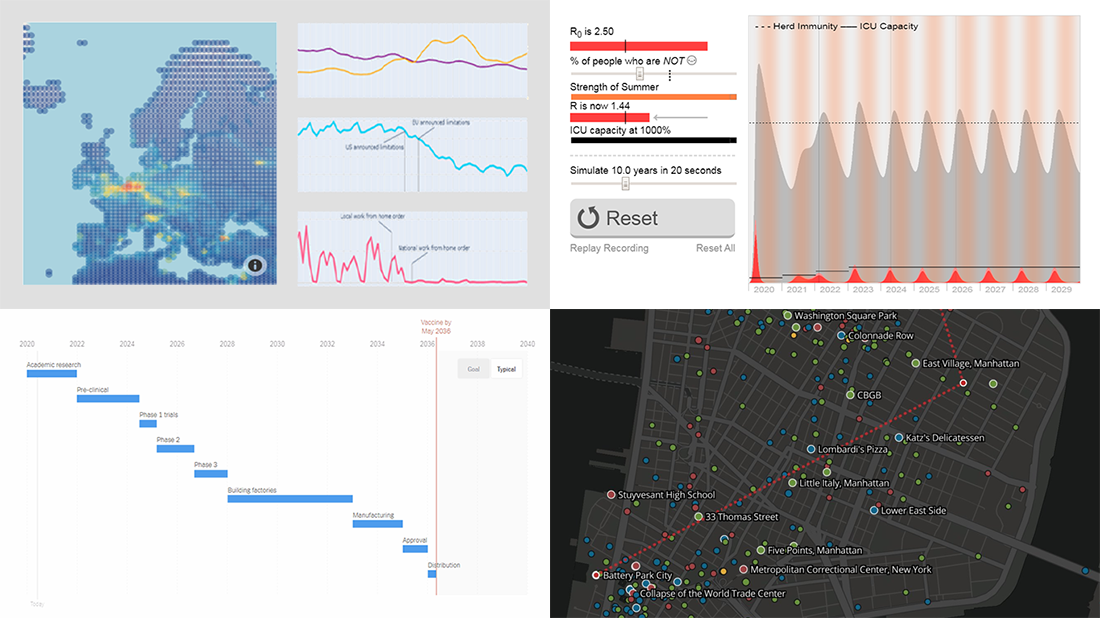 Without any exaggeration, the vast majority of data visualizations made public these weeks (and already months) are about the novel coronavirus pandemic. In compliance with the general trend, three of the four projects presented in the new DataViz Weekly article shed light on issues related to COVID-19. Take a glance at a quick list of the featured data visualization works and read more to meet them.
- COVID-19 vaccine development timeframe and how to reduce it – NYT
- COVID-19 future, in playable simulators – M. Salathé & N. Case
- COVID-19 impact on traffic and air pollution in Europe – European Data Portal
- Atlas of places featured in Wikipedia – T. Noulas, R. Schifanella, D. Sáez-Trumper & J. Tan
- Categories: Data Visualization Weekly
- No Comments »
Creating Choropleth Map Data Visualization Using JavaScript, on COVID-19 Stats
May 6th, 2020 by Anastasia Zoumpliou These days you see choropleth maps in a variety of webpages and utilized for various subjects. Have you wondered how such data visualizations are built? Are you interested in making them by yourself? If so, stay with me through this JS charting tutorial, where I will show you how to create an interactive JavaScript choropleth map from scratch but with ease.
Basic knowledge of HTML5 and JS is always helpful, but even if you are a beginner in this field, understand these four simple steps and you will be able to quickly get a good-looking cross-platform interactive choropleth map data visualization for your app or website!
What exactly are choropleth maps? When you break down the word, you see that choro- (“choros”) means “area” and pleth- (“plethos”) means “multitude.” Exactly, these maps are used to visualize statistical data related to multiple geographic areas. Each area is colored or shaded differently according to the value of the given data, making it easy to grasp how a measurement varies across a territory.
For this JS mapping tutorial, I will use open COVID-19 data to show the distribution of confirmed cases and deaths around the world by country. I will start with a basic choropleth map that will graphically represent the confirmed cases. Then I will add a legend, customize the tooltip, and add bubbles to visualize the number of deaths.
Let’s get started!
Read the JS charting tutorial »
- Categories: AnyChart Charting Component, AnyMap, Big Data, HTML5, JavaScript, JavaScript Chart Tutorials, Tips and Tricks
- 2 Comments »
New COVID-19 Data Visualizations — DataViz Weekly
May 1st, 2020 by AnyChart Team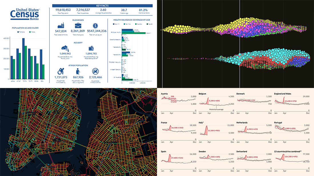 It’s Friday, May 1, and we invite you to take a quick look at the fresh DataViz Weekly selection of cool charts and maps. This article presents the following new COVID-19 data visualizations we have come across this week:
- Discovering excess deaths from COVID-19 — FT
- Exploring NYC sidewalk widths through the prism of social distancing — Meli Harvey
- Analyzing coronavirus search trends — Schema Design, Google News Initiative and Axios
- Visualizing demographic and economic data for COVID-19 impact planning reports — U.S. Census Bureau
- Categories: Data Visualization Weekly
- No Comments »
1918 Spanish Flu Pandemic in Data and Charts — DataViz Weekly
April 17th, 2020 by AnyChart Team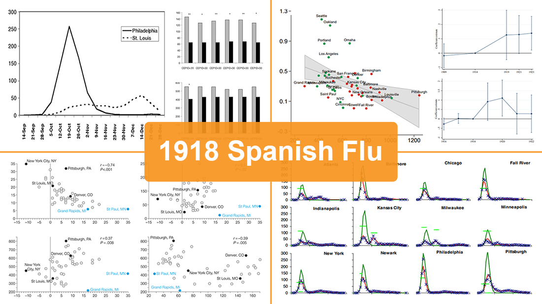 While the world keeps fighting the coronavirus disease outbreak, we have seen a number of attempts to draw analogies between the COVID-19 and previous influenza pandemics. Inspired by a recent National Geographic article by Nina Strochlic with graphics from Riley D. Champine, today we invite you to find out (or remember) what the 1918 Spanish flu pandemic looked like and what lessons it may offer to cope with the current crisis.
For this new DataViz Weekly, we have curated four researches on the 1918 flu pandemic in the United States. Focusing on an analysis of nonpharmaceutical interventions (NPIs) such as social distancing measures and their role, these studies contain a lot of diverse data and charts. They are worth checking out if you’re interested in the subject of epidemics or in data science, analytics, and visualizations as such.
- Categories: Data Visualization Weekly
- No Comments »
Social Distancing in Data Visualizations — DataViz Weekly
April 3rd, 2020 by AnyChart Team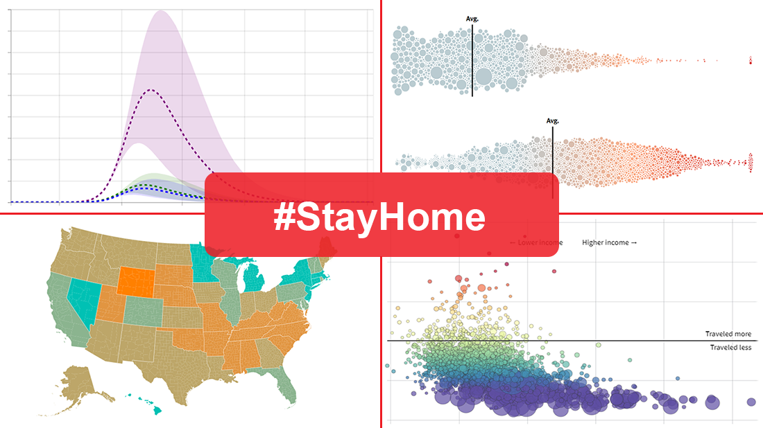 Many health and epidemiology experts consider social distancing to be the most effective way to slow the spread of COVID-19 at the current stage. But does it really work and help?
In today’s DataViz Weekly, we put a focus on data visualizations — charts and maps — on where we, in the United States, have been on social distancing. The following projects deserved to get featured in this special “#StayHome” edition:
- “The Social Distancing of America” — Reuters
- “Where America Didn’t Stay Home Even as the Virus Spread” — NYT
- “Social Distancing Scoreboard” — Unacast
- “COVID-19 Projections Assuming Full Social Distancing Through May 2020” — IHME, UW Medicine
- Categories: Data Visualization Weekly
- 1 Comment »
Coronavirus in US in Charts and Maps — DataViz Weekly
March 20th, 2020 by AnyChart Team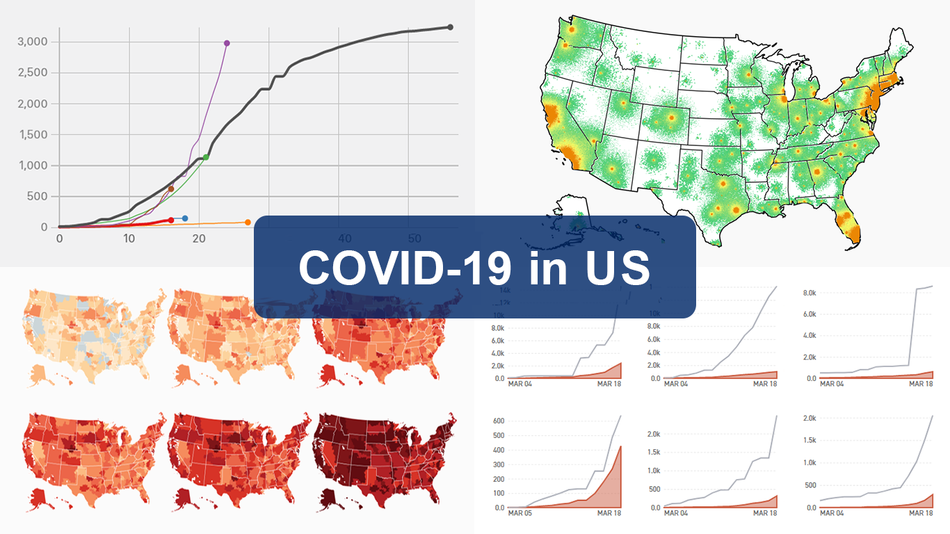 As the novel coronavirus pandemic is in full swing, COVID-19 is now by far the most topical issue on the global agenda. So it’s no surprise that the vast majority of the data visualization projects we’ve come across this week are about the outbreak. That’s why the new DataViz Weekly article is entirely devoted to the same subject — the coronavirus.
We are quite sure many of you have already seen some if not all of the best dashboards, charts, and trackers of the global COVID-19 outbreak from Johns Hopkins University, The New York Times, Financial Times, Business Insider, The Guardian, Bloomberg, and others. Awesome animated simulations from The Washington Post’s Harry Stevens, showing why epidemics like this spread exponentially and how social distancing could help to flatten the curve of COVID-19 cases, have almost certainly came to your attention and does not need to be presented additionally.
Headquartered in the United States, we decided to find out more about what has been going on about COVID-19 in America. Join us on a review of four interesting (though sometimes a bit frightening) data graphics features created by top media outlets, which provide insight into where the U.S. stands — from the perspective of cases and tests (Politico), scenarios (TIME), and hospital bed capacity (The Upshot by NYT), as well as compared to the rest of the world (BuzzFeed News). Check out the special “COVID-19 in US” edition of DataViz Weekly on the AnyChart blog.
- Categories: Data Visualization Weekly
- 2 Comments »