Great New Charts & Maps Worth Seeing — DataViz Weekly
April 8th, 2022 by AnyChart Team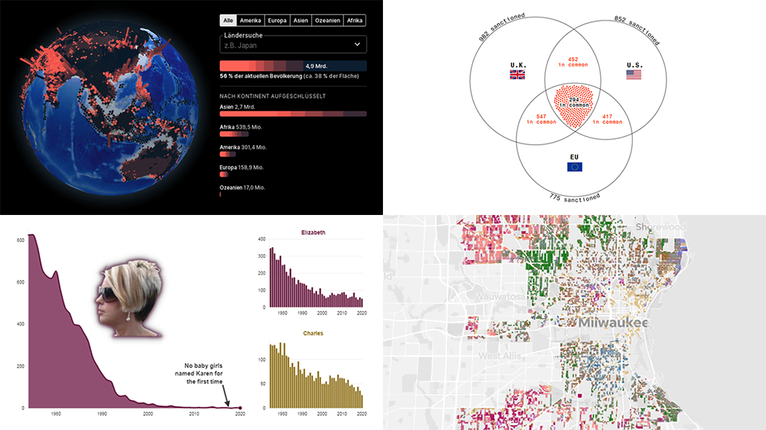 Ready for a new selection of great charts and maps? Join us in checking out four awesome data visualization projects we have come across this week! Today on DataViz Weekly:
- Uninhabitable locations worldwide by 2100 — Berliner Morgenpost
- Sanctions against Russian oligarchs — Bloomberg
- Baby naming trends in Scotland — The Courier
- Milwaukee architectural home styles — The Milwaukee Journal Sentinel
- Categories: Data Visualization Weekly
- No Comments »
Feel Power of Data Visualization in Four New Examples — DataViz Weekly
October 2nd, 2020 by AnyChart Team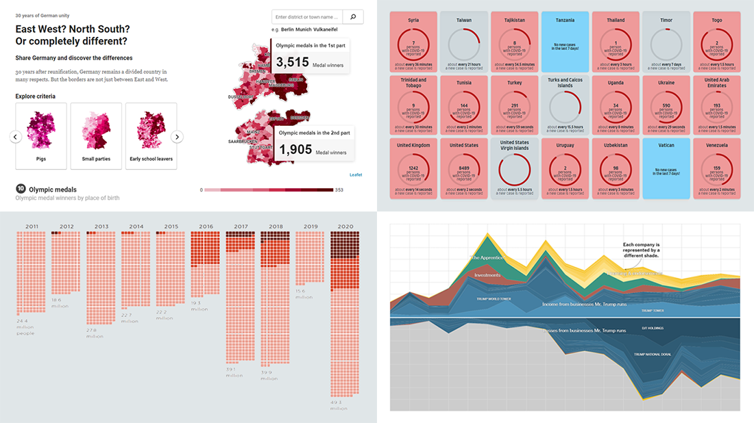 We’ve curated another four new wonderful examples from around the web that greatly illustrate the power of data visualization in action. Meet them straight away, on DataViz Weekly!
- COVID-19 spreading rates by country — Jan Willem Tulp
- Two decades of Trump’s finances — The New York Times
- Dangerous air pollution in the record wildfire season in the Western U.S. — NPR
- Germany divided — Berliner Morgenpost
- Categories: Data Visualization Weekly
- No Comments »
New Charts and Maps to Check Out — DataViz Weekly
August 23rd, 2019 by AnyChart Team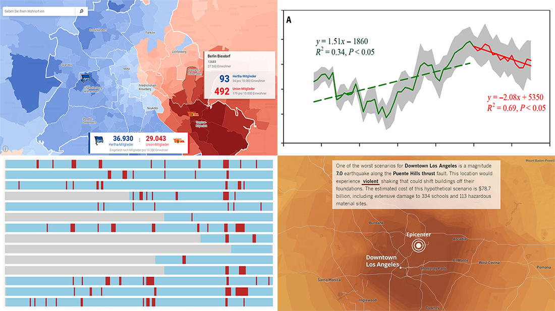 Continuing our DataViz Weekly series, we’ve put together a fresh selection of cool new charts and maps that are worth looking at and exploring. The visualizations we feature this time provide interesting insight into the following topics:
- Economic recessions worldwide in 1960-2019 — Business Insider
- Football divide in Berlin — Berliner Morgenpost
- Earthquake scenarios for California landmarks — Los Angeles Times
- Decline in the global vegetation growth — Science Advances
- Categories: Data Visualization Weekly
- No Comments »
New Data Graphic Examples Worth Checking Out — DataViz Weekly
June 28th, 2019 by AnyChart Team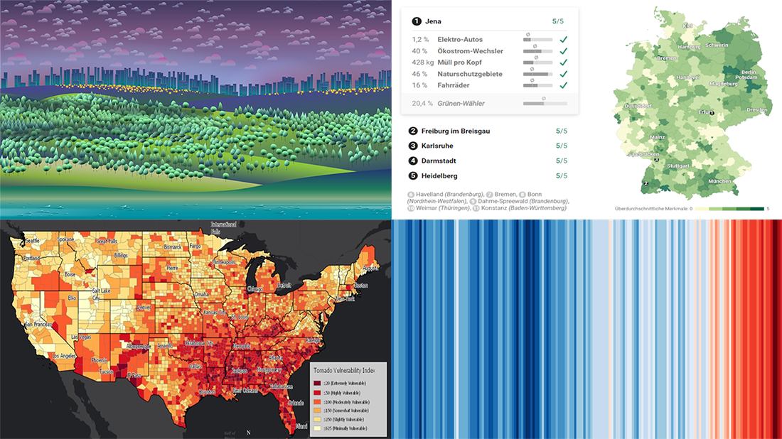 We’ve picked another four awesome projects as new data graphic examples to showcase in DataViz Weekly this Friday. Check them out right away as they are definitely worth it:
- Suicides in the Netherlands
- Where Germany is really green
- Temperature change worldwide
- Vulnerability to tornadoes across the United States of America
- Categories: Data Visualization Weekly
- 1 Comment »
New Interesting Data Visualizations on NBA, Spending, and Gender Pay Gap — DataViz Weekly
March 15th, 2019 by AnyChart Team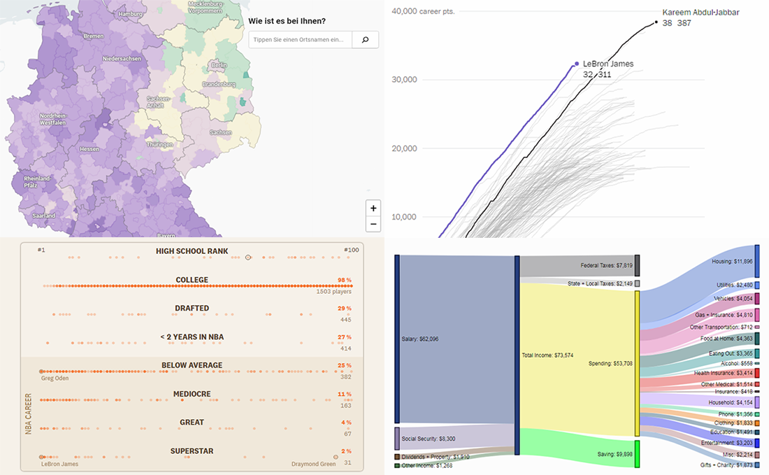 Continuing the regular DataViz Weekly feature on the AnyChart blog, today we are happy to tell you about new interesting data visualizations we’ve found these days — wonderful examples of charts designed for visual storytelling and analytics:
- gender pay gap in Germany;
- NBA’s all-time scoring leaders, now with LeBron James in top 4;
- from leading high school basketball players to NBA superstars;
- household spending in the United States, by income group.
- Categories: Data Visualization Weekly
- No Comments »
New Cool Data Visualizations on Emissions, Climate, Travel, and Music — DataViz Weekly
December 7th, 2018 by AnyChart Team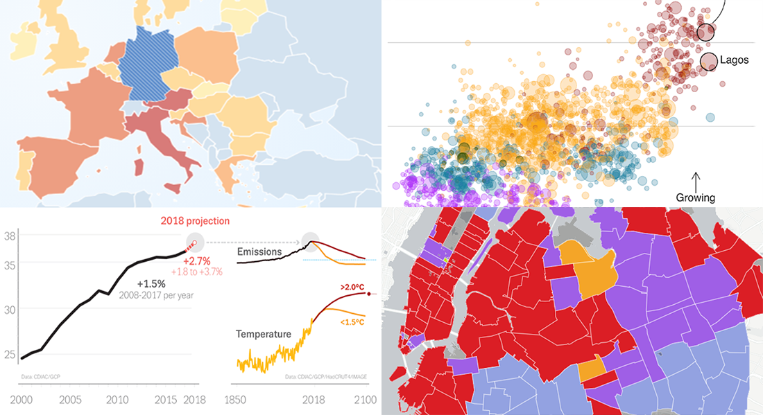 Take a look at new cool data visualizations recently published on the web. In today’s DataViz Weekly, we are glad to feature interesting information graphics from the Global Carbon Project, BBC News, Berliner Morgenpost, and Vivid Seats, dedicated to the following subjects:
- carbon dioxide emissions;
- current state of climate change;
- top 2018 summer travel destinations for Germans;
- top music genres and artists in NYC by neighborhood.
- Categories: Data Visualization Weekly
- No Comments »