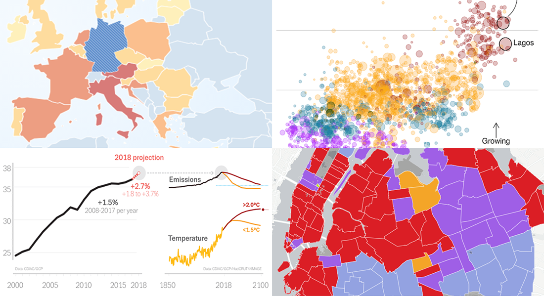
 Take a look at new cool data visualizations recently published on the web. In today’s DataViz Weekly, we are glad to feature interesting information graphics from the Global Carbon Project, BBC News, Berliner Morgenpost, and Vivid Seats, dedicated to the following subjects:
- carbon dioxide emissions;
- current state of climate change;
- top 2018 summer travel destinations for Germans;
- top music genres and artists in NYC by neighborhood.
New Cool Data Visualizations in DataViz Weekly: November 30, 2018 — December 7, 2018
Carbon Dioxide Emissions
The Global Carbon Project, a scientific collaboration between experts and economists tracking the increasing greenhouse gas emissions, has published this week an annual update of the global carbon budget and trends. In the new Global Carbon Budget 2018 paper, the authors presented a lot of diverse data on the problem, using charts and infographics to ensure the most effective communication. Learn about where the world currently is on the carbon dioxide issue.
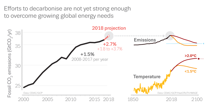
Current State of Climate Change
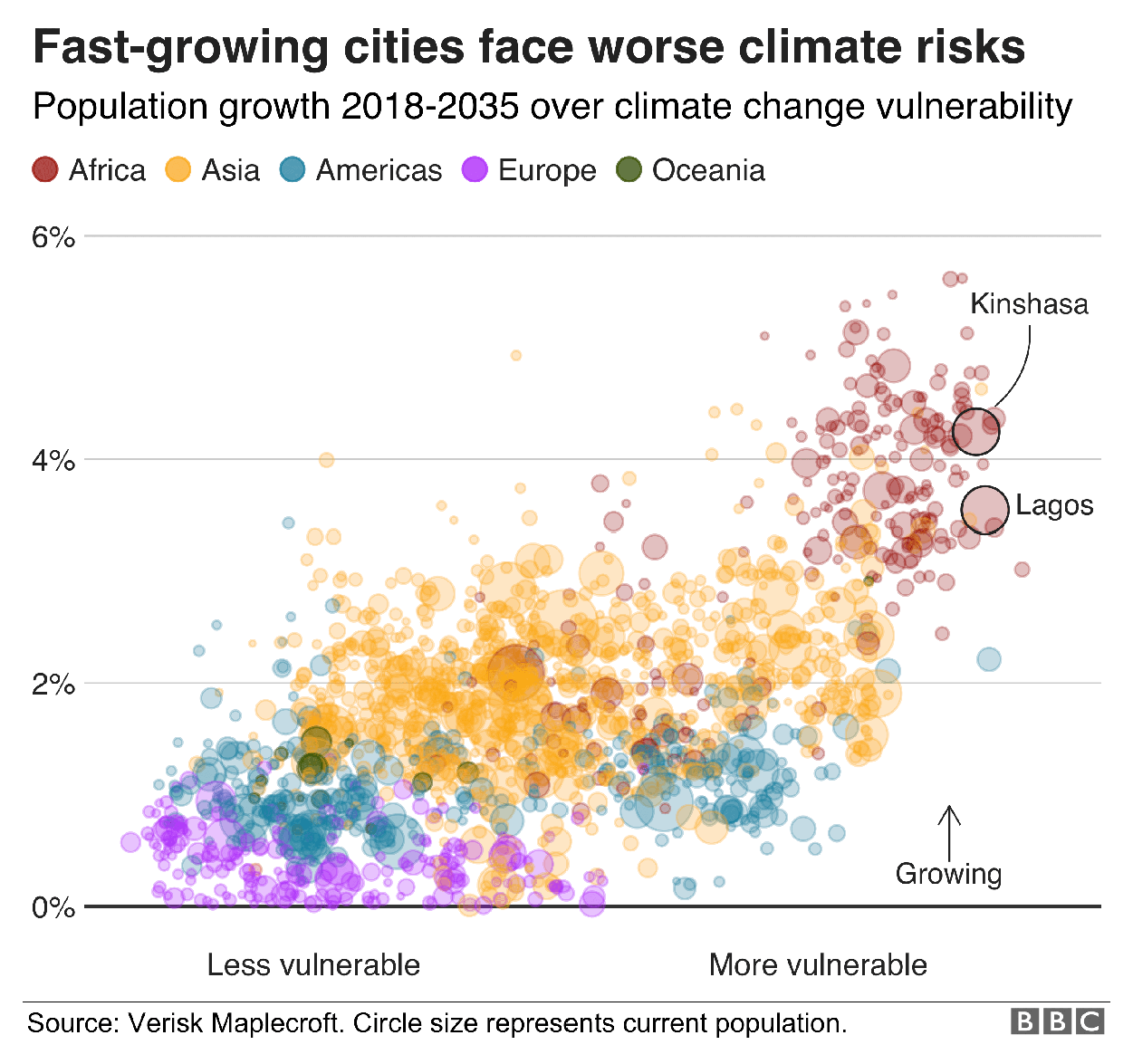
In the run-up to COP24, the 24th Conference of the Parties to the UN Framework Convention on Climate Change, BBC News shared seven charts that visualize data from diverse sources to show the current state of the global warming issue. Check out the dynamics of the average air temperature over years, warming projections by 2100, climate risks for world cities, and more.
Top Summer Travel Destinations for Germans
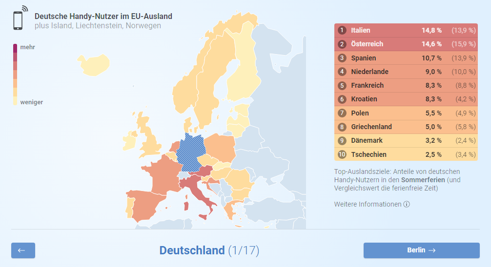
Berliner Morgenpost published a new interesting interactive data visualization project created by Funke Interaktiv, providing insight into the most popular European travel destinations for Germans during the last summer holidays. The project is based on mobile roaming data from Mobilcom-Debitel. It is possible to view the data for the whole country of Germany or focus on the travel preferences of people living in a certain German city.
Top Music Genres and Artists in NYC
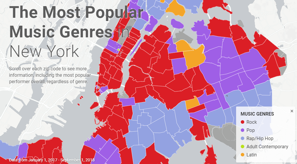
Online ticket reseller Vivid Seats built an interactive map that displays what kind of music is most popular in each neighborhood of New York City. The visualization is based on the company’s concert ticket sales data over the period from January 1, 2017, through September 1, 2018. Look what music genres and performers are the NYC citizens’ favorites.
***
If you are making the first steps in understanding data visualization, check out our dataviz 101 guide published on Hacker Noon just a few days ago. The original “What is Data Visualization? Definition, History, and Examples” article is available on our blog, posted two weeks ago.
Thank you for your attention. Stay tuned for Data Visualization Weekly.
- Categories: Data Visualization Weekly
- No Comments »