Exploring Insights with Data Visualization — DataViz Weekly
May 3rd, 2024 by AnyChart Team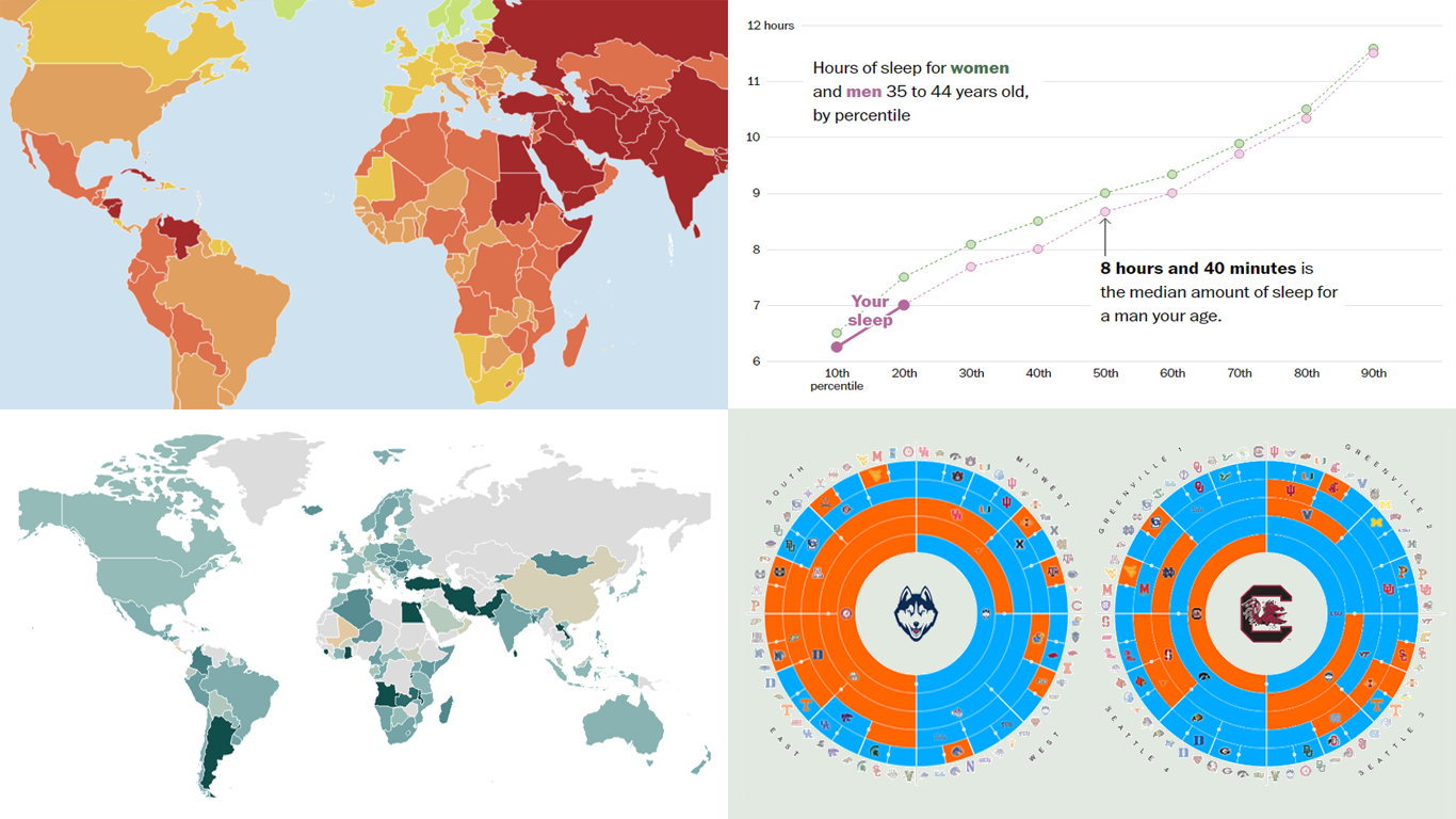 Welcome to the new DataViz Weekly, where we continue exploring the transformative power of data visualization. This edition presents a selection of new examples of how charts and maps can help us understand trends and patterns in various subjects — from sports and philanthropy to global challenges like press freedom and inflation, and everyday topics such as sleep. Here are the projects featured this time:
- March Madness philanthropy challenge — Bloomberg
- 2024 World Press Freedom Index — Reporters Without Borders
- Global Inflation Tracker — Council on Foreign Relations
- Sleep trends in America — The Washington Post
- Categories: Data Visualization Weekly
- No Comments »
Data Visualization Best Practices in Action — DataViz Weekly
December 17th, 2021 by AnyChart Team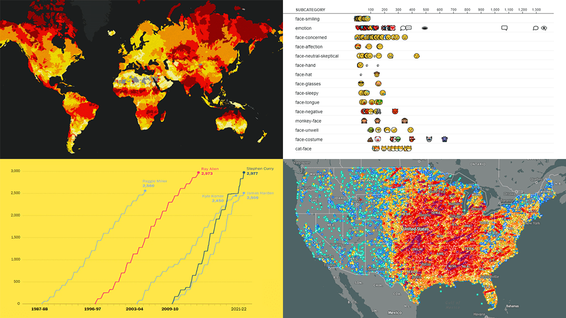 Committed to bringing you the most robust charting solutions, we also continue to curate weekly roundups highlighting projects that greatly implement data visualization best practices, for your inspiration. A new one is here! Look what we’ve got for you to check out this time on DataViz Weekly:
- Tornadoes since the late 19th century — Tornado Archive
- Emoji use frequency in 2021 — Unicode
- Links between climate change and violent conflicts — Crisis Group
- Curry’s rise to the NBA’s three-point king — The Washington Post
- Categories: Data Visualization Weekly
- No Comments »
New Impressive Visualizations Making Data Talk — DataViz Weekly
August 20th, 2021 by AnyChart Team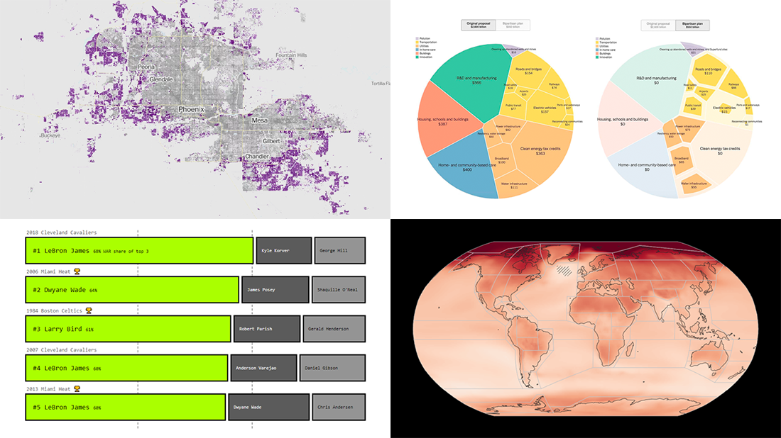 DataViz Weekly is here with an overview of new impressive visualizations that make data talk. These four projects grabbed our attention recently and we could not help telling you about them!
- The biggest carry jobs in NBA history — The Pudding
- Global and regional climate change effects — IPCC
- Presidential and bipartisan infrastructure plans in comparison — The Upshot
- Urban development and sprawl in America between 2001 and 2019 — The Washington Post
- Categories: Data Visualization Weekly
- No Comments »
Fresh Compelling Data Graphics Worth Seeing — DataViz Weekly
March 26th, 2021 by AnyChart Team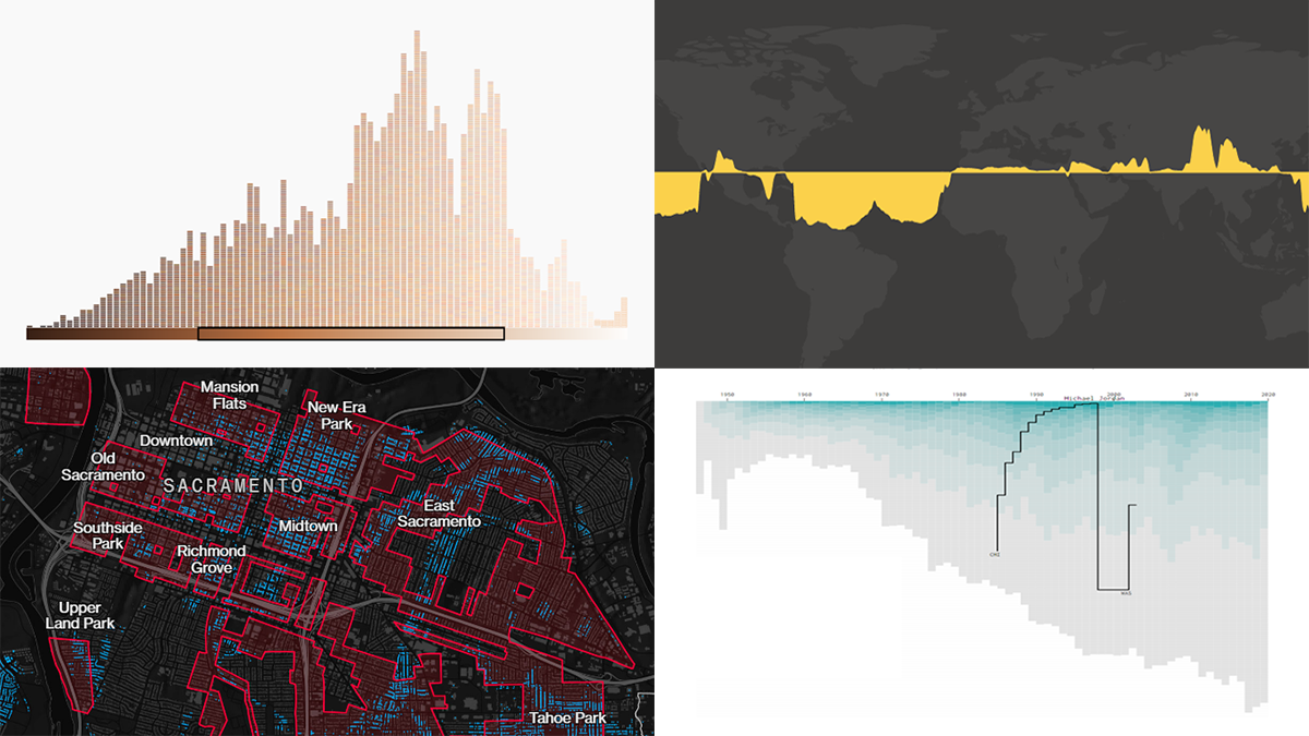 Get your weekly dose of cool data visualization stuff! We have come across these four new amazing projects just lately and are glad to tell you about them right now. Here are the graphics featured this time on DataViz Weekly:
- Career timelines for all NBA players since 1946 — Nathan Yau
- Bias and anti-blackness in the names of foundation shades — The Pudding
- Flood risk in historically redlined and non-redlined neighborhoods — Bloomberg CityLab
- Elevation and bathymetry worldwide along parallels — Nicolas Lambert
- Categories: Data Visualization Weekly
- No Comments »
How to Create Diverging Bar Chart with JavaScript
March 2nd, 2021 by Shachee Swadia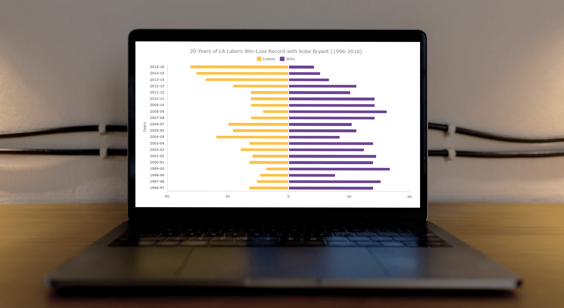 This article is a step-by-step guide that’ll show you how to build an interactive JavaScript range chart that visualizes 20 years of the LA Lakers’ performance with Kobe Bryant.
The year 2020 was pretty poignant for obvious reasons. But even before the pandemic, the year started on a sad note with the death of basketball legend Kobe Bryant. He was a star NBA athlete who had played for 20 years with one and only one team — the Los Angeles Lakers.
Remembering Kobe one year after that horrible crash, I wondered how the Lakers had performed in his two-decade era. So, I visualized that in an interactive Diverging Bar Chart with the help of pure JavaScript.
Thinking that this project might be helpful for those new to web charting, I also logged the entire process and made a tutorial. Check it out!
Read the JS charting tutorial »
- Categories: AnyChart Charting Component, HTML5, JavaScript, JavaScript Chart Tutorials, Tips and Tricks
- No Comments »
Readership, NBA, Color, and Christmas Data Visualizations — DataViz Weekly
December 27th, 2019 by AnyChart Team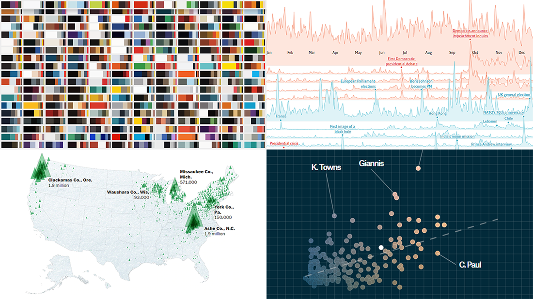 Merry Christmas to all who celebrate it! On the last Friday of 2019, we invite you to check out the year’s last DataViz Weekly article on AnyChart Blog, highlighting some of the most interesting charts published at the end of the year. Of course, we could not help featuring some Christmas data graphics in this festive week. But here you will also learn about projects with cool charts on other subjects. Here’s a list of what the data visualizations shown in today’s DataViz Weekly are about:
- Where American Christmas trees come from — The Washington Post
- Top news stories of 2019 by readership — The Economist
- NBA players’ performance against pay — The Pudding
- Colors on Scientific American’s covers over 175 years of the magazine’s life — Scientific American
- Categories: Data Visualization Weekly
- No Comments »
Awesome Data Visualizations on NBA, NFL, Syllabi, and Demographics — DataViz Weekly
July 26th, 2019 by AnyChart Team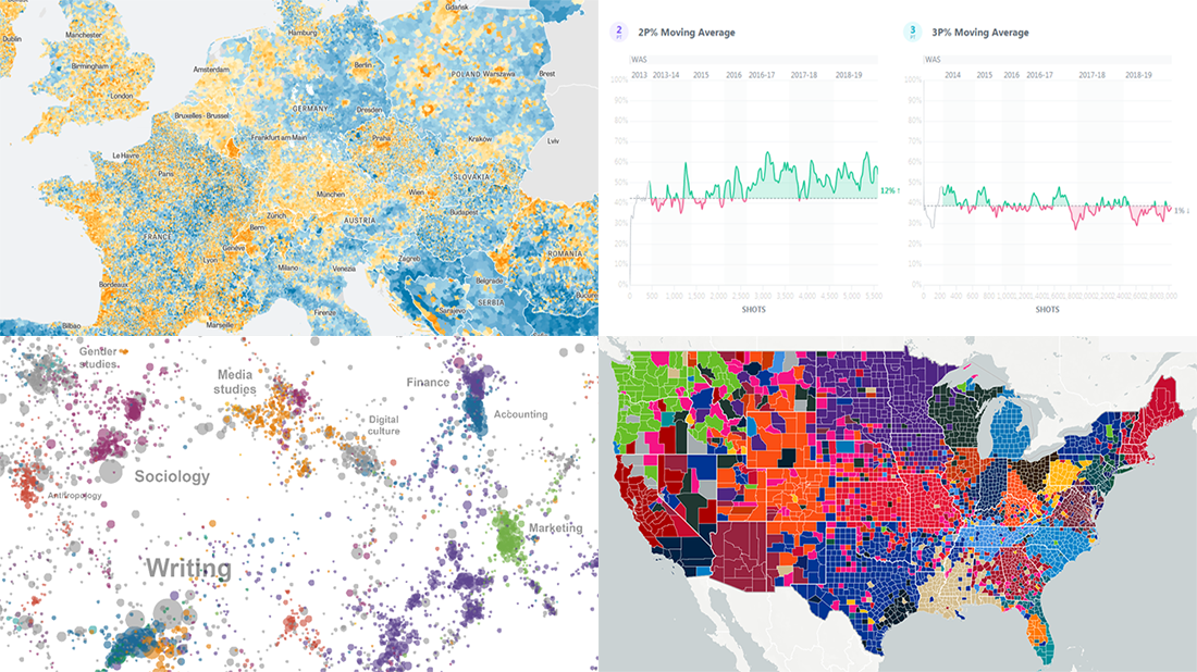 It’s Friday, and we have a pleasure to show you another four new awesome data visualizations we’ve been delighted to check out these days. Look what’s presented on DataViz Weekly this time:
- NBA players’ shot improvement
- Population trends in Europe
- The most-assigned texts from college syllabi worldwide
- The most popular NFL teams and players in every county of the United States
- Categories: Data Visualization Weekly
- No Comments »