January 24th, 2020 by AnyChart Team
 Check out some of the new hot visualizations we have come across this week! Not only are they good graphical data presentation examples, they also bring interesting insights.
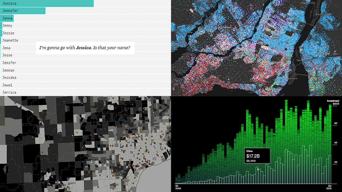
- Youth life expectancy and educational opportunity across the United States — Child Trends
- Guessing names based on what letter(s) they start with — FlowingData
- Climate change scoreboard — Bloomberg Green
- Mother tongues across Canada — Anagraph
Read more »
January 22nd, 2020 by AnyChart Team
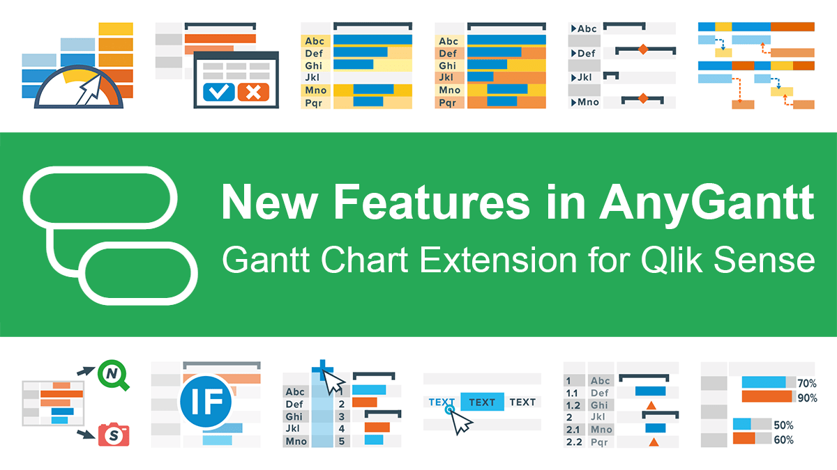 Great news for Qlikkies: We released another major update to our AnyGantt extension for Qlik Sense, which will further enhance your project data visualization experience. So the current 4th generation of our solution for Gantt charts in Qlik already delivers a whole bunch of new awesome features and improvements — learn about them now in a quick overview.
Read more at qlik.anychart.com »
January 17th, 2020 by AnyChart Team
 Join us on a quick review of some of the most interesting projects with cool charts and maps made public just recently. These are good examples of visualizing organization structure, changes in time spending patterns, and more. Here’s a full list of the projects highlighted in today’s DataViz Weekly:
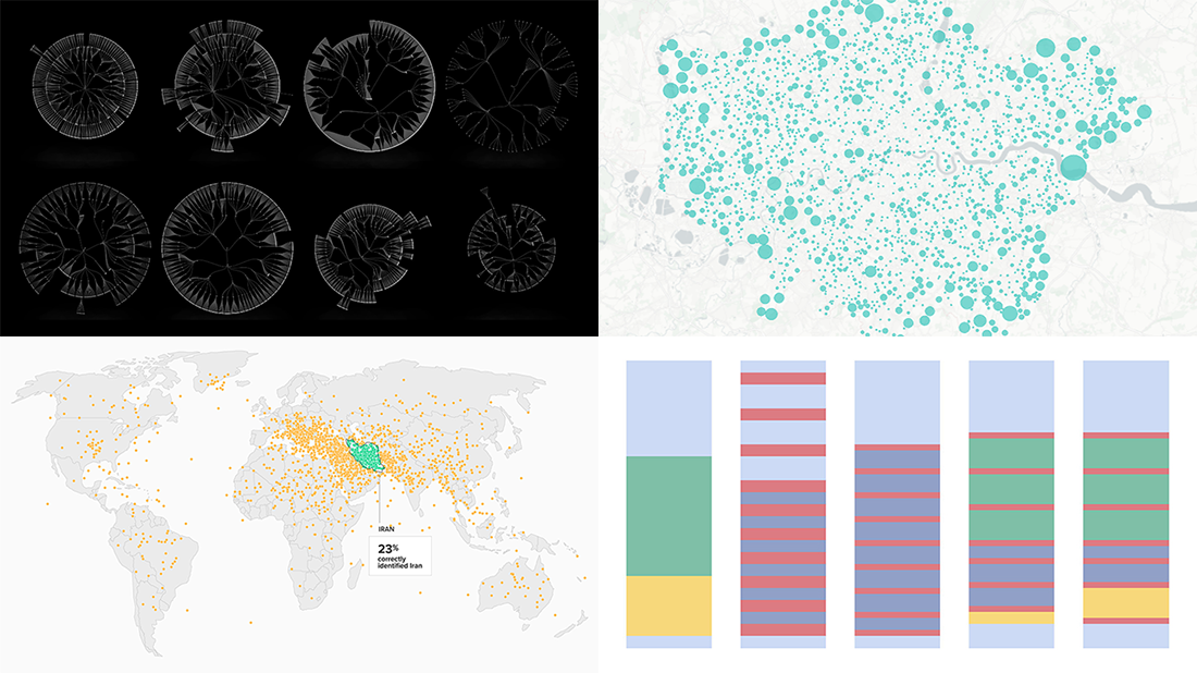
- Structure of British government departments — Peter Cook
- Identifying Iran on unlabeled maps — Morning Consult
- Time allocation before and with a baby — Caitlin Hudon
- Retreats from busy streets in big cities — Hans Hack
Read more »
January 10th, 2020 by AnyChart Team
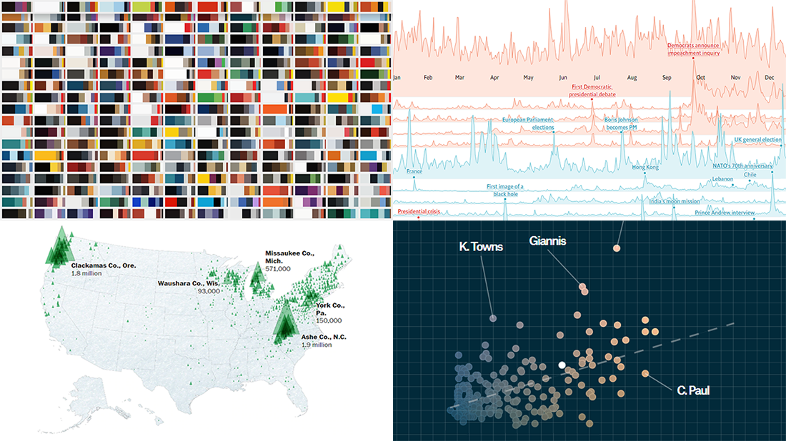
 2019 was very fruitful for the world of data visualization. We saw a lot of charts, maps, and infographics on all kinds of topics published here and there. Today we would like to invite you to recall some of the most top-notch data visualization projects. Enjoy these four awesome collections of the best charts of the past year:
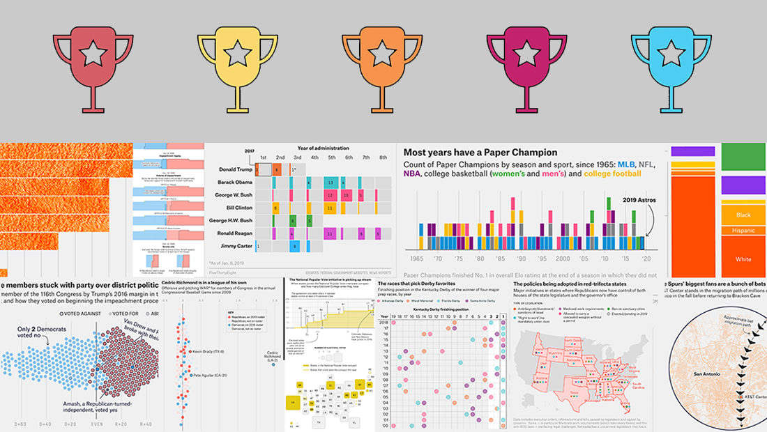
- FlowingData’s picks for the best data visualization projects of 2019
- The Pudding’s favorite visual and data-driven stories of 2019 (the Pudding Cup winners)
- FiveThirtyEight’s 56 best (“and weirdest”) charts made in 2019
- Visual Capitalist’s top infographics of 2019
Read more »
January 3rd, 2020 by AnyChart Team
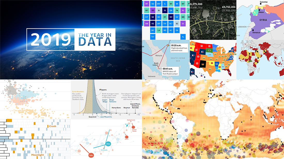 Happy New Year everyone! Now that 2020 is finally here, let’s hold on just one moment to take a look back at 2019. In the first DataViz Weekly post of this new year, we highlight four cool “Year in Charts” stories from the World Bank, The Economist, Financial Times, and Business Insider. Check them out to remember what 2019 was like.
Read more »
December 27th, 2019 by AnyChart Team
 Merry Christmas to all who celebrate it! On the last Friday of 2019, we invite you to check out the year’s last DataViz Weekly article on AnyChart Blog, highlighting some of the most interesting charts published at the end of the year. Of course, we could not help featuring some Christmas data graphics in this festive week. But here you will also learn about projects with cool charts on other subjects. Here’s a list of what the data visualizations shown in today’s DataViz Weekly are about:
- Where American Christmas trees come from — The Washington Post
- Top news stories of 2019 by readership — The Economist
- NBA players’ performance against pay — The Pudding
- Colors on Scientific American’s covers over 175 years of the magazine’s life — Scientific American
Read more »
December 20th, 2019 by AnyChart Team
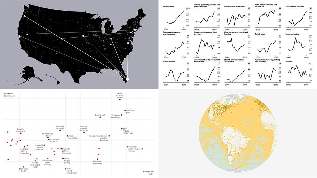 Visual data analytics with the help of charts and maps as efficient graphical presentation forms can quickly bring a lot of insight into mere numbers. We’ve curated some more examples from all over the web to illustrate this. See our new DataViz Weekly selection of great recently-published projects featuring data visualization in action:
- Street protests in the United States — Alyssa Fowers
- American GDP by county — Bloomberg
- Topical issues for U.S. voters — The Upshot, The New York Times
- Weather observations in old ship logbooks — Reuters
Read more »
December 13th, 2019 by AnyChart Team
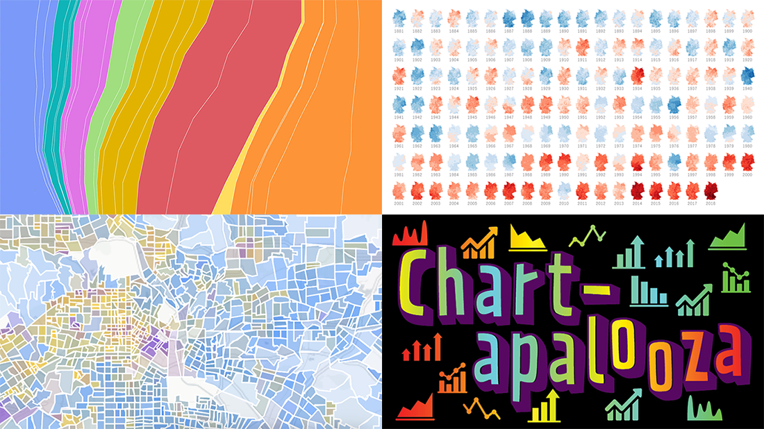 We know you love good data visualizations. So what we have here for you today is a presentation of new cool charts we’ve found this week. Look at the fresh examples of awesome data graphics, in DataViz Weekly:
- U.S. metropolitan growth — Zillow
- Climate change in Germany — Zeit Online
- Changes in job distribution in America — FlowingData
- Canada’s economy chartapalooza — Maclean’s Magazine
Read more »
December 6th, 2019 by AnyChart Team
 Today is Friday, which means we are ready to present four new cool examples of beautiful visualizations we came across just recently surfing the web. Look through a quick list of the projects featured this time in DataViz Weekly and do not hesitate to check them out right away:
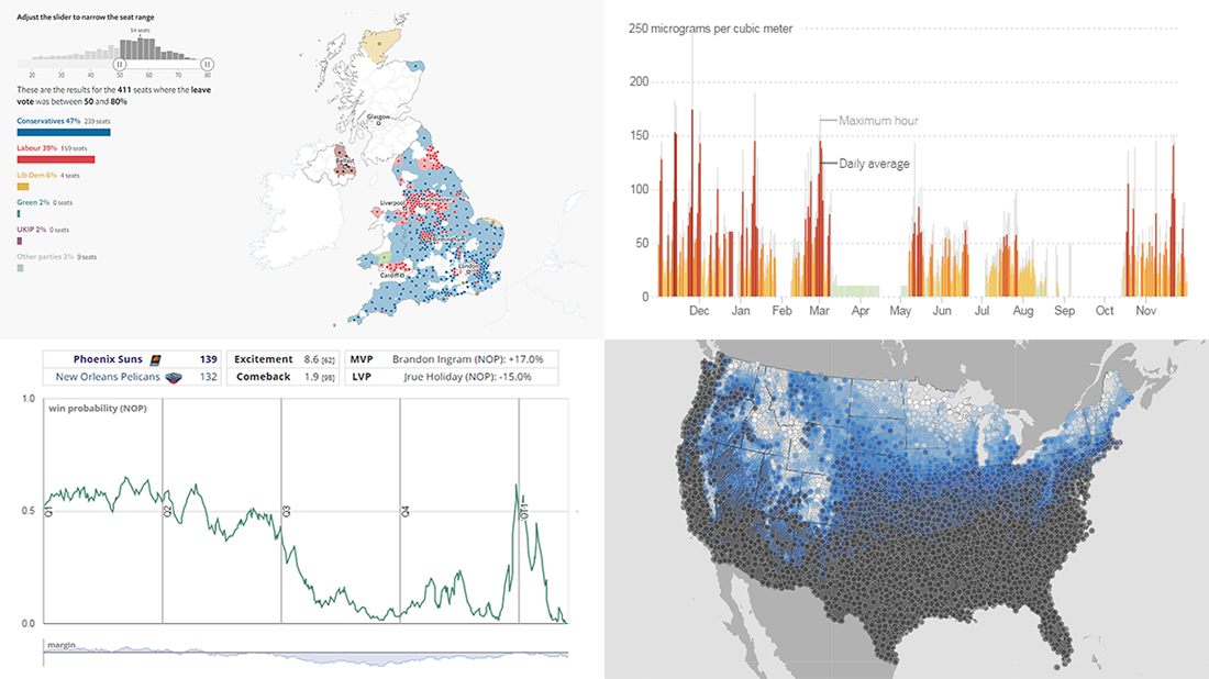
- 2015 and 2017 United Kingdom general election results (2019 on the way soon) — The Economist
- Air pollution worldwide and in your city — The New York Times
- NBA win probability box scores — inpredictable
- Probability of a white Christmas across the United States of America — NOAA
Read more »
November 29th, 2019 by AnyChart Team
 Hardly a day goes by without new visualizations appearing around the internet, providing insight into data about various things, big and small. Every week, we curate some of the most interesting ones to meet you with them within the framework of our regular DataViz Weekly feature. Enjoy and get inspired by information graphics examples on the following subjects in our new selection of cool visual data projects:
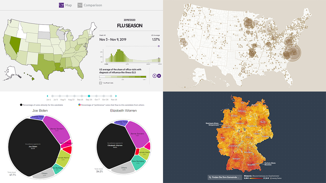
- Preferential polling for the Democratic presidential primaries — Swayable
- Rent prices in Germany — Zeit Online
- Flu season in the United States — athenaInsight
- Thanksgiving harvest origins — Esri’s StoryMaps team
Read more »