 Today is Friday, which means we are ready to present four new cool examples of beautiful visualizations we came across just recently surfing the web. Look through a quick list of the projects featured this time in DataViz Weekly and do not hesitate to check them out right away:
- 2015 and 2017 United Kingdom general election results (2019 on the way soon) — The Economist
- Air pollution worldwide and in your city — The New York Times
- NBA win probability box scores — inpredictable
- Probability of a white Christmas across the United States of America — NOAA
Beautiful Visualizations in Data Visualization Weekly: November 29, 2019 — December 6, 2019
UK General Elections of 2015 and 2017
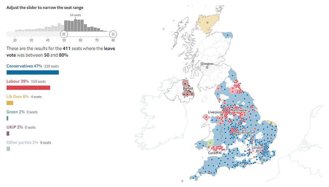
The Economist made beautiful visualizations of the results of the 2015 and 2017 general elections in the United Kingdom, providing an insightful view of how Britain voted. There, it is possible to make use of multiple filters to find and look into some interesting patterns revealing how demographics can be considered to determine the landscape of the country’s political geography. You can filter by leave vote, population density, income, young, old, and white and British people.
Apply filters, play with the Parliament seat range slider, and watch the map changing. There is room for the upcoming 2019 UK election, so returning here for a look at the new vote data after December 12 could be a good idea if you are interested.
Air Pollution Worldwide and In Your City
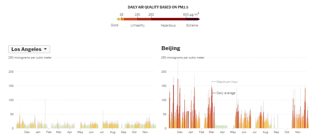
The New York Times published an impressive visual story that shows at a glance air quality data from the U.S. Environmental Protection Agency (EPA) and Berkeley Earth. The piece starts with displaying floating particles depicting microscopic particulate pollution called PM2.5. Choose a world city and the number (or concentration) of dots will demonstrate air pollution in that city on this year’s worst day in terms of air quality. Then you can explore how air pollution in different cities have been changing over the past year based on daily air quality data, and in particular, compare them to America’s San Francisco, India’s New Delhi, and China’s Beijing.
While scrolling down the story, don’t miss out on an animated map of the world. Visualizing data from the Copernicus Atmosphere Monitoring Service implemented by the European Center for Medium-Range Weather Forecasts (ECMWF), it shows particulate pollution around the globe over the course of the year, highlighting the areas worth paying special attention to.
NBA Win Probability Box Scores
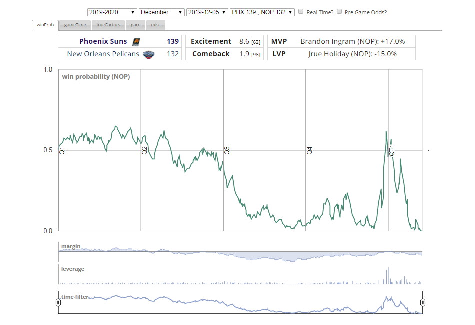
Michael Beuoy, currently VP at Blue Shield of California, a health plan provider, owns a cool website named “inpredictable” that he uses as a playground for his sports analytics hobby with the primary focus on American basketball, NBA and WNBA. He indeeed shares a lot of very interesting data and statistics stuff over there, so you should definitely check it out.
A good idea is to start with exploring his NBA Win Probability Box Scores work that features win probability charts for NBA games going back to season 1996-97. What captivated our attention to this project lately was a new “dopplegamers” feature. The win probability shape of of each game is now compared to all other NBA games over more than twenty years, and now you can open the “misc” tab to see the three most similar games; the 100% similarity score marks the identical win probability. Everyone fond of sports statistics and analytics will definitely be amazed to check out this tool and the whole website. So welcome.
Probability of White Christmas in America
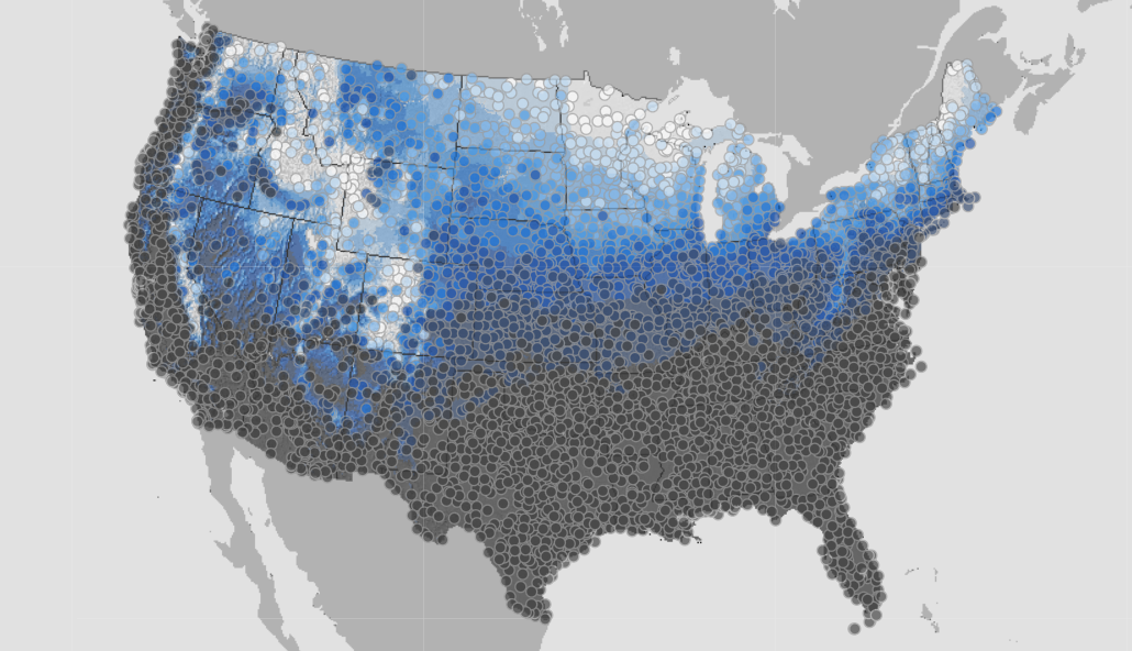
Many Americans, especially kids, are known to dream of a white Christmas. So will there be snow on December 25 in your area? Check this map to find out. Visualizing data from the National Oceanic and Atmospheric Administration’s National Centers for Environmental Information, it displays the historic probability of seeing at least one inch of snow on Christmas Day across the conterminous United States. The darkest gray color shows locations in which the chances of observing snow on the ground or snowfall on December 25 are under 10%. The areas highlighted in white are lucky as the probability of a white Christmas there is between 90% and 100%.
Look at the map to learn what to expect on Christmas Day this year in terms of snow. However, keep in mind that it’s just a historic probability, you now, not a fact (at least yet).
***
Data Visualization Weekly will be back to AnyChart Blog in seven days, bringing a showcase of another four new beautiful visualizations we will have found and impressed with by then. Meanwhile, may all of you guys have a wonderful time. Stay tuned.
- Categories: Data Visualization Weekly
- No Comments »