Creating Radar Chart with JavaScript
December 23rd, 2022 by Awan Shrestha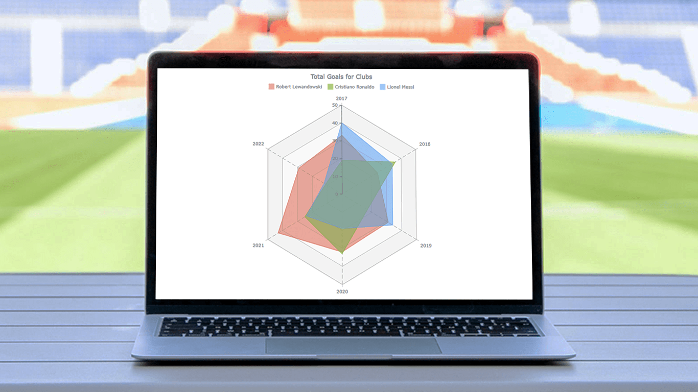 There are various data visualization techniques designed to reveal insights that numbers alone just can’t. In this tutorial, we will see how to easily create a radar chart using JavaScript. It is an effective way to graphically represent multivariate data of several quantitative variables.
Writing the tutorial during the FIFA World Cup 2022, I could not resist taking some football data for a practical illustration. The JS radar chart examples built and customized here step by step will plot the number of goals three top players have scored for their clubs over the last six years: Lionel Messi, Cristiano Ronaldo, and Robert Lewandowski.
The whistle for kickoff is blown, and it all begins!
Read the JS charting tutorial »
- Categories: AnyChart charting component, HTML5, JavaScript, JavaScript chart tutorials, Tips and tricks
- No Comments »
How to Create Word Tree Using JavaScript
October 14th, 2022 by Awan Shrestha It is a pure fact that a graphical or pictorial representation of data, known as a data visualization, conveys information faster than raw data in arrays, spreadsheets, or dense reports. Charts make data easier to understand, which further helps to quickly develop valuable insights. Interesting, right? Now, let’s have a look at one chart type called a word tree and see how to build it with ease.
A word tree is a data visualization form designed to show multiple parallel sequences of words (or phrases) as they appear in a text. Analyzing texts becomes easier with word trees as they display, by means of a branching structure, how selected words are connected to others.
In this tutorial, I will walk you through the process of creating a beautiful word tree chart with JavaScript (HTML5). The text being visualized will be the famous speech “I Have a Dream” by minister and civil rights activist Martin Luther King Jr. Each step will be explained in detail, and you’ll see everything is pretty simple. Sit tight and enjoy the learning!
Read the JS charting tutorial »
- Categories: AnyChart charting component, HTML5, JavaScript, JavaScript chart tutorials, Tips and tricks
- No Comments »
New Examples of Charts Enabling Effective Visual Data Exploration — DataViz Weekly
September 9th, 2022 by AnyChart Team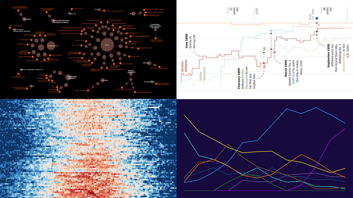 DataViz Weekly is back with a quick look at some of the most interesting new examples of charts that enable effective visual data exploration. Here are the projects featured this time:
- Producers of Russian military equipment — Texty
- Wins, losses, and comebacks in Serena Williams’s professional tennis career — The Washington Post
- Tropical nights in Spain over the decades — elDiario.es
- Platform origins of viral memes — Know Your Meme
- Categories: Data Visualization Weekly
- No Comments »
Creating Circle Packing Chart with JavaScript
September 8th, 2022 by Awan Shrestha A circle packing chart is a common data visualization technique for representing hierarchically organized data through nested circles. Due to the similarity to a treemap, which uses nested rectangles for the same purpose, sometimes it is called a circular treemap. Introduced to data analysis by American mathematician William Thurston in 1985, circle packings greatly reveal the hierarchical structure of data.
I want to show how you can easily build an elegant interactive circle packing chart with the help of JavaScript! In this step-by-step tutorial, we will be representing the world’s 100 wealthiest people in 2022 by country and industry, according to Forbes’ list of billionaires. So, get your packings done and get ready as your brain is going to get slightly richer!
Read the JS charting tutorial »
- Categories: AnyChart charting component, HTML5, JavaScript, JavaScript chart tutorials, Tips and tricks
- 1 Comment »
Creating Connector Map with JavaScript
July 15th, 2022 by Awan Shrestha Connector maps are designed to be ideal for visualizing routes and other links between locations in geospatial data analysis. In this tutorial, you’ll learn how to quickly create a compelling interactive one using JavaScript.
Step by step, we will be visualizing a route of the famous ancient Silk Road. We’ll start with the development of a basic JS connector map in four moves and then make a few tweaks to make it look awesome. Let’s start the voyage!
Read the JS charting tutorial »
- Categories: AnyChart charting component, AnyMap, HTML5, JavaScript, JavaScript chart tutorials, Tips and tricks
- No Comments »
How to Make Treemap Using JS
June 8th, 2022 by Awan Shrestha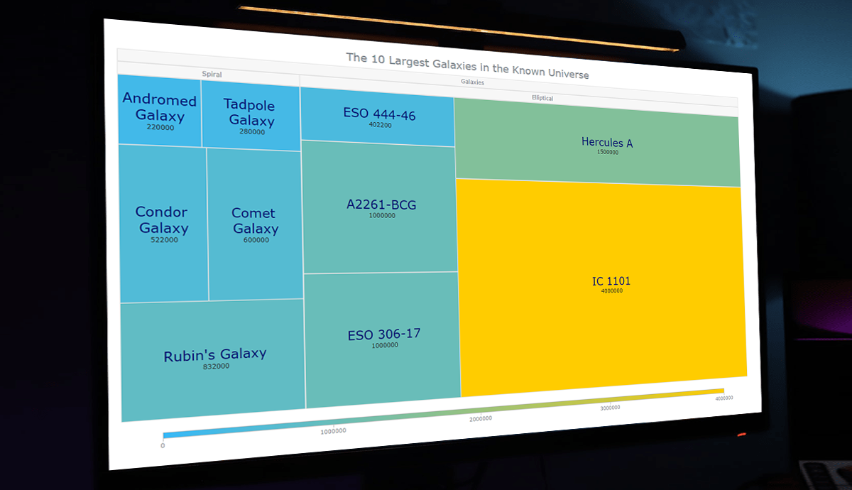 Treemap visualizations are widely used in hierarchical data analysis. If you need to build one but have never done that before, you might think the process is somewhat complicated. Well, not necessarily. I decided to make a step-by-step tutorial explaining how to create awesome interactive treemap charts with ease using JavaScript. And you’re gonna love the illustrations!
Are we alone in the universe? A question every one of us has asked ourselves at some point. While we are thinking about the odds of the Earth being the only habitable planet in the universe, or not, one of the things we might consider is how big the universe is. Let’s look at that with the help of treemaps! In this tutorial, we will be visualizing the scale of the 10 largest galaxies in the known universe using the treemapping technique.
So, would you like to know how to quickly build a JS-based treemap chart? Follow me in this stepwise tutorial and learn in an easy, fun way!
Read the JS charting tutorial »
- Categories: AnyChart charting component, HTML5, JavaScript, JavaScript chart tutorials, Tips and tricks
- No Comments »
Building Area Chart with JavaScript
May 12th, 2022 by Awan Shrestha If you are into data visualization, one of the things that you might often need to do is represent a variable’s values over time. Or, you might need to compare multiple datasets in terms of how they are changing during a certain period. This is where area charts can be helpful.
Not sure how to build an elegant area chart? Now you will master a really easy way! In this step-by-step tutorial, we will be visualizing data on the military budgets of the USA and Russia over the past two decades in interactive area charts using JavaScript. All aboard!
Read the JS charting tutorial »
- Categories: AnyChart charting component, HTML5, JavaScript, JavaScript chart tutorials, Tips and tricks
- No Comments »