How to Build Point Map with JavaScript
December 22nd, 2023 by Awan Shrestha If you’re a budding developer or data enthusiast eager to explore map creation, you’re in the right place. In this tutorial, I’ll guide you through how to easily build an interactive point map using JavaScript.
To make things even more interesting, I’ll use data on the number of millionaires in cities as an example. By the end of this tutorial, you’ll have made a visually stunning JS point map, ready to tell the story of the world’s wealthiest cities and a solid understanding of applying these skills to any data and scenarios. And stick around for a bonus at the end — I’ll also show you how to transform your point map into a bubble map where the size of the markers conveys additional information.
Ready to master the JS point mapping technique? Let’s get started, and don’t forget to join me in the bonus section where size matters!
Read the JS charting tutorial »
- Categories: AnyChart Charting Component, AnyMap, Big Data, HTML5, JavaScript, JavaScript Chart Tutorials, Tips and Tricks
- No Comments »
How to Make Mekko Chart Using JavaScript
November 27th, 2023 by Awan Shrestha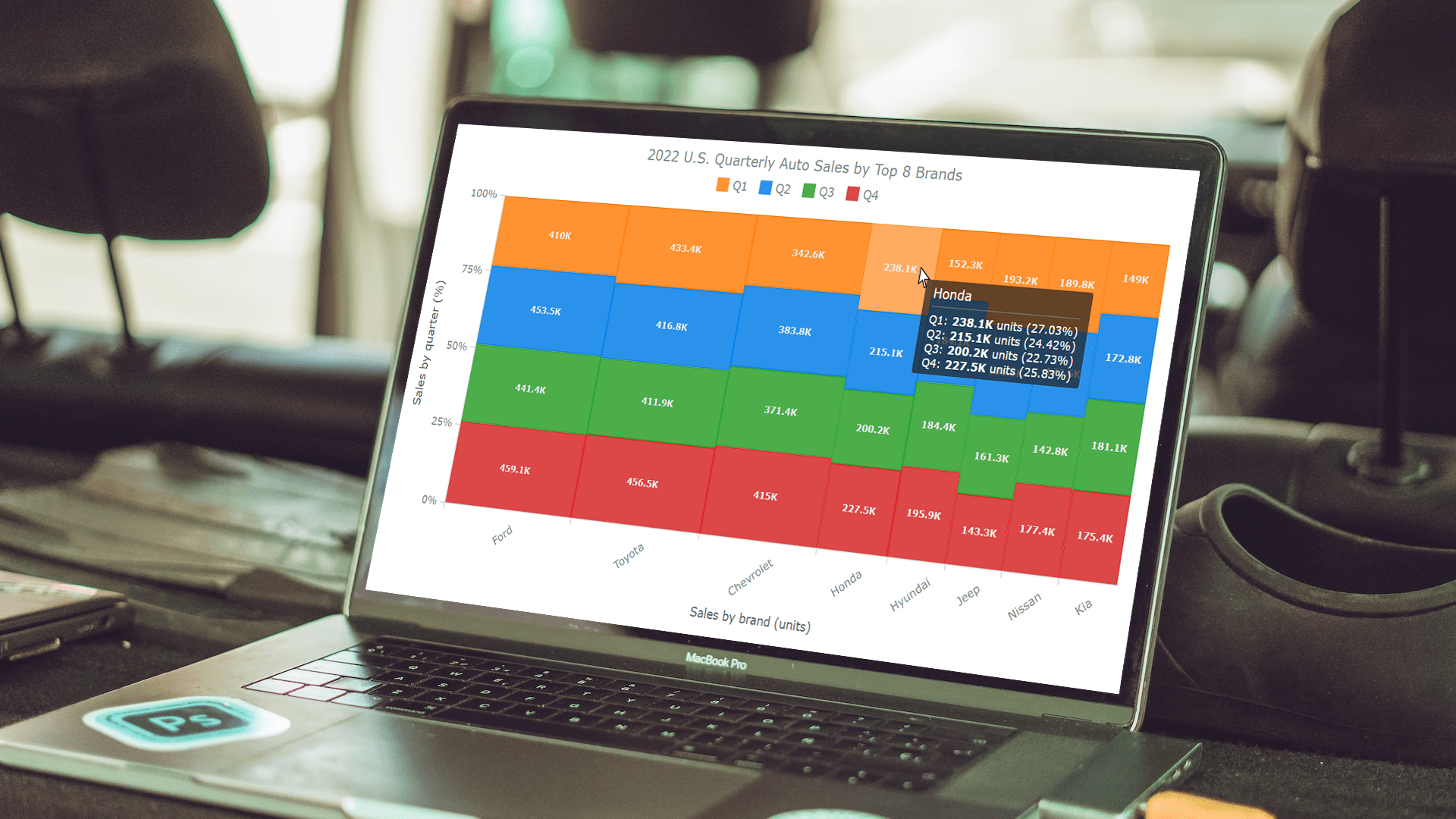 Data visualization plays a pivotal role in comprehending complex information and conveying insights clearly. Among the diverse array of techniques, the Mekko chart stands out for its ability to vividly represent categorical data and illuminate relationships between categories and subcategories.
In this tutorial, we will delve into the world of Mekko charts. First, let’s take a moment to explore what they are and how they function. Then, we’ll get to the focal point, a step-by-step guide on how to quickly create a Mekko chart using JavaScript.
The data used for illustration is the U.S. car sales data for the top eight car brands in 2022. By the end of this tutorial, you will have crafted a cool interactive JS Mekko chart that graphically represents the respective proportions within this data by brand and by quarter.
So, ignite your data visualization engines, and let’s go!
Read the JS charting tutorial »
- Categories: AnyChart Charting Component, HTML5, JavaScript, JavaScript Chart Tutorials, Tips and Tricks
- No Comments »
OHLC Chart: Understanding & Creating in JavaScript Step-by-Step
November 13th, 2023 by Awan Shrestha Unearthing insights from vast datasets is an intricate blend of art and science. In the realm of financial analysis, a pivotal instrument for visually exploring complex data is the Open-High-Low-Close (OHLC) chart. This tutorial is your roadmap to swiftly crafting your OHLC chart using JavaScript, a step-by-step journey. We’ll harness S&P 500 data, and by the end of this article, you’ll possess the skills to orchestrate visual stock analysis adeptly.
Read the JS charting tutorial »
- Categories: AnyChart Charting Component, AnyStock, Big Data, Business Intelligence, Financial Charts, HTML5, JavaScript, JavaScript Chart Tutorials, Stock Charts, Tips and Tricks
- No Comments »
Building Waterfall Charts in JS
November 2nd, 2023 by Awan Shrestha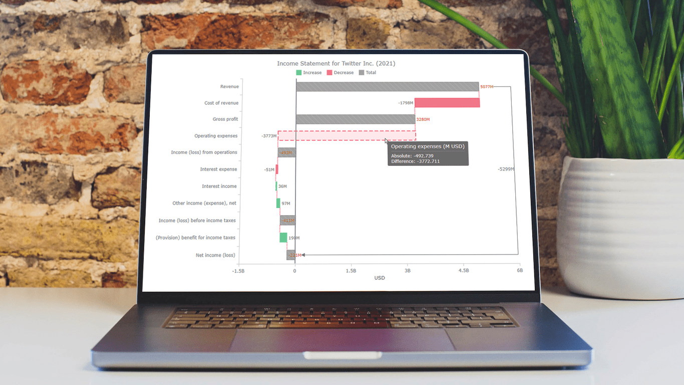 Data visualization is an essential tool for understanding complex data sets and effectively conveying insights. Among the various types of charts and graphs used for this purpose, the waterfall chart stands out as a powerful way to represent changes in financial data, such as revenue, expenses, and profits over a specific period.
In this tutorial, we'll explore how to create a waterfall chart using JavaScript. To illustrate the process, we'll use the example of an income statement for a company, in this case, Twitter Inc.’s latest (and last) one.
Whether it’s to analyze a company's financial performance, project budgets, or inventory fluctuations, this step-by-step guide will help you easily create a useful interactive JS-based waterfall chart.
Read the JS charting tutorial »
- Categories: AnyChart Charting Component, Big Data, Business Intelligence, HTML5, JavaScript, JavaScript Chart Tutorials, Tips and Tricks
- No Comments »
How to Create Resource Chart with JavaScript
October 16th, 2023 by Awan Shrestha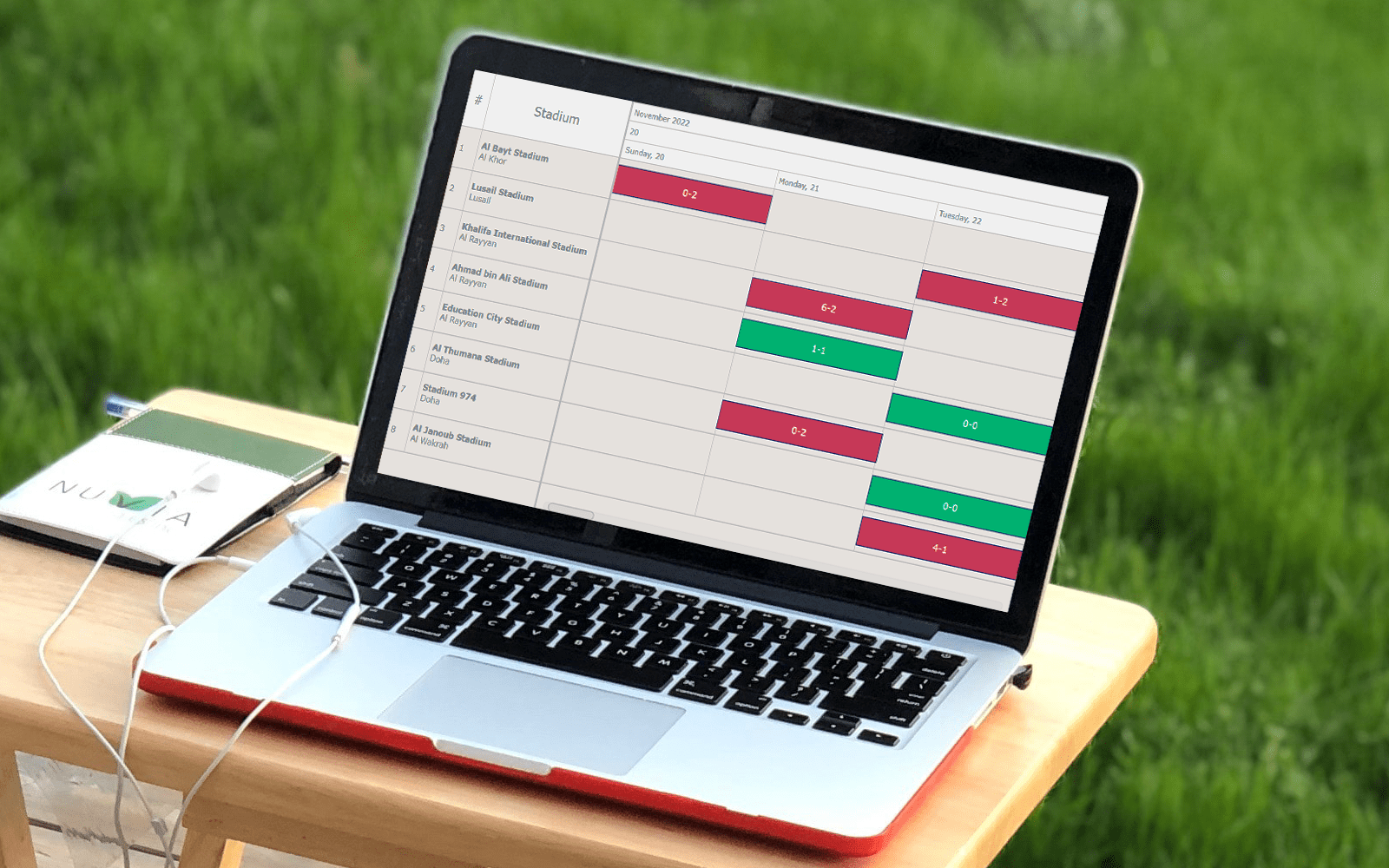 In today’s data-driven world, data visualization simplifies complex information and empowers individuals to make informed decisions. One particularly valuable chart type is the Resource Chart, which facilitates efficient resource allocation. This tutorial will be your essential guide to creating dynamic resource charts using JavaScript.
A resource chart is a type of Gantt chart that visualizes data about resource utilization, such as equipment, employees, and so on. It provides a comprehensive overview, making it easier to make informed decisions promptly. As an illustrative example, in this tutorial, I will represent the FIFA World Cup 2022 Qatar schedule by stadium, enabling you to track when and where each game took place.
Get your coding boots ready, and by the end of this guide, you’ll be well-equipped to create your own JS-based resource chart and have a valuable tool at your disposal for tracking your next favorite tournament, or servers status, or employee project assignments, or anything else of that kind.
Read the JS charting tutorial »
- Categories: AnyChart Charting Component, AnyGantt, Business Intelligence, Gantt Chart, HTML5, JavaScript, JavaScript Chart Tutorials, Tips and Tricks
- No Comments »
Nobel Laureates’ Countries, or Making Tag Cloud with JavaScript
October 3rd, 2023 by Awan Shrestha The Nobel Prize 2023 announcements are just around the corner, scheduled from October 2 to 9. Recently, I stumbled upon this news, sparking my interest in Nobel laureates and their countries of origin.
This curiosity led me to the comprehensive list of Nobel Prize winners on Britannica, which I transformed into an interactive tag cloud (or word cloud) using JavaScript, providing an elegant means to explore and uncover the countries with the highest number of Nobel laureates throughout history.
During this process, it dawned on me that this visualization could serve as an excellent illustrative example for a tutorial on creating interactive JS-based tag clouds. So, if you share my curiosity about Nobel laureates by country, you’re in for a treat right below! and if you’re eager to learn how I brought this tag cloud to life — and, therefore, how you can create your own — read on!
Read the JS charting tutorial »
- Categories: AnyChart Charting Component, Big Data, HTML5, JavaScript, JavaScript Chart Tutorials, Tips and Tricks
- No Comments »
Building Bubble Chart with JavaScript
August 1st, 2023 by Awan Shrestha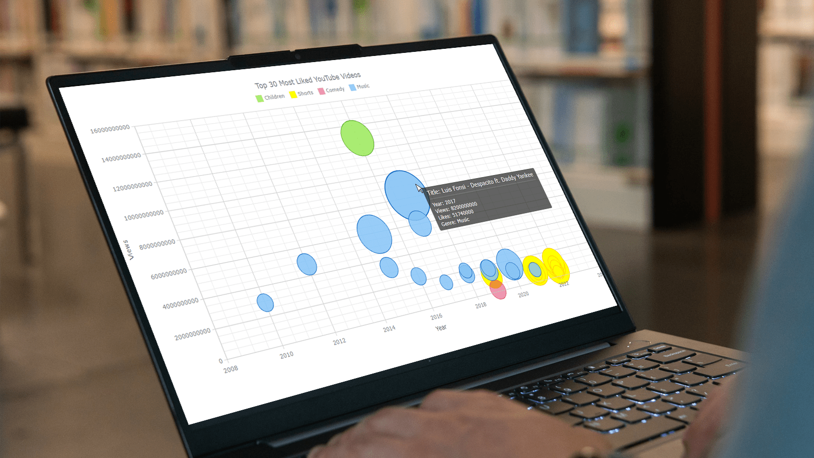 Do you want to turn that data chaos into a comprehensible data show? Look no further than data visualization! And let me tell you, one chart to rule them all is the bubble chart. It's like blowing bubbles at your data and watching them pop into understanding! And the best part? With JavaScript, you can easily create an interactive bubble chart, and I will show you how!
Bubble charts are versatile data visualizations that display data points in the form of bubbles, where the bubbles' size, color, and position represent different variables. In this tutorial, I'll walk you through building these graphics step by step, making the process a breeze. For illustration, we'll take data on the popularity of various YouTube videos and use JavaScript to create an interactive bubble chart showcasing the top 30 most-liked videos of all time, categorized by year of release, views, and likes.
By the end of this tutorial, you'll be able to create visually-stunning JS-based bubble charts without any hassle. So let's dive into the world of data bubbles and turn numbers into a visual feast for the eyes!
Read the JS charting tutorial »
- Categories: AnyChart Charting Component, Big Data, Business Intelligence, HTML5, JavaScript, JavaScript Chart Tutorials, Tips and Tricks
- No Comments »
How to Make Sunburst Chart in JavaScript
June 19th, 2023 by Awan Shrestha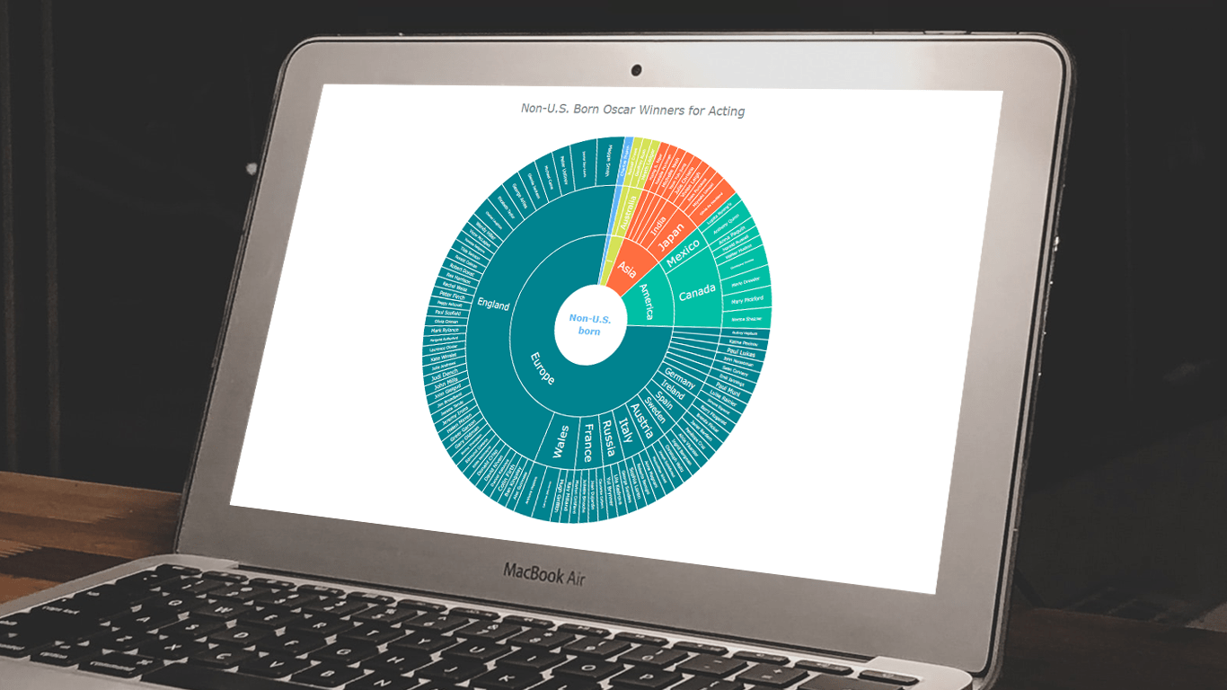 In the world of data all around us, charts play a crucial role in helping us explore and understand data more effectively. One powerful visualization technique is the sunburst chart, which allows us to represent hierarchical datasets, providing insights into complex compositions visually. In this tutorial, I’ll show you how to create your own stunning interactive sunburst charts using JavaScript effortlessly.
We’ll embark on an exciting journey using data about Oscar-winning actors and actresses from countries around the world as an example. Our JS-based sunburst chart will shine a spotlight on the achievements of those born outside the United States, representing the rich diversity of their origins.
Get ready to unlock the secrets of JavaScript sunburst chart development as I’ll guide you step-by-step. Together, we’ll learn how to effortlessly bring data to life, creating this mesmerizing visualization that engages and informs. Let’s dive in and discover the fascinating world of the sunburst chart!
Read the JS charting tutorial »
- Categories: AnyChart Charting Component, Big Data, HTML5, JavaScript, JavaScript Chart Tutorials, Tips and Tricks
- No Comments »
How to Create Candlestick Chart with JavaScript for Stock Analysis
May 2nd, 2023 by Awan Shrestha Candlestick charts are a fantastic data visualization tool for tracking the price movements of stocks over a period of time. In this tutorial, I'll show you how to create your own candlestick chart using JavaScript.
We’ll be using TSMC (Taiwan Semiconductor Manufacturing Company) as an example, as they're the largest contract chip maker in the world and have been making waves in the stock market recently.
By the end of this tutorial, you'll be able to create your own JS candlestick charts and analyze stock trends like a pro. So, let's get started and dive into the exciting world of data visualization with JavaScript!
Read the JS charting tutorial »
- Categories: AnyChart Charting Component, AnyStock, Big Data, Financial Charts, HTML5, JavaScript, JavaScript Chart Tutorials, Tips and Tricks
- 2 Comments »
Building 3D Surface Plot in JavaScript
April 11th, 2023 by Awan Shrestha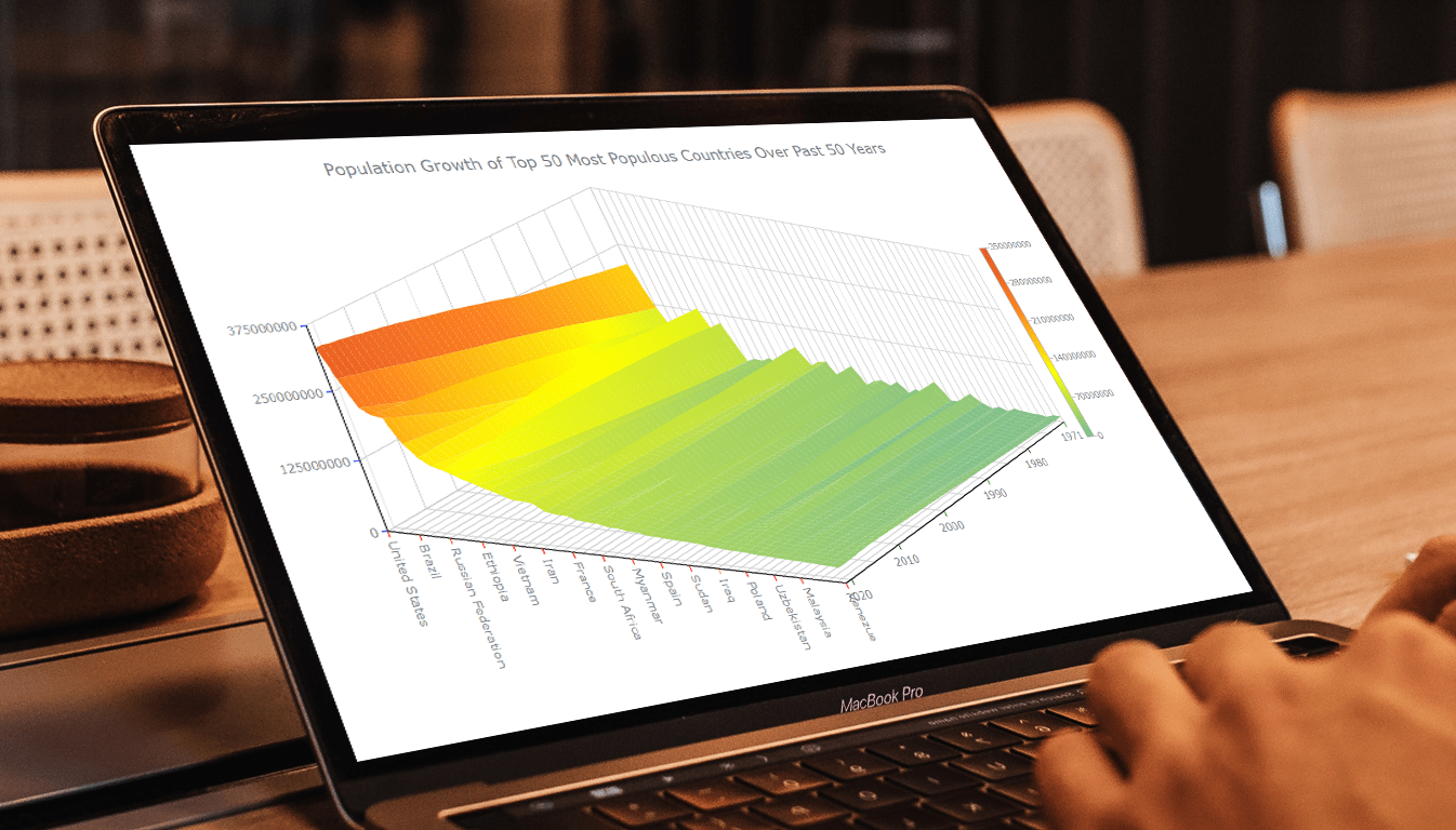 Welcome to this tutorial on creating a visually stunning and interactive 3D surface plot using JavaScript! If you’re passionate about data visualization and want to expand your skills to the next level, this guide is for you. Here, we’ll take you through a step-by-step process to create an engaging 3D surface plot that will make your data come alive.
Sometimes, representing complex information using traditional 2D charts can be difficult, especially when working with large datasets or data that varies over three or more dimensions. This is where a 3D surface plot (or surface chart) can prove to be useful. In this tutorial, we’ll be using real-world population data to create our surface plot, showcasing the population growth trends of the top 50 most populous countries in the world. You don’t need to be a data expert to follow this guide, as we’ll cover everything in detail.
So, sit back, grab your favorite beverage, and let’s dive into the world of data visualization with a 3D surface plot. By the end of this tutorial, you’ll have an impressive chart that you can showcase to your colleagues or friends. Let’s get started!
Read the JS charting tutorial »
- Categories: AnyChart Charting Component, Big Data, HTML5, JavaScript, JavaScript Chart Tutorials, Tips and Tricks
- No Comments »