 Data visualization plays a pivotal role in comprehending complex information and conveying insights clearly. Among the diverse array of techniques, the Mekko chart stands out for its ability to vividly represent categorical data and illuminate relationships between categories and subcategories.
In this tutorial, we will delve into the world of Mekko charts. First, let’s take a moment to explore what they are and how they function. Then, we’ll get to the focal point, a step-by-step guide on how to quickly create a Mekko chart using JavaScript.
The data used for illustration is the U.S. car sales data for the top eight car brands in 2022. By the end of this tutorial, you will have crafted a cool interactive JS Mekko chart that graphically represents the respective proportions within this data by brand and by quarter.
So, ignite your data visualization engines, and let’s go!
What Is a Mekko Chart?
The Mekko Chart is a two-dimensional visualization of categorical data presented in a rectangular grid, often referred to as the mosaic plot. Essentially, it functions as a variable-width 100% stacked column chart with no spacing between columns and is designed to assist data analysts in uncovering relationships between categories and subcategories.
Mekko charts effectively represent categorical data across two variables along the horizontal and vertical axes, respectively. Each category is depicted as a column, signifying 100%, and its width illustrates the category’s size relative to the total of all categories, which is also represented as 100%. These columns are further divided into components, with the height of each sub-column indicating the proportion of subcategories within the overarching category.
Mekko charts are also known as Marimekko charts. The "full" name "Marimekko charts" pays homage to the Finnish textile company Marimekko, renowned for its vibrant prints, some of which these charts resemble. Staying true to their inspirational source, Marimekko charts offer an engaging approach to intuitively presenting complex data. They excel in scenarios where you need to showcase how categories and subcategories contribute to their respective wholes and compare these contributions. These charts find wide-ranging applications across various fields, including market segmentation, product portfolio analysis, and project resource allocation.
Mekko Chart Example: Preview
Eager to catch a glimpse of the data graphic we’re about to create? Here’s a sneak peek of what the final JavaScript-based Mekko chart will look like after implementing all the steps described in this tutorial.
Get ready to kickstart this data visualization journey with JavaScript. Buckle up as we steer through this data-driven road trip!
A. Building a Basic Mekko Chart with JavaScript
Creating a JS-based Mekko chart is just a few simple steps away. Those are:
- Set up an HTML page with a container
- Include the required JavaScript files
- Load the data
- Write some JS charting code
No need to worry if you’re a beginner in HTML, CSS, and JavaScript – I’ll guide you through every step in detail.
1. Set up an HTML page with a container
To create a Mekko chart, you’ll need to set up an HTML container, your canvas for this masterpiece. Here’s how:
Begin by creating a basic HTML page, or if you have one ready, use that as your starting point.
Next, introduce a <div> element into the body of your HTML page. Give it a unique ID, which you’ll refer to in the JavaScript charting code.
You can also adjust CSS rules within the <style> tags to influence the chart’s appearance. For instance, if you want it to span the entire page, set both the width and height properties to 100%. However, keep in mind that these CSS properties are totally flexible, and you can modify them to match the design and aesthetic requirements of your project.
Here’s an example of how a basic web page structure, including a Mekko chart container element, might look:
<!DOCTYPE html>
<html lang="en">
<head>
  <meta charset="utf-8">
  <title>JavaScript Mekko Chart</title>
  <style type="text/css">
    html,
    body,
    #mekko-container {
      width: 100%;
      height: 100%;
      margin: 0;
      padding: 0;
    }
  </style>
</head>
<body>
  <div id="mekko-container"></div>
</body>
</html>
2. Include the required JavaScript files
With your HTML structure in place, it’s time to incorporate the JavaScript files needed for creating the required graphic. To streamline the process, you can opt for a JavaScript charting library that comes with built-in Mekko chart support. This tutorial uses AnyChart.
Generally, you have two ways to include JavaScript files. You can download them for local usage or link them directly via a CDN. This tutorial showcases the CDN approach.
Here’s how your HTML code might look with a library’s modules:
<!DOCTYPE html>
<html lang="en">
<head>
  <meta charset="utf-8">
  <title>JavaScript Mekko Chart</title>
  <style type="text/css">
    html,
    body,
    #mekko-container {
      width: 100%;
      height: 100%;
      margin: 0;
      padding: 0;
    }
  </style>
  <script src="https://cdn.anychart.com/releases/8.11.1/js/anychart-core.min.js"></script>
  <script src="https://cdn.anychart.com/releases/8.11.1/js/anychart-mekko.min.js"></script>
</head>
<body>
  <div id="mekko-container"></div>
</body>
</html>
3. Load the data
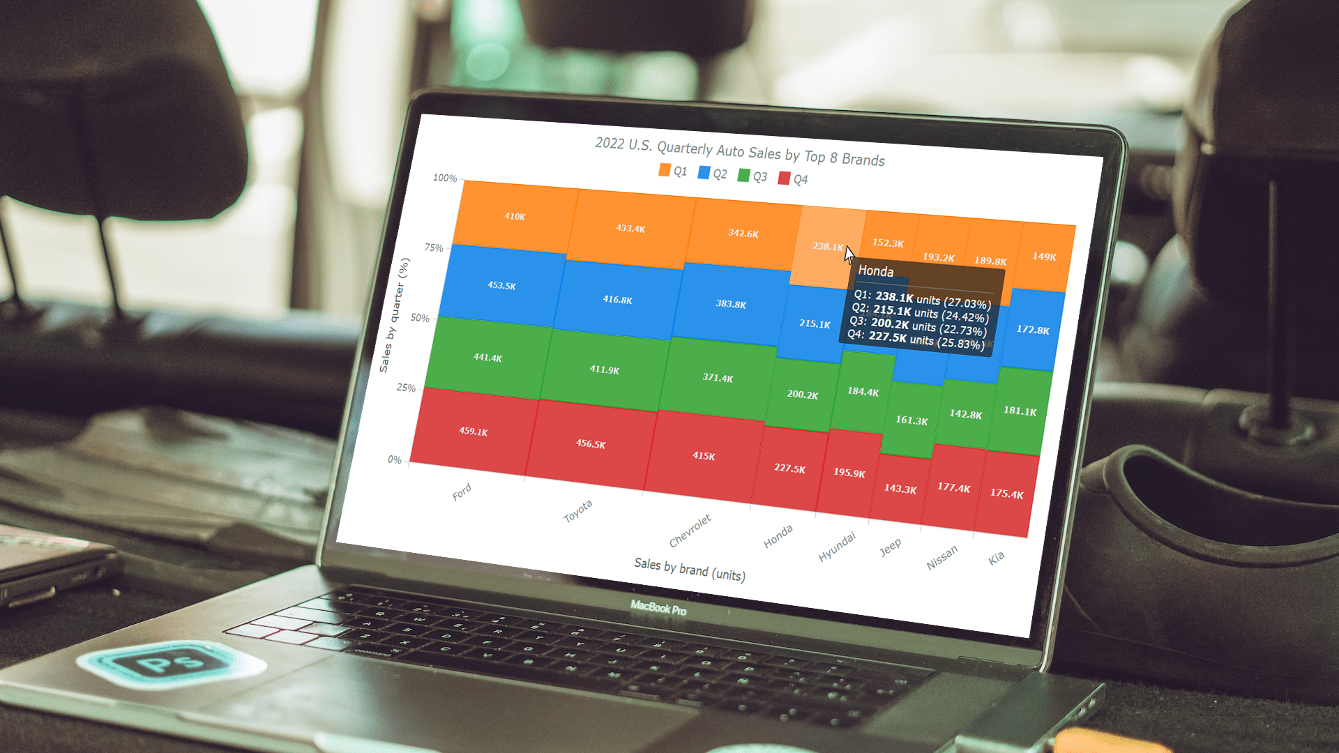
Now, it’s time to provide your Mekko chart with data. The data I’m guiding you through visualizing in this tutorial pertains to auto sales of the top 8 car brands in the United States for the year 2022, broken down by quarter for each brand. It has been sourced from GoodCarBadCar.net. Given the dataset’s conciseness, you can add it directly into the JS code.
In the example provided below, the data is structured as a JavaScript object referred to as "data." This object encompasses the title of the dataset, a header array that delineates the four quarters of 2022, and a rows array. Within the rows array, each item is itself an array that corresponds to a leading auto brand and its quarterly sales figures.
var data = {
  title: "2022 U.S. Quarterly Auto Sales by Top 8 Brands",
  header: ["Name", "Q1", "Q2", "Q3", "Q4"],
  rows: [
    ["Ford", 410.0, 453.5, 441.4, 459.1],
    ["Toyota", 433.4, 416.8, 411.9, 456.5],
    ["Chevrolet", 342.6, 383.8, 371.4, 415.0],
    ["Honda" 238.1, 215.1, 200.2, 227.5],
    ["Hyundai", 152.3, 184.1, 184.4, 195.9],
    ["Jeep", 193.2, 186.6, 161.3, 143.3],
    ["Nissan", 189.8, 172.6, 142.8, 177.4],
    ["Kia", 149.0, 172.8, 181.1, 175.4]
  ]
};
4. Write some JS charting code
Now that the data is ready, start coding your Mekko chart with JavaScript.
Begin by adding the anychart.onDocumentReady() function, which ensures that your chart is rendered only when the web page is fully loaded.
<script>
  anychart.onDocumentReady(function () {
    // The Mekko chart data and code will be in this section
  });
</script>
Then, introduce the data prepared in Step 3 to create a Mekko chart.
anychart.onDocumentReady(function () {
  // create a dataset
  var data = {
      title: "2022 U.S. Quarterly Auto Sales by Top 8 Brands",
      header: ["Name", "Q1", "Q2", "Q3", "Q4"],
      rows: [
        ["Ford", 410.0, 453.5, 441.4, 459.1],
        ["Toyota", 433.4, 416.8, 411.9, 456.5],
        ["Chevrolet", 342.6, 383.8, 371.4, 415.0],
        ["Honda", 238.1, 215.1, 200.2, 227.5],
        ["Hyundai", 152.3, 184.1, 184.4, 195.9],
        ["Jeep", 193.2, 186.6, 161.3, 143.3],
        ["Nissan", 189.8, 172.6, 142.8, 177.4],
        ["Kia", 149.0, 172.8, 181.1, 175.4]
      ]
    };
  });
Next, within the same code enclosing function, create a Mekko chart instance and add the data to it.
// create a mekko (marimekko) chart
var chart = anychart.mekko();

// add the data to the chart
chart.data(data);
Finally, just put the chart in the div container created in Step 1 and draw the resulting Mekko chart.
// set the container
chart.container("mekko-container");

// draw the chart
chart.draw();
And with that, you’ve successfully created a Mekko chart using JavaScript. By observing the width of the columns, you can determine the sales share for each brand, while the height of the bars within each column reveals the quarterly brand sales distribution. Feel free to explore the interactive version of this chart here, and stay tuned for the next section of this tutorial, which will delve into some ways to customize a ready JS Mekko chart.
<!DOCTYPE html>
<html lang="en">
<head>
  <meta charset="utf-8">
  <title>JavaScript Mekko Chart</title>
  <style type="text/css">
    html,
    body,
    #mekko-container {
      width: 100%;
      height: 100%;
      margin: 0;
      padding: 0;
    }
  </style>
  <script src="https://cdn.anychart.com/releases/8.11.1/js/anychart-core.min.js"></script>
  <script src="https://cdn.anychart.com/releases/8.11.1/js/anychart-mekko.min.js"></script>
</head>
<body>
  <div id="mekko-container"></div>
  <script>
    anychart.onDocumentReady(function () {
      // create a dataset
      var data = {
        title: "2022 U.S. Quarterly Auto Sales by Top 8 Brands",
        header: ["Name", "Q1", "Q2", "Q3", "Q4"],
        rows: [
          ["Ford", 410.0, 453.5, 441.4, 459.1],
          ["Toyota", 433.4, 416.8, 411.9, 456.5],
          ["Chevrolet", 342.6, 383.8, 371.4, 415.0],
          ["Honda", 238.1, 215.1, 200.2, 227.5],
          ["Hyundai", 152.3, 184.1, 184.4, 195.9],
          ["Jeep", 193.2, 186.6, 161.3, 143.3],
          ["Nissan", 189.8, 172.6, 142.8, 177.4],
          ["Kia", 149.0, 172.8, 181.1, 175.4]
        ]
      };
      // create a mekko (marimekko) chart
      var chart = anychart.mekko();
      // add the data to the chart
      chart.data(data);
      // set a container
      chart.container("mekko-container");
      // draw the chart
      chart.draw();
    });
  </script>
</body>
</html>
B. Customizing a Mekko Chart
Now, let’s see how you can add some customizations to your basic Mekko chart to make it more visually appealing and informative.
1. Axes Titles
In order to make it understandable at a glance, it’s generally a good idea to add appropriate captions to a chart. For instance, to make it obvious right away precisely what each axis represents, you can set titles for the axes.
// set the x-axis title
chart.xAxis().title("Sales by brand (units)");
// set the y-axis title
chart.yAxis().title("Sales by quarter (%)");
2. Labels Format
Next, you may want to enhance the chart labels. Here’s a way to add a unit of measurement, which is thousands of vehicles in this case, and slightly change their formatting.
chart.labels()
  .useHtml(true)
  .format("<b style='color:#ebebeb;font-size:10px;'>{%Value}K</b>");
3. Axis Labels Rotation
If the horizontal axis labels appear long and do not fit properly, it’s possible to rotate them. Here’s, for example, how you can rotate the X-axis labels by 40 degrees counterclockwise.
chart.xAxis().labels().rotation(-40);
4. Color Adjustment
To enhance the visual appeal of your Mekko (or any other chart), align it with your brand’s design preferences, or improve its overall comprehensibility, you can consider applying different colors than appear by default.
Begin by creating a custom color palette for the chart, specifying color codes, and then set it to the chart’s palette.
var customPalette = anychart.palettes.distinctColors()
  .items(["#ff7f0e", "#077fe8", "#2ca02c", "#d62728"]);
chart.palette(customPalette);
5. Chart Legend
Adding a legend can be a good way to enhance the chart’s legibility. It helps viewers understand the meaning of different colors and elements within your chart.
To include a legend, just enable it. Additionally, you can adjust the font size and padding for better visibility and positioning. That will make your Mekko chart more user-friendly and informative.
chart.legend()
  .enabled(true)
  .fontSize(13)
  .padding([0, 0, 20, 0]);
6. Tooltip Enhancement
Customizing tooltips is like fine-tuning an engine for better performance. In this way, viewers can quickly gain the necessary detailed insights by hovering over specific chart segments.
For example, here’s how it’s possible to customize Mekko tooltips to display essential information such as the brand name, sales value, and percentage contribution to total sales for each quarter.
chart.tooltip()
  .useHtml(true)
  .format("{%seriesName}: <b>{%Value}K</b> units ({%yPercentOfCategory}%)")
  .displayMode("union");
It’s truly remarkable how these seemingly minor adjustments can significantly enhance the visual clarity and information provided by the data. Take a moment to explore the final version of the Mekko chart. You can access an interactive version of the final chart here and experiment further.
<!DOCTYPE html>
<html lang="en">
<head>
  <meta charset="utf-8">
  <title>JavaScript Mekko Chart</title>
  <style type="text/css">
    html,
    body,
    #mekko-container {
      width: 100%;
      height: 100%;
      margin: 0;
      padding: 0;
    }
  </style>
  <script src="https://cdn.anychart.com/releases/8.11.1/js/anychart-core.min.js"></script>
  <script src="https://cdn.anychart.com/releases/8.11.1/js/anychart-mekko.min.js"></script>
</head>
<body>
  <div id="mekko-container"></div>
  <script>
    anychart.onDocumentReady(function () {
      // create a dataset
      var data = {
        title: "2022 U.S. Quarterly Auto Sales by Top 8 Brands",
        header: ["Name", "Q1", "Q2", "Q3", "Q4"],
        rows: [
          ["Ford", 410.0, 453.5, 441.4, 459.1],
          ["Toyota", 433.4, 416.8, 411.9, 456.5],
          ["Chevrolet", 342.6, 383.8, 371.4, 415.0],
          ["Honda", 238.1, 215.1, 200.2, 227.5],
          ["Hyundai", 152.3, 184.1, 184.4, 195.9],
          ["Jeep", 193.2, 186.6, 161.3, 143.3],
          ["Nissan", 189.8, 172.6, 142.8, 177.4],
          ["Kia", 149.0, 172.8, 181.1, 175.4]
        ]
      };
      // create a mekko (marimekko) chart
      var chart = anychart.mekko();
      // add the dataset to the chart
      chart.data(data);
      // set the x-axis title
      chart.xAxis().title("Sales by brand (units)");
      // set the y-axis title
      chart.yAxis().title("Sales by quarter (%)");
      // customize the chart labels
      chart.labels()
        .useHtml(true)
        .format("<b style='color:#ebebeb;font-size:10px;'>{%Value}K</b>");
      // rotate the x-axis labels
      chart.xAxis().labels().rotation(-40);
      // set a custom color palette for the chart
      var customPalette = anychart.palettes.distinctColors()
        .items(["#ff7f0e", "#077fe8", "#2ca02c", "#d62728"]);
      chart.palette(customPalette);
      // enable the legend
      chart.legend()
        .enabled(true)
        .fontSize(13)
        .padding([0, 0, 20, 0]);
      // customize the tooltip format
      chart.tooltip()
        .useHtml(true)
        .format("{%seriesName}: <b>{%Value}K</b> units ({%yPercentOfCategory}%)")
        .displayMode("union");
      // set a container
      chart.container("mekko-container");
      // draw the chart
      chart.draw();
    });
  </script>
</body>
</html>
Conclusion
Bravo! We’ve successfully navigated the journey of creating a Mekko chart using JavaScript. Hopefully, this guide has equipped you with the knowledge and skills to craft your own charts of this type.
Now it’s your turn to take the wheel and explore the limitless customizations available to you. I’m excited to see the JavaScript-based Mekko charts you'll create after following this tutorial. Let your creativity cruise in the fast lane, and let your work shine as a beacon on the data highway!
Happy mekkoing!
Published with the permission of Awan Shrestha. Originally appeared on Codementor under the title “Mekko Chart & How to Build It with JavaScript” on November 8, 2023.
You’re also welcome to check out the Marimekko Chart Tutorial specifically produced by Dilhani Withanage for our blog earlier, visualizing global smartphone shipments by quarter and by vendor step by step.
See our other JavaScript charting tutorials and continue improving your interactive data visualization skills.
Would you like to contribute some nice guest post? Don’t hesitate to contact us.
- Categories: AnyChart Charting Component, HTML5, JavaScript, JavaScript Chart Tutorials, Tips and Tricks
- No Comments »