AnyChart 6.0.10 Available
July 11th, 2012 by Margaret SkomorokhA new version of our charting component is available – AnyChart 6.0.10. The improvements include:
New features
- Circular Gauges Beta have been added to the HTML5 engine.
- The Flex component now provides the getBase64PNG() and getBase64PDF() methods with optional width and height parameters.
Bug fixes for the HTML5 engine
- Custom attributes are now correctly set via JSON.
- Custom attributes are now correctly retrieved in point events.
- Action arguments are now correctly passed in JSON.
- The maxChar and maxCharFinalChars formatting options are now supported.
- The autocalculated datetime scale crash is fixed.
- The heatmap lower case row/column names problem is fixed.
- The first stack elements are no longer hidden when the Logarithmic scale is used with the Stacked mode.
Bug fixes for the Flash engine
- “On resize” crash in Flex applications is fixed.
- The getPNG(), getPDF(), saveAsImage(), and saveAsPDF() methods now properly handle optional width and height parameters.
- Marker series is now properly animated.
- Incorrect plot display in 3D mode with scroll enabled is fixed.
- Opacity is now correctly set in 3D “Aqua” pie charts.
- The first stack elements are no longer hidden when the Logarithmic scale is used with the Stacked mode.
- Tooltips are properly positioned in Flex applications with non-absolute layering used.
Here you can see AnyChart version history: http://6.anychart.com/products/anychart7/history/
The new version is available for trial download: https://www.anychart.com/download/
- Categories: AnyChart Charting Component
- No Comments »
Extravision Chooses AnyChart to Display Email Reporting Statistics
July 2nd, 2012 by Margaret SkomorokhThe numerous industries where AnyChart was applied includes the Email Marketing industry, and today we are publishing a success story about this case.
![]() Extravision, founded in 2004, is a privately owned UK-based email service provider that offers flexible email marketing solutions to both small and large businesses across all sectors. Its products include Extravision Messenger, which enables users to create and send email marketing campaigns, and Extravision Reports — a tool designed to assess the ROI and effectiveness of email campaigns sent via Extravision Messenger.
Extravision, founded in 2004, is a privately owned UK-based email service provider that offers flexible email marketing solutions to both small and large businesses across all sectors. Its products include Extravision Messenger, which enables users to create and send email marketing campaigns, and Extravision Reports — a tool designed to assess the ROI and effectiveness of email campaigns sent via Extravision Messenger.
The challenge was:
- To enhance the display of the top email reporting statistics within Extravision Reports.
- To create a style that is easy for users to interpret and digest.
- To visualize different types of data: opens, clicks, and unsubscribe percentages as well as some time-based metrics.
Solution:
- AnyChart was chosen to visualize the statistics due to its flexibility and opportunity to create visually appealing and readable charts.
- AnyChart has all the features needed to easily configure charts and customize the style.
- Opens, clicks and unsubscribes were displayed in a pie chart format which allows users to see in an instant the success of their email campaigns. Line charts were used to display time-based data.
You can enjoy the full success story here:
| ExtravisionExtravision Chooses AnyChart to Display Email Reporting Statistics >> |
Or see other AnyChart Customers Success Stories.
- Categories: AnyChart Charting Component, Success Stories
- No Comments »
NERRS Centralized Data Management Office Chooses AnyChart to Visualize Water Quality and Weather Data
June 29th, 2012 by Margaret SkomorokhWe are glad to present a new customer success story that demonstrates how AnyChart was used to visualize water quality and weather data.
![]() The National Estuarine Research Reserve System (NERRS) is a partnership program between the U.S. National Oceanic and Atmospheric Administration and the coastal states, established in 1972. It encompasses a network of 28 areas representing different biogeographic regions of the United States that are protected for research, education, and stewardship. Quantitative measurements within the program concern both short-term variability and long-term changes in the water quality and weather of estuarine ecosystems. The NERRS Centralized Data Management Office is charged with managing and disseminating these data.
The National Estuarine Research Reserve System (NERRS) is a partnership program between the U.S. National Oceanic and Atmospheric Administration and the coastal states, established in 1972. It encompasses a network of 28 areas representing different biogeographic regions of the United States that are protected for research, education, and stewardship. Quantitative measurements within the program concern both short-term variability and long-term changes in the water quality and weather of estuarine ecosystems. The NERRS Centralized Data Management Office is charged with managing and disseminating these data.
The challenge was:
- To provide graphs of near real-time water quality and weather data that is transmitted hourly from National Estuarine Research Reserves across the United States.
- To allow users, which vary from local fishermen to research scientists, a quick and clean way to view data from one or multiple parameters (such as air temperature, wind direction, salinity, etc.) for the past 24 hours.
The solution consisted in the following:
- AnyChart’s charting technology was chosen as a solution. Data from an SQL database is converted to the XML format by ColdFusion and passed to the Flex version of AnyChart component, which is an easy and quick way to update the graphs.
- AnyChart’s ample opportunities for customization were used to create comprehensible and clear interactive visualizations.
This visualization is publicly available through the NERRS Centralized Data Management Office Real Time Data Application
You can enjoy the full success story here:
| The National Estuarine Research Reserve System’s Centralized Data Management OfficeNERRS Centralized Data Management Office Chooses AnyChart to Visualize Water Quality and Weather Data >> |
Or see other AnyChart Customers Success Stories.
- Categories: AnyChart Charting Component, Success Stories
- No Comments »
AnyChart 6.0.9 Available
June 5th, 2012 by Margaret SkomorokhWe have released AnyChart 6.0.9, and now our HTML5 engine supports the following features:
- blur effect in 3D Pie Charts,
- cone shape in Bar Series,
- dashed lines,
- hatch fill.
We also have fixed a number of bugs, mostly of the HTML5 engine:
- HTML5 engine no longer creates functions and variables in the global document namespace.
- Memory leak problem in TreeMaps and AxisBased charts is solved.
- Multiple axes markers display problems is solved.
- The {%AxisMax} and {%AxisMin} tokens are calculated properly now.
Here you can see AnyChart version history: http://6.anychart.com/products/anychart7/history/
The new version is available for trial download: https://www.anychart.com/download/
- Categories: AnyChart Charting Component
- No Comments »
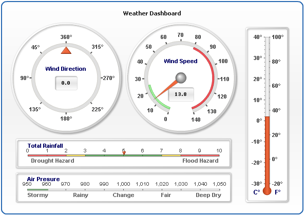
Circular and Linear Gauges in AnyChart
April 2nd, 2012 by Margaret SkomorokhToday we are going to highlight another useful feature of our product. A Gauge (also known as Meter) is an instrument with a graduated scale or a dial for measuring or indicating quantity. As a rule, it is used to show business Key Performance Indicators (KPIs) and to reproduce barometers, thermometers or voltmeters. In AnyChart two types of gauges are available: Circular and Linear.
The Circular Gauge is like gauges on a car dashboard. It consists of a radial scale holding your data range and a pointer. Gauges can be not only circular, but also semi-circular. In fact, AnyChart supports any angle ranges.
Our component also provides the opportunity to implement color ranges, which are used for classifying data. You can set the desired number of different colors depending on the number of your conditions. For example, you may have only 2 colors for satisfactory and unsatisfactory results or a whole palette consisting of 10 colors indicating different temperature ranges.
You can use multiple pointers and even multiple data ranges, place them anywhere or invert data ranges direction. Circular ranges have an adjustable data scale, so you can define its length, minimum and maximum values, and so on.
Horizontal Linear Gauges and Vertical Linear Gauges are sliders or a wide lines (either vertical or horizontal). Their main idea is moving a pointer or pointers over a range of data to some point’s value or the difference between points.
AnyChart gives you the opportunity to use multiple pointers and multiple data ranges, set the width of the line and the number of pointers. Different color ranges for background coloring are available, being a significant and very informative element of your gauge.
With AnyChart you have the freedom to create unique gauges, because all elements are fully adjustable. You can create any gauges needed, make them look like in real life and perform any functions, even surpassing their real analogues.
Here is the list of main available features:
- Circular Gauges with variable scale angles
- Vertical Linear Gauges
- Horizontal Linear Gauges
- Multiple Scales for any type of gauges
- Multiple Pointers and Pointer types (Needle, Marker, Bar, etc.)
- Complex Composite Gauges
- Real-time update
- Interactive update
- Thermometer styled Gauge
- Tank styled Gauge
- Bullet Graphs
To learn more about Gauges, see our documentation and the following sections of our gallery:
For easy start we recommend you these tutorials:
- Gauges Architecture
- Your First Circular Gauge
- Your First Horizontal Linear Gauge
- Your First Vertical Linear Gauge
Gauges can be a very suggestive and useful tool when all their potential is used, and in this post we have tried to give you some clues how to do it.
Also please feel free to ask our support team any questions about working with gauges. Thank you for being with us today.
- Categories: AnyChart Charting Component, Tips and Tricks
- No Comments »
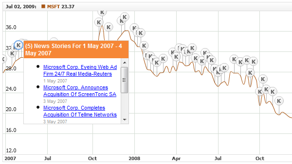
Working with Event Markers in AnyStock
March 25th, 2012 by Margaret Skomorokh One of the most exciting features of AnyChart Stock are Event Markers – a special type of chart markers that are designed to provide the best experience in showing various events on financial charts: Key Developments, Dividends, Splits, Insider Transactions, Analyst Opinion Changes and so on. This information is very important for financial analysis and have to be properly visualized. That is why our component has a very flexible and convenient set of tools for working with Event Markers.
Event Markers in AnyStock can be added to a chart series or to a timeline. Due to the stacking and merging systems, you can put as many markers as necessary and at the same time keep your chart clean and readable. Rich interactivity improves the perception of events by users, and the opportunity to bind Event Markers to additional data turns them into a highly informative tool.
Available options include:
- complete control over all visual settings
- rich interactivity and the opportunity for users to select Event Markers
- grouping markers that hit the same date into stacks or into a single marker
- binding additional data (e.g URL links) to each Event Marker
- built-in elegant tooltip with the support of HTML formatting
- full range of supported external events and methods for controlling Event Markers from the outside
- four special marker shapes
and many, many more…
You can learn how to work with Event Markers from our documentation, gallery, and online demos, each of them containing a sample chart, its source code and description. Here is the full list of these demos:
- Adding/Removing Event Markers
- Navigating to an URL on Event Markers Click
- HTML Tooltips for Event Markers
- HTML Tooltips for Event Markers with Hyperlinks
- Simple HTML Tooltips for Event Markers
- Getting Event Markers List in a Time Range
- Merged Event Markers Events Handling
- Selecting Event Markers Using JavaScript
- Showing/Hiding Event Markers Groups
- Showing/Hiding Event Markers using JavaScript
- Updating Event Markers Visual Settings Using JavaScript
- Event Markers Events Handling
We want you to pay special attention to the following three samples because they can be used in real applications as ready-made building blocks. These samples also demonstrate a number of important characteristics of Event Markers. For example, as it is clear from the two RSS examples, Event Markers can be loaded and removed during runtime, which means that they can be equally as dynamic as data thought not being a part of it.
We hope that we succeeded to throw some light on this useful feature and this article will help you to implement new functionality in your applications, but if anything is still not clear, do not hesitate to contact our support team. We will do our best to help you.
- Categories: AnyChart Charting Component, Tips and Tricks
- No Comments »
How to Choose Chart/Graph Type for Seeing Data Over Time
March 13th, 2012 by Margaret SkomorokhWe continue publishing tips for choosing between different types of charts. Last time we were talking about comparing data, and today we will focus on seeing data over time.
The most popular and adequate ways to visualize time-based data are bar graphs and line graphs. What is the difference between them? First, large sets of data are better visualized via line graphs since line graphs are good in showing trends, and bar graphs in this case just look overcomplicated. Second, bar graphs emphasize the magnitude of changes, so they are an excellent way to demonstrate data with sharp fluctuations.
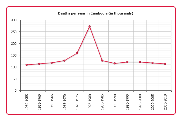
Example 1.
The following graph shows the number of deaths per year in Cambodia between 1960 and 1990 according to UN estimates:
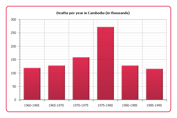
As you can see, there was a sharp increase of mortality in 1975-1980, which is almost the same period when Cambodia was under the Pol Pot regime (1975-1979). Our graph clearly shows the scale of the genocide this regime is responsible for.
Example 2.
And now we are going to demonstrate demographic data about Cambodia for a longer period: since 1950 and including modernity. A bar graph is not the best choice in this situation. Instead, we will use a line graph:
This visualization still shows the increase of mortality in 1975 quite well and at the same time comprehensively represents the long-term trend.
Example 3.
Sometimes a value we are interested in changes discreetly, i.e. stays constant between change points. For example, stamp prices change only in the rare moments when new stamps with new denominations are emitted. In this case we can choose a bar graph since it represents data discreetly, but what if our data covers a long period of time? A bar graph would be difficult to read, but a line graph should not be used either because to connect two points with a line would mean to distort the real picture.
Fortunately, there is one useful variation of line graphs – step line graphs. To connect data points they use only vertical and horizontal segments instead of straight lines. Here is such a graph demonstrating the US Postal Service prices for first class stamps from 1975 to 2008:

Step line graphs combine advantages of bar and line charts, being good at both showing trends and making the magnitude of changes explicit. And by omitting change points you can focus on the periods when the represented value is constant:
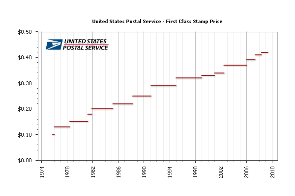
See also: Creating Step Line Chart with AnyChart and Line, Spline, Step Line Charts Gallery
That is all for today, more tips are coming soon.
Check the updated article on how to choose chart/graph type for seeing data over time published within the framework of the new 7-part Choose Chart Type feature on our blog.
- Categories: AnyChart Charting Component, Tips and Tricks
- 2 Comments »
AnyChart 6.0.8 Released
February 28th, 2012 by Margaret SkomorokhAnyChart 6.0.8 is available for download. We keep improving our HTML5 engine and fixing the bugs discovered there. We would also like to draw your attention to Vertical and Horizontal Gauges, this instrument being absolutely necessary if you want to show Key Performance Indicators and Bullet Graphs in Scorecards and Dashboards. As for basic chart types, we have added a couple of useful features, without which it is sometimes very difficult to go.
HTML5 engine now supports:
- Vertical and Horizontal Gauges
- the TreeMap plot
- Aqua styles for 2D Pie and 2D Doughnut chart types
- 3D Pie and 3D Doughnut chart types
New labels features:
- Added the possibility to set a fixed width for Y-axis labels.
- Added the possibility to set a fixed width for X-axis labels and to wrap text.
Version history: http://6.anychart.com/products/anychart7/history/
Trial download: https://www.anychart.com/download/
- Categories: AnyChart Charting Component
- No Comments »
Meteomedia AG Chooses AnyChart to Visualize Weather Forecasts
February 20th, 2012 by Margaret SkomorokhToday we are glad to publish a new success story – about AnyChart and Meteomedia AG.
![]() Meteomedia, founded in 1990, is one of the leading weather services in Europe operating its own private weather measurement network and providing detailed data for various weather-dependent industries. The company successfully runs Energy Trading Portal designed for gas and electricity traders as well as energy meteorologists, online Severe Weather Centers in different countries, and other weather portals.
Meteomedia, founded in 1990, is one of the leading weather services in Europe operating its own private weather measurement network and providing detailed data for various weather-dependent industries. The company successfully runs Energy Trading Portal designed for gas and electricity traders as well as energy meteorologists, online Severe Weather Centers in different countries, and other weather portals.
The challenge was to:
- To visualize complex long-range weather forecasts and weather maps for Energy Trading Portal, making it possible for users to compare at a glance different weather models.
- To give users the opportunity to switch quickly between different locations, time ranges, and other parameters.
- To ensure that charts will be easy updatable since new forecast data is added daily or even hourly.
Solution:
- AnyChart solution was used to implement cross-browser and cross-platform animated dashboards visualizing various weather forecasts.
- AnyChart’s interactivity options and ample customization opportunities allowed creating flexible and quickly customizable charts and maps.
- Due to simple XML interface, AnyChart visualizations are very easy to update both manually and via any server-side scripts.
When it comes to making viable forecasts concerning energy price risk and energy demand, weather data is crucial. Temperatures are the key parameter in consumption forecasting. At the same time, the rising energy supply resulting from the availability of renewable energy is increasingly impacting electricity prices, so wind and solar power predictions are also needed. Energy traders are interested both in namely short-term prognoses for the spot market and long-term prognoses for the futures market. And there is no doubt that all these complex data should be clearly and comprehensively visualized.
Meteomedia Energy Trading Portal offers advanced customizable charts and maps of different types (line, range area, bar, and color-coded maps) created via AnyChart engine. They are conveniently grouped in dashboards to provide users with the opportunity to compare various forecasts, e.g. related to the same country. It is possible to add and delete charts as well as to select for each of them a particular time range, location, forecast type, and some other parameters.
The following data is visualized in Meteomedia Energy Trading Portal using AnyChart Charts and Maps:
- Overview charts and ensemble evaluations: air temperature at 2m height, temperature 850 hPa level, 24h-precipitation sum, wind speed mean, probability of general weather situation.
- Map of Europe, climate comparison: temperature deviation in comparison with longtime mean.
- Daily temperatures mean, solar power prediction, wind power prediction, wind power model comparison, precipitation totals.
Alongside with that, AnyChart was used to visualize forecasts for online Severe Weather Centers, which are available to the general public: Temperatures, Precipitation, Sunshine duration, Wind, Wind direction, and Humidity.
Take a look at the sample dashboard from the Energy Trading Portal (click it to view a larger image):

This case clearly shows that AnyChart solution has application in weather forecasting industry and can be succesfully used in other systems.
You can enjoy the full success story here: Meteomedia AG Chooses AnyChart To Visualize Weather Forecasts >>
Or see other AnyChart Customers Success Stories.
- Categories: AnyChart Charting Component, Success Stories
- No Comments »
How to Choose Chart/Graph Type for Comparing Data
January 27th, 2012 by Margaret SkomorokhToday we start publishing basic tips for choosing between different types of graphs. Visualization can be a very powerful and convincing instrument to present your data – the only thing needed is to use it correctly. One should always clearly understand what exactly he or she wants to show and what is the best way to do it.
There are three main situations when visualizations are made: comparing data, seeing data over time, and breaking data into parts, plus some mixed cases. We will consider them one by one and figure out what type of graphs fits each case. The first post will be about comparing data.
Example 1.
The most common tool for comparing data are bar graphs. For example, here is an AnyChart visualization showing men unemployment rate in the Nordic countries:
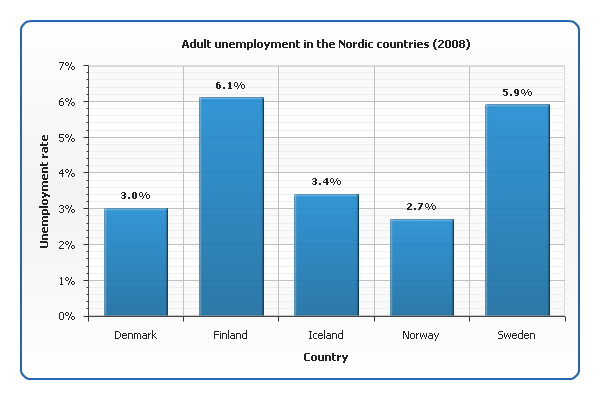
See also our documentation and gallery: Creating Bar/Column Chart with AnyChart, Bar/Column Charts Gallery
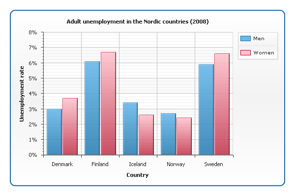
Example 2.
What if we want to show not only men but also women unemployment rate? Now we have two sets of data for each country, and to distinguish them, we need to use different colors:
Example 3.
When one needs to represent the correlation between two related values (which can be viewed as a kind of comparison too), a scatter graph is used. Take a look at a chart showing the correlation between religiosity index and suicide rate in different countries:
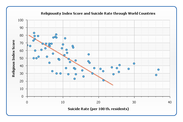
While bar charts are good for emphasizing the difference between individual entities, scatter graphs are good for generalizing. The information about particular countries is hardly readable from our graph, but it perfectly shows that more religious countries tend to have lower suicide rates: the points group around an imaginary line that falls down from left to right (sometimes called line of best fit, or trend line). It is considered that the closer the points are to this line, the stronger the correlation is.
See also: Creating Scatter Chart with AnyChart, Scatter Charts Gallery
Check the updated article on how to choose chart/graph type for comparing data published within the framework of the new 7-part Choose Chart Type feature on our blog.
- Categories: AnyChart Charting Component, Tips and Tricks
- 1 Comment »