We continue publishing tips for choosing between different types of charts. Last time we were talking about comparing data, and today we will focus on seeing data over time.
The most popular and adequate ways to visualize time-based data are bar graphs and line graphs. What is the difference between them? First, large sets of data are better visualized via line graphs since line graphs are good in showing trends, and bar graphs in this case just look overcomplicated. Second, bar graphs emphasize the magnitude of changes, so they are an excellent way to demonstrate data with sharp fluctuations.
Example 1.
The following graph shows the number of deaths per year in Cambodia between 1960 and 1990 according to UN estimates:
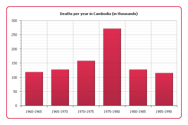
As you can see, there was a sharp increase of mortality in 1975-1980, which is almost the same period when Cambodia was under the Pol Pot regime (1975-1979). Our graph clearly shows the scale of the genocide this regime is responsible for.
Example 2.
And now we are going to demonstrate demographic data about Cambodia for a longer period: since 1950 and including modernity. A bar graph is not the best choice in this situation. Instead, we will use a line graph:
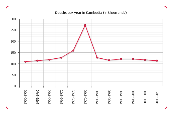
This visualization still shows the increase of mortality in 1975 quite well and at the same time comprehensively represents the long-term trend.
Example 3.
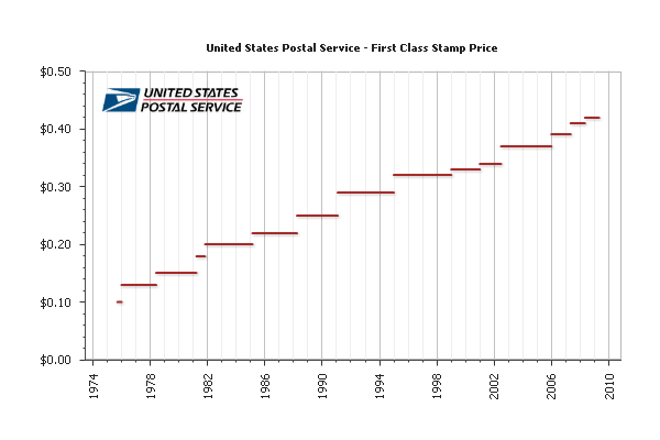
Sometimes a value we are interested in changes discreetly, i.e. stays constant between change points. For example, stamp prices change only in the rare moments when new stamps with new denominations are emitted. In this case we can choose a bar graph since it represents data discreetly, but what if our data covers a long period of time? A bar graph would be difficult to read, but a line graph should not be used either because to connect two points with a line would mean to distort the real picture.
Fortunately, there is one useful variation of line graphs – step line graphs. To connect data points they use only vertical and horizontal segments instead of straight lines. Here is such a graph demonstrating the US Postal Service prices for first class stamps from 1975 to 2008:

Step line graphs combine advantages of bar and line charts, being good at both showing trends and making the magnitude of changes explicit. And by omitting change points you can focus on the periods when the represented value is constant:
See also: Creating Step Line Chart with AnyChart and Line, Spline, Step Line Charts Gallery
That is all for today, more tips are coming soon.
Check the updated article on how to choose chart/graph type for seeing data over time published within the framework of the new 7-part Choose Chart Type feature on our blog.
- Categories: AnyChart Charting Component, Tips and Tricks
- 2 Comments »
Comments (2)
what about the evolution of two cars company during 10 years?
It looks like a line chart with multiple series could work if we fully understand what you mean. Please feel free to elaborate on the type of data you want to visualize and its intended purpose, and we’ll gladly try to be more specific.
Meanwhile, you are more than welcome to check out our new article on charts to visualize data over time, as well as Chartopedia, a free encyclopedia of chart types that we’ve recently created. Our Support Team is always happy to assist you too.
Thanks for your interest!