Building JavaScript Scatter Plot Module
May 27th, 2020 by Wayde Herman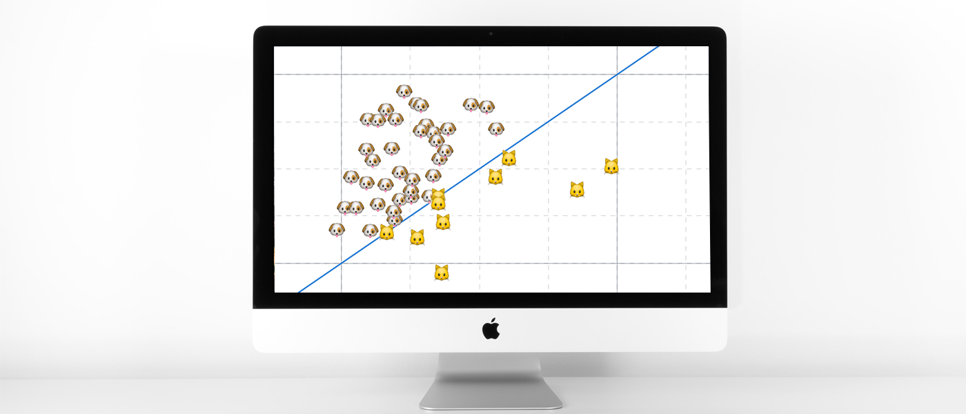 Scatter plots are a great way to visualize data. Data is represented as points on a Cartesian plane where the x and y coordinate of each point represents a variable. These charts let you investigate the relationship between two variables, detect outliers in the data set as well as detect trends. They are one of the most commonly used data visualization techniques and are a must have for your data visualization arsenal!
In this tutorial, I will teach you how to build your very own interactive scatter plot charts using JavaScript.
Ever wondered whether the population of the United States of America were dog people? Well, you’re about to find out! To help you learn more about building scatter plots I will be using the Cat vs Dog Popularity in US dataset. This dataset contains the percentage of homes with dogs and cats for each US state.
Read the JS charting tutorial »
- Categories: AnyChart Charting Component, Big Data, HTML5, JavaScript, JavaScript Chart Tutorials, Tips and Tricks
- 1 Comment »
JavaScript Charting Library 8.8.0 Released with New Exciting Data Viz Features
May 22nd, 2020 by AnyChart Team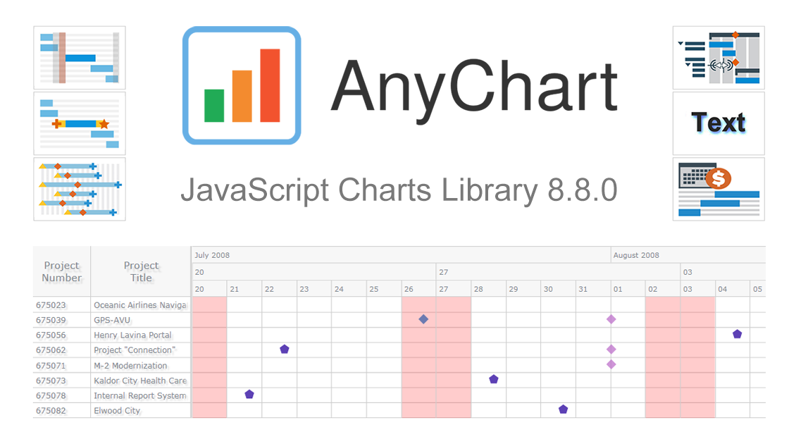 We’ve just updated our JavaScript charting library with new exciting features and improvements! In the 8.8.0 release of AnyChart JS, the focus is put on enhancements for Gantt charts. They will be helpful in making your project and resource data visualizations even more insightful with ease. We’ve also upgraded basic and time-series charts as well as maps. Below is an overview of the new key arrivals. Be sure to check it out, download the updated builds, and enjoy!
»»» See What’s New in AnyChart 8.8.0! «««
- Categories: AnyChart Charting Component, AnyGantt, AnyMap, AnyStock, Big Data, Business Intelligence, Dashboards, Financial Charts, Gantt Chart, HTML5, JavaScript, News, Stock Charts
- 1 Comment »
StopCorona Creator Shares How They Visualize COVID-19 Data Using AnyChart
May 21st, 2020 by AnyChart Team![]() Earlier, we introduced you to a new, ever-updating COVID tracker that uses AnyChart to visualize the latest pandemic data in insightful charts, StopCorona.info. To let you know more, we also talked to Vadim Peskov, CEO at Diffco, the app development company behind StopCorona, and asked him a few questions.
Earlier, we introduced you to a new, ever-updating COVID tracker that uses AnyChart to visualize the latest pandemic data in insightful charts, StopCorona.info. To let you know more, we also talked to Vadim Peskov, CEO at Diffco, the app development company behind StopCorona, and asked him a few questions.
Read our quick interview to learn more about StopCorona and their experience using our JavaScript charting library for interactive data visualization. (Stack: MySQL/Symfony/Angular.)
- Categories: AnyChart Charting Component, Big Data, Charts and Art, HTML5, JavaScript, Success Stories
- 3 Comments »
COVID Tracker StopCorona.info Adds AnyChart JS Charts to Visualize Coronavirus Statistics
May 18th, 2020 by AnyChart Team![]() COVID tracker StopCorona.info is using our JavaScript data visualization library to display up-to-date coronavirus statistics in compelling and insightful charts. (Read our interview with its creator to learn how.)
COVID tracker StopCorona.info is using our JavaScript data visualization library to display up-to-date coronavirus statistics in compelling and insightful charts. (Read our interview with its creator to learn how.)
COVID-19 is a global emergency and the fight against it requires a joint effort. We at AnyChart cannot stay aside, too. With a lot of pandemic data out there, from numerous sources and with constant updates, it’s difficult to keep up with how the situation unfolds, let alone making sense of all relevant information in due course. But this is exactly where we can help, with our established charting solutions that can visualize any data on the fly.
We thought you should know we’re ready to give a full-featured non-profit license to all initiatives aiming to tackle the novel coronavirus outbreak. Moreover, we’ve already allowed one project – StopCorona.info – to use our JavaScript charting library for free.
Developed as a not-for-profit initiative by Diffco, a top Silicon Valley app development company, StopCorona is designed to bring transparency to the pandemic situation worldwide. To achieve that, it collects COVID-19 statistics from more than 20 reliable public open data sources, including WHO, CDC, ECDC, CCDC, and NHC to name a few. Now this enormous (and ever-expanding) set of coronavirus data is graphically represented in an analyst-friendly interface powered by AnyChart JS Charts.
As a global leader of data visualization and reporting tools, we at AnyChart were more than happy to support StopCorona by letting them use our award-winning JS charting library absolutely free, under a full-featured non-profit license.
If you guys are building a useful resource for COVID-19 data analytics, try AnyChart and apply for a free license, too. We will gladly provide you with complimentary access to our flexible data visualization solutions. In this way you will get the industry’s best charts for the web or mobile fully at your service, empowering your website visitors or app users to make sense of the myriad COVID numbers at a glance, with great ease.
- Categories: AnyChart Charting Component, AnyStock, Big Data, Business Intelligence, Dashboards, HTML5, JavaScript, Success Stories
- 5 Comments »
Creating Choropleth Map Data Visualization Using JavaScript, on COVID-19 Stats
May 6th, 2020 by Anastasia Zoumpliou These days you see choropleth maps in a variety of webpages and utilized for various subjects. Have you wondered how such data visualizations are built? Are you interested in making them by yourself? If so, stay with me through this JS charting tutorial, where I will show you how to create an interactive JavaScript choropleth map from scratch but with ease.
Basic knowledge of HTML5 and JS is always helpful, but even if you are a beginner in this field, understand these four simple steps and you will be able to quickly get a good-looking cross-platform interactive choropleth map data visualization for your app or website!
What exactly are choropleth maps? When you break down the word, you see that choro- (“choros”) means “area” and pleth- (“plethos”) means “multitude.” Exactly, these maps are used to visualize statistical data related to multiple geographic areas. Each area is colored or shaded differently according to the value of the given data, making it easy to grasp how a measurement varies across a territory.
For this JS mapping tutorial, I will use open COVID-19 data to show the distribution of confirmed cases and deaths around the world by country. I will start with a basic choropleth map that will graphically represent the confirmed cases. Then I will add a legend, customize the tooltip, and add bubbles to visualize the number of deaths.
Let’s get started!
Read the JS charting tutorial »
- Categories: AnyChart Charting Component, AnyMap, Big Data, HTML5, JavaScript, JavaScript Chart Tutorials, Tips and Tricks
- 2 Comments »
Mills College Uses AnyChart JS Charts for Student Success Data Visualization
April 29th, 2020 by AnyChart Team Myriads of enterprise-level software developers rely on our award-winning JavaScript data visualization library to build comprehensive reporting and analytics applications. However, AnyChart is also widely chosen to operate basic charts. One example of such a use case is a visualization of student success metrics at Mills College, a famous American higher education institution attended at different times by filmmaker Sofia Coppola, musician Dave Brubeck, and Congresswoman Barbara Lee among other great people.
We interviewed Angelique Felgentreff from Mills College to get you first-hand information about their experience using charts powered by AnyChart. (Stack: OmniUpdate OU Campus/PHP.)
- Categories: AnyChart Charting Component, HTML5, JavaScript, Success Stories
- No Comments »
Qlik Sense Timeline Chart and More New Features in AnyGantt Extension V 4.1.244
April 24th, 2020 by AnyChart Team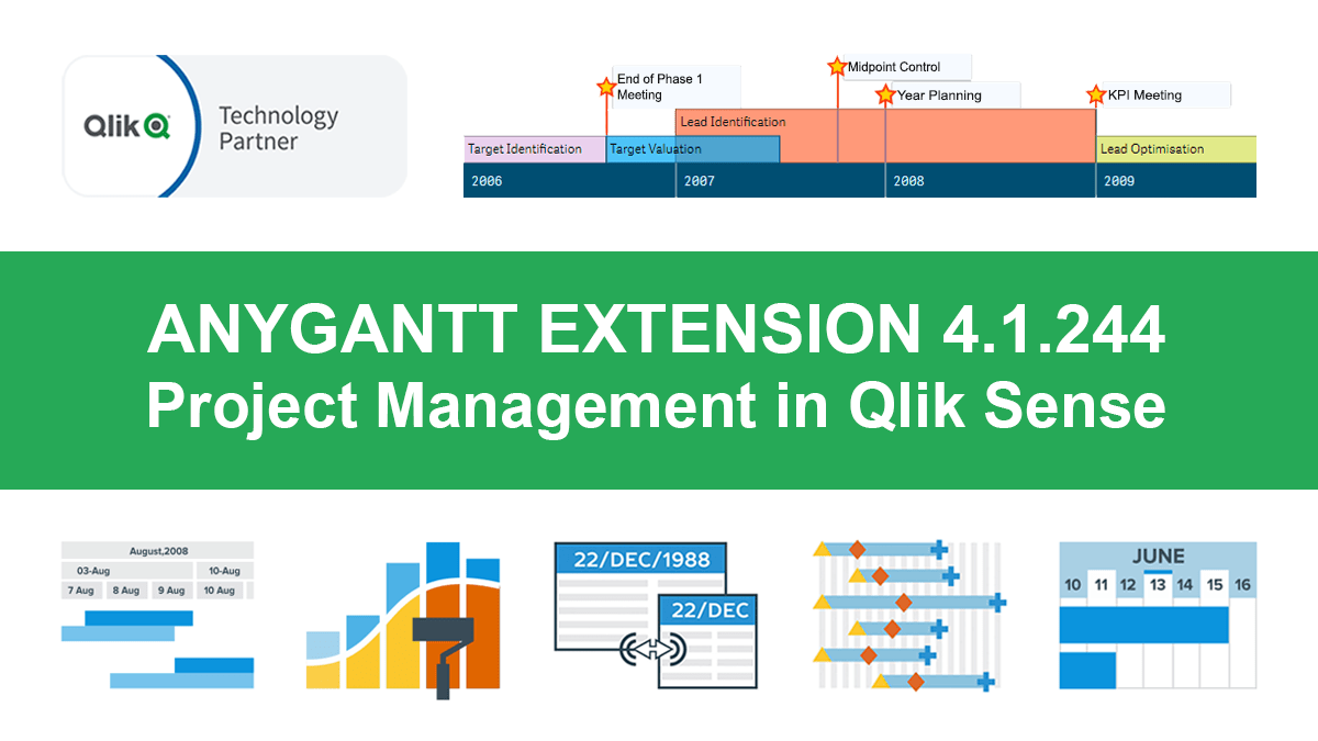 Hey Qlikkies, meet the awesome Qlik Sense Timeline Chart from AnyChart! We are excited to deliver it in the new, just-released version of our AnyGantt extension.
Hence the Timeline Chart has become — wait for it — the 40th chart type available in our data visualization extensions for Qlik Sense overall! For AnyGantt specifically it is the 3rd one, making AnyGantt a unique, cutting-edge Project Management Bundle for Qlik now comprising the Project Gantt Chart, Resource Chart, and Timeline Chart in a single intuitive extension.
However, it is not all great news. Release 4.1.244 also brings a bunch of other awesome features and improvements to the AnyGantt extension.
Read more at qlik.anychart.com »
- Categories: AnyChart Charting Component, AnyGantt, Big Data, Business Intelligence, Gantt Chart, News, Qlik
- No Comments »
Creating JavaScript Column and Bar Charts on COVID-19 Data
April 6th, 2020 by Jay Stevenson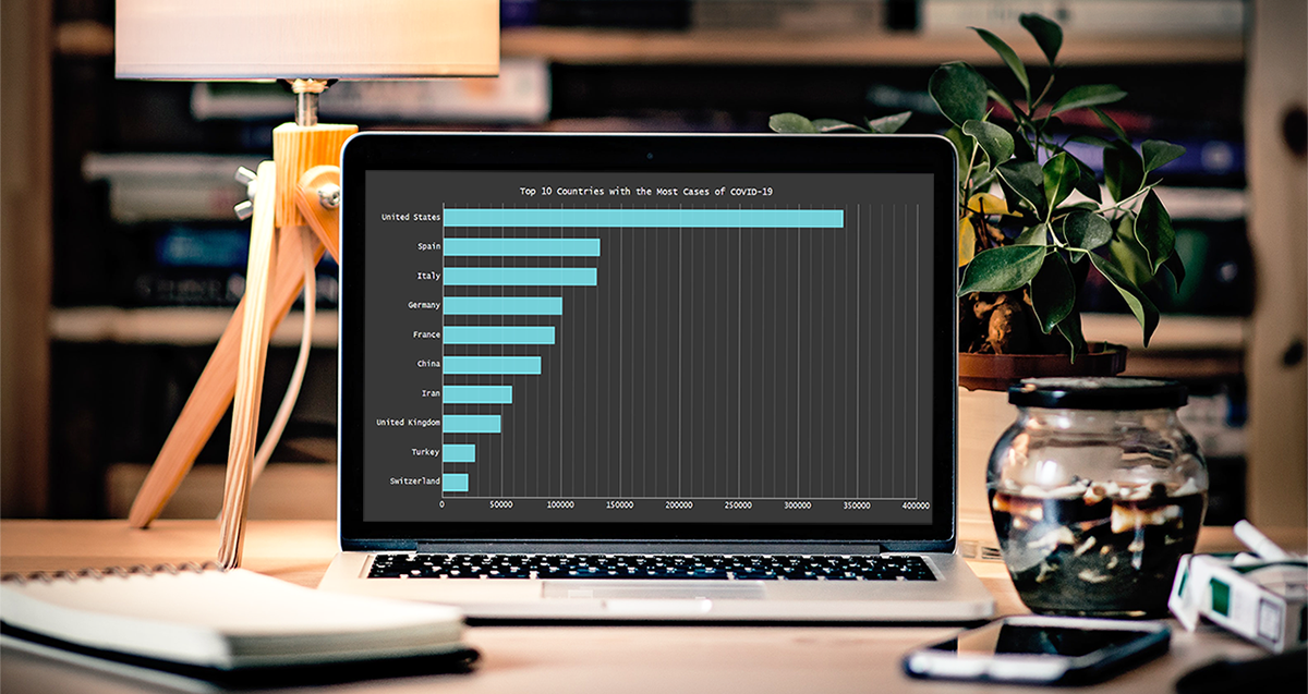 Need compelling JS charts for your website or app? Start with the basics! Complete this quick data visualization tutorial and you’ll learn how to easily create JavaScript column and bar charts that will look great in any HTML5-based project, allowing for easy comparisons.
Chart examples to be built and demonstrated in this tutorial will be visualizing the latest novel coronavirus cases data from JHU CSSE as COVID-19 is the most topical issue nowadays.
Keep reading and you’ll see JS charting is actually very simple. Especially if you have at least a very basic understanding of programming (more than that is awesome but far from necessary).
Read the JS charting tutorial »
- Categories: AnyChart Charting Component, HTML5, JavaScript, JavaScript Chart Tutorials, Tips and Tricks
- No Comments »
Making JS Candlestick Chart in Four Simple Steps
March 25th, 2020 by Anastasia Zoumpliou Do you have trading data, looking for a way to effectively visualize it for your website or app project? If so, a JS candlestick chart could be your best pick. This tutorial will break down the process needed to create such a chart into simple steps and provide a detailed explanation of the code. Keep reading even if you are new to programming, because only a basic understanding is needed to follow along and master such a JavaScript (HTML5) based data visualization technique.
Also called a Japanese candlestick chart, this chart type is one of the most popular forms of financial and stock data visualization. Each candlestick represents information about the open, high, low, and close price of the day. Candlestick charts are widely used in technical analysis of price movement patterns.
Complete this tutorial and you will be able to create a compelling interactive candlestick chart in JavaScript real quick, with ease.
Read the JS charting tutorial »
- Categories: AnyChart Charting Component, AnyStock, Big Data, Financial Charts, HTML5, JavaScript, JavaScript Chart Tutorials, Stock Charts, Tips and Tricks
- No Comments »
How to Add Dimensions and Measures in Project Gantt Chart in AnyGantt Extension for Qlik Sense
March 17th, 2020 by AnyChart Team We’ve made a new tutorial on building charts in Qlik Sense. This one sheds light on how to add dimensions and measures creating a Project Gantt chart using the AnyGantt extension.
The tutorial is available in the video and text-and-pictures versions — choose one or check out both!
Read more at qlik.anychart.com »
- Categories: AnyChart Charting Component, AnyGantt, Big Data, Business Intelligence, Gantt Chart, Qlik
- No Comments »