Building Word Tree Chart with JavaScript
October 4th, 2021 by Shachee Swadia Data visualization is not only useful for communicating insights but also helpful for data exploration. There are a whole lot of different chart types that are widely used for identifying patterns in data. One of the lesser-used chart types is Word Tree. It is a very interesting visualization form, quite effective in analyzing texts. And right now, I will teach you how to quickly create nice interactive word tree charts using JavaScript.
Word trees display how a set of selected words are connected to other words in text data with a branching layout. These charts are similar to word clouds where words that occur more frequently are shown bigger. But they are different in the sense that word trees also show the connection between the words, which adds context and helps find patterns.
In this tutorial, I will create a lovely word tree from the text of the very famous book The Little Prince by French aviator and writer Antoine de Saint-Exupéry. Check out a demonstration of the final chart below and keep reading to learn how this and any other interactive JS word tree can be built with ease.
Read the JS charting tutorial »
- Categories: AnyChart Charting Component, Big Data, Books, HTML5, JavaScript, JavaScript Chart Tutorials, Tips and Tricks
- No Comments »
AnyChart Used for Data Visualization in Open-Source Redis Inventory Tool
September 29th, 2021 by AnyChart Team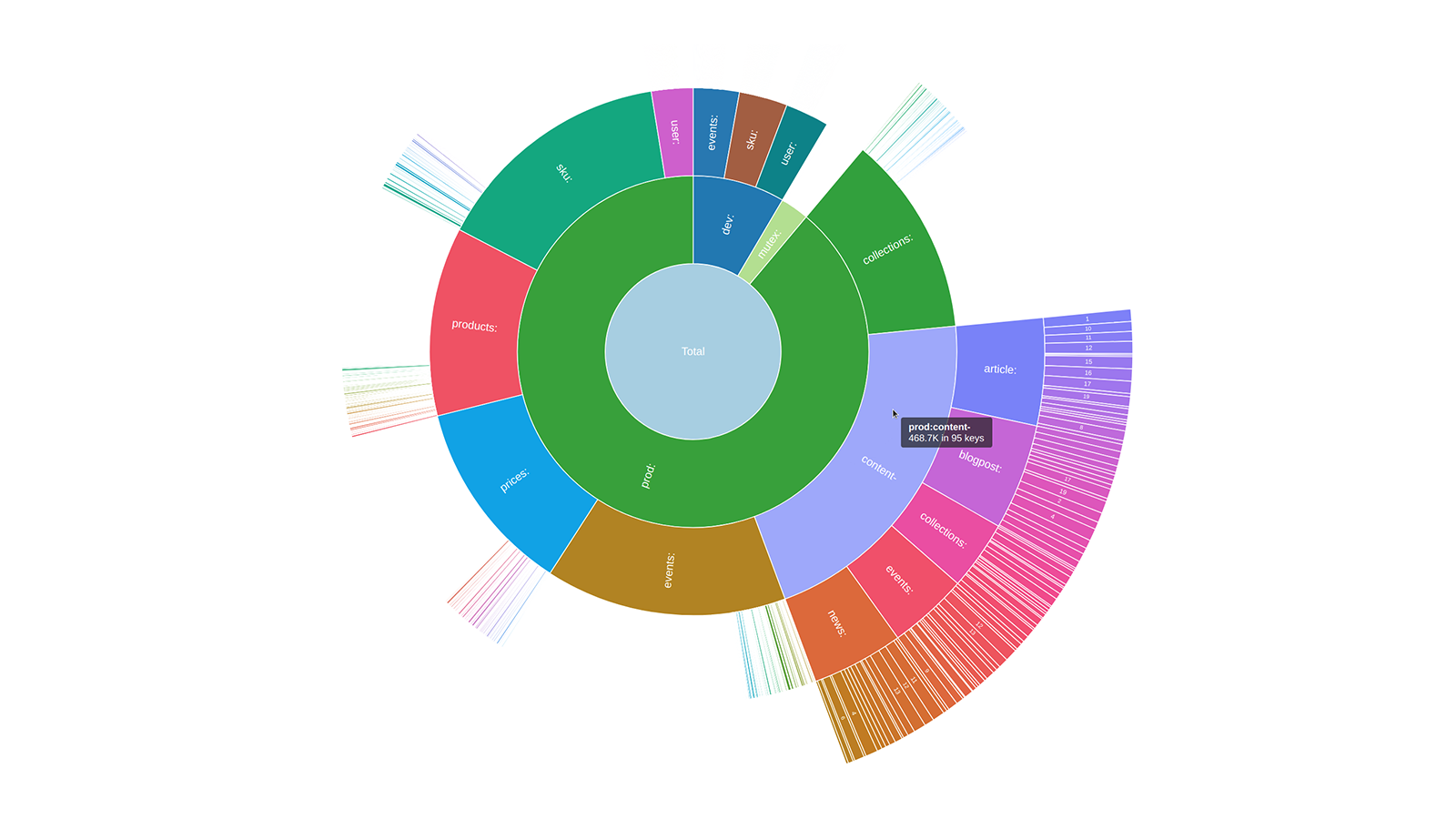 Sunburst charts are known to be greatly useful for visualizing hierarchical data structures. So it is no surprise that this chart type became a big hit among our users immediately after we added it to the AnyChart JavaScript library. Because the core of our global customer base is enterprise clients, most of the real-world use cases for our JS sunburst chart are hidden in internal corporate apps. But AnyChart is often picked for data visualization in open projects as well, and we invite you to see a super cool example we have recently found out about — Redis Inventory. It is an open-source tool that makes it easy to view Redis memory usage by key patterns in a hierarchical way, with an interactive sunburst chart in action.
Learn more about Redis Inventory and how AnyChart is used there from our quick interview with its creator Aleksandr Obukhov. (Stack: Go/Cobra/Redis.)
- Categories: AnyChart Charting Component, Big Data, HTML5, JavaScript, Success Stories
- No Comments »
How to Build Interactive Connector Map with JavaScript
September 21st, 2021 by Shachee Swadia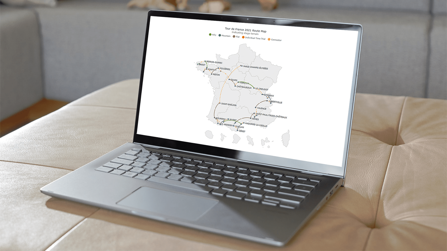 A connector map is a set of straight or curved lines that link points on a geographical map. It is commonly used to graphically represent routes or any other connections between locations. Would you like to learn how to build an attractive data visualization like that for a web page or app?
Actually, it is easy to create an interactive connector map using JavaScript. And I am ready to show you how right now! Follow along with this tutorial as I depict the cycling path of the 2021 Tour de France in the form of a JS connector map and thoroughly explain all steps.
Read the JS charting tutorial »
- Categories: AnyChart Charting Component, AnyMap, HTML5, JavaScript, JavaScript Chart Tutorials, Tips and Tricks
- 2 Comments »
AnyChart Used to Power Charts in Data Science Teaching Project Made at Edinburgh Napier University
September 16th, 2021 by AnyChart Team At AnyChart, we are eager to support education projects by letting their creators work gratis with the same data visualization solutions used by the world’s leading companies to build interactive charts.
Recently, a group of students at Edinburgh Napier University — including Martin McVey, Tibor Toth, Daniel Glen, Flynn Kearney, David Stewart, and John Frampton — reached out to us as they were building a website to assist with the learning of data science. And we were more than happy to provide them with a free license for the use of our JavaScript charting library.
The website is now available to the public, presenting a wide range of chart types with real-world examples along with questions and answers. Acknowledged as one of the top projects in the university year and awarded with a prize from Computershare, it is to be used for teaching about data visualization and analytics in Scottish schools.
We thought you could be interested to not only check out the website but also learn some more about the project and its developers’ experience with AnyChart. So we had a quick talk on that with Martin McVey from the team. Read below.
- Categories: AnyChart Charting Component, AnyMap, HTML5, JavaScript, Success Stories
- No Comments »
How to Create Financial Open-High-Low-Close (OHLC) Chart Using JavaScript
September 7th, 2021 by Shachee Swadia A stepwise guide on how to create interactive financial charts in the form of an OHLC chart. Visualizing the stock prices of Amazon over the course of Jeff Bezos’s tenure as the CEO.
Financial charts are especially useful to represent large amounts of data and identify trends. Would like to learn one such cool financial chart called the OHLC chart that visualizes stock price movement?
Read the JS charting tutorial »
- Categories: AnyChart Charting Component, AnyStock, Big Data, Financial Charts, HTML5, JavaScript, JavaScript Chart Tutorials, Stock Charts, Tips and Tricks
- No Comments »
Cesefor Uses AnyChart to Visualize Forestry Data in Nemus System
August 31st, 2021 by AnyChart Team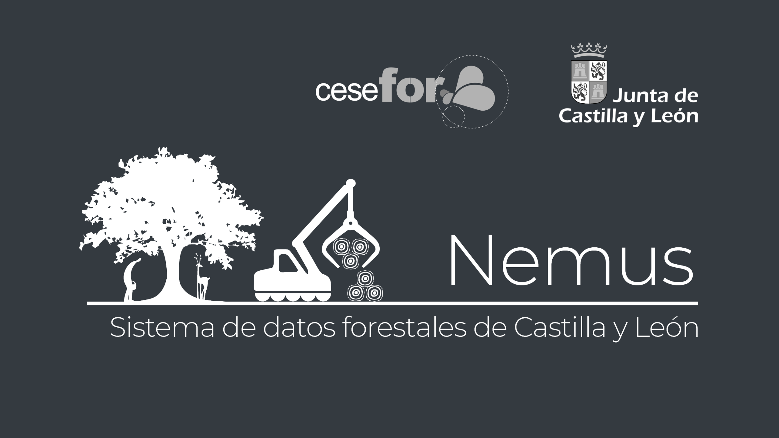 Many thousands of developers worldwide use our solutions for interactive data visualization. So it is hardly surprising to come across a graphic powered by AnyChart here or there. Some projects, however, deserve a showcase. Such a new interesting one demonstrating great use of AnyChart has recently come to our notice and we are happy to let you know about it.
A Spanish nonprofit, Cesefor used our JavaScript charting library to visualize forestry data for the Spanish region of Castile and León in a whole lot of different charts and maps, aiming to make relevant insights easily accessible and actionable for sustainability.
The project is called Nemus. Shh, it is still in beta, not yet officially launched. But Rodrigo Gómez Conejo, Head of ICT and Knowledge Management Area at Cesefor, allowed us to let you in and even gave us a brief interview disclosing some peculiar details about the system and how AnyChart is employed — check it out below. (Stack: jQuery/CodeIgniter/PostgreSQL.)
- Categories: AnyChart Charting Component, AnyMap, Big Data, Dashboards, HTML5, JavaScript, Success Stories
- No Comments »
Building JS Resource Gantt Chart to Visualize Tokyo 2020 Paralympic Schedule
August 17th, 2021 by Shachee Swadia Smart resource allocation is a must to achieve a high level of operational efficiency. Aiming to ensure it, project management professionals commonly rely on a special form of data visualization called a Resource Gantt chart. Creating graphics like this may seem daunting at first sight. But I am here to show you an easy way to build Resource Gantt charts with JS using a compelling, topical example.
Resource Gantt charts, also known as simply Resource charts, consist of bars oriented along the horizontal axis. Each bar visualizes a resource used by an activity, with the length representing the duration while that resource is occupied by that activity. The left and right edges of the bars display the start and end times. The resources, or event labels, are listed on the left. The dates and times are shown in the header.
Tokyo 2020 Paralympic Games are just around the corner. So, I decided to visualize their sports program by venue. Follow along with this stepwise tutorial and you will learn how to create a cool JavaScript Resource Gantt chart visualizing the Tokyo 2020 Paralympic schedule!
Read the JS charting tutorial »
- Categories: AnyChart Charting Component, AnyGantt, Big Data, Business Intelligence, Gantt Chart, HTML5, JavaScript, JavaScript Chart Tutorials, Tips and Tricks
- No Comments »
Yarra Hills Secondary College Uses AnyChart to Visualize Student Progress on Digital Data Wall
August 10th, 2021 by AnyChart Team Leading the enterprise data visualization market, AnyChart is also widely used by not-for-profit organizations in sectors such as education. Stephen Blackwell from Yarra Hills Secondary College (Australia) has recently shown us another great example of such an application.
Data walls have become a widespread practice in schools across the globe, letting teachers track and benchmark student progress to create effective learning environment. In many cases, they are just physical. For Yarra Hills, Stephen created a digital one that supercharges the overview with the help of well-thought-out visualizations powered by our JavaScript charting library.
Stephen kindly agreed to tell us about his Digital Data Wall project and how AnyChart is implemented. Read our fresh interview below. As you can imagine the original web app is for internal use only, but if you want to take a glance here is a copy with de-identified student data (password anychArt) and this is an example of an individual student profile. (Stack: PHP/MySQL.)
- Categories: AnyChart Charting Component, Big Data, HTML5, JavaScript, Success Stories
- No Comments »
How to Create Line Chart with JavaScript
July 28th, 2021 by Shachee Swadia A line chart is one of the basic and most commonly used techniques of data visualization. Such graphics are known to provide an informative look at the change of one or several variables over time. Right now, I’ll explain how to easily create a cool interactive line chart using JavaScript! The process will be demonstrated with the help of compelling examples that you can play with afterwards to hone your new data visualization development skills.
To make the article especially thrilling for you to read and learn from, I decided to showcase a practical application of a line chart to real-world data. The month of June was celebrated as Pride Month, and I thought it would be great to see how attitudes toward LGBT people have changed over the recent years. Then I found interesting public opinion data from the General Social Survey (GSS), a project of the National Opinion Research Center (NORC) at the University of Chicago, which appeared to be a good fit, and took part of it to visualize in this guide.
So, follow along with the tutorial and you will also be able to explore the shifts in acceptance of same-sex relationships in the United States over the last two decades! We will create a single-series JS line chart first, representing the general trend, and then a multi-series JS line chart to visualize a breakdown by age group.
All aboard!
Read the JS charting tutorial »
- Categories: AnyChart Charting Component, Big Data, Business Intelligence, HTML5, JavaScript, JavaScript Chart Tutorials, Tips and Tricks
- 2 Comments »
Stacked Waterfall Chart for Qlik Sense Upgraded
July 23rd, 2021 by AnyChart Team
You asked, and we listened. We have continued to work on plans to deliver an unprecedented experience with Waterfall Charts in Qlik Sense. And we are pleased to announce that several new valuable features are now there to improve the way you explore not only a by-category but also a by-subcategory breakdown of metrics!
Read below to see what’s new in our Stacked Waterfall Chart for Qlik Sense — just upgraded with the July release of the AnyChart Qlik Extension — and give it a try without delay!
Read more at qlik.anychart.com »
- Categories: AnyChart Charting Component, AnyGantt, Big Data, Business Intelligence, Gantt Chart, News, Qlik
- No Comments »