How to Build JavaScript Donut Charts
July 6th, 2021 by Shachee Swadia Wondering how data designers and developers create compelling donut charts using JavaScript? Then you’ve come to the right place at the right time. Follow along and you will learn how to build an interactive JS donut chart with great ease even if you are a beginner!
In this tutorial, we will be visualizing data about the global market share of the top online music streaming platforms. It is a good example of information that can be nicely represented in a donut chart.
To make sure we are on the same page, let’s first see what a donut chart is and then get down to charting straight away!
Read the JS charting tutorial »
- Categories: AnyChart Charting Component, HTML5, JavaScript, JavaScript Chart Tutorials, Tips and Tricks
- 2 Comments »
How to Create Interactive Timeline Chart with JavaScript
June 17th, 2021 by Shachee Swadia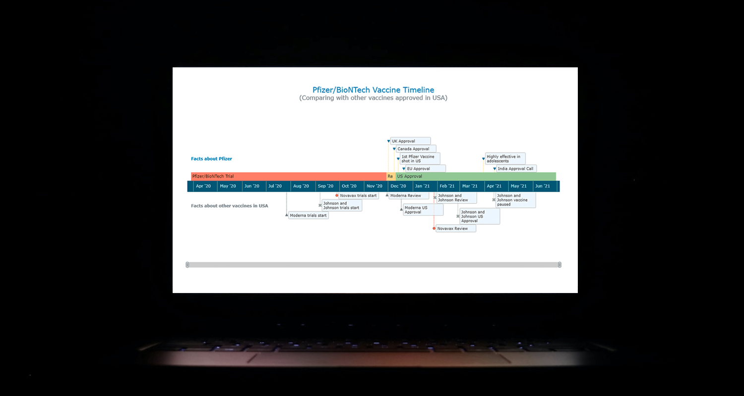 I think all of us have come across timelines somewhere or the other; as a means of conveying chronological information, the classic timeline is unmatched, both in the depth of information conveyed and the “cool” factor, when done with a deft creative touch. So, with that said, would you like to learn how to build a timeline chart using JavaScript that both looks great and is simple to create? (Of course, you do!) Follow along with me as I take you through the step-by-step breakdown for developing your own JS timeline with a practical example.
As the world continues to battle with COVID-19, the long-awaited good news is the development of vaccines across the globe. Here, I decided to build an interactive timeline that showcases the phases of Pfizer-BioNTech vaccine development in the United States. To add more contextual information, I also wanted to show approvals from other countries and some related facts, including the dates for the development of the 3 other vaccines approved for usage in the US.
Read the JS charting tutorial »
- Categories: AnyChart Charting Component, Big Data, Charts and Art, HTML5, JavaScript, JavaScript Chart Tutorials, Tips and Tricks
- No Comments »
Building Mosaic Chart in JavaScript
May 11th, 2021 by Shachee Swadia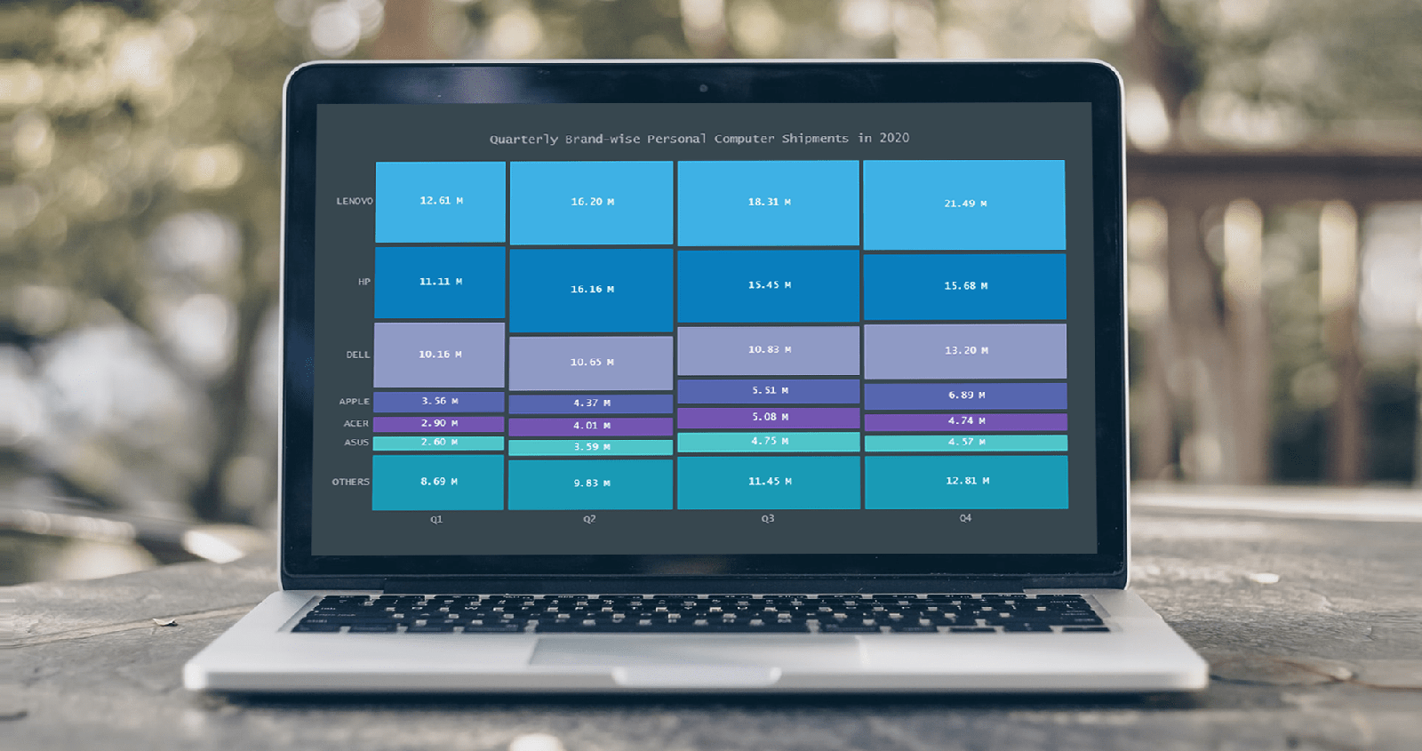 A step-by-step guide for building an interactive JS Mosaic Chart. Illustrated by visualizing data on quarterly PC shipments by brand in 2020.
Data visualization is a valuable tool in today’s scenario, with data everywhere and various opportunities to tap into that data to find insights. Visual charts are imperative to communicate ideas, identify patterns, and make the most of the available data.
So then, would you like to quickly and easily learn how to create a really cool chart that showcases data interestingly?
A mosaic chart is a multi-series chart that effectively represents data with over 2 parameters and is so-called because each data point has distinctive indents, making it visually similar to a piece of mosaic art. Not only is this chart beautiful to look at, but is also very helpful in representing multiple variables and recognizing the relationship between these different variables.
The year 2020 was not all bad, at least for the market of personal computers. The sales of PCs increased throughout each quarter of 2020, with more people working and studying from home. I explored how each brand fared in every quarter based on the number of global shipments.
Read the JS charting tutorial »
- Categories: AnyChart Charting Component, HTML5, JavaScript, JavaScript Chart Tutorials, Tips and Tricks
- No Comments »
Making JS Dot Density Map to Visualize Shipping Ports Across Globe
April 20th, 2021 by Shachee Swadia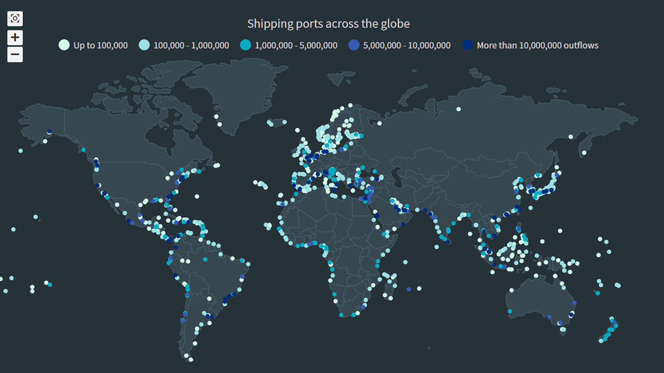 The recent incident of the Suez Canal blockage caught my interest in shipping and prompted me to explore the various shipping ports around the globe. There are more than 850 ports in the world and to get an overall view of where these are located, I decided to plot them on a dot map, or dot density map, using JavaScript.
Building an interactive JS dot density map can seem like a daunting task. But let me assure you that it can be pretty straightforward. Right now, I will show how to make a fully functional dot map chart using a JavaScript library for data visualization.
Read the JS charting tutorial »
- Categories: AnyChart Charting Component, AnyMap, Big Data, HTML5, JavaScript, JavaScript Chart Tutorials, Tips and Tricks
- No Comments »
How to Create Diverging Bar Chart with JavaScript
March 2nd, 2021 by Shachee Swadia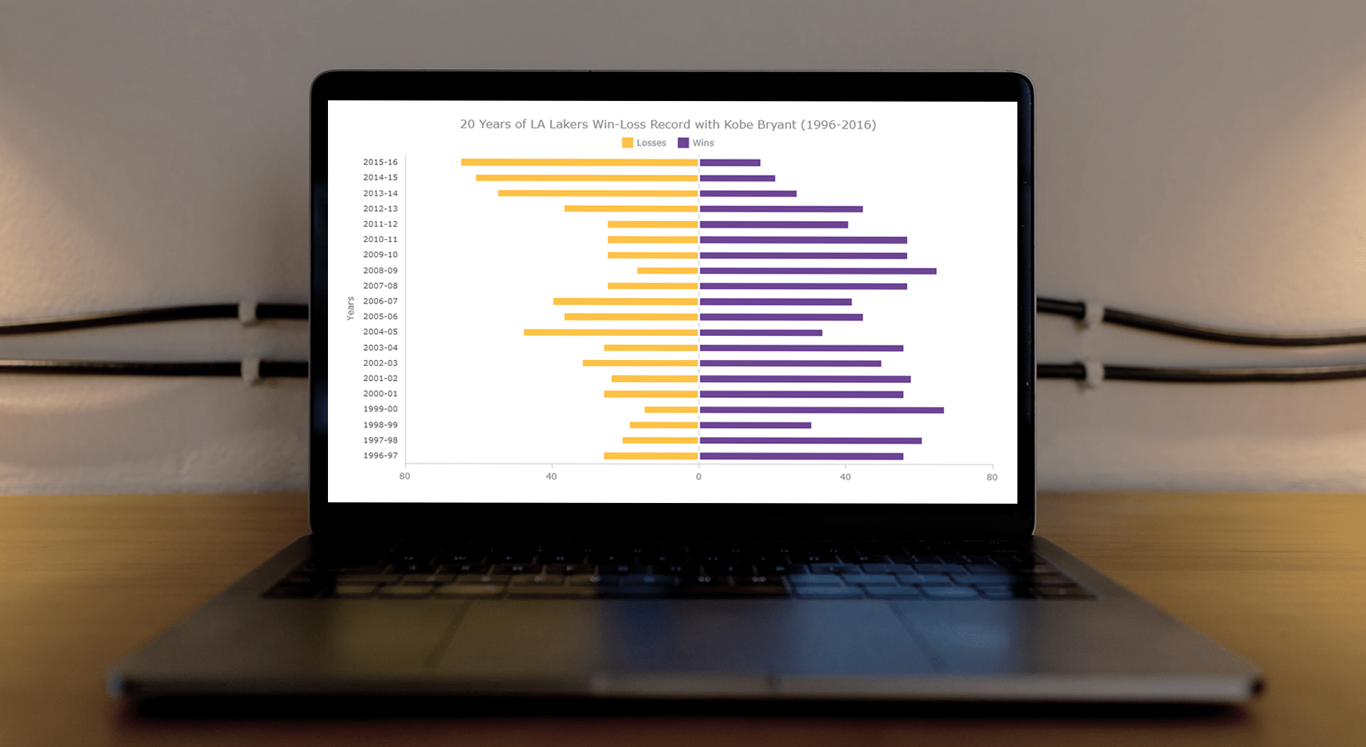 This article is a step-by-step guide that’ll show you how to build an interactive JavaScript range chart that visualizes 20 years of the LA Lakers’ performance with Kobe Bryant.
The year 2020 was pretty poignant for obvious reasons. But even before the pandemic, the year started on a sad note with the death of basketball legend Kobe Bryant. He was a star NBA athlete who had played for 20 years with one and only one team — the Los Angeles Lakers.
Remembering Kobe one year after that horrible crash, I wondered how the Lakers had performed in his two-decade era. So, I visualized that in an interactive Diverging Bar Chart with the help of pure JavaScript.
Thinking that this project might be helpful for those new to web charting, I also logged the entire process and made a tutorial. Check it out!
Read the JS charting tutorial »
- Categories: AnyChart Charting Component, HTML5, JavaScript, JavaScript Chart Tutorials, Tips and Tricks
- No Comments »
Creating JavaScript Angular Gauge
February 3rd, 2021 by Shachee Swadia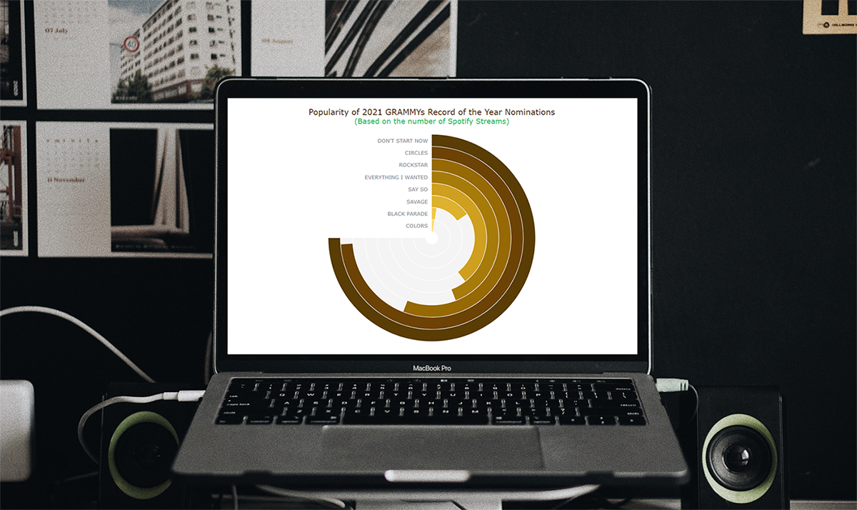 Would you like to add another really cool and interesting chart to your data visualization portfolio? Follow this simple tutorial and you’ll learn how to create a beautiful and interactive Angular Gauge using JavaScript, with ease!
An Angular Gauge, also known as a Circular Gauge, is a type of gauge chart with a radial scale. Such visualizations can nicely show a value within a range and are widely used in various dashboards.
The recent good news of vaccines feels like music to our ears. So, I thought why not take some interesting music data for visualization in this tutorial! The 63rd annual Grammy Awards ceremony will be held in March 2021, and when I looked through the list of the Record of the Year nominees, I wondered how popular each of these songs is. To find out, I decided to look at the number of their streams on Spotify, one of the world’s leading music streaming platforms, and thought that a Solid Angular Gauge could work well in such a visual analysis. It also resembles a vinyl record, which makes it an especially interesting chart type to opt for when representing such data!
So, along the tutorial, I will be visualizing Spotify stream counts for each 2021 GRAMMYs Record of the Year nominee song in a JS Angular Gauge chart. That is going to be entertaining! All aboard!
Read the JS charting tutorial »
- Categories: AnyChart Charting Component, HTML5, JavaScript, JavaScript Chart Tutorials, Tips and Tricks
- No Comments »
How to Create Bubble Map with JavaScript to Visualize Election Results
January 25th, 2021 by Shachee Swadia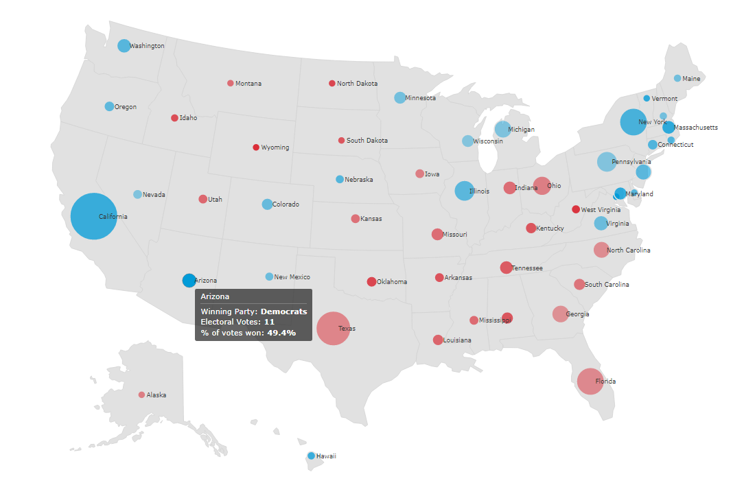 In these times of exponentially growing data, visualization is a necessary skillset to have in your tool box. Popular techniques include bar charts, line graphs, pie charts, and bubble maps among others.
Building interactive charts from scratch with JavaScript can be a difficult endeavor for any developer, especially someone starting out new. That is exactly why we have JS charting libraries which make it much easier and quicker to conjure up insightful visualizations!
Read on to see how I create a JavaScript Bubble Map with one of these libraries.
Read the JS charting tutorial »
- Categories: AnyChart Charting Component, AnyMap, Big Data, Charts and Art, HTML5, JavaScript, JavaScript Chart Tutorials, Tips and Tricks
- No Comments »
How I Created Sunburst Chart Using JavaScript to Visualize COVID-19 Data
December 8th, 2020 by Shachee Swadia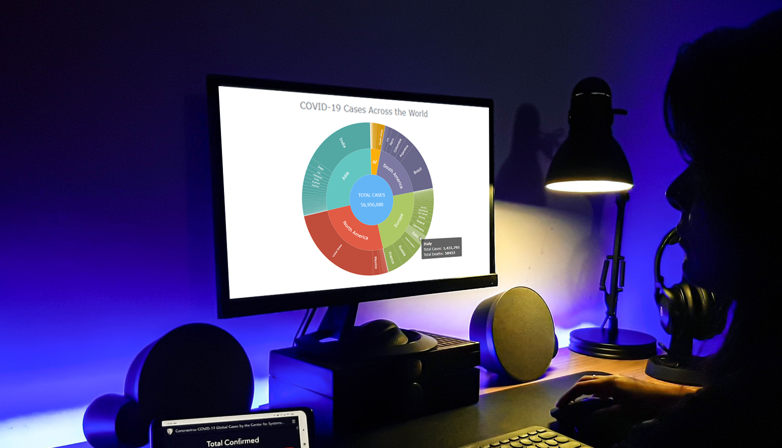 Almost recovered from COVID-19 myself these days, I decided to explore how the world is currently doing, during the pandemic. So I created a sunburst chart to see at a glance what continents and countries are more (and less) affected by the coronavirus than others. The process was quick and I thought someone could be interested to learn about how such data visualizations can be built in a pretty straightforward way, even with very little technical skills. So I also made a tutorial. And here I am — (1) sharing my interactive sunburst chart of COVID cases and (2) describing how I created it using JavaScript in a matter of minutes, step by step!
My JS sunburst chart provides an overview of the situation as of November 24, 2020, and also shows the global count, continent-wide data, and country-wise proportions for the current active COVID-19 cases and deaths. Scroll down to explore it by yourself and check out the tutorial along the way. Here is a sneak peek of the final chart to get you excited:
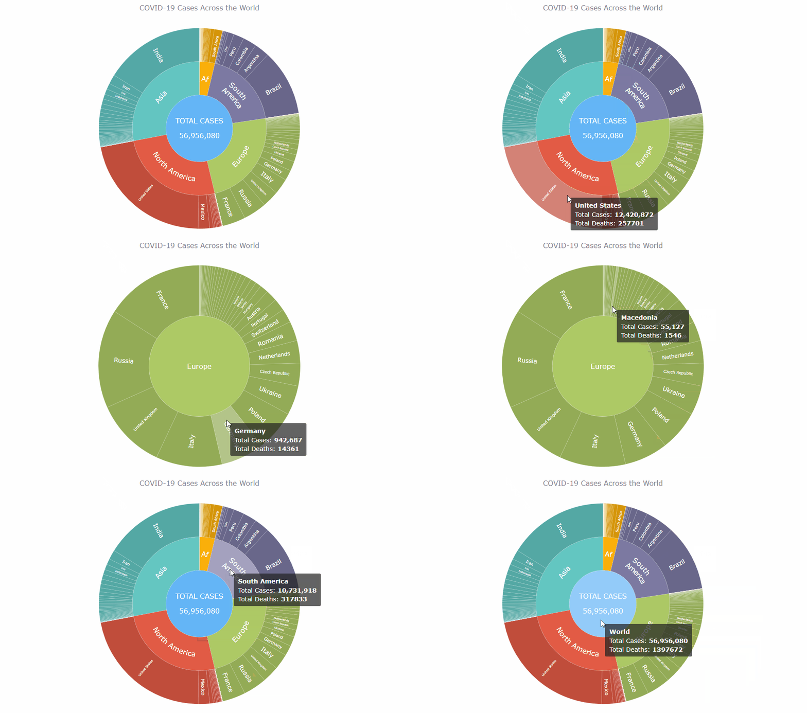
This sunburst charting tutorial is mainly for beginners to data science. So before we get to business, let’s make sure we’re on the same page. I’ll explain what a sunburst chart is and how it works, to start with. Then I’ll show you how to create a cool and colorful interactive visualization like that with JavaScript (and you can do it even if you don’t know it too well). That’s the plan!
Read the JS charting tutorial »
- Categories: AnyChart Charting Component, Big Data, Business Intelligence, HTML5, JavaScript, JavaScript Chart Tutorials, Tips and Tricks
- No Comments »
How to Create Venn Diagram with JavaScript
November 11th, 2020 by Shachee Swadia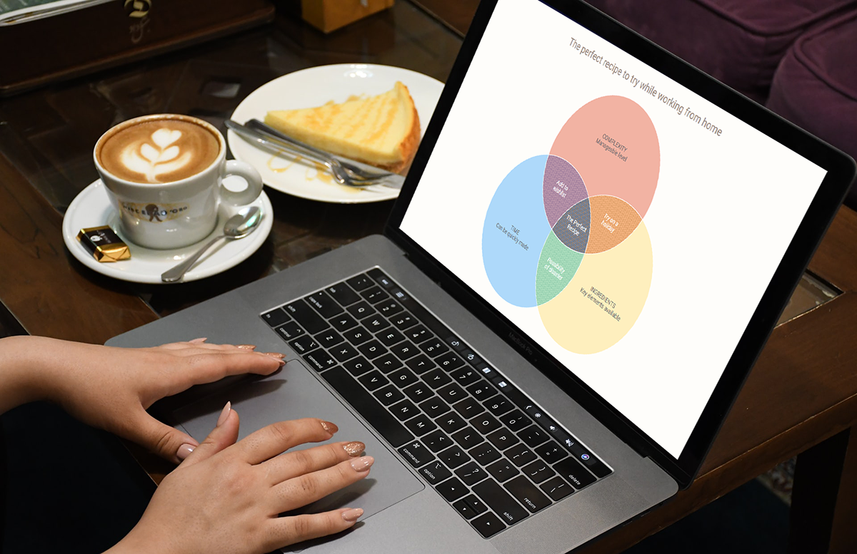 A Venn diagram is a form of data visualization that uses shapes, generally circles, to show the relationships among groups of things. In this chart type, overlapping areas show commonalities while circles that do not overlap show the traits that are not shared.
Introduced by John Venn, an English mathematician, logician, and philosopher, Venn diagrams are also called set diagrams or logic diagrams since they show possible logical relations between elements of different sets. When drawing such charts, we will most probably be dealing with two or three overlapping circles, since having only one circle would be boring, and having four or more circles quickly becomes really complicated.
Not only are these diagrams good visualizations as a concept, but they also provide a great opportunity to represent qualitative data and a bit of graphic humor. Basically, they are easy and fun to build and use. I’ll show you right now!
Read this tutorial to learn how to easily create a visually appealing and informative Venn diagram for your website or app with the help of JavaScript. All the code used and demonstrated along the tutorial will be freely available for you to play with.
During the ongoing coronavirus pandemic, with working from home and avoiding food from outside, many of us have become amateur chefs. So, let us use a JS-based Venn diagram to find out what kind of recipe would be the best to try out on a working day — this is going to be a delightful use case to explore!
Read the JS charting tutorial »
- Categories: AnyChart Charting Component, HTML5, JavaScript, JavaScript Chart Tutorials, Tips and Tricks
- 2 Comments »