Yarra Hills Secondary College Uses AnyChart to Visualize Student Progress on Digital Data Wall
August 10th, 2021 by AnyChart Team Leading the enterprise data visualization market, AnyChart is also widely used by not-for-profit organizations in sectors such as education. Stephen Blackwell from Yarra Hills Secondary College (Australia) has recently shown us another great example of such an application.
Data walls have become a widespread practice in schools across the globe, letting teachers track and benchmark student progress to create effective learning environment. In many cases, they are just physical. For Yarra Hills, Stephen created a digital one that supercharges the overview with the help of well-thought-out visualizations powered by our JavaScript charting library.
Stephen kindly agreed to tell us about his Digital Data Wall project and how AnyChart is implemented. Read our fresh interview below. As you can imagine the original web app is for internal use only, but if you want to take a glance here is a copy with de-identified student data (password anychArt) and this is an example of an individual student profile. (Stack: PHP/MySQL.)
- Categories: AnyChart Charting Component, Big Data, HTML5, JavaScript, Success Stories
- No Comments »
How to Create Line Chart with JavaScript
July 28th, 2021 by Shachee Swadia A line chart is one of the basic and most commonly used techniques of data visualization. Such graphics are known to provide an informative look at the change of one or several variables over time. Right now, I’ll explain how to easily create a cool interactive line chart using JavaScript! The process will be demonstrated with the help of compelling examples that you can play with afterwards to hone your new data visualization development skills.
To make the article especially thrilling for you to read and learn from, I decided to showcase a practical application of a line chart to real-world data. The month of June was celebrated as Pride Month, and I thought it would be great to see how attitudes toward LGBT people have changed over the recent years. Then I found interesting public opinion data from the General Social Survey (GSS), a project of the National Opinion Research Center (NORC) at the University of Chicago, which appeared to be a good fit, and took part of it to visualize in this guide.
So, follow along with the tutorial and you will also be able to explore the shifts in acceptance of same-sex relationships in the United States over the last two decades! We will create a single-series JS line chart first, representing the general trend, and then a multi-series JS line chart to visualize a breakdown by age group.
All aboard!
Read the JS charting tutorial »
- Categories: AnyChart Charting Component, Big Data, Business Intelligence, HTML5, JavaScript, JavaScript Chart Tutorials, Tips and Tricks
- 2 Comments »
Creating JS Flow Map in Four Steps
July 13th, 2021 by Shachee Swadia A step-by-step tutorial showing how to create an interactive JS Flow Map. Illustrated by visualizing data on migration to the US.
It may seem to be complicated to create an interactive Flow Map for the Web using JavaScript. But it’s not! This easy-to-follow tutorial will show you how to build beautiful JS flow maps without too much effort.
In these difficult times of the pandemic, there is a lot of confusion and concern about the immigration status of people around the globe. I decided to take a look at the immigration data of the US which has more migrants than any other country in the world. Here, I explore where these immigrants come from and represent the top 15 countries that contributed the highest number of migrants to the US in the year 2019.
A flow map seems the perfect way to showcase the inflow of migrants into the United States from various countries. Before going further, let me give you a brief idea about a flow map and its uses.
Read the JS charting tutorial »
- Categories: AnyChart Charting Component, AnyMap, Big Data, Business Intelligence, HTML5, JavaScript, JavaScript Chart Tutorials, Tips and Tricks
- 2 Comments »
Building Mosaic Chart in JavaScript
May 11th, 2021 by Shachee Swadia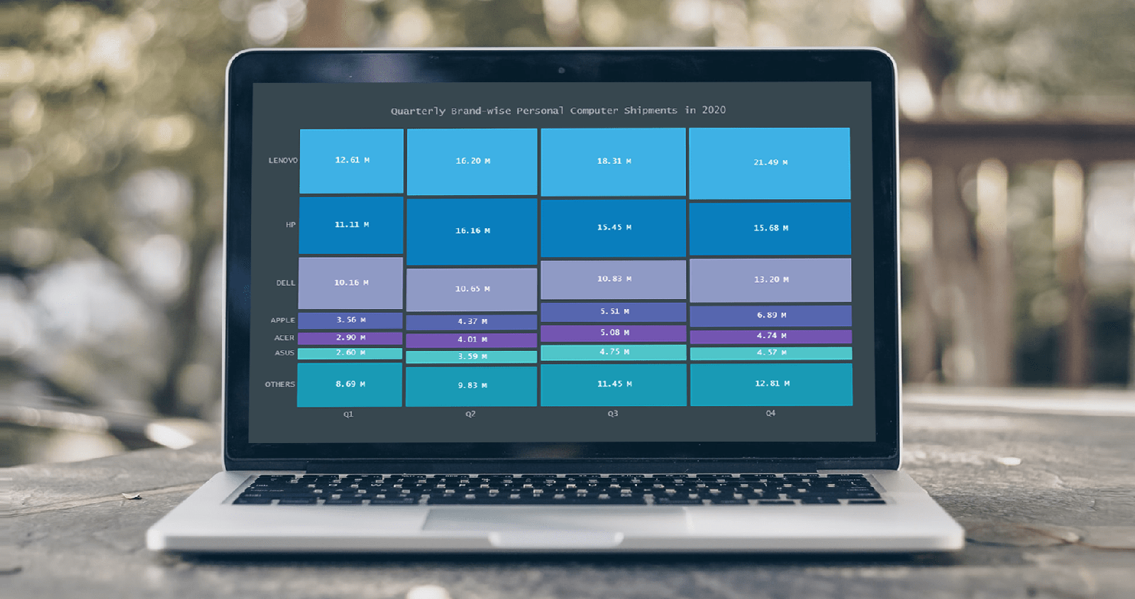 A step-by-step guide for building an interactive JS Mosaic Chart. Illustrated by visualizing data on quarterly PC shipments by brand in 2020.
Data visualization is a valuable tool in today’s scenario, with data everywhere and various opportunities to tap into that data to find insights. Visual charts are imperative to communicate ideas, identify patterns, and make the most of the available data.
So then, would you like to quickly and easily learn how to create a really cool chart that showcases data interestingly?
A mosaic chart is a multi-series chart that effectively represents data with over 2 parameters and is so-called because each data point has distinctive indents, making it visually similar to a piece of mosaic art. Not only is this chart beautiful to look at, but is also very helpful in representing multiple variables and recognizing the relationship between these different variables.
The year 2020 was not all bad, at least for the market of personal computers. The sales of PCs increased throughout each quarter of 2020, with more people working and studying from home. I explored how each brand fared in every quarter based on the number of global shipments.
Read the JS charting tutorial »
- Categories: AnyChart Charting Component, HTML5, JavaScript, JavaScript Chart Tutorials, Tips and Tricks
- No Comments »
Creating Waterfall Chart with JS
March 16th, 2021 by Dilhani Withanage Do you want to know how to easily add a waterfall chart to a web page or application using JavaScript? This tutorial will make sure you’re prepared to confidently deal with that sort of interactive data visualization development!
Waterfall charts illuminate how a starting value turns into a final value over a sequence of intermediate additions (positive values) and subtractions (negative values). These additions and subtractions can be time-based or represent categories such as multiple income sources and expenditures. In finance, a waterfall chart is often called a bridge; you may have also heard it referred to as a cascade, Mario, or flying bricks chart.
To see waterfall charts in action and learn how to build them with JavaScript (HTML5), we need some interesting real-world data to visualize. In this tutorial, let’s look at the 2020 income statement for Alphabet Inc. (GOOGL), the parent company of Google.
Hence, be with me to reach our target step by step, so in the end, you’ll see how a lot of numbers can be made sense of with real ease when illustrated as a beautiful, interactive, JS waterfall chart. All aboard!
Read the JS charting tutorial »
- Categories: AnyChart Charting Component, Business Intelligence, HTML5, JavaScript, JavaScript Chart Tutorials, Tips and Tricks
- No Comments »
How I Created Sunburst Chart Using JavaScript to Visualize COVID-19 Data
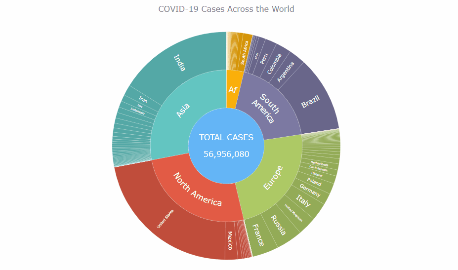
December 8th, 2020 by Shachee Swadia Almost recovered from COVID-19 myself these days, I decided to explore how the world is currently doing, during the pandemic. So I created a sunburst chart to see at a glance what continents and countries are more (and less) affected by the coronavirus than others. The process was quick and I thought someone could be interested to learn about how such data visualizations can be built in a pretty straightforward way, even with very little technical skills. So I also made a tutorial. And here I am — (1) sharing my interactive sunburst chart of COVID cases and (2) describing how I created it using JavaScript in a matter of minutes, step by step!
My JS sunburst chart provides an overview of the situation as of November 24, 2020, and also shows the global count, continent-wide data, and country-wise proportions for the current active COVID-19 cases and deaths. Scroll down to explore it by yourself and check out the tutorial along the way. Here is a sneak peek of the final chart to get you excited:
This sunburst charting tutorial is mainly for beginners to data science. So before we get to business, let’s make sure we’re on the same page. I’ll explain what a sunburst chart is and how it works, to start with. Then I’ll show you how to create a cool and colorful interactive visualization like that with JavaScript (and you can do it even if you don’t know it too well). That’s the plan!
Read the JS charting tutorial »
- Categories: AnyChart Charting Component, Big Data, Business Intelligence, HTML5, JavaScript, JavaScript Chart Tutorials, Tips and Tricks
- No Comments »
Flippity Uses AnyChart in Word Cloud Visualization Tool
October 26th, 2020 by AnyChart Team
While thousands of companies choose AnyChart to operate interactive data visualization in commercial projects, we are especially proud our charting solutions have been put for good use in education. Here’s a great new case, for example.
Have you heard about Flippity? It is a fascinating free web project providing teachers (and students) with an extremely straightforward way to turn Google Sheets’ spreadsheets into something cool and useful in the education process — flashcards, quizzes, games, timelines, leaderboards, random name pickers, progress indicators, and many other online things. Earlier this year, Flippity added a dedicated tool to create a Word Cloud from a Google spreadsheet, and we are excited it is powered by our JavaScript charting library!
To learn and tell you more about Flippity and their experience using AnyChart JS for data visualization, we had a quick talk with Steve Fortna, a school teacher from Massachusetts and the creator of Flippity. Check out the interview! (Stack: HTML/Google Sheets.)
- Categories: AnyChart Charting Component, HTML5, JavaScript, Success Stories
- No Comments »
How to Create JavaScript Network Graph
July 22nd, 2020 by Wayde Herman Network graphs are a special, very interesting form of data visualization. Unlike more traditional chart types like bar graphs or pie charts, a network graph does a bit more than visualize numerical data. With these charts, you represent each object as a point, referred to as a node, and the connections between the objects as a line, referred to as either a link or an edge. Here, we do not focus on representing objects with the same precision we are typically used to. Instead, we are trying to discover relationships in a network or sections of a network and are less worried about individual nodes.
Right now, I will guide you through how to develop an interactive network graph for the web using JavaScript (HTML5). Inspired by one fun visualization created by Ben Sullins, I decided to take data about the last decade’s biggest TV series, Game of Thrones. It is an epic fantasy tale revolving around the quabbles of various faction-like houses. So in this tutorial, I will be visualizing the relationships in the world of Game of Thrones by showing who attacked whom. Follow me, it’s going to be a cool adventure!
Read the JS charting tutorial »
- Categories: AnyChart Charting Component, HTML5, JavaScript, JavaScript Chart Tutorials, Tips and Tricks
- 7 Comments »
Building JavaScript Radar Chart
July 7th, 2020 by Wayde Herman Radar charts, which are also referred to as spider charts or radar plots, are a data visualization used to compare observations with multiple quantitative variables. Each variable is encoded to a spoke which are equidistant apart. The higher the value, the further away from the center of the chart the point is made. Radar charts are best used to compare the ‘profile’ of observations and to detect outliers within the data. They are therefore used quite a bit in sports, most notably in basketball and soccer for profiling players.
In this tutorial I will be teaching you how to build your own radar chart with JavaScript and how to use them to help with one of the toughest decisions in gaming history: which starting pokemon to choose!
That’s right, we will be building radar charts to perform data analysis on Bulbasaur, Charmander and Squirtle to determine, once and for all, which is the best choice.
Read the JS charting tutorial »
- Categories: AnyChart Charting Component, Charts and Art, HTML5, JavaScript, JavaScript Chart Tutorials, Tips and Tricks
- No Comments »
How to Create JavaScript Bubble Chart — Tutorial for Web Developers
March 3rd, 2020 by Wayde Herman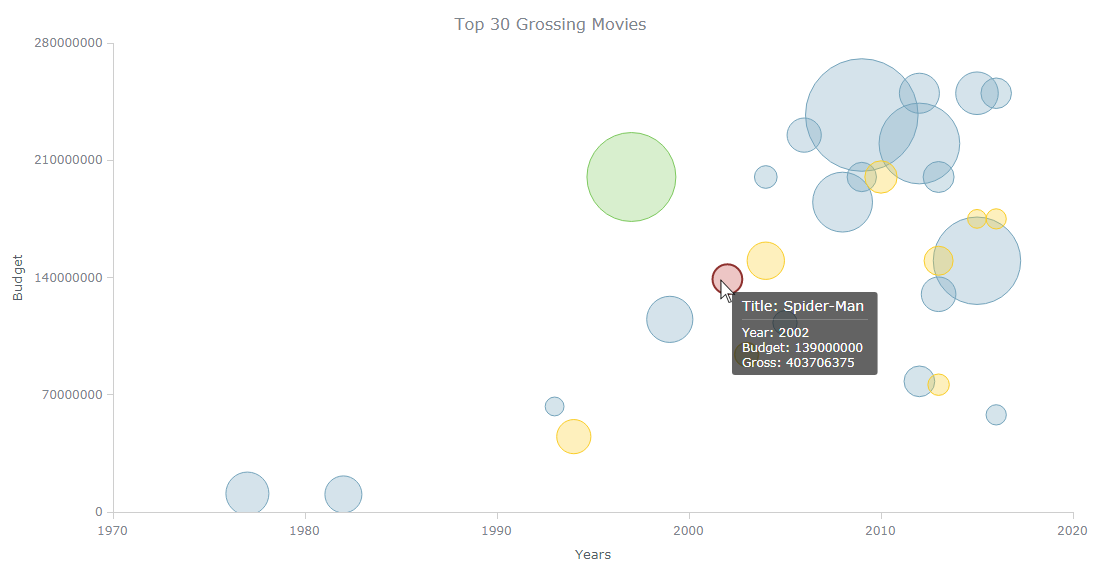 Have you ever wanted to create a bubble chart using JavaScript but did not know how? Then this tutorial is for you! Carry on reading to learn more about bubble charts and how we can build them quickly and painlessly.
Bubble charts are an extension of the scatter plot. Most commonly, they display three variables which are expressed as the horizontal distance of the point (x), the vertical distance of the point (y), and the size of the point (z). A bubble chart is a great visualization technique to let users compare data points. When designed well, it can be really eye-catching and engaging.
In this tutorial, I will teach you how to build your very own interactive JS bubble chart and bring it to life through customization. All examples will be available with the full code.
For this “getting started” guide, I have decided to explore the data of the top 30 grossing movies. Let’s look at the amount of money each movie has grossed, the budget, as well as the year of release. A bubble chart is a particularly good choice for the visualization of this dataset as it will allow us to easily compare these three numeric variables in an interesting and beautiful way.
Read the JS charting tutorial »
- Categories: AnyChart Charting Component, HTML5, JavaScript, JavaScript Chart Tutorials, Tips and Tricks
- No Comments »