Integrating AnyChart JS Charts in Python Django Financial Trading Dashboard
December 3rd, 2024 by Michael Whittle We are pleased to share an insightful article by Michael Whittle, a seasoned solution architect and developer with over 20 years of experience. Originally published on EODHD.com, it explores how he integrated our JavaScript charting library into a financial trading dashboard built with Python Django. Michael also shares his experience migrating a treemap from D3.js to AnyChart and explains why he chose our solution for implementing a stock chart, highlighting the intuitive code and enhanced functionality. Read on to discover how you can elevate your financial data visualizations in Python Django web applications with AnyChart JS Charts.
- Categories: AnyChart Charting Component, AnyStock, Big Data, Dashboards, Financial Charts, HTML5, JavaScript, Stock Charts, Third-Party Developers, Tips and Tricks
- No Comments »
How to Make Treemap Using JS
June 8th, 2022 by Awan Shrestha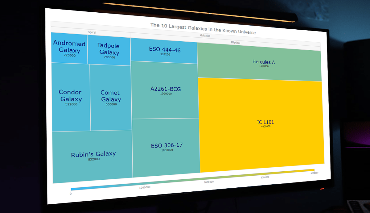 Treemap visualizations are widely used in hierarchical data analysis. If you need to build one but have never done that before, you might think the process is somewhat complicated. Well, not necessarily. I decided to make a step-by-step tutorial explaining how to create awesome interactive treemap charts with ease using JavaScript. And you’re gonna love the illustrations!
Are we alone in the universe? A question every one of us has asked ourselves at some point. While we are thinking about the odds of the Earth being the only habitable planet in the universe, or not, one of the things we might consider is how big the universe is. Let’s look at that with the help of treemaps! In this tutorial, we will be visualizing the scale of the 10 largest galaxies in the known universe using the treemapping technique.
So, would you like to know how to quickly build a JS-based treemap chart? Follow me in this stepwise tutorial and learn in an easy, fun way!
Read the JS charting tutorial »
- Categories: AnyChart Charting Component, HTML5, JavaScript, JavaScript Chart Tutorials, Tips and Tricks
- No Comments »
Cesefor Uses AnyChart to Visualize Forestry Data in Nemus System
August 31st, 2021 by AnyChart Team Many thousands of developers worldwide use our solutions for interactive data visualization. So it is hardly surprising to come across a graphic powered by AnyChart here or there. Some projects, however, deserve a showcase. Such a new interesting one demonstrating great use of AnyChart has recently come to our notice and we are happy to let you know about it.
A Spanish nonprofit, Cesefor used our JavaScript charting library to visualize forestry data for the Spanish region of Castile and León in a whole lot of different charts and maps, aiming to make relevant insights easily accessible and actionable for sustainability.
The project is called Nemus. Shh, it is still in beta, not yet officially launched. But Rodrigo Gómez Conejo, Head of ICT and Knowledge Management Area at Cesefor, allowed us to let you in and even gave us a brief interview disclosing some peculiar details about the system and how AnyChart is employed — check it out below. (Stack: jQuery/CodeIgniter/PostgreSQL.)
- Categories: AnyChart Charting Component, AnyMap, Big Data, Dashboards, HTML5, JavaScript, Success Stories
- No Comments »
How I Created Sunburst Chart Using JavaScript to Visualize COVID-19 Data
December 8th, 2020 by Shachee Swadia Almost recovered from COVID-19 myself these days, I decided to explore how the world is currently doing, during the pandemic. So I created a sunburst chart to see at a glance what continents and countries are more (and less) affected by the coronavirus than others. The process was quick and I thought someone could be interested to learn about how such data visualizations can be built in a pretty straightforward way, even with very little technical skills. So I also made a tutorial. And here I am — (1) sharing my interactive sunburst chart of COVID cases and (2) describing how I created it using JavaScript in a matter of minutes, step by step!
My JS sunburst chart provides an overview of the situation as of November 24, 2020, and also shows the global count, continent-wide data, and country-wise proportions for the current active COVID-19 cases and deaths. Scroll down to explore it by yourself and check out the tutorial along the way. Here is a sneak peek of the final chart to get you excited:
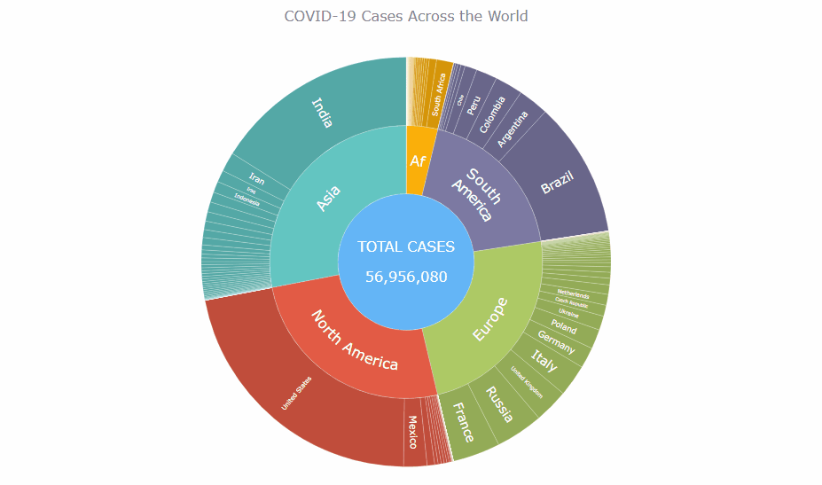
This sunburst charting tutorial is mainly for beginners to data science. So before we get to business, let’s make sure we’re on the same page. I’ll explain what a sunburst chart is and how it works, to start with. Then I’ll show you how to create a cool and colorful interactive visualization like that with JavaScript (and you can do it even if you don’t know it too well). That’s the plan!
Read the JS charting tutorial »
- Categories: AnyChart Charting Component, Big Data, Business Intelligence, HTML5, JavaScript, JavaScript Chart Tutorials, Tips and Tricks
- No Comments »
Fresh Examples of Data Visualization Best Practices in Action — DataViz Weekly
October 9th, 2020 by AnyChart Team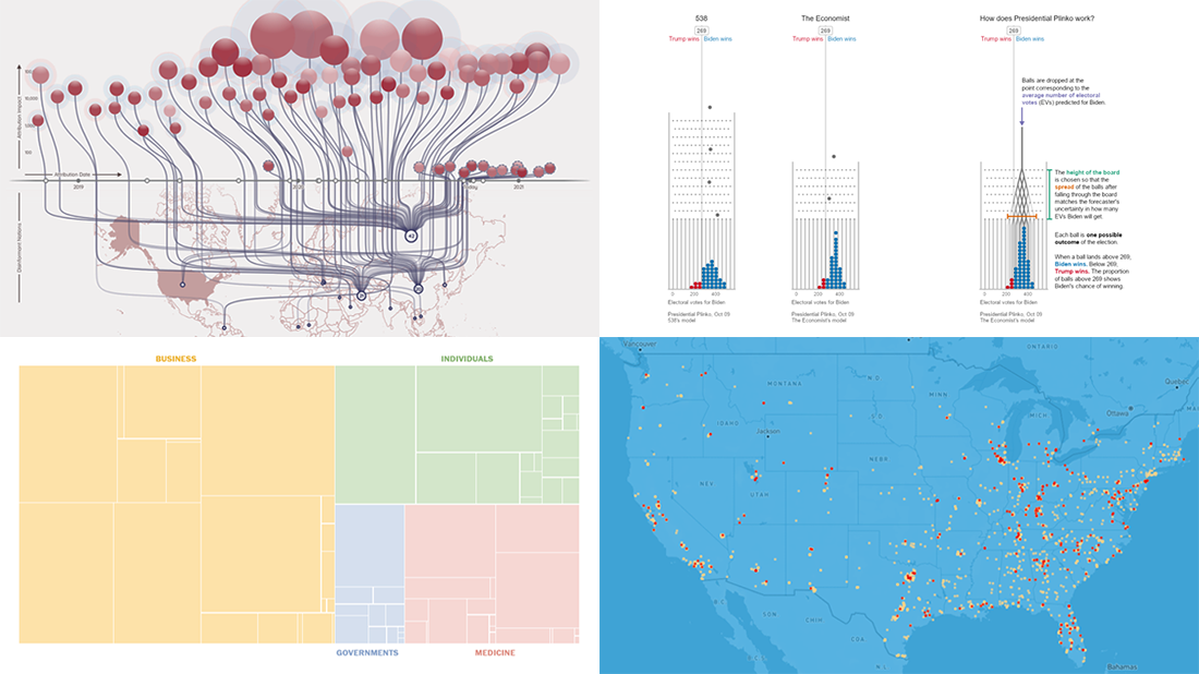 DataViz Weekly is here featuring a selection of new compelling projects with awesome charts and maps. Check out some of the coolest fresh examples of data visualization best practices in action!
- $4 trillion coronavirus bailout under the microscope — The Washington Post
- Presidential Plinko — Matthew Kay, Northwestern University
- Allegations of foreign interference in the 2020 U.S. election — DFRLab
- American streets named after athletes — ESPN
- Categories: Data Visualization Weekly
- No Comments »
Visual Statistics About Fast & Furious, Internet Users, Afghanistan, and Satellites — DataViz Weekly
August 2nd, 2019 by AnyChart Team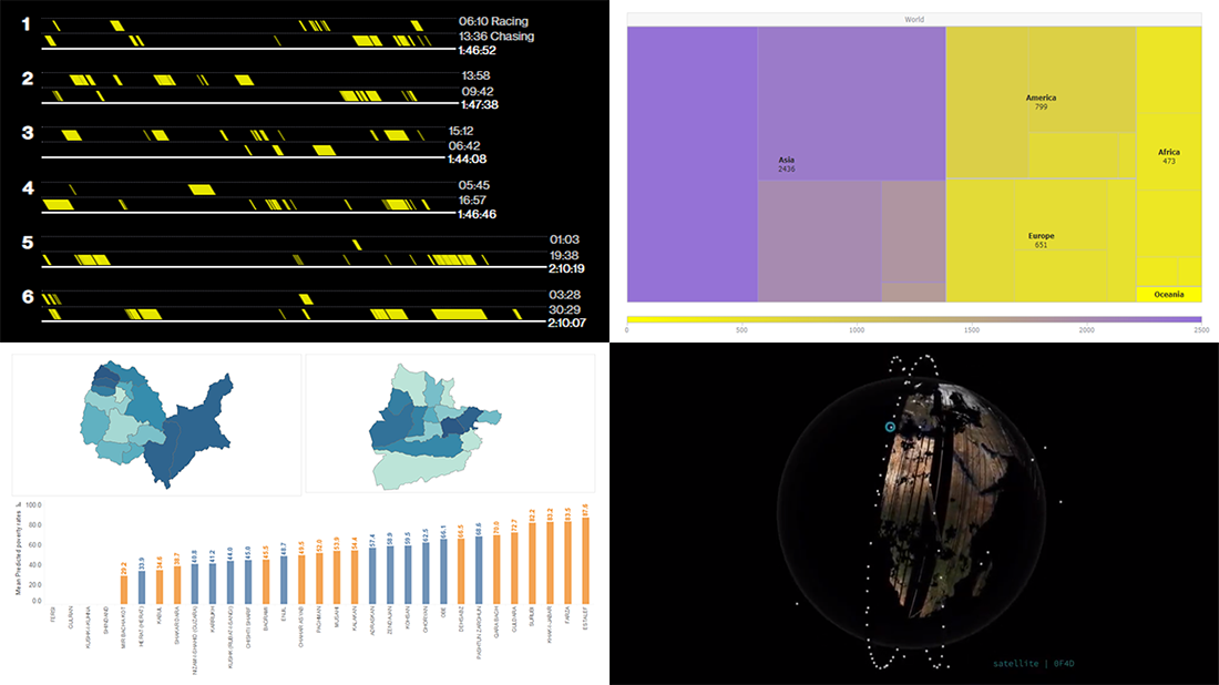 Enjoy our new selection of cool visual statistics projects that have been recently created around the web. These are worth seeing and we are glad to feature them on DataViz Weekly:
- All eight Fast & Furious movies in data
- Worldwide internet users statistics by region
- Economic and other indicators across 401 districts of Afghanistan
- Satellites imaging our Earth every day
- Categories: Data Visualization Weekly
- No Comments »
Creating Treemap Chart Using JavaScript
August 1st, 2019 by Douglas "Bugggster" Baxter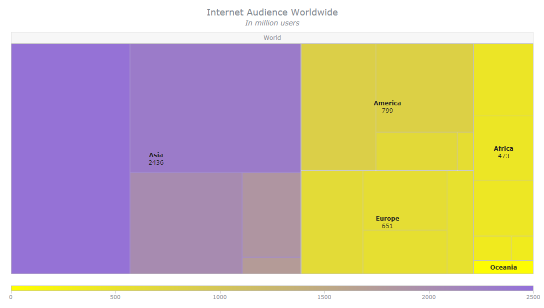 Treemap is a popular chart type for hierarchical data visualization. I’ll show you how to create a cool interactive treemap chart using JavaScript in four simple steps right now. Join me on this quick tutorial for front-end web developers and data viz enthusiasts to understand the core principles of the process. Basically, I am sure everyone at least a little familiar with coding in HTML5 will love the presented, easy way to make beautiful JavaScript treemap charts that are perfectly suitable to be embedded into any web page or app.
In honor of World Wide Web Day celebrated today, August 1, I will develop a JS treemap visualizing data about the number of worldwide internet users as of January 2019, by region, available on Statista.
Read the JS charting tutorial »
- Categories: AnyChart Charting Component, HTML5, JavaScript, JavaScript Chart Tutorials, Tips and Tricks
- 2 Comments »