Freshest Data Visualization Inspirations — DataViz Weekly
July 1st, 2022 by AnyChart Team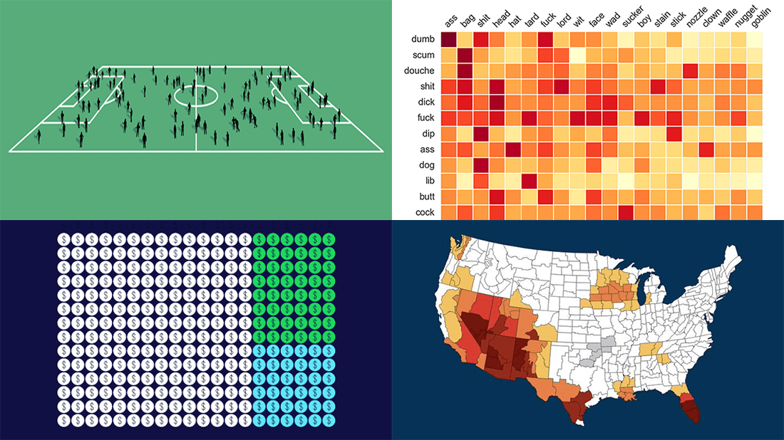 Need some inspiration for data visualization? Especially for you, on DataViz Weekly, we’ve selected four new online projects where charts and maps do a fascinating job to explain and let people explore a thing!
- Population of England and Wales, according to Census 2021 — ONS
- Daily estimates of climate change’s impact on temperatures across the U.S. — Climate Central
- Compound pejoratives on Reddit — Colin Morris
- Music streaming revenue distribution model — The Pudding
- Categories: Data Visualization Weekly
- No Comments »
Engaging Data Graphics on Hobbies, Protests, Commute, and Reddit — DataViz Weekly
April 23rd, 2021 by AnyChart Team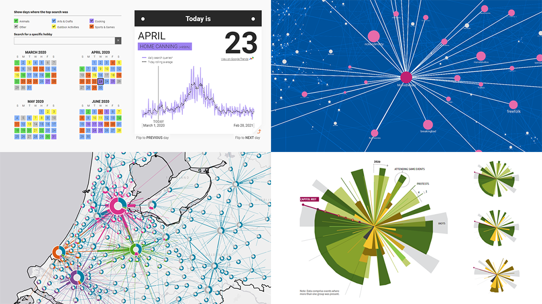 Can’t wait for a new portion of engaging data graphics? We’ve got it for you right here, right now! The following visualizations caught our eye this week, and DataViz Weekly is here to make sure you do not miss out on them:
- Top trending hobbies during the COVID-19 pandemic — Polygraph and Google Trends
- Right-wing protests in America in 2020-2021 — Reuters
- Commuting in the Netherlands — Statistics Netherlands
- Map of Reddit — Andrei Kashcha
- Categories: Data Visualization Weekly
- No Comments »
Visualizing Reddit Data Using AnyChart JS Charting Library
November 25th, 2020 by AnyChart Team Leading the data visualization market with the best-in-class solutions, we are always excited to see how not only companies but also individuals from all over the world use them to produce interactive charts in their projects. Here’s one new interesting example we’ve recently learned about. A developer created “Cloud a Subreddit,” a web project that generates a beautiful interactive Word Cloud chart out of any given Reddit’s subreddit with the help of the AnyChart JS library.
[Editor’s note: The interviewee’s personal details have been removed following a GDPR request.]
We had a quick interview with the creator to learn more about the work and experience of using AnyChart. Check it out.
- Categories: AnyChart Charting Component, Big Data, HTML5, JavaScript, Success Stories
- No Comments »
Visualizing Data About Energy Mix, Subreddit Posts, Hate Crimes, and McDonald’s Ice Cream Availability — DataViz Weekly
November 13th, 2020 by AnyChart Team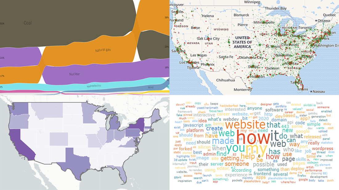 DataViz Weekly is back — check out some of the most interesting third-party data visualization projects we have recently come across! Let’s start with a quick list and then take a closer look at each:
- Electricity generation in America since 2001 — NYT
- Subreddits in word clouds — Cloud a Subreddit
- Hate crimes in the United States — UCLA
- McDonald’s ice cream machine status — Rashiq Zahid
- Categories: Data Visualization Weekly
- No Comments »
Visual Data Analysis in Action with Examples on Laugh, DST, Science, and Health — DataViz Weekly
November 8th, 2019 by AnyChart Team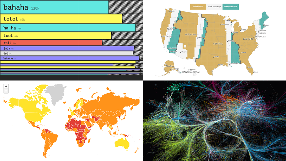 Visual data analysis can be extremely helpful when you need to make sense of large amounts of diverse information. Check out several new striking examples! The four projects in the spotlight of today’s DataViz Weekly roundup have been made public just about now and we are glad to introduce them to you right now:
- Laughing online — The Pudding
- DST gripe assistant tool — Andy Woodruff
- 150 years of papers — Nature
- Global health security — JHU, NTI, and EIU
- Categories: Data Visualization Weekly
- No Comments »