Engaging Data Graphics on Hobbies, Protests, Commute, and Reddit — DataViz Weekly
April 23rd, 2021 by AnyChart Team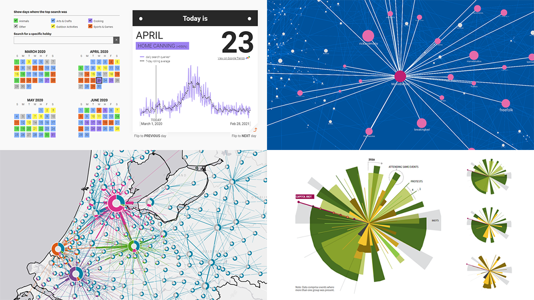 Can’t wait for a new portion of engaging data graphics? We’ve got it for you right here, right now! The following visualizations caught our eye this week, and DataViz Weekly is here to make sure you do not miss out on them:
- Top trending hobbies during the COVID-19 pandemic — Polygraph and Google Trends
- Right-wing protests in America in 2020-2021 — Reuters
- Commuting in the Netherlands — Statistics Netherlands
- Map of Reddit — Andrei Kashcha
- Categories: Data Visualization Weekly
- No Comments »
Visualizing Hubble Observations, Census Evolution, Conflicts, and Media Consumption — DataViz Weekly
April 10th, 2020 by AnyChart Team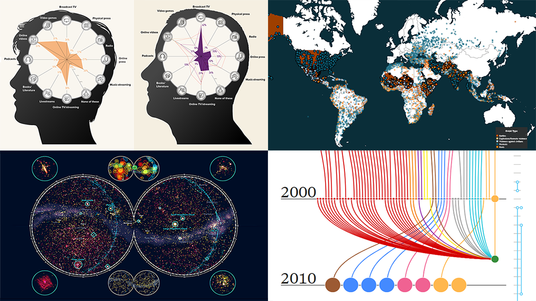 In the new DataViz Weekly post, we are glad to tell you about new compelling visualizations we have come across these days. Here’s what projects made it to our today’s selection, from people’s activities to Hubble observations:
- 30 years of the Hubble Space Telescope’s observations — Physics Today
- Evolution of the U.S. census from 1790 to 2020 — The Pudding
- 10 conflicts to worry about in 2020 — ACLED
- Media consumption during the COVID-19 pandemic — Visual Capitalist
- Categories: Data Visualization Weekly
- No Comments »
Creative Visualizations on Climate, Protests, Jobs, and Wildlife — DataViz Weekly
March 27th, 2020 by AnyChart Team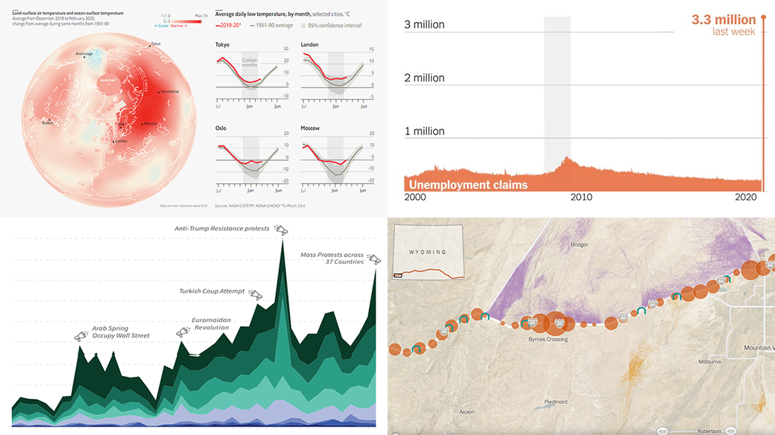 The new issue of DataViz Weekly puts a spotlight on some of the most interesting new creative visualizations from around the Web. Last week, we made a focus on COVID-19 charts. This time, we get along without the coronavirus subject. Well, mostly.
Here is what’s on DataViz Weekly this Friday:
- Winter temperatures in the northern hemisphere — The Economist
- Mass political protests worldwide — Center for Strategic and International Studies
- Spike in joblessness in the United States of America — The New York Times
- Wyoming wildlife corridors — The Washington Post
- Categories: Data Visualization Weekly
- No Comments »
Visual Data Analytics on Protests, GDP, Opinions, and Weather — DataViz Weekly
December 20th, 2019 by AnyChart Team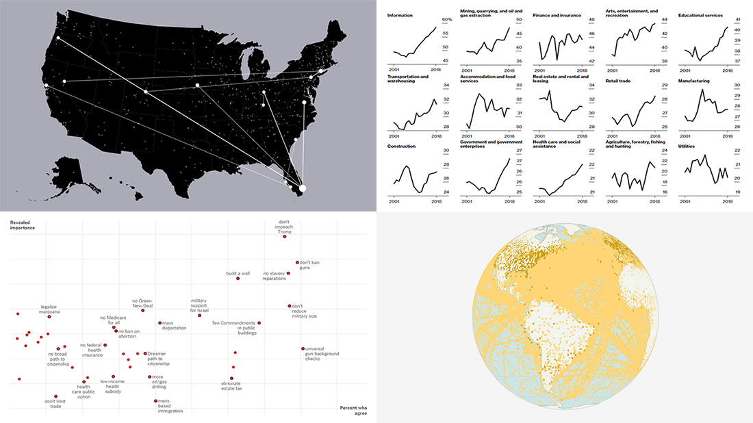 Visual data analytics with the help of charts and maps as efficient graphical presentation forms can quickly bring a lot of insight into mere numbers. We’ve curated some more examples from all over the web to illustrate this. See our new DataViz Weekly selection of great recently-published projects featuring data visualization in action:
- Street protests in the United States — Alyssa Fowers
- American GDP by county — Bloomberg
- Topical issues for U.S. voters — The Upshot, The New York Times
- Weather observations in old ship logbooks — Reuters
- Categories: Data Visualization Weekly
- No Comments »