Creating Connector Map with JavaScript
July 15th, 2022 by Awan Shrestha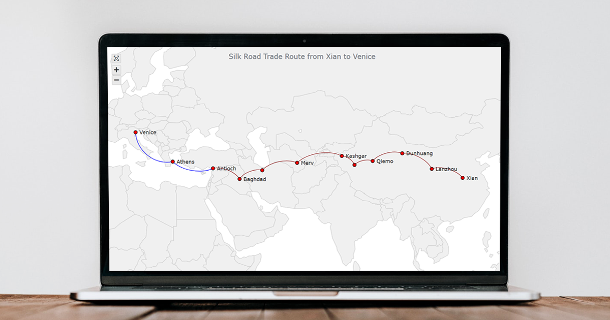 Connector maps are designed to be ideal for visualizing routes and other links between locations in geospatial data analysis. In this tutorial, you’ll learn how to quickly create a compelling interactive one using JavaScript.
Step by step, we will be visualizing a route of the famous ancient Silk Road. We’ll start with the development of a basic JS connector map in four moves and then make a few tweaks to make it look awesome. Let’s start the voyage!
Read the JS charting tutorial »
- Categories: AnyChart Charting Component, AnyMap, HTML5, JavaScript, JavaScript Chart Tutorials, Tips and Tricks
- No Comments »
How to Build Interactive Connector Map with JavaScript
September 21st, 2021 by Shachee Swadia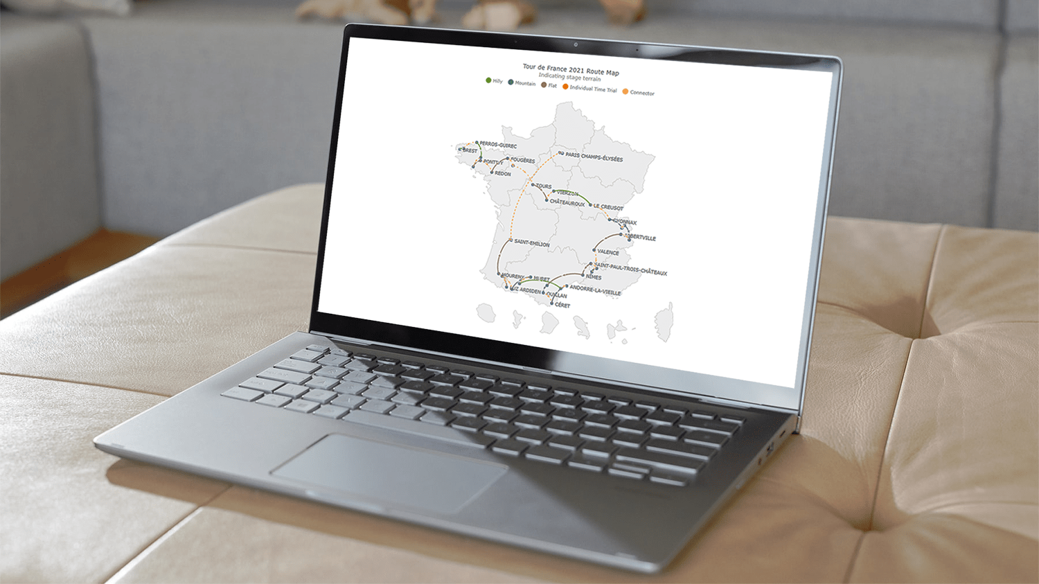 A connector map is a set of straight or curved lines that link points on a geographical map. It is commonly used to graphically represent routes or any other connections between locations. Would you like to learn how to build an attractive data visualization like that for a web page or app?
Actually, it is easy to create an interactive connector map using JavaScript. And I am ready to show you how right now! Follow along with this tutorial as I depict the cycling path of the 2021 Tour de France in the form of a JS connector map and thoroughly explain all steps.
Read the JS charting tutorial »
- Categories: AnyChart Charting Component, AnyMap, HTML5, JavaScript, JavaScript Chart Tutorials, Tips and Tricks
- 2 Comments »
Making JS Dot Density Map to Visualize Shipping Ports Across Globe
April 20th, 2021 by Shachee Swadia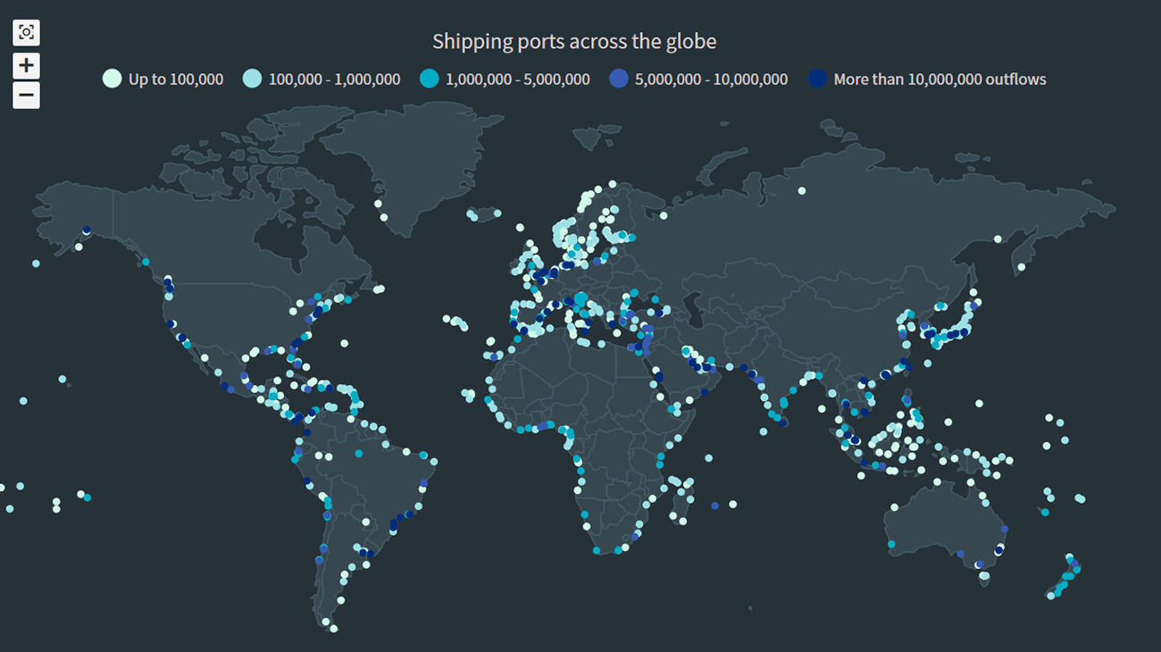 The recent incident of the Suez Canal blockage caught my interest in shipping and prompted me to explore the various shipping ports around the globe. There are more than 850 ports in the world and to get an overall view of where these are located, I decided to plot them on a dot map, or dot density map, using JavaScript.
Building an interactive JS dot density map can seem like a daunting task. But let me assure you that it can be pretty straightforward. Right now, I will show how to make a fully functional dot map chart using a JavaScript library for data visualization.
Read the JS charting tutorial »
- Categories: AnyChart Charting Component, AnyMap, Big Data, HTML5, JavaScript, JavaScript Chart Tutorials, Tips and Tricks
- No Comments »
COVID-19 Vaccine, Future, Impact, and Non-COVID Wiki Atlas Visualizations — DataViz Weekly
May 8th, 2020 by AnyChart Team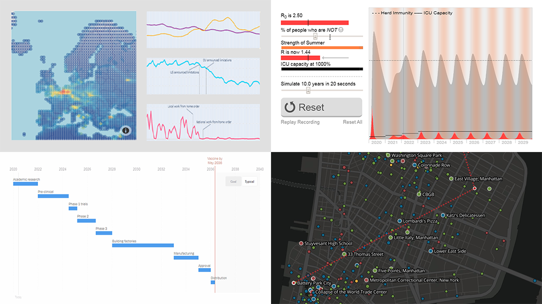 Without any exaggeration, the vast majority of data visualizations made public these weeks (and already months) are about the novel coronavirus pandemic. In compliance with the general trend, three of the four projects presented in the new DataViz Weekly article shed light on issues related to COVID-19. Take a glance at a quick list of the featured data visualization works and read more to meet them.
- COVID-19 vaccine development timeframe and how to reduce it – NYT
- COVID-19 future, in playable simulators – M. Salathé & N. Case
- COVID-19 impact on traffic and air pollution in Europe – European Data Portal
- Atlas of places featured in Wikipedia – T. Noulas, R. Schifanella, D. Sáez-Trumper & J. Tan
- Categories: Data Visualization Weekly
- No Comments »
Social Distancing in Data Visualizations — DataViz Weekly
April 3rd, 2020 by AnyChart Team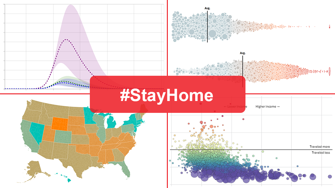 Many health and epidemiology experts consider social distancing to be the most effective way to slow the spread of COVID-19 at the current stage. But does it really work and help?
In today’s DataViz Weekly, we put a focus on data visualizations — charts and maps — on where we, in the United States, have been on social distancing. The following projects deserved to get featured in this special “#StayHome” edition:
- “The Social Distancing of America” — Reuters
- “Where America Didn’t Stay Home Even as the Virus Spread” — NYT
- “Social Distancing Scoreboard” — Unacast
- “COVID-19 Projections Assuming Full Social Distancing Through May 2020” — IHME, UW Medicine
- Categories: Data Visualization Weekly
- 1 Comment »