Pinch-to-Zoom in Stock Charts — JS Chart Tips
March 5th, 2025 by AnyChart Team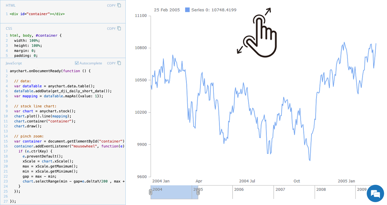 Stock charts are designed to handle large volumes of time-based data, and smooth navigation is key to working with them effectively. One common need is zooming — whether to focus on a specific time range in greater detail or to get a broader view of the data.
In our JavaScript stock charts, zooming works out of the box through the scroller element, which appears by default as the main navigational UI control, making it easy to adjust the visible range on the go. For even greater flexibility, the range selection UI provides extra tools like preset time period buttons and date input fields. You can also activate zooming via mouse wheel scrolling with the zoomOnMouseWheel() method, which corresponds to the two-finger swipe gesture on touchpads and trackpads.
Pinch-to-zoom is another intuitive zooming option. It allows users to zoom in and out naturally on mobile and touch devices by moving two fingers farther apart or closer together. This is also easy to implement — and it is exactly what we cover in this edition of JS Chart Tips. Learn how to add pinch-to-zoom to your JavaScript stock chart!
- Categories: AnyChart Charting Component, AnyStock, Big Data, Financial Charts, HTML5, JavaScript, JS Chart Tips, Stock Charts, Tips and Tricks
- No Comments »
Stock Chart with Custom Time Intervals — JS Chart Tips
January 30th, 2025 by AnyChart Team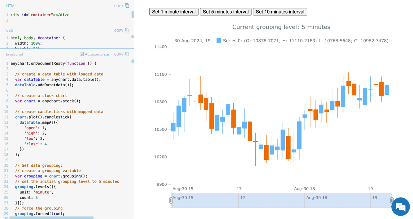 Grouping data points into appropriate time intervals is essential for making stock charts more readable and insightful. While raw data may be collected at a high frequency, such as every minute, financial analysts and traders often need to view broader trends, where grouping data into 5-minute, 15-minute, 1-hour, 1-day, and other time frames can provide clearer insights. In this edition of JS Chart Tips, we will walk you through the process of setting a custom time interval for a stock chart using our JavaScript charting library.
- Categories: AnyChart Charting Component, AnyStock, Big Data, Financial Charts, HTML5, JavaScript, JS Chart Tips, Stock Charts, Tips and Tricks
- No Comments »
Integrating AnyChart JS Charts in Python Django Financial Trading Dashboard
December 3rd, 2024 by Michael Whittle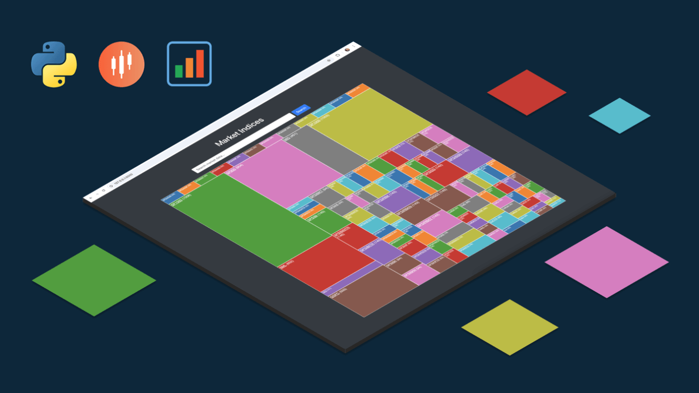 We are pleased to share an insightful article by Michael Whittle, a seasoned solution architect and developer with over 20 years of experience. Originally published on EODHD.com, it explores how he integrated our JavaScript charting library into a financial trading dashboard built with Python Django. Michael also shares his experience migrating a treemap from D3.js to AnyChart and explains why he chose our solution for implementing a stock chart, highlighting the intuitive code and enhanced functionality. Read on to discover how you can elevate your financial data visualizations in Python Django web applications with AnyChart JS Charts.
- Categories: AnyChart Charting Component, AnyStock, Big Data, Dashboards, Financial Charts, HTML5, JavaScript, Stock Charts, Third-Party Developers, Tips and Tricks
- No Comments »
Gantt Chart Legend — JS Chart Tips
November 21st, 2024 by AnyChart Team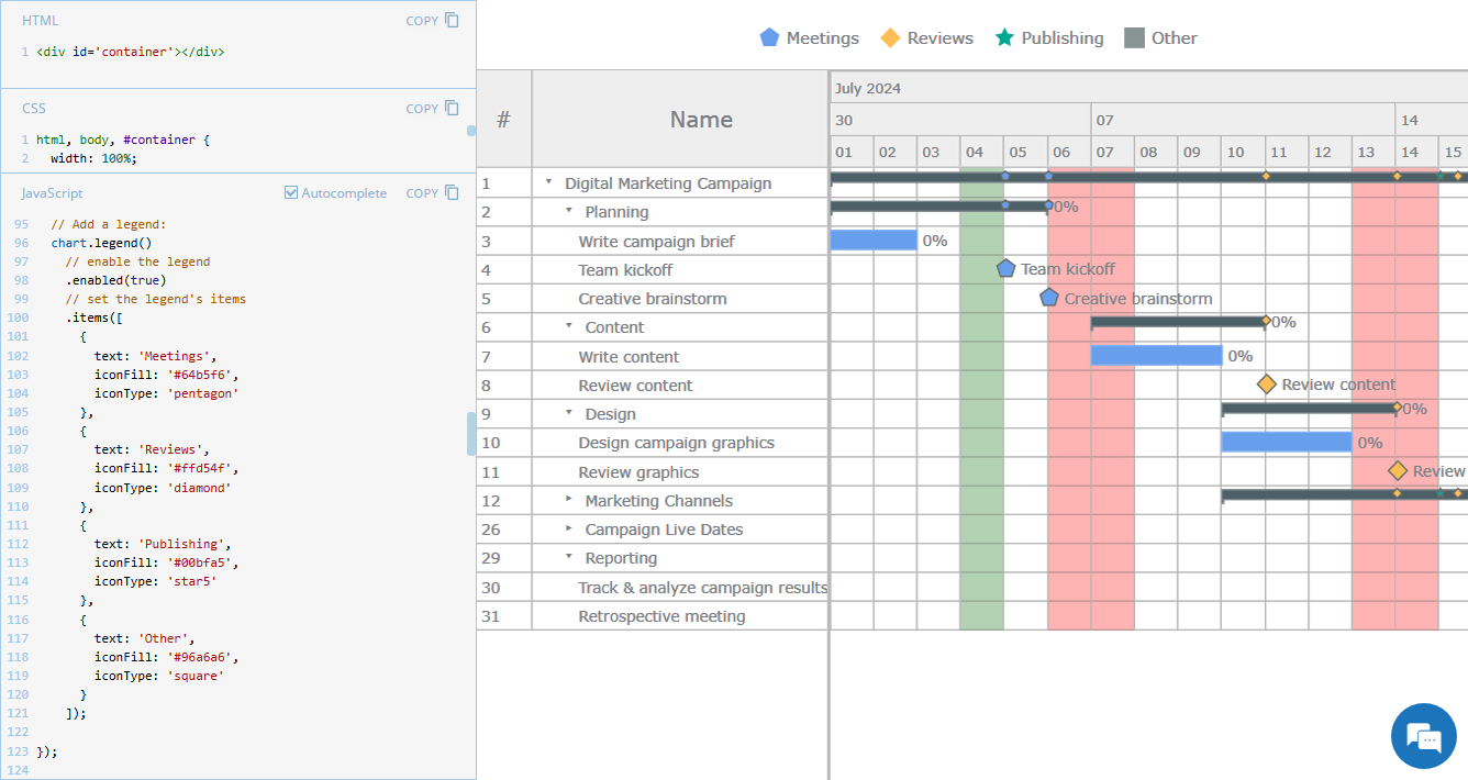 Legend is a vital element in many charts, helping viewers quickly understand what each visual component represents. However, it is not always a must-have for every chart type. For instance, Gantt charts often work perfectly fine without a legend, so it is not enabled in our JavaScript Gantt Chart by default. That said, creating one is straightforward. Right now, we will show you how to add a legend to a Gantt chart — join us as we continue our JS Chart Tips series, sharing quick solutions inspired by real customer queries!
- Categories: AnyChart Charting Component, AnyGantt, Business Intelligence, Gantt Chart, HTML5, JavaScript, JS Chart Tips, Tips and Tricks
- 2 Comments »
3 Ways to Set Height and Width of JavaScript Charts — JS Chart Tips
October 17th, 2024 by AnyChart Team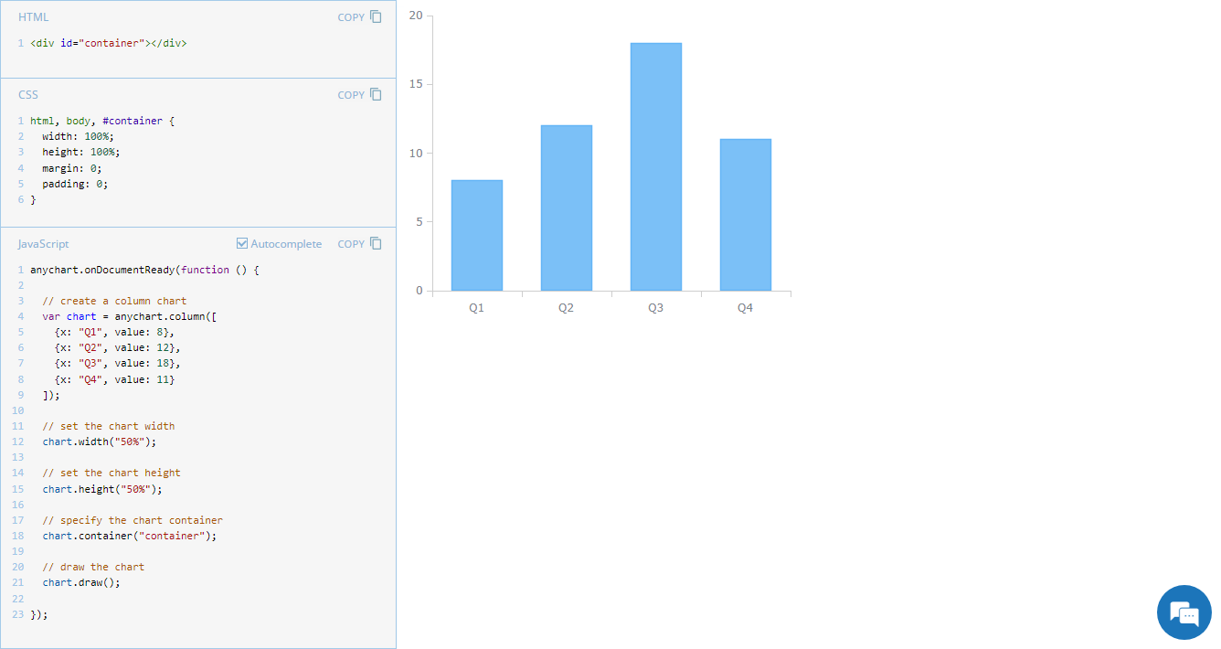 Navigating chart dimensions is key in crafting user-friendly visual presentations, especially when integrating multiple charts into an existing web page or app screen. In our JavaScript chart tutorials, charts are usually showcased as stretching across an entire web page. But it’s far from rocket science to make them smaller. In today’s JS Chart Tips, we explore three effective ways to resize your charts by adjusting their width and height.
- Categories: AnyChart Charting Component, Dashboards, HTML5, JavaScript, JS Chart Tips, Tips and Tricks
- No Comments »
Creating Calendar Charts with JavaScript
March 4th, 2024 by Nick Gogin Building an interactive calendar chart from scratch may initially seem daunting and time-consuming. However, I'm here to show you it's not only manageable but straightforward once you know the steps. Whether you're developing a scheduling application, tracking events, or looking to enhance your web page with a sleek calendar graphic, this tutorial is designed specifically for you. I'll guide you through the steps to create impressive interactive calendar charts using JavaScript, simplifying what may seem complex.
We'll delve into this process using a JavaScript charting library. As a support engineer at AnyChart, and with our JS library recently named best in data visualization, it was a natural choice to use our tool for this tutorial. What about the example data? Other tutorials! There's a treasure trove of JS charting tutorials on our blog, and it occurred to me that compiling these tutorials into a calendar chart would serve as a unique, engaging, and practical example for this guide.
Therefore, the calendar chart created by the end of this tutorial will offer a concise overview of all tutorials published on the AnyChart blog over the last four years, enabling you to quickly discover the ones that interest you the most. All aboard, fellow web developers and data enthusiasts!
Read the JS charting tutorial »
- Categories: AnyChart Charting Component, HTML5, JavaScript, JavaScript Chart Tutorials, Tips and Tricks
- No Comments »
Building Bubble Chart with JavaScript
August 1st, 2023 by Awan Shrestha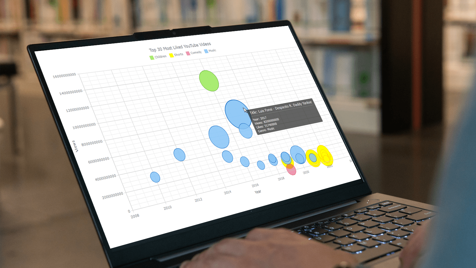 Do you want to turn that data chaos into a comprehensible data show? Look no further than data visualization! And let me tell you, one chart to rule them all is the bubble chart. It's like blowing bubbles at your data and watching them pop into understanding! And the best part? With JavaScript, you can easily create an interactive bubble chart, and I will show you how!
Bubble charts are versatile data visualizations that display data points in the form of bubbles, where the bubbles' size, color, and position represent different variables. In this tutorial, I'll walk you through building these graphics step by step, making the process a breeze. For illustration, we'll take data on the popularity of various YouTube videos and use JavaScript to create an interactive bubble chart showcasing the top 30 most-liked videos of all time, categorized by year of release, views, and likes.
By the end of this tutorial, you'll be able to create visually-stunning JS-based bubble charts without any hassle. So let's dive into the world of data bubbles and turn numbers into a visual feast for the eyes!
Read the JS charting tutorial »
- Categories: AnyChart Charting Component, Big Data, Business Intelligence, HTML5, JavaScript, JavaScript Chart Tutorials, Tips and Tricks
- No Comments »
How to Make Bubble Maps in JavaScript
November 16th, 2022 by Shachee Swadia Map charts are a great way to put data in a geographical context. And they are not difficult to create! I am eager to demonstrate that by walking you through the creation of a bubble map, one of the most popular types data maps, with the help of JavaScript.
A bubble map is a combination of a bubble chart and a geographical map. It uses circles of different sizes (and sometimes colors) to indicate numeric values relating to locations or territories.
In this tutorial, I will be visualizing the data on gasoline prices across the United States. They saw record highs this summer after a surge fueled by the outbreak of the Russia–Ukraine conflict. The first, basic bubble map will display the gas prices in July by state. The final one will add the magnitude of the change since February 23, one day before Russia launched an attack on Ukraine.
Follow along and you’ll learn to build beautiful interactive maps in JS with ease and no problem!
Read the JS charting tutorial »
- Categories: AnyChart Charting Component, AnyMap, Big Data, HTML5, JavaScript, JavaScript Chart Tutorials, Tips and Tricks
- No Comments »
Building Scatter Chart in JavaScript
June 17th, 2022 by Shachee Swadia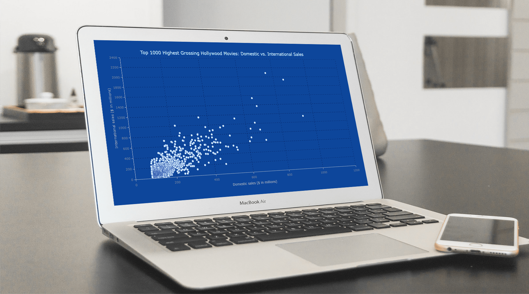 With data everywhere around us, it is imperative to know how to quickly create visualizations that help reveal trends and patterns in it. Today, let’s learn how to build a scatter chart in just a few lines of simple JavaScript code!
Scatter charts, or scatter plots, are designed to identify a correlation between typically two variables. In such graphics, the data is visualized as a set of points usually displayed as markers. The position of each marker indicates the values of the variables along the horizontal and vertical axes.
In this tutorial, we will be visualizing international and domestic sales of the 1000 highest-grossing Hollywood movies as of January 2022. So, get your popcorn and start watching the JS scatter chart development!
Read the JS charting tutorial »
- Categories: AnyChart Charting Component, Big Data, HTML5, JavaScript, JavaScript Chart Tutorials, Tips and Tricks
- No Comments »
Creating Bullseye Chart with JS to Visualize the COVID-19 Vaccine Pipeline
March 25th, 2022 by Shachee Swadia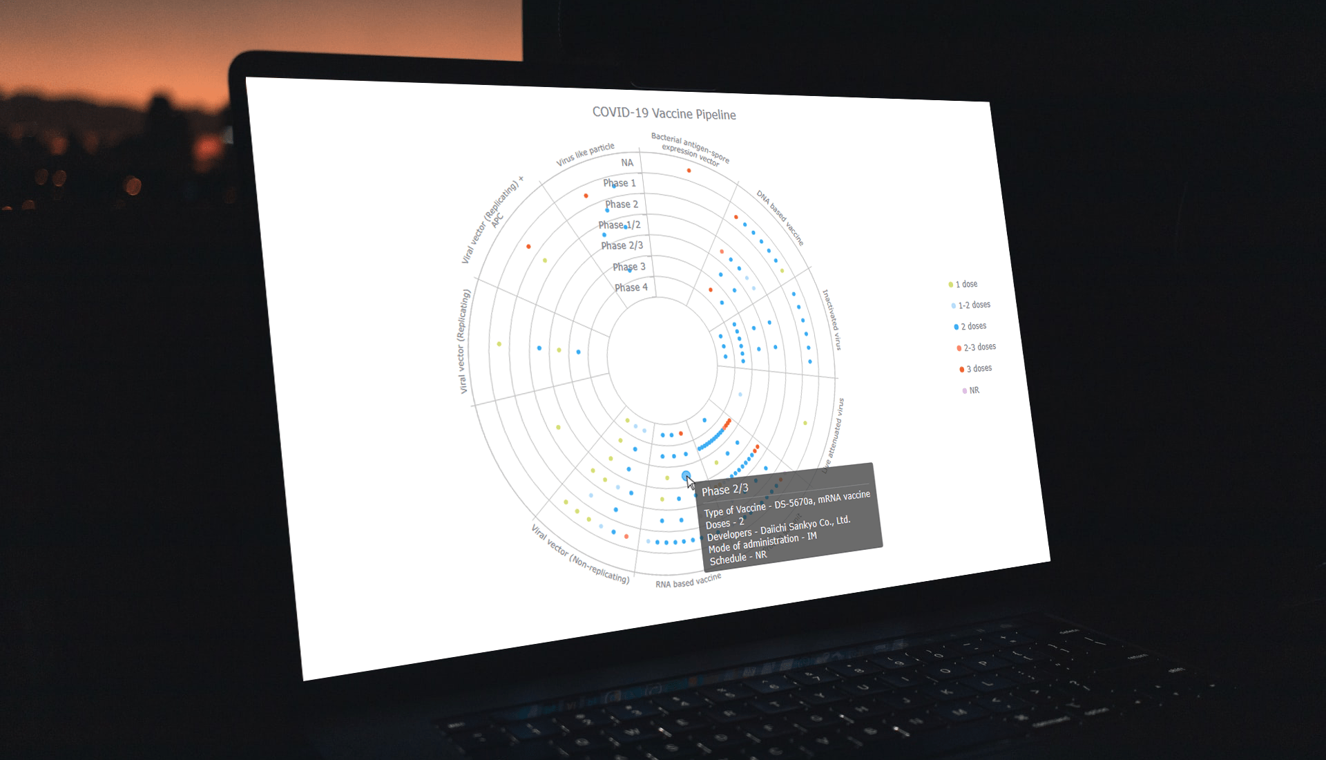 Visualizing data across a set of concentric rings, bullseye charts are widely used in drug pipeline and clinical trials data analysis. This tutorial will explain how to create this type of diagram with JavaScript. What’s more, you’ll see an excellent, typical example of an interactive bullseye chart in action!
I collated detailed information about all the COVID-19 vaccine candidates currently undergoing clinical studies from the WHO’s vaccine tracker. Now, join me as I plot it all in an interactive JS-based bullseye chart, by vaccine type and development phase!
Read the JS charting tutorial »
- Categories: AnyChart Charting Component, Big Data, Business Intelligence, HTML5, JavaScript, JavaScript Chart Tutorials, Tips and Tricks
- No Comments »