New Interesting Data Visualizations to Explore — DataViz Weekly
September 13th, 2024 by AnyChart Team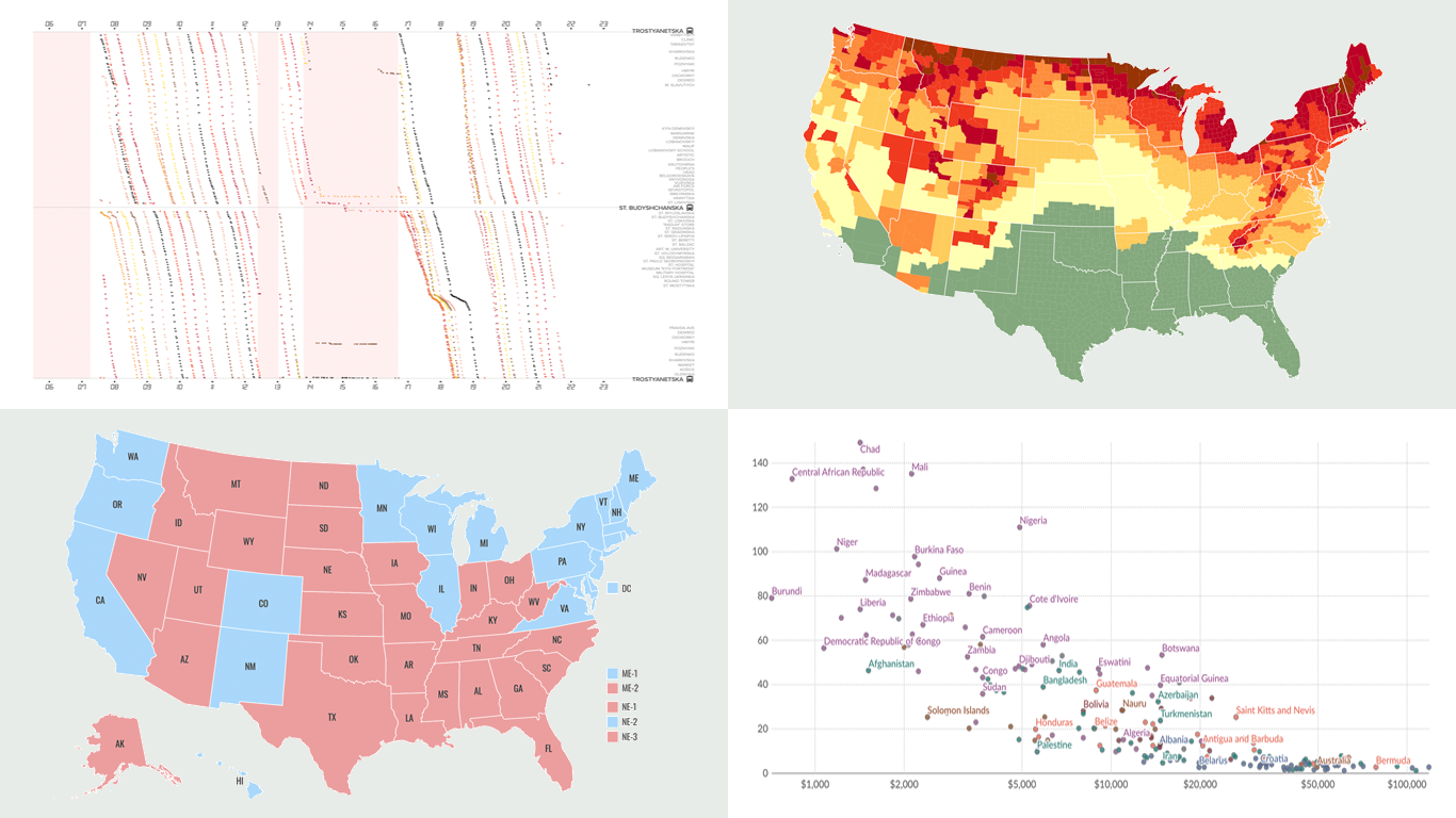 Another week, another collection of new data visualizations! Check out some of the most interesting examples we’ve discovered recently, curated for DataViz Weekly.
- Predicting the outcome of the 2024 U.S. presidential election — NBC News
- Impact of air alerts on Kyiv’s public transport — Text.org.ua
- U.S. fall foliage in 2024 — SmokyMountains.com
- Child mortality due to malnutrition — Our World in Data
- Categories: Data Visualization Weekly
- No Comments »
JavaScript Pie Chart with Radial Scale — JS Chart Tips
September 9th, 2024 by AnyChart Team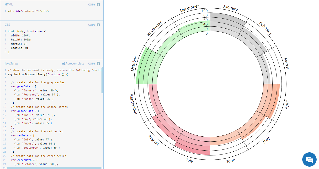 Welcome to JS Chart Tips, our new blog series where we showcase practical solutions to common and unique challenges our Support Team has helped customers overcome. This time, we’re eager to explain how to build a sophisticated circular diagram that may resemble a pie chart with a radial scale. Just a heads-up: this type of visualization is technically a polar column chart.
- Categories: AnyChart Charting Component, Business Intelligence, HTML5, JavaScript, JS Chart Tips, Tips and Tricks
- No Comments »
JavaScript Gantt Chart with Custom Data Grid Header Font — JS Chart Tips
August 20th, 2024 by AnyChart Team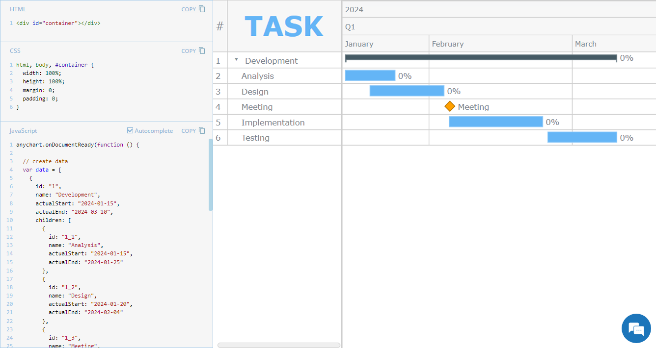 Hey everyone! We’re excited to launch a new regular feature on our blog called JS Chart Tips. In this series, we’ll share some recent cases handled by our Support Team for users of our JavaScript charting library, highlighting both frequent questions and those unique solutions that shouldn’t remain hidden.
Whether these scenarios directly resonate with a challenge you’re facing or simply spark an idea for your current or future data visualization development tasks, we hope you’ll find valuable insights. Each entry will include code snippets and JS chart examples to illustrate the solutions. If you get additional questions or need more details, simply comment below or contact our Support Team directly. We’re here to help enhance your JavaScript charting experience!
Without further ado, welcome to the first edition of JS Chart Tips! Today, you’ll learn how to customize the font of the data grid header in a JavaScript Gantt chart.
- Categories: AnyChart Charting Component, AnyGantt, Business Intelligence, Gantt Chart, HTML5, JavaScript, JS Chart Tips, Tips and Tricks
- No Comments »
Unlocking Visual Data Insights — DataViz Weekly
August 16th, 2024 by AnyChart Team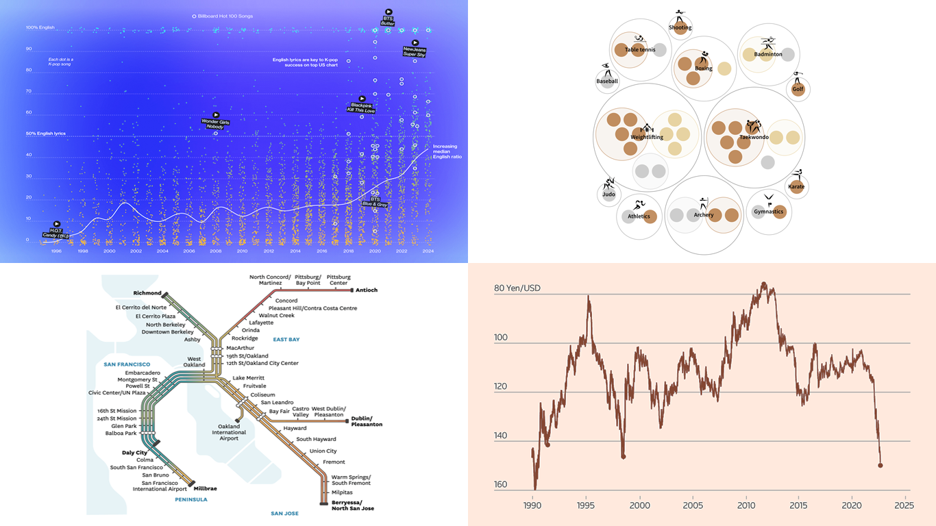 Data speaks louder when it’s represented graphically. Unlock the power of visual data insights in our new edition of DataViz Weekly, putting a spotlight on new charts and maps that make trends and patterns clear and engaging. Take a look at the projects that have stood out to us this week:
- K-pop’s global reach through internationalization — Bloomberg
- The Bay Area’s microclimates revealed through the BART network — The San Francisco Chronicle
- Taiwan’s Olympic medals — Taiwan Data Stories
- Yen fluctuations and the Bank of Japan’s influence — Reuters
- Categories: Data Visualization Weekly
- No Comments »
Paris 2024 Olympic Medal Count Trackers — DataViz Weekly
August 9th, 2024 by AnyChart Team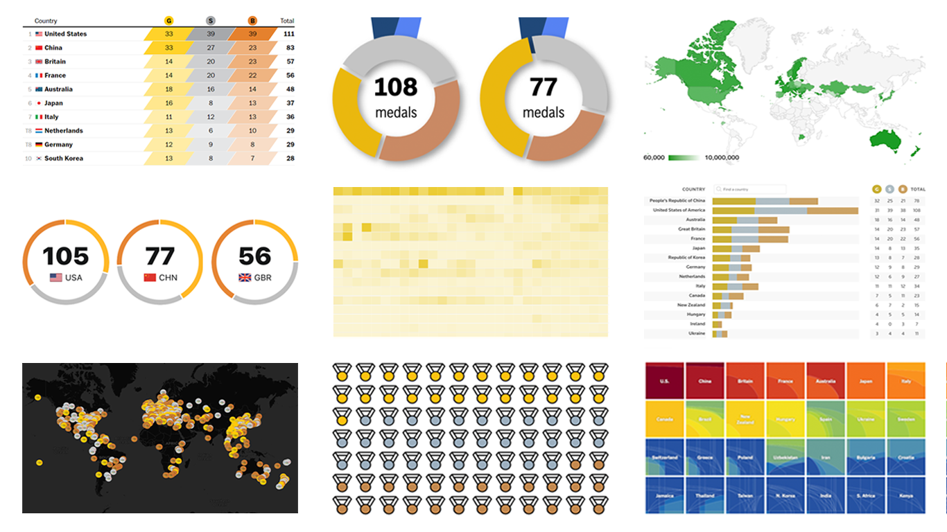 The Paris Summer Olympics are in full swing. If you’re interested in tracking the results and want to know which countries are excelling, numerous media outlets have prepared a variety of medal count trackers. In this special edition of DataViz Weekly, we showcase a selection of these projects, with a special focus on those that not only display numbers but also present them through compelling visualizations. Let’s dive in!
- Categories: Data Visualization Weekly
- No Comments »
Fresh Charts and Maps You Need to See — DataViz Weekly
August 2nd, 2024 by AnyChart Team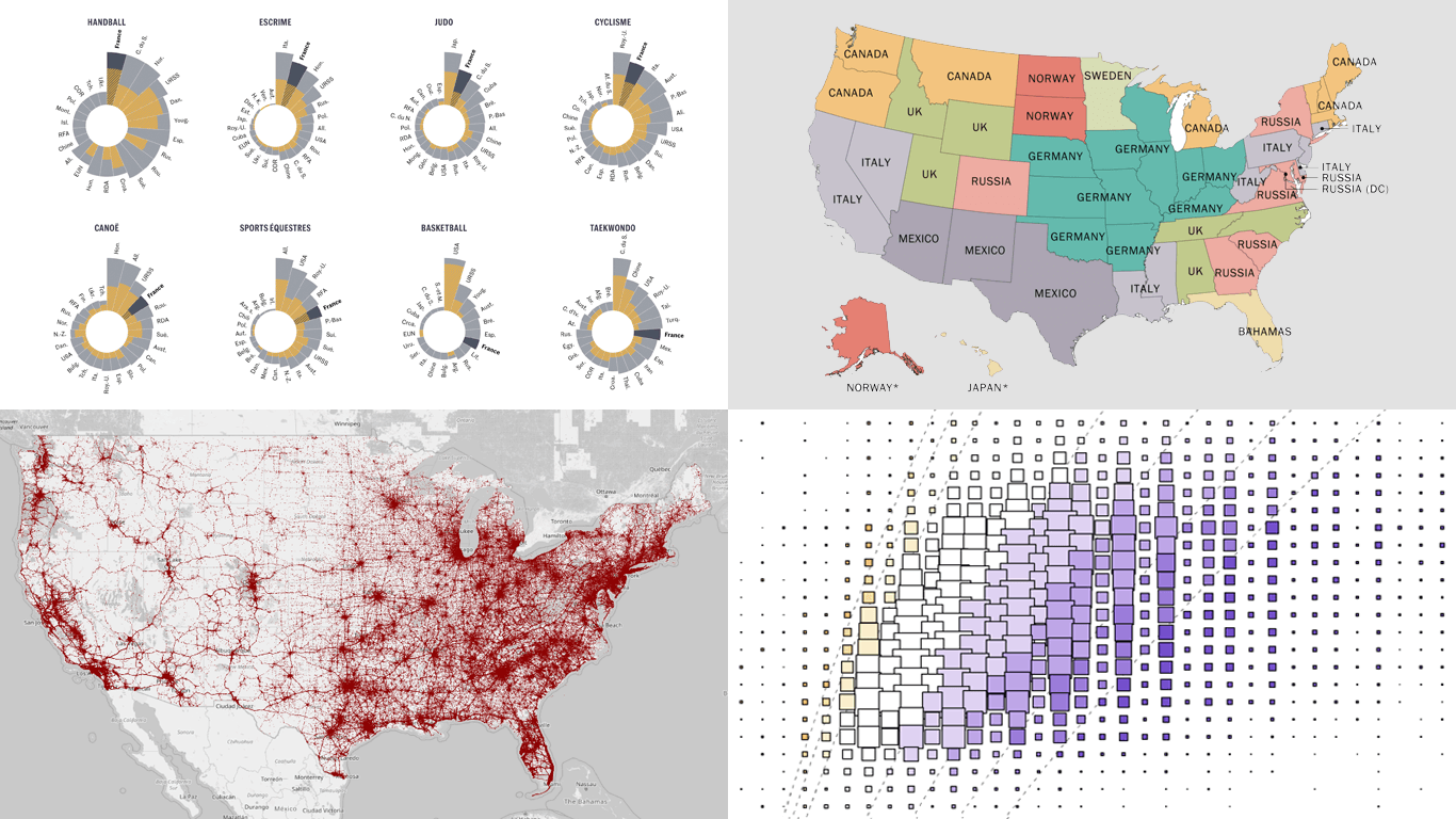 Greetings from DataViz Weekly, a feature on our blog dedicated to exploring the power of charts and maps in uncovering and communicating data. As visual creatures, humans understand and engage with information more effectively when it’s presented in graphical form. Our series focuses on highlighting outstanding and fresh data visualizations that have captured our attention. Today, we’ll showcase these great projects:
- Olympic performances since 1948 with focus on France — Le Monde
- U.S. immigrant origins and settlements in 1850–2022 — Pew Research Center
- Body mass index in the United States — FlowingData
- Traffic fatalities in the U.S. in 2001–2022 — Roadway Report
- Categories: Data Visualization Weekly
- No Comments »
Stunning New Data Visualization Examples in Our Curated Collection — DataViz Weekly
July 26th, 2024 by AnyChart Team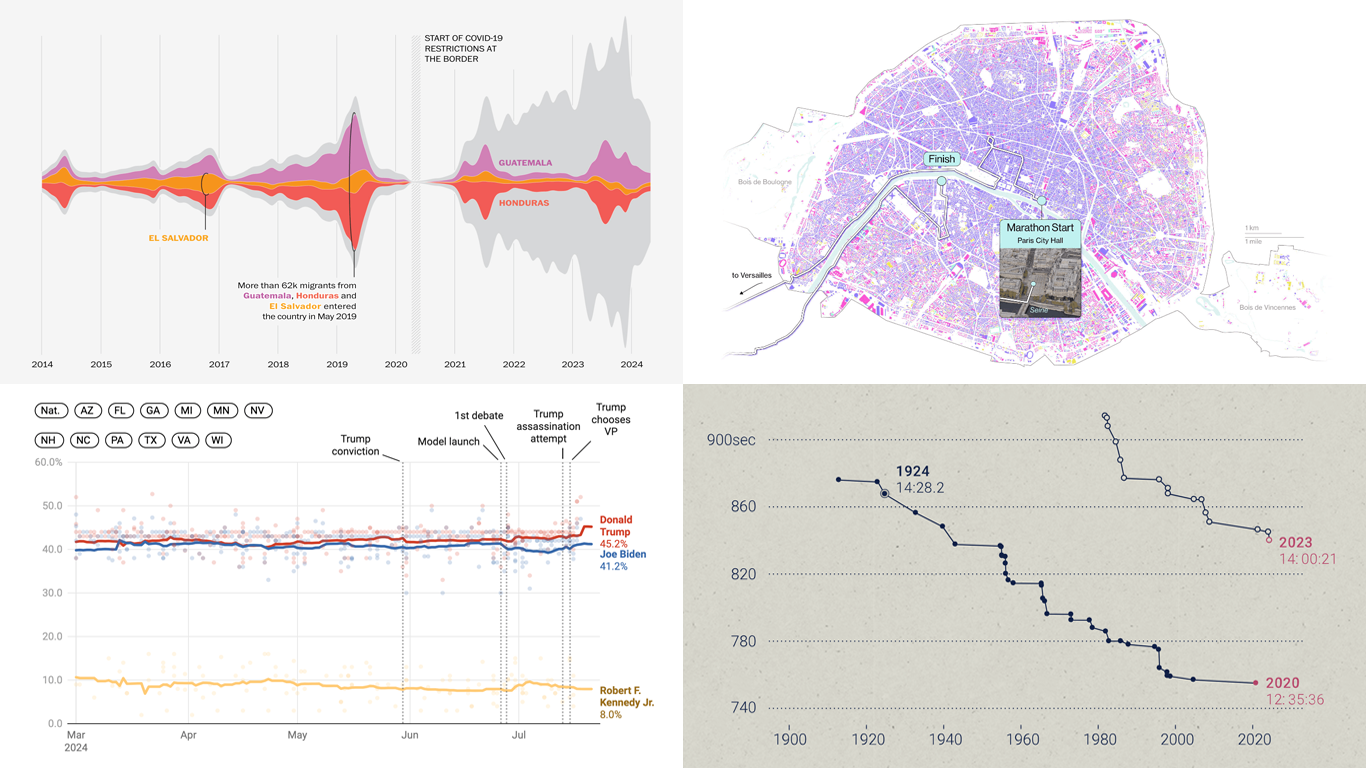 Welcome to DataViz Weekly, where we present a curated selection of stunning data visualization examples our there. Whether you’re a data professional or simply interested in visual data, these charts and maps can provide both inspiration and practical ideas. Here’s what we have for you to explore today:
- U.S. immigration patterns — WaPo
- 2024 U.S. presidential election forecast — Silver Bulletin
- Paris Olympics 100 years later — SCMP
- Extreme heat challenges at the 2024 Summer Olympics — Bloomberg Green
- Categories: Data Visualization Weekly
- No Comments »
New Data Visualization Projects Worth Checking Out — DataViz Weekly
July 19th, 2024 by AnyChart Team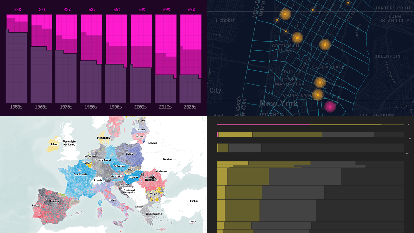 Data is easier to explore and analyze when visualized. If you’re looking for practical examples, you’ve arrived at the right place. DataViz Weekly is here to introduce you to some new data visualization projects we have found on the web.
- NYC congestion zone crash tracker — Transpo Maps
- 2024 European Parliament election map — ZEIT ONLINE
- Global hunger insights — Reuters
- Evolution of sci-fi films — The Pudding
- Categories: Data Visualization Weekly
- No Comments »
Visualizing Forecast Accuracy, College Admissions, Global Demographics, and Election Results — DataViz Weekly
July 12th, 2024 by AnyChart Team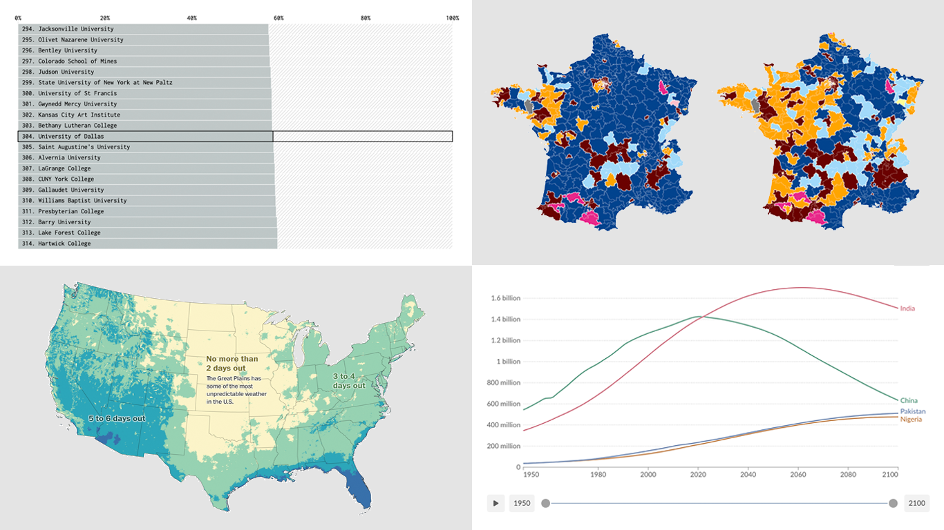 Ready for a fresh dose of impressive data visualizations crafted by seasoned professionals? Here’s what DataViz Weekly has in store for you this time:
- Weather forecast accuracy across the United States — The Washington Post
- U.S. college admission rates — FlowingData
- Global demographic shifts — Our World in Data
- France’s parliamentary election results — Various publications
- Categories: Data Visualization Weekly
- No Comments »
2024 UK Election Maps — DataViz Weekly
July 8th, 2024 by AnyChart Team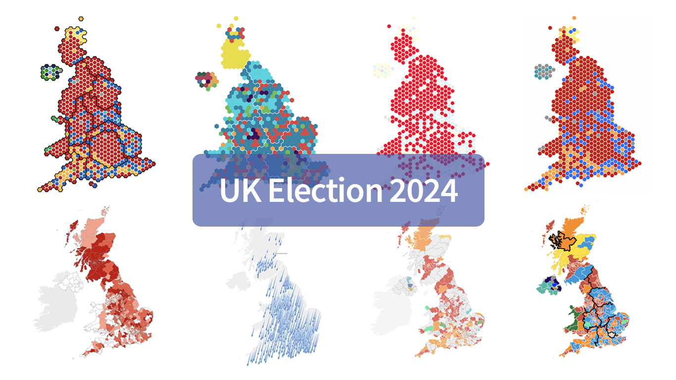 Last Thursday’s 2024 United Kingdom general election resulted in a historic shift within the nation’s political landscape, marking the Conservatives’ most severe defeat in nearly two centuries. As people look for clarity on these changes, election maps have come to the forefront as effective visual tools to make sense of voting outcomes and underlying patterns.
In this special edition of DataViz Weekly, we present a quick overview of UK election maps from prestigious sources including Sky News, The Independent, the BBC, The Financial Times, The Guardian, CNN, Open Innovations, and The New York Times, complete with links to them. Explore these data visualization projects to delve deeper into the dramatic shifts of the 2024 election, experience the power of effective electoral data mapping, and perhaps find inspiration for your own work.
? See also: 2024 U.S. Election Maps (November 2024).
- Categories: Data Visualization Weekly
- No Comments »