 DataViz Weekly is here! Today, we spotlight cool new projects that illuminate how complex topics can be presented and explored in a comprehendible and impactful manner with the help of appropriate data graphics. Here’s a quick look at what we’re covering today:
- Evaluating agri-environmental policy effectiveness globally — Our World in Data
- Visualizing сlimate сhange across generations — The Tardigrade
- Revealing pandemic toll on U.S. prison populations — The Marshall Project
- Exploring Israel’s integrated air defense capabilities in action — Reuters
Data Visualization Weekly: April 19, 2024 — April 26, 2024
Evaluating Agri-Environmental Policy Effectiveness Globally
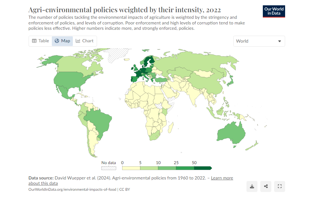
As the global population is expected to approach 10 billion in just three decades, the environmental impacts of agriculture — spanning deforestation, biodiversity loss, and pollution — pose critical challenges. Hanna Ritchie’s article on Our World in Data delves into the efficacy of agro-environmental policies, revealing both successful interventions and those that inadvertently exacerbate problems.
Utilizing a diverse array of data visualizations, including maps and charts, Ritchie illustrates the complex landscape of these policies worldwide. She highlights instances like Sri Lanka’s counterproductive fertilizer ban, juxtaposed with European successes in reducing fertilizer use. Through a blend of global data and case studies, the article underscores the nuanced effectiveness of policies aimed at reducing agriculture’s environmental footprint.
Dive into this insightful exploration of how policies shape agricultural practices and their environmental footprints on Our World in Data.
Visualizing Climate Change Across Generations
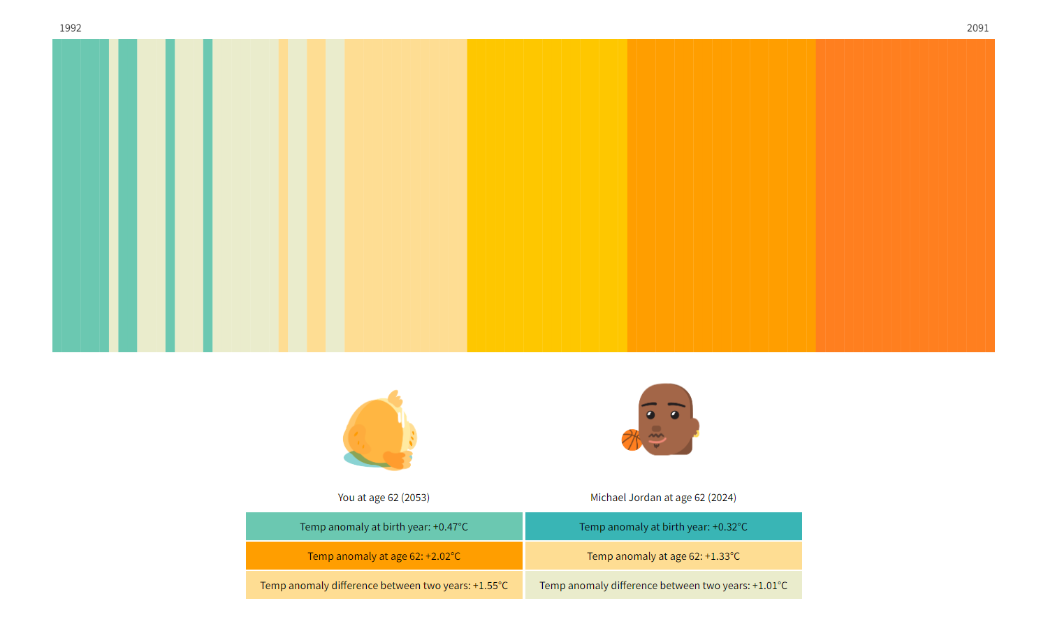
Amid rising global temperatures and frequent extreme weather events, an engaging new project on The Tardigrade examines how the Earth has changed within our lifetimes and the implications for future generations.
With this project, Julia Janicki and Daisy Chung invite you to interactively compare your lifetime temperature changes with those of notable figures like Greta Thunberg and Michael Jordan, using data visualized through colorful, annual temperature change stripes. These visualizations draw on historical data from the World Meteorological Organization and future projections from the Intergovernmental Panel on Climate Change, highlighting potential scenarios based on different global development paths.
For those intrigued by the intersection of personal history and global climate trends, delve deeper into this insightful project to see how your lifetime of change compares to others by visiting The Tardigrade.
Revealing Pandemic Toll on U.S. Prison Populations
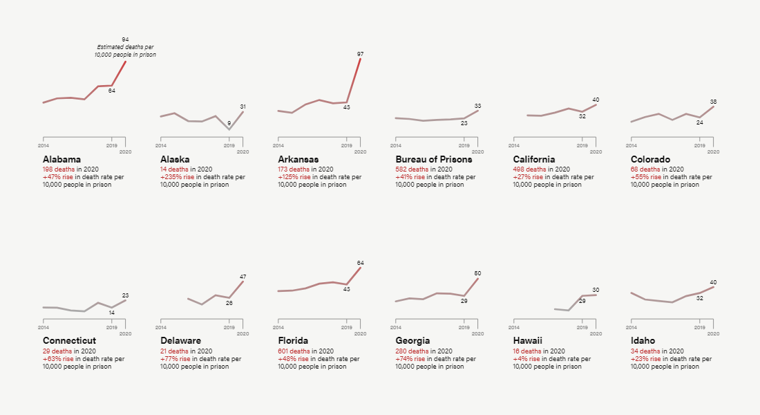
The COVID-19 pandemic highlighted severe vulnerabilities within the U.S. prison system, revealing a stark increase in mortality rates among incarcerated individuals. A study led by the University of California, Irvine and Brigham and Women’s Hospital, highlighted and illustrated through line charts by Anna Flagg, Jamiles Lartey, and Shannon Heffernan, shows that during 2020, prisoners died at rates significantly higher than the general population, particularly affecting older inmates. The research indicates that in some states, the death rate among prisoners aged 50 and older increased dramatically, underscoring the heightened vulnerability of this group.
These findings suggest a critical need for systemic reforms to enhance the health protections available to incarcerated populations, especially during global health emergencies. The visual data not only captures the grim reality of the disparities but also serves as a crucial tool for understanding the impact of health measures in prisons.
For a deeper exploration of the findings and their implications on public health and safety within the correctional system, read the full article on the Marshall Project.
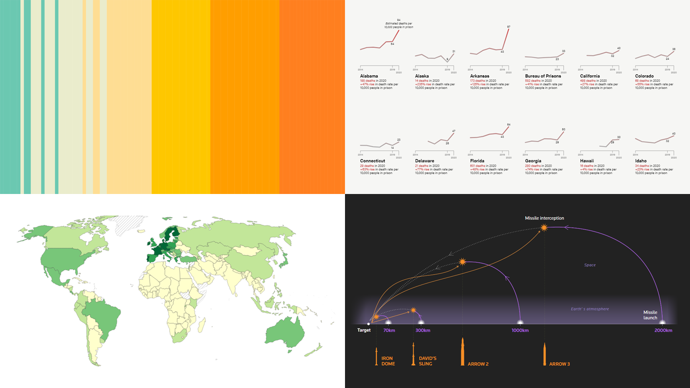
Exploring Israel’s Integrated Air Defense Capabilities in Action
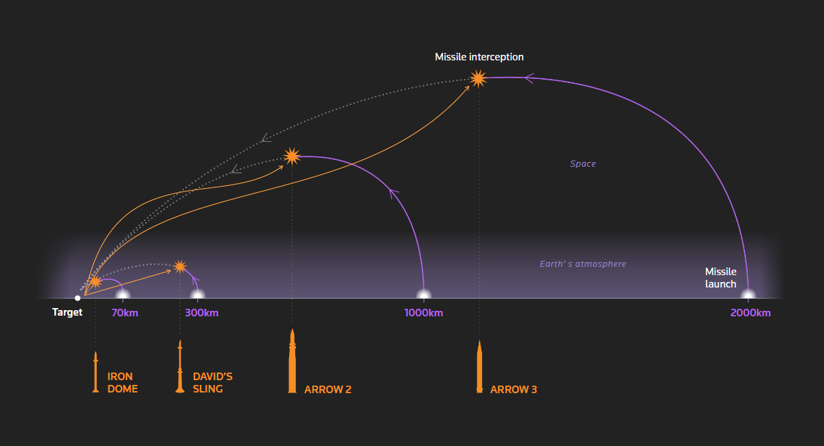
Amid escalating tensions, Israel’s air defense systems were put to the test during a significant missile and drone assault by Iran on April 13. An enlightening article by Gerry Doyle, Mariano Zafra, Adolfo Arranz, and Jitesh Chowdhury on Reuters examines Israel’s multi-tiered defense strategy using a set of graphics.
These technologies, including the high-altitude Arrow systems and the shorter-range Iron Dome, are designed to intercept threats at various altitudes and distances. Together, they form an integrated network to safeguard the nation.
For a comprehensive look at how these advanced systems operate and their strategic importance in modern warfare, check out the full article on Reuters.
Wrapping Up
Now, let’s wrap up this edition of DataViz Weekly, where we’ve explored the power of visualizations to decipher the complexities of our world. These projects vividly illustrate how graphics can bridge the gap between intricate data and informed comprehension.
Dive deeper into each project to gain valuable insights, and be sure to join us again next Friday for more compelling data visualization discoveries. Keep exploring, keep sharing, and stay informed!
- Categories: Data Visualization Weekly
- No Comments »