Discover Some of Most Interesting Recent Data Visualization Projects — DataViz Weekly
July 23rd, 2021 by AnyChart Team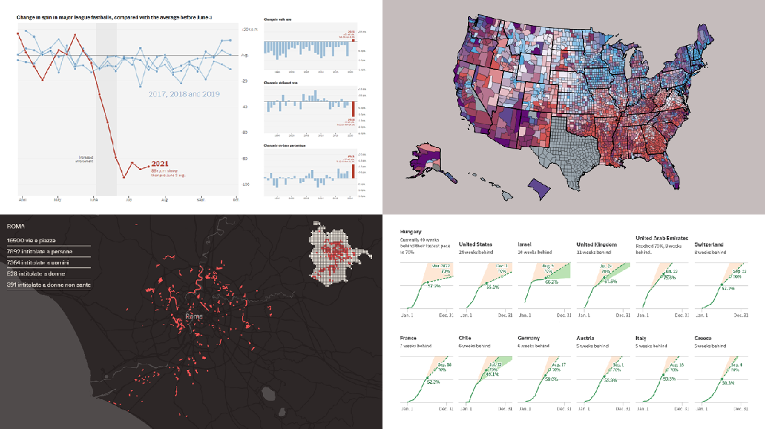 Look at some of the most interesting data visualizations we have come across out there over the last few days! The following projects are deservedly featured in DataViz Weekly this time:
- Falling spin rates in American baseball after a crackdown on sticky substances — The Upshot
- Gender diversity in Italian street names — EDJNet
- Shifts in the COVID-19 vaccination pace worldwide since January 2021 — Reuters
- Vaccination equity in America — CDC
- Categories: Data Visualization Weekly
- No Comments »
New Stunning Data Visualization Examples to See and Learn From — DataViz Weekly
July 9th, 2021 by AnyChart Team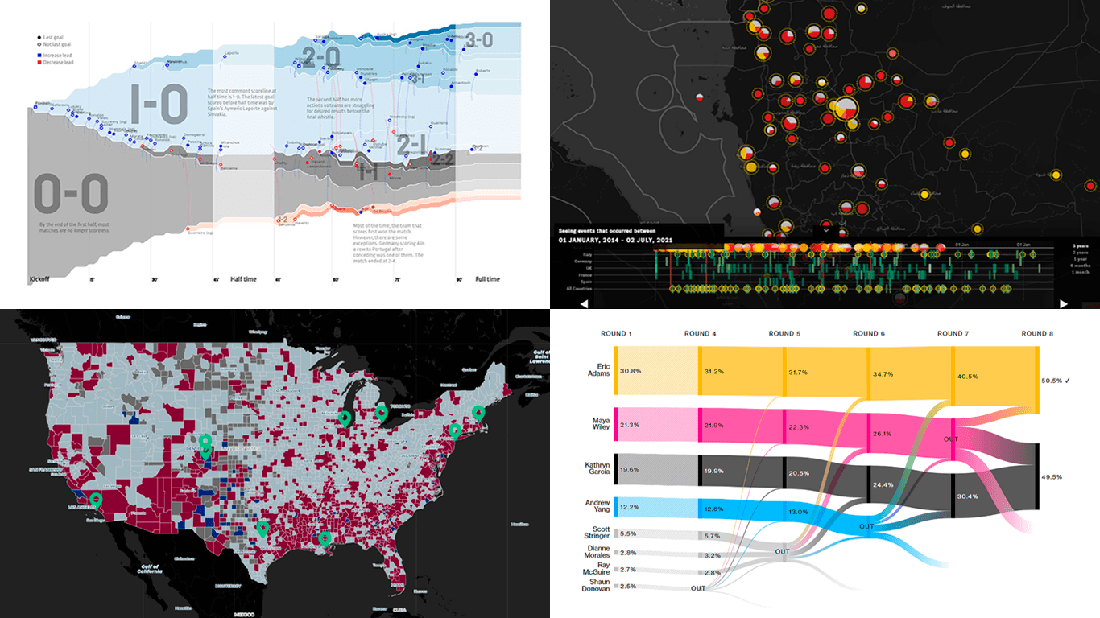 Graphical representation makes data easier to understand and interpret. The DataViz Weekly series on our blog aims to highlight the most vivid examples of clever data visualization in action so you can better realize how it can work or simply have fun exploring new stunning charts and maps.
Today on DataViz Weekly:
- European arms in the bombing of Yemen — Forensic Architecture, Yemeni Archive, ECCHR, and Bellingcat
- All scorelines and goals from the UEFA Euro 2020 group stage — Krist Wongsuphasawat
- Racial residential segregation in the United States — The Othering and Belonging Institute at UC Berkeley
- NYC Democratic mayoral primary vote results — Bloomberg
- Categories: Data Visualization Weekly
- No Comments »
Excellent Visualizations on Subway, Moons, Energy, and Sea Ice — DataViz Weekly
July 12th, 2019 by AnyChart Team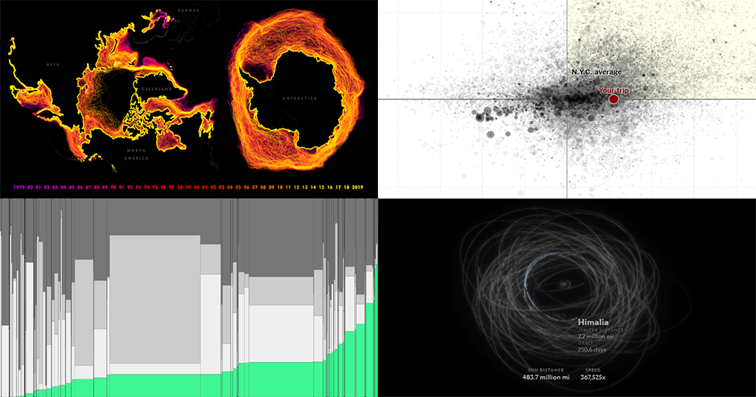 Many excellent visualizations have appeared this week around the web. Now it’s time to choose four and briefly introduce them to you — that’s what we’ve been doing for years within the framework of the special DataViz Weekly feature on our blog.
Alright. We invite you to take a look at the following new cool projects as another set of great data visualization examples, for your inspiration and fun:
- Variability in the New York subway commutes — The Upshot
- Moons in our solar system — National Geographic
- Energy consumption worldwide since 1980 — Bloomberg
- Sea ice extents since 1979 — ArcGIS Blog
- Categories: Data Visualization Weekly
- No Comments »
Engaging Data Visualizations About Time, Light, America, and Britain — DataViz Weekly
July 5th, 2019 by AnyChart Team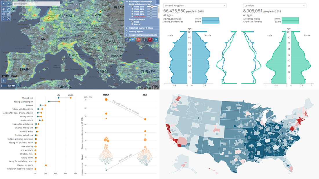 Here are some of the cool, engaging data visualizations we’ve come across these days. They are great examples of how awesome and informative charts can be when they truly let data talk.
The visualizations we are featuring this time on DataViz Weekly are as follows:
- Differences between men and women’s everyday life with kids — FlowingData
- 50 maps showing various aspects of the American life — Business Insider
- New population estimates for the United Kingdom — ONS
- Light pollution around the globe — Jurij Stare
- Categories: Data Visualization Weekly
- No Comments »
AnyChart Blog Named in 50 Best Data Visualization Blogs to Follow in 2019
April 10th, 2019 by AnyChart Team Yay, AnyChart Blog with our flagship regular feature DataViz Weekly has made it to the Top 50 Data Visualization Blogs and Websites To Follow in 2019! Curated by Feedspot, this newly updated list ranks our blog as high as second — right next to Nathan Yau’s brilliant blog FlowingData deservedly occupying the first place among the best data visualization blogs.
- Categories: News
- 1 Comment »
Data Visualization Blog Weekly: Roundup of Latest Cool Charts and Maps
June 23rd, 2017 by AnyChart Team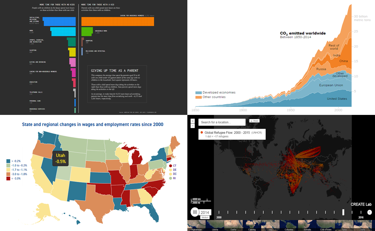 Greetings to all readers of our data visualization blog DataViz Weekly! We’ve collected four more charts and maps that should be worth getting your attention. Our today’s choice of cool recent data visualizations includes:
- patterns of how parents and adults without kids use their time,
- global CO2 emission since 1850,
- wages and employment rates in the US (by state), and
- global refugee flow since 2000.
Let’s get down to these now!
- Categories: Data Visualization Weekly
- No Comments »